Spaces:
Running

Running
File size: 108,521 Bytes
82f32a6 |
1 2 3 4 5 6 7 8 9 10 11 12 13 14 15 16 17 18 19 20 21 22 23 24 25 26 27 28 29 30 31 32 33 34 35 36 37 38 39 40 41 42 43 44 45 46 47 48 49 50 51 52 53 54 55 56 57 58 59 60 61 62 63 64 65 66 67 68 69 70 71 72 73 74 75 76 77 78 79 80 81 82 83 84 85 86 87 88 89 90 91 92 93 94 95 96 97 98 99 100 101 102 103 104 105 106 107 108 109 110 111 112 113 114 115 116 117 118 119 120 121 122 123 124 125 126 127 128 129 130 131 132 133 134 135 136 137 138 139 140 141 142 143 144 145 146 147 148 149 150 151 152 153 154 155 156 157 158 159 160 161 162 163 164 165 166 167 168 169 170 171 172 173 174 175 176 177 178 179 180 181 182 183 184 185 186 187 188 189 190 191 192 193 194 195 196 197 198 199 200 201 202 203 204 205 206 207 208 209 210 211 212 213 214 215 216 217 218 219 220 221 222 223 224 225 226 227 228 229 230 231 232 233 234 235 236 237 238 239 240 241 242 243 244 245 246 247 248 249 250 251 252 253 254 255 256 257 258 259 260 261 262 263 264 265 266 267 268 269 270 271 272 273 274 275 276 277 278 279 280 281 282 283 284 285 286 287 288 289 290 291 292 293 294 295 296 297 298 299 300 301 302 303 304 305 306 307 308 309 310 311 312 313 314 315 316 317 318 319 320 321 322 323 324 325 326 327 328 329 330 331 332 333 334 335 336 337 338 339 340 341 342 343 344 345 346 347 348 349 350 351 352 353 354 355 356 357 358 359 360 361 362 363 364 365 366 367 368 369 370 371 372 373 374 375 376 377 378 379 380 381 382 383 384 385 386 387 388 389 390 391 392 393 394 395 396 397 398 399 400 401 402 403 404 405 406 407 408 409 410 411 412 413 414 415 416 417 418 419 420 421 422 423 424 425 426 427 428 429 430 431 432 433 434 435 436 437 438 439 440 441 442 443 444 445 446 447 448 449 450 451 452 453 454 455 456 457 458 459 460 461 462 463 464 465 466 467 468 469 470 471 472 473 474 475 476 477 478 479 480 481 482 483 484 485 486 487 488 489 490 491 492 493 494 495 496 497 498 499 500 501 502 503 504 505 506 507 508 509 510 511 512 513 514 515 516 517 518 519 520 521 522 523 524 525 526 527 528 529 530 531 532 533 534 535 536 537 538 539 540 541 542 543 544 545 546 547 548 549 550 551 552 553 554 555 556 557 558 559 560 561 562 563 564 565 566 567 568 569 570 571 572 573 574 575 576 577 578 579 580 581 582 583 584 585 586 587 588 589 590 591 592 593 594 595 596 597 598 599 600 601 602 603 604 605 606 607 608 609 610 611 612 613 614 615 616 617 618 619 620 621 622 623 624 625 626 627 628 629 630 631 632 633 634 635 636 637 638 639 640 641 642 643 644 645 646 647 648 649 650 651 652 653 654 655 656 657 658 659 660 661 662 663 664 665 666 667 668 669 670 671 672 673 674 675 676 677 678 679 680 681 682 683 684 685 686 687 688 689 690 691 692 693 694 695 696 697 698 699 700 701 702 703 704 705 706 707 708 709 710 711 712 713 714 715 716 717 718 719 720 721 722 723 724 725 726 727 728 729 730 731 732 733 734 735 736 737 738 739 740 741 742 743 744 745 746 747 748 749 750 751 752 753 754 755 756 757 758 759 760 761 762 763 764 765 766 767 768 769 770 771 772 773 774 775 776 777 778 779 780 781 782 783 784 785 786 787 788 789 790 791 792 793 794 795 796 797 798 799 800 801 802 803 804 805 806 807 808 809 810 811 812 813 814 815 816 817 818 819 820 821 822 823 824 825 826 827 828 829 830 831 832 833 834 835 836 837 838 839 840 841 842 843 844 845 846 847 848 849 850 851 852 853 854 855 856 857 858 859 860 861 862 863 864 865 866 867 868 869 870 871 872 873 874 875 876 877 878 879 880 881 882 883 884 885 886 887 888 889 890 891 892 893 894 895 896 897 898 899 900 901 902 903 904 905 906 907 908 909 910 911 912 913 914 915 916 917 918 919 920 921 922 923 924 925 926 927 928 929 930 931 932 933 934 935 936 937 938 939 940 941 942 943 944 945 946 947 948 949 950 951 952 953 954 955 956 957 958 959 960 961 962 963 964 965 966 967 968 969 970 971 972 973 974 975 976 977 978 979 980 981 982 983 984 985 986 987 988 989 990 991 992 993 994 995 996 997 998 999 1000 1001 1002 1003 1004 1005 1006 1007 1008 1009 1010 1011 1012 1013 1014 1015 1016 1017 1018 1019 1020 1021 1022 1023 1024 1025 1026 1027 1028 1029 1030 1031 1032 1033 1034 1035 1036 1037 1038 1039 1040 1041 1042 1043 1044 1045 1046 1047 1048 1049 1050 1051 1052 1053 1054 1055 1056 1057 1058 1059 1060 1061 1062 1063 1064 1065 1066 1067 1068 1069 1070 1071 1072 1073 1074 1075 1076 1077 1078 1079 1080 1081 1082 1083 1084 1085 1086 1087 1088 1089 1090 1091 1092 1093 1094 1095 1096 1097 1098 1099 1100 1101 1102 1103 1104 1105 1106 1107 1108 1109 1110 1111 1112 1113 1114 1115 1116 1117 1118 1119 1120 1121 1122 1123 1124 1125 1126 1127 1128 1129 1130 1131 1132 1133 1134 1135 1136 1137 1138 1139 1140 1141 1142 1143 1144 1145 1146 1147 1148 1149 1150 1151 1152 1153 1154 1155 1156 1157 1158 1159 1160 1161 1162 1163 1164 1165 1166 1167 1168 1169 1170 1171 1172 1173 1174 1175 1176 1177 1178 1179 1180 1181 1182 1183 1184 1185 1186 1187 1188 1189 1190 1191 1192 1193 1194 1195 1196 1197 1198 1199 1200 1201 1202 1203 1204 1205 1206 1207 1208 1209 1210 1211 1212 1213 1214 1215 1216 1217 1218 1219 1220 1221 1222 1223 1224 1225 1226 1227 1228 1229 1230 1231 1232 1233 1234 1235 1236 1237 1238 1239 1240 1241 1242 1243 1244 1245 1246 1247 1248 1249 1250 1251 1252 1253 1254 1255 1256 1257 1258 1259 1260 1261 1262 1263 1264 1265 1266 1267 1268 1269 1270 1271 1272 1273 1274 1275 1276 1277 1278 1279 1280 1281 1282 1283 1284 1285 1286 1287 1288 1289 1290 1291 1292 1293 1294 1295 1296 1297 1298 1299 1300 1301 1302 1303 1304 1305 1306 1307 1308 1309 1310 1311 1312 1313 1314 1315 1316 1317 1318 1319 1320 1321 1322 1323 1324 1325 1326 1327 1328 1329 1330 1331 1332 1333 1334 1335 1336 1337 1338 1339 1340 1341 1342 1343 1344 1345 1346 1347 1348 1349 1350 1351 1352 1353 1354 1355 1356 1357 1358 1359 1360 1361 1362 1363 1364 1365 1366 1367 1368 1369 1370 1371 1372 1373 1374 1375 1376 1377 1378 1379 1380 1381 1382 1383 1384 1385 1386 1387 1388 1389 1390 1391 1392 1393 1394 1395 1396 1397 1398 1399 1400 1401 1402 1403 1404 1405 1406 1407 1408 1409 1410 1411 1412 1413 1414 1415 1416 1417 1418 1419 1420 1421 1422 1423 1424 1425 1426 1427 1428 1429 1430 1431 1432 1433 1434 1435 1436 1437 1438 1439 1440 1441 1442 1443 1444 1445 1446 1447 1448 1449 1450 1451 1452 1453 1454 1455 1456 1457 1458 1459 1460 1461 1462 1463 1464 1465 1466 1467 1468 1469 1470 1471 1472 1473 1474 1475 1476 1477 1478 1479 1480 1481 1482 1483 1484 1485 1486 1487 1488 1489 1490 1491 1492 1493 1494 1495 1496 1497 1498 1499 1500 1501 1502 1503 1504 1505 1506 1507 1508 1509 1510 1511 1512 1513 1514 1515 1516 1517 1518 1519 1520 1521 1522 1523 1524 1525 1526 1527 1528 1529 1530 1531 1532 1533 1534 1535 1536 1537 1538 1539 1540 1541 1542 1543 1544 1545 1546 1547 1548 1549 1550 1551 1552 1553 1554 1555 1556 1557 1558 1559 1560 1561 1562 1563 1564 1565 1566 1567 1568 1569 1570 1571 1572 1573 1574 1575 1576 1577 1578 1579 1580 1581 1582 1583 1584 1585 1586 1587 1588 1589 1590 1591 1592 1593 1594 1595 1596 1597 1598 1599 1600 1601 1602 1603 1604 1605 1606 1607 1608 1609 1610 1611 1612 1613 1614 1615 1616 1617 1618 1619 1620 1621 1622 1623 1624 1625 1626 1627 1628 1629 1630 1631 1632 1633 1634 1635 1636 1637 1638 1639 1640 1641 1642 1643 1644 1645 1646 1647 1648 1649 1650 1651 1652 1653 1654 1655 1656 1657 1658 1659 1660 1661 1662 1663 1664 1665 1666 1667 1668 1669 1670 1671 1672 1673 1674 1675 1676 1677 1678 1679 1680 1681 1682 1683 1684 1685 1686 1687 1688 1689 1690 1691 1692 1693 1694 1695 1696 1697 1698 1699 1700 1701 1702 1703 1704 1705 1706 1707 1708 1709 1710 1711 1712 1713 1714 1715 1716 1717 1718 1719 1720 1721 1722 1723 1724 1725 1726 1727 1728 1729 1730 1731 1732 1733 1734 1735 1736 1737 1738 1739 1740 1741 1742 1743 1744 1745 1746 1747 1748 1749 1750 1751 1752 1753 1754 1755 1756 1757 1758 1759 1760 1761 1762 1763 1764 1765 1766 1767 1768 1769 1770 1771 1772 1773 1774 1775 1776 1777 1778 1779 1780 1781 1782 1783 1784 1785 1786 1787 1788 1789 1790 1791 1792 1793 1794 1795 1796 1797 1798 1799 1800 1801 1802 1803 1804 1805 1806 1807 1808 1809 1810 1811 1812 1813 1814 1815 1816 1817 1818 1819 1820 1821 1822 1823 1824 1825 1826 1827 1828 1829 1830 1831 1832 1833 1834 1835 1836 1837 1838 1839 1840 1841 1842 1843 1844 1845 1846 1847 1848 1849 1850 1851 1852 1853 1854 1855 1856 1857 1858 1859 1860 1861 1862 1863 1864 1865 1866 1867 1868 1869 1870 1871 1872 1873 1874 1875 1876 1877 1878 1879 1880 1881 1882 1883 1884 1885 1886 1887 1888 1889 1890 1891 1892 1893 1894 1895 1896 1897 1898 1899 1900 1901 1902 1903 1904 1905 1906 1907 1908 1909 1910 1911 1912 1913 1914 1915 1916 1917 1918 1919 1920 1921 1922 1923 1924 1925 1926 1927 1928 1929 1930 1931 1932 1933 1934 1935 1936 1937 1938 1939 1940 1941 1942 1943 1944 1945 1946 1947 1948 1949 1950 1951 1952 1953 1954 1955 1956 1957 1958 1959 1960 1961 1962 1963 1964 1965 1966 1967 1968 1969 1970 1971 1972 1973 1974 1975 1976 1977 1978 1979 1980 1981 1982 1983 1984 1985 1986 1987 1988 1989 1990 1991 1992 1993 1994 1995 1996 1997 1998 1999 2000 2001 2002 2003 2004 2005 2006 2007 2008 2009 2010 2011 2012 2013 2014 2015 2016 2017 2018 2019 2020 2021 2022 2023 2024 2025 2026 2027 2028 2029 2030 2031 2032 2033 2034 2035 2036 2037 2038 2039 2040 2041 2042 2043 2044 2045 2046 2047 2048 2049 2050 2051 2052 2053 2054 2055 2056 2057 2058 2059 2060 2061 2062 2063 2064 2065 2066 2067 2068 2069 2070 2071 2072 2073 2074 2075 2076 2077 2078 2079 2080 2081 2082 2083 2084 2085 2086 2087 2088 2089 2090 2091 2092 2093 2094 2095 2096 2097 2098 2099 2100 2101 2102 2103 2104 2105 2106 2107 2108 2109 2110 2111 2112 2113 2114 2115 2116 2117 2118 2119 2120 2121 2122 2123 2124 2125 2126 2127 2128 2129 2130 2131 2132 2133 2134 2135 2136 2137 2138 2139 2140 2141 2142 2143 2144 2145 2146 2147 2148 2149 2150 2151 2152 2153 2154 2155 2156 2157 2158 2159 2160 2161 2162 2163 2164 2165 2166 2167 2168 2169 2170 2171 2172 2173 2174 2175 2176 2177 2178 2179 2180 2181 2182 2183 2184 2185 2186 2187 2188 2189 2190 2191 2192 2193 2194 2195 2196 2197 2198 2199 2200 2201 2202 2203 2204 2205 2206 2207 2208 2209 2210 2211 2212 2213 2214 2215 2216 2217 2218 2219 2220 2221 2222 2223 2224 2225 2226 2227 2228 2229 2230 2231 2232 2233 2234 2235 2236 2237 2238 2239 2240 2241 2242 2243 2244 2245 2246 2247 2248 2249 2250 2251 2252 2253 2254 2255 2256 2257 2258 2259 2260 2261 2262 2263 2264 2265 2266 2267 2268 2269 2270 2271 2272 2273 2274 2275 2276 2277 2278 2279 2280 2281 2282 2283 2284 2285 2286 2287 2288 2289 2290 2291 2292 2293 2294 2295 2296 2297 2298 2299 2300 2301 2302 2303 2304 2305 2306 2307 2308 2309 2310 2311 2312 2313 2314 2315 2316 2317 2318 2319 2320 2321 2322 2323 2324 2325 2326 2327 2328 2329 2330 2331 2332 2333 2334 2335 2336 2337 2338 2339 2340 2341 2342 2343 2344 2345 2346 2347 2348 2349 2350 2351 2352 2353 2354 2355 2356 2357 2358 2359 2360 2361 2362 2363 2364 2365 2366 2367 2368 2369 2370 2371 2372 2373 2374 2375 2376 2377 2378 2379 2380 2381 2382 2383 2384 2385 2386 2387 2388 2389 2390 2391 2392 2393 2394 2395 2396 2397 2398 2399 2400 2401 2402 2403 2404 2405 2406 2407 2408 2409 2410 2411 2412 2413 2414 2415 2416 2417 2418 2419 2420 2421 2422 2423 2424 2425 2426 2427 2428 2429 2430 2431 2432 2433 2434 2435 2436 2437 2438 2439 2440 2441 2442 2443 2444 2445 2446 2447 2448 2449 2450 2451 2452 2453 2454 2455 2456 2457 2458 2459 2460 2461 2462 2463 2464 2465 2466 2467 2468 2469 2470 2471 2472 2473 2474 2475 2476 2477 2478 2479 2480 2481 2482 2483 2484 2485 2486 2487 2488 2489 2490 2491 2492 2493 2494 2495 2496 2497 2498 2499 2500 2501 2502 2503 2504 2505 2506 2507 2508 2509 2510 2511 2512 2513 2514 2515 2516 2517 2518 2519 2520 2521 2522 2523 2524 2525 2526 2527 2528 2529 2530 2531 2532 2533 2534 2535 2536 2537 2538 2539 2540 2541 2542 2543 2544 2545 2546 2547 2548 2549 2550 2551 2552 2553 2554 2555 2556 2557 2558 2559 2560 2561 2562 2563 2564 2565 2566 2567 2568 2569 2570 2571 2572 2573 2574 2575 2576 2577 2578 2579 2580 2581 2582 2583 2584 2585 2586 2587 2588 2589 2590 2591 2592 2593 2594 2595 2596 2597 2598 2599 2600 2601 2602 2603 2604 2605 2606 2607 2608 2609 2610 2611 2612 2613 2614 2615 2616 2617 2618 2619 2620 2621 2622 2623 2624 2625 2626 2627 2628 2629 2630 2631 2632 2633 2634 2635 2636 2637 2638 2639 2640 2641 2642 2643 2644 2645 2646 2647 2648 2649 2650 2651 2652 2653 2654 2655 2656 2657 2658 2659 2660 2661 2662 2663 2664 2665 2666 2667 2668 2669 2670 2671 2672 2673 2674 2675 2676 2677 2678 2679 2680 2681 2682 2683 2684 |
# More Blocks Features
## Examples
Just like with `gr.Interface`, you can also add examples for your functions when you are working with `gr.Blocks`. In this case, instantiate a `gr.Examples` similar to how you would instantiate any other component. The constructor of `gr.Examples` takes two required arguments:
- `examples`: a nested list of examples, in which the outer list consists of examples and each inner list consists of an input corresponding to each input component
- `inputs`: the component or list of components that should be populated when the examples are clicked
You can also set `cache_examples=True` or `cache_examples='lazy'`, similar to [the caching API in `gr.Interface`](https://www.gradio.app/guides/more-on-examples), in which case two additional arguments must be provided:
- `outputs`: the component or list of components corresponding to the output of the examples
- `fn`: the function to run to generate the outputs corresponding to the examples
Here's an example showing how to use `gr.Examples` in a `gr.Blocks` app:
```python
import gradio as gr
def calculator(num1, operation, num2):
if operation == "add":
return num1 + num2
elif operation == "subtract":
return num1 - num2
elif operation == "multiply":
return num1 * num2
elif operation == "divide":
return num1 / num2
with gr.Blocks() as demo:
with gr.Row():
with gr.Column():
num_1 = gr.Number(value=4)
operation = gr.Radio(["add", "subtract", "multiply", "divide"])
num_2 = gr.Number(value=0)
submit_btn = gr.Button(value="Calculate")
with gr.Column():
result = gr.Number()
submit_btn.click(
calculator, inputs=[num_1, operation, num_2], outputs=[result], api_visibility="private"
)
examples = gr.Examples(
examples=[
[5, "add", 3],
[4, "divide", 2],
[-4, "multiply", 2.5],
[0, "subtract", 1.2],
],
inputs=[num_1, operation, num_2],
)
if __name__ == "__main__":
demo.launch(footer_links=["gradio"])
```
<gradio-app space='gradio/calculator_blocks'></gradio-app>
**Note**: When you click on examples, not only does the value of the input component update to the example value, but the component's configuration also reverts to the properties with which you constructed the component. This ensures that the examples are compatible with the component even if its configuration has been changed.
## Running Events Continuously
You can run events on a fixed schedule using `gr.Timer()` object. This will run the event when the timer's `tick` event fires. See the code below:
```python
with gr.Blocks as demo:
timer = gr.Timer(5)
textbox = gr.Textbox()
textbox2 = gr.Textbox()
timer.tick(set_textbox_fn, textbox, textbox2)
```
This can also be used directly with a Component's `every=` parameter, if the value of the Component is a function:
```python
with gr.Blocks as demo:
timer = gr.Timer(5)
textbox = gr.Textbox()
textbox2 = gr.Textbox(set_textbox_fn, inputs=[textbox], every=timer)
```
Here is an example of a demo that print the current timestamp, and also prints random numbers regularly!
```python
import gradio as gr
import random
import time
with gr.Blocks() as demo:
timer = gr.Timer(1)
timestamp = gr.Number(label="Time")
timer.tick(lambda: round(time.time()), outputs=timestamp, api_name="timestamp")
number = gr.Number(lambda: random.randint(1, 10), every=timer, label="Random Number")
with gr.Row():
gr.Button("Start").click(lambda: gr.Timer(active=True), None, timer)
gr.Button("Stop").click(lambda: gr.Timer(active=False), None, timer)
gr.Button("Go Fast").click(lambda: 0.2, None, timer)
if __name__ == "__main__":
demo.launch()
```
<gradio-app space='gradio/timer_simple'></gradio-app>
## Gathering Event Data
You can gather specific data about an event by adding the associated event data class as a type hint to an argument in the event listener function.
For example, event data for `.select()` can be type hinted by a `gradio.SelectData` argument. This event is triggered when a user selects some part of the triggering component, and the event data includes information about what the user specifically selected. For example, if a user selected a specific word in a `Textbox`, a specific pixel in an `Image`, a specific image in a `Gallery`, or a specific cell in a `DataFrame`, the event data argument would contain information about the specific selection.
The `SelectData` includes the value that was selected, and the index where the selection occurred. A simple example that shows what text was selected in a `Textbox`.
```python
import gradio as gr
with gr.Blocks() as demo:
textbox = gr.Textbox("The quick brown fox jumped.")
selection = gr.Textbox()
def get_selection(select_evt: gr.SelectData):
return select_evt.value
textbox.select(get_selection, None, selection)
```
In the 2 player tic-tac-toe demo below, a user can select a cell in the `DataFrame` to make a move. The event data argument contains information about the specific cell that was selected. We can first check to see if the cell is empty, and then update the cell with the user's move.
```python
import gradio as gr
with gr.Blocks() as demo:
turn = gr.Textbox("X", interactive=False, label="Turn")
board = gr.Dataframe(value=[["", "", ""]] * 3, interactive=False, type="array")
def place(board: list[list[int]], turn, evt: gr.SelectData):
if evt.value:
return board, turn
board[evt.index[0]][evt.index[1]] = turn
turn = "O" if turn == "X" else "X"
return board, turn
board.select(place, [board, turn], [board, turn], show_progress="hidden")
demo.launch()
```
<gradio-app space='gradio/tictactoe'></gradio-app>
## Validation
For certain apps, it is important to validate inputs prior to using them. While this can be done in the main event function, events also support a `validator` function dedicated to this task.
This feature allows for a far better user experience than placing this logic in your main function for the following reasons:
- Input validation is performed immediately, bypassing the queue, giving the end user almost instant feedback.
- Validation errors returned from the `validator` function are displayed differently in the UI.
- The validator function allows for greater granularity. Rather than raising a generic exception, you can return a validation message and status for each input individually.
The `validator` kwarg should be a function that returns a `gr.validate` object for each input. `gr.validate` takes two arguments:
- `is_valid` - whether or not the input is valid
- `message` - the message to display if validation fails.
In the demo below you can see that by returning a validation status for each input, we have more granular information that we can display to the user.
```python
import gradio as gr
def validate_input(age, location):
return [
gr.validate(not age or age > 3, "Age must be at least 3"),
gr.validate("london" not in location.lower(), "Location must not be in London"),
]
def process_text(age, location):
return f"Processed: {age} -- {location.upper()}"
with gr.Blocks() as demo:
gr.Markdown("# Validator Parameter Test Demo")
with gr.Row():
with gr.Column():
age = gr.Number(
label="Enter age",
placeholder="Enter age",
)
location = gr.Textbox(
max_lines=3,
label="Enter location",
placeholder="Enter location",
)
validate_btn = gr.Button("Process with Validation", variant="primary")
output_with_validation = gr.Textbox(
label="Output (with validation)", interactive=False
)
validate_btn.click(
fn=process_text,
validator=validate_input,
inputs=[age, location],
outputs=output_with_validation,
)
demo.launch()
```
# Custom Components with `gr.HTML`
If you wish to create custom HTML in your app, use the `gr.HTML` component. Here's a basic "HTML-only" example:
```python
gr.HTML(value="<h1>Hello World!</h1>")
```
You can also use html-templates to organize your HTML. Take a look at the example below:
```python
gr.HTML(value="John", html_template"<h1>Hello, {{value}}!</h1><p>${value.length} letters</p>")
```
"John" becomes `value` when injected into the template, resulting in:
```html
<h1>Hello, John!</h1><p>4 letters</p>
```
Notice how we support two types of templating syntaxes: `${}` for custom JavaScript expressions, and `{{}}` for Handlebars templating. You can use either or both in your templates - `${}` allows for completely custom JS logic, while Handlebars provides structured templating for loops and conditionals.
Let's look at another example for displaying a list of items:
```python
gr.HTML(value=["apple", "banana", "cherry"], html_templates="""
<h1>${value.length} fruits:</h1>
<ul>
{{#each value}}
<li>{{this}}</li>
{{/each}}
</ul>
""")
```
By default, the content of gr.HTML will have some CSS styles applied to match the Gradio theme. You can disable this with `apply_default_css=False`. You can also provide your own CSS styles via the `css_template` argument as shown in the next example.
Let's build a simple star rating component using `gr.HTML`, and then extend it with more features.
```python
import gradio as gr
with gr.Blocks() as demo:
three_star_rating = gr.HTML("""
<h2>Star Rating:</h2>
<img src='https://upload.wikimedia.org/wikipedia/commons/d/df/Award-star-gold-3d.svg'>
<img src='https://upload.wikimedia.org/wikipedia/commons/d/df/Award-star-gold-3d.svg'>
<img src='https://upload.wikimedia.org/wikipedia/commons/d/df/Award-star-gold-3d.svg'>
<img class='faded' src='https://upload.wikimedia.org/wikipedia/commons/d/df/Award-star-gold-3d.svg'>
<img class='faded' src='https://upload.wikimedia.org/wikipedia/commons/d/df/Award-star-gold-3d.svg'>
""", css_template="""
img { height: 50px; display: inline-block; }
.faded { filter: grayscale(100%); opacity: 0.3; }
""")
demo.launch()
```
<gradio-app space='gradio/star_rating_simple'></gradio-app>
Note how we used the `css_template` argument to add custom CSS that styles the HTML inside the `gr.HTML` component.
Let's see how the template automatically updates when we update the value.
```python
import gradio as gr
with gr.Blocks() as demo:
star_rating = gr.HTML(
value=3,
html_template="""
<h2>Star Rating:</h2>
${Array.from({length: 5}, (_, i) => `<img class='${i < value ? '' : 'faded'}' src='https://upload.wikimedia.org/wikipedia/commons/d/df/Award-star-gold-3d.svg'>`).join('')}""",
css_template="""
img { height: 50px; display: inline-block; }
.faded { filter: grayscale(100%); opacity: 0.3; }
""")
rating_slider = gr.Slider(0, 5, 3, step=1, label="Select Rating")
rating_slider.change(fn=lambda x: x, inputs=rating_slider, outputs=star_rating)
demo.launch()
```
<gradio-app space='gradio/star_rating_templates'></gradio-app>
We may wish to pass additional props beyond just `value` to the `html_template`. Simply add these props to your templates and pass them as kwargs to the `gr.HTML` component. For example, lets add `size` and `max_stars` props to the star rating component.
```python
import gradio as gr
with gr.Blocks() as demo:
star_rating = gr.HTML(
7,
size=40,
max_stars=10,
html_template="""
<h2>Star Rating:</h2>
${Array.from({length: max_stars}, (_, i) => `<img class='${i < value ? '' : 'faded'}' src='https://upload.wikimedia.org/wikipedia/commons/d/df/Award-star-gold-3d.svg'>`).join('')}""",
css_template="""
img { height: ${size}px; display: inline-block; }
.faded { filter: grayscale(100%); opacity: 0.3; }
"""
)
rating_slider = gr.Slider(0, 10, step=1, label="Select Rating")
rating_slider.change(fn=lambda x: x, inputs=rating_slider, outputs=star_rating)
size_slider = gr.Slider(20, 100, 40, step=1, label="Select Size")
size_slider.change(fn=lambda x: gr.HTML(size=x), inputs=size_slider, outputs=star_rating)
demo.launch()
```
<gradio-app space='gradio/star_rating_props'></gradio-app>
Note how both `html_template` and `css_template` can format these extra props. Note also how any of these props can be updated via Gradio event listeners.
## Triggering Events and Custom Input Components
The `gr.HTML` component can also be used to create custom input components by triggering events. You will provide `js_on_load`, javascript code that runs when the component loads. The code has access to the `trigger` function to trigger events that Gradio can listen to, and the object `props` which has access to all the props of the component, including `value`.
```python
import gradio as gr
with gr.Blocks() as demo:
star_rating = gr.HTML(
value=3,
html_template="""
<h2>Star Rating:</h2>
${Array.from({length: 5}, (_, i) => `<img class='${i < value ? '' : 'faded'}' src='https://upload.wikimedia.org/wikipedia/commons/d/df/Award-star-gold-3d.svg'>`).join('')}
<button id='submit-btn'>Submit Rating</button>
""",
css_template="""
img { height: 50px; display: inline-block; cursor: pointer; }
.faded { filter: grayscale(100%); opacity: 0.3; }
""",
js_on_load="""
const imgs = element.querySelectorAll('img');
imgs.forEach((img, index) => {
img.addEventListener('click', () => {
props.value = index + 1;
});
});
const submitBtn = element.querySelector('#submit-btn');
submitBtn.addEventListener('click', () => {
trigger('submit');
});
""")
rating_output = gr.Textbox(label="Submitted Rating")
star_rating.submit(lambda x: x, inputs=star_rating, outputs=rating_output)
demo.launch()
```
<gradio-app space='gradio/star_rating_events'></gradio-app>
Take a look at the `js_on_load` code above. We add click event listeners to each star image to update the value via `props.value` when a star is clicked. This also re-renders the template to show the updated value. We also add a click event listener to the submit button that triggers the `submit` event. In our app, we listen to this trigger to run a function that outputs the `value` of the star rating.
You can update any other props of the component via `props.<prop_name>`, and trigger events via `trigger('<event_name>')`. The trigger event can also be send event data, e.g.
```js
trigger('event_name', { key: value, count: 123 });
```
This event data will be accessible the Python event listener functions via gr.EventData.
```python
def handle_event(evt: gr.EventData):
print(evt.key)
print(evt.count)
star_rating.event(fn=handle_event, inputs=[], outputs=[])
```
Keep in mind that event listeners attached in `js_on_load` are only attached once when the component is first rendered. If your component creates new elements dynamically that need event listeners, attach the event listener to a parent element that exists when the component loads, and check for the target. For example:
```js
element.addEventListener('click', (e) =>
if (e.target && e.target.matches('.child-element')) {
props.value = e.target.dataset.value;
}
);
```
## Component Classes
If you are reusing the same HTML component in multiple places, you can create a custom component class by subclassing `gr.HTML` and setting default values for the templates and other arguments. Here's an example of creating a reusable StarRating component.
```python
import gradio as gr
class StarRating(gr.HTML):
def __init__(self, label, value=0, **kwargs):
html_template = """
<h2>${label} rating:</h2>
${Array.from({length: 5}, (_, i) => `<img class='${i < value ? '' : 'faded'}' src='https://upload.wikimedia.org/wikipedia/commons/d/df/Award-star-gold-3d.svg'>`).join('')}
"""
css_template = """
img { height: 50px; display: inline-block; cursor: pointer; }
.faded { filter: grayscale(100%); opacity: 0.3; }
"""
js_on_load = """
const imgs = element.querySelectorAll('img');
imgs.forEach((img, index) => {
img.addEventListener('click', () => {
props.value = index + 1;
});
});
"""
super().__init__(value=value, label=label, html_template=html_template, css_template=css_template, js_on_load=js_on_load, **kwargs)
def api_info(self):
return {"type": "integer", "minimum": 0, "maximum": 5}
with gr.Blocks() as demo:
gr.Markdown("# Restaurant Review")
food_rating = StarRating(label="Food", value=3)
service_rating = StarRating(label="Service", value=3)
ambience_rating = StarRating(label="Ambience", value=3)
average_btn = gr.Button("Calculate Average Rating")
rating_output = StarRating(label="Average", value=3)
def calculate_average(food, service, ambience):
return round((food + service + ambience) / 3)
average_btn.click(
fn=calculate_average,
inputs=[food_rating, service_rating, ambience_rating],
outputs=rating_output
)
demo.launch()
```
<gradio-app space='gradio/star_rating_component'></gradio-app>
Note: Gradio requires all components to accept certain arguments, such as `render`. You do not need
to handle these arguments, but you do need to accept them in your component constructor and pass
them to the parent `gr.HTML` class. Otherwise, your component may not behave correctly. The easiest
way is to add `**kwargs` to your `__init__` method and pass it to `super().__init__()`, just like in the code example above.
We've created several custom HTML components as reusable components as examples you can reference in [this directory](https://github.com/gradio-app/gradio/tree/main/gradio/components/custom_html_components).
### API / MCP support
To make your custom HTML component work with Gradio's built-in support for API and MCP (Model Context Protocol) usage, you need to define how its data should be serialized. There are two ways to do this:
**Option 1: Define an `api_info()` method**
Add an `api_info()` method that returns a JSON schema dictionary describing your component's data format. This is what we do in the StarRating class above.
**Option 2: Define a Pydantic data model**
For more complex data structures, you can define a Pydantic model that inherits from `GradioModel` or `GradioRootModel`:
```python
from gradio.data_classes import GradioModel, GradioRootModel
class MyComponentData(GradioModel):
items: List[str]
count: int
class MyComponent(gr.HTML):
data_model = MyComponentData
```
Use `GradioModel` when your data is a dictionary with named fields, or `GradioRootModel` when your data is a simple type (string, list, etc.) that doesn't need to be wrapped in a dictionary. By defining a `data_model`, your component automatically implements API methods.
## Security Considerations
Keep in mind that using `gr.HTML` to create custom components involves injecting raw HTML and JavaScript into your Gradio app. Be cautious about using untrusted user input into `html_template` and `js_on_load`, as this could lead to cross-site scripting (XSS) vulnerabilities.
You should also expect that any Python event listeners that take your `gr.HTML` component as input could have any arbitrary value passed to them, not just the values you expect the frontend to be able to set for `value`. Sanitize and validate user input appropriately in public applications.
## Next Steps
Check out some examples of custom components that you can build in [this directory](https://github.com/gradio-app/gradio/tree/main/gradio/components/custom_html_components).
# Customizing your demo with CSS and Javascript
Gradio allows you to customize your demo in several ways. You can customize the layout of your demo, add custom HTML, and add custom theming as well. This tutorial will go beyond that and walk you through how to add custom CSS and JavaScript code to your demo in order to add custom styling, animations, custom UI functionality, analytics, and more.
## Adding custom CSS to your demo
Gradio themes are the easiest way to customize the look and feel of your app. You can choose from a variety of themes, or create your own. To do so, pass the `theme=` kwarg to the `launch()` method of the `Blocks` constructor. For example:
```python
with gr.Blocks() as demo:
... # your code here
demo.launch(theme=gr.themes.Glass())
...
```
Gradio comes with a set of prebuilt themes which you can load from `gr.themes.*`. You can extend these themes or create your own themes from scratch - see the [Theming guide](/guides/theming-guide) for more details.
For additional styling ability, you can pass any CSS to your app as a string using the `css=` kwarg in the `launch()` method. You can also pass a pathlib.Path to a css file or a list of such paths to the `css_paths=` kwarg in the `launch()` method.
**Warning**: The use of query selectors in custom JS and CSS is _not_ guaranteed to work across Gradio versions that bind to Gradio's own HTML elements as the Gradio HTML DOM may change. We recommend using query selectors sparingly.
The base class for the Gradio app is `gradio-container`, so here's an example that changes the background color of the Gradio app:
```python
with gr.Blocks() as demo:
... # your code here
demo.launch(css=".gradio-container {background-color: red}")
...
```
If you'd like to reference external files in your css, preface the file path (which can be a relative or absolute path) with `"/gradio_api/file="`, for example:
```python
with gr.Blocks() as demo:
... # your code here
demo.launch(css=".gradio-container {background: url('/gradio_api/file=clouds.jpg')}")
...
```
Note: By default, most files in the host machine are not accessible to users running the Gradio app. As a result, you should make sure that any referenced files (such as `clouds.jpg` here) are either URLs or [allowed paths, as described here](/main/guides/file-access).
## The `elem_id` and `elem_classes` Arguments
You can `elem_id` to add an HTML element `id` to any component, and `elem_classes` to add a class or list of classes. This will allow you to select elements more easily with CSS. This approach is also more likely to be stable across Gradio versions as built-in class names or ids may change (however, as mentioned in the warning above, we cannot guarantee complete compatibility between Gradio versions if you use custom CSS as the DOM elements may themselves change).
```python
css = """
#warning {background-color: #FFCCCB}
.feedback textarea {font-size: 24px !important}
"""
with gr.Blocks() as demo:
box1 = gr.Textbox(value="Good Job", elem_classes="feedback")
box2 = gr.Textbox(value="Failure", elem_id="warning", elem_classes="feedback")
demo.launch(css=css)
```
The CSS `#warning` ruleset will only target the second Textbox, while the `.feedback` ruleset will target both. Note that when targeting classes, you might need to put the `!important` selector to override the default Gradio styles.
## Adding custom JavaScript to your demo
There are 3 ways to add javascript code to your Gradio demo:
1. You can add JavaScript code as a string to the `js` parameter of the `Blocks` or `Interface` initializer. This will run the JavaScript code when the demo is first loaded.
Below is an example of adding custom js to show an animated welcome message when the demo first loads.
```python
import gradio as gr
def welcome(name):
return f"Welcome to Gradio, {name}!"
js = """
function createGradioAnimation() {
var container = document.createElement('div');
container.id = 'gradio-animation';
container.style.fontSize = '2em';
container.style.fontWeight = 'bold';
container.style.textAlign = 'center';
container.style.marginBottom = '20px';
var text = 'Welcome to Gradio!';
for (var i = 0; i < text.length; i++) {
(function(i){
setTimeout(function(){
var letter = document.createElement('span');
letter.style.opacity = '0';
letter.style.transition = 'opacity 0.5s';
letter.innerText = text[i];
container.appendChild(letter);
setTimeout(function() {
letter.style.opacity = '1';
}, 50);
}, i * 250);
})(i);
}
var gradioContainer = document.querySelector('.gradio-container');
gradioContainer.insertBefore(container, gradioContainer.firstChild);
return 'Animation created';
}
"""
with gr.Blocks() as demo:
inp = gr.Textbox(placeholder="What is your name?")
out = gr.Textbox()
inp.change(welcome, inp, out)
if __name__ == "__main__":
demo.launch(js=js)
```
<gradio-app space='gradio/blocks_js_load'></gradio-app>
2. When using `Blocks` and event listeners, events have a `js` argument that can take a JavaScript function as a string and treat it just like a Python event listener function. You can pass both a JavaScript function and a Python function (in which case the JavaScript function is run first) or only Javascript (and set the Python `fn` to `None`). Take a look at the code below:
```python
import gradio as gr
blocks = gr.Blocks()
with blocks as demo:
subject = gr.Textbox(placeholder="subject")
verb = gr.Radio(["ate", "loved", "hated"])
object = gr.Textbox(placeholder="object")
with gr.Row():
btn = gr.Button("Create sentence.")
reverse_btn = gr.Button("Reverse sentence.")
foo_bar_btn = gr.Button("Append foo")
reverse_then_to_the_server_btn = gr.Button(
"Reverse sentence and send to server."
)
def sentence_maker(w1, w2, w3):
return f"{w1} {w2} {w3}"
output1 = gr.Textbox(label="output 1")
output2 = gr.Textbox(label="verb")
output3 = gr.Textbox(label="verb reversed")
output4 = gr.Textbox(label="front end process and then send to backend")
btn.click(sentence_maker, [subject, verb, object], output1)
reverse_btn.click(
None, [subject, verb, object], output2, js="(s, v, o) => o + ' ' + v + ' ' + s"
)
verb.change(None, verb, output3, js="(x) => [...x].reverse().join('')")
foo_bar_btn.click(None, [], subject, js="(x) => x + ' foo'")
reverse_then_to_the_server_btn.click(
None,
[subject, verb, object],
output4,
js="(s, v, o) => [s, v, o].map(x => [...x].reverse().join('')).join(' ')",
)
demo.launch()
```
<gradio-app space='gradio/blocks_js_methods'></gradio-app>
3. Lastly, you can add JavaScript code to the `head` param of the `Blocks` initializer. This will add the code to the head of the HTML document. For example, you can add Google Analytics to your demo like so:
```python
head = f"""
<script async src="https://www.googletagmanager.com/gtag/js?id={google_analytics_tracking_id}"></script>
<script>
window.dataLayer = window.dataLayer || [];
function gtag(){{dataLayer.push(arguments);}}
gtag('js', new Date());
gtag('config', '{google_analytics_tracking_id}');
</script>
"""
with gr.Blocks() as demo:
gr.HTML("<h1>My App</h1>")
demo.launch(head=head)
```
The `head` parameter accepts any HTML tags you would normally insert into the `<head>` of a page. For example, you can also include `<meta>` tags to `head` in order to update the social sharing preview for your Gradio app like this:
```py
import gradio as gr
custom_head = """
<!-- HTML Meta Tags -->
<title>Sample App</title>
<meta name="description" content="An open-source web application showcasing various features and capabilities.">
<!-- Facebook Meta Tags -->
<meta property="og:url" content="https://example.com">
<meta property="og:type" content="website">
<meta property="og:title" content="Sample App">
<meta property="og:description" content="An open-source web application showcasing various features and capabilities.">
<meta property="og:image" content="https://cdn.britannica.com/98/152298-050-8E45510A/Cheetah.jpg">
<!-- Twitter Meta Tags -->
<meta name="twitter:card" content="summary_large_image">
<meta name="twitter:creator" content="@example_user">
<meta name="twitter:title" content="Sample App">
<meta name="twitter:description" content="An open-source web application showcasing various features and capabilities.">
<meta name="twitter:image" content="https://cdn.britannica.com/98/152298-050-8E45510A/Cheetah.jpg">
<meta property="twitter:domain" content="example.com">
<meta property="twitter:url" content="https://example.com">
"""
with gr.Blocks(title="My App") as demo:
gr.HTML("<h1>My App</h1>")
demo.launch(head=custom_head)
```
Note that injecting custom JS can affect browser behavior and accessibility (e.g. keyboard shortcuts may be lead to unexpected behavior if your Gradio app is embedded in another webpage). You should test your interface across different browsers and be mindful of how scripts may interact with browser defaults. Here's an example where pressing `Shift + s` triggers the `click` event of a specific `Button` component if the browser focus is _not_ on an input component (e.g. `Textbox` component):
```python
import gradio as gr
shortcut_js = """
<script>
function shortcuts(e) {
var event = document.all ? window.event : e;
switch (e.target.tagName.toLowerCase()) {
case "input":
case "textarea":
break;
default:
if (e.key.toLowerCase() == "s" && e.shiftKey) {
document.getElementById("my_btn").click();
}
}
}
document.addEventListener('keypress', shortcuts, false);
</script>
"""
with gr.Blocks() as demo:
action_button = gr.Button(value="Name", elem_id="my_btn")
textbox = gr.Textbox()
action_button.click(lambda : "button pressed", None, textbox)
demo.launch(head=shortcut_js)
```
# Using Gradio Blocks Like Functions
**Prerequisite**: This Guide builds on the Blocks Introduction. Make sure to [read that guide first](https://gradio.app/blocks-and-event-listeners).
## Introduction
Did you know that apart from being a full-stack machine learning demo, a Gradio Blocks app is also a regular-old python function!?
This means that if you have a gradio Blocks (or Interface) app called `demo`, you can use `demo` like you would any python function.
So doing something like `output = demo("Hello", "friend")` will run the first event defined in `demo` on the inputs "Hello" and "friend" and store it
in the variable `output`.
If I put you to sleep 🥱, please bear with me! By using apps like functions, you can seamlessly compose Gradio apps.
The following section will show how.
## Treating Blocks like functions
Let's say we have the following demo that translates english text to german text.
```python
import gradio as gr
from transformers import pipeline
pipe = pipeline("translation", model="t5-base")
def translate(text):
return pipe(text)[0]["translation_text"]
with gr.Blocks() as demo:
with gr.Row():
with gr.Column():
english = gr.Textbox(label="English text")
translate_btn = gr.Button(value="Translate")
with gr.Column():
german = gr.Textbox(label="German Text")
translate_btn.click(translate, inputs=english, outputs=german, api_name="translate-to-german")
examples = gr.Examples(examples=["I went to the supermarket yesterday.", "Helen is a good swimmer."],
inputs=[english])
demo.launch()
```
I already went ahead and hosted it in Hugging Face spaces at [gradio/english_translator](https://huggingface.co/spaces/gradio/english_translator).
You can see the demo below as well:
<gradio-app space='gradio/english_translator'></gradio-app>
Now, let's say you have an app that generates english text, but you wanted to additionally generate german text.
You could either:
1. Copy the source code of my english-to-german translation and paste it in your app.
2. Load my english-to-german translation in your app and treat it like a normal python function.
Option 1 technically always works, but it often introduces unwanted complexity.
Option 2 lets you borrow the functionality you want without tightly coupling our apps.
All you have to do is call the `Blocks.load` class method in your source file.
After that, you can use my translation app like a regular python function!
The following code snippet and demo shows how to use `Blocks.load`.
Note that the variable `english_translator` is my english to german app, but its used in `generate_text` like a regular function.
```python
import gradio as gr
from transformers import pipeline
english_translator = gr.load(name="spaces/gradio/english_translator")
english_generator = pipeline("text-generation", model="distilgpt2")
def generate_text(text):
english_text = english_generator(text)[0]["generated_text"]
german_text = english_translator(english_text)
return english_text, german_text
with gr.Blocks() as demo:
with gr.Row():
with gr.Column():
seed = gr.Text(label="Input Phrase")
with gr.Column():
english = gr.Text(label="Generated English Text")
german = gr.Text(label="Generated German Text")
btn = gr.Button("Generate")
btn.click(generate_text, inputs=[seed], outputs=[english, german])
gr.Examples(["My name is Clara and I am"], inputs=[seed])
demo.launch()
```
<gradio-app space='gradio/generate_english_german'></gradio-app>
## How to control which function in the app to use
If the app you are loading defines more than one function, you can specify which function to use
with the `fn_index` and `api_name` parameters.
In the code for our english to german demo, you'll see the following line:
```python
translate_btn.click(translate, inputs=english, outputs=german, api_name="translate-to-german")
```
The `api_name` gives this function a unique name in our app. You can use this name to tell gradio which
function in the upstream space you want to use:
```python
english_generator(text, api_name="translate-to-german")[0]["generated_text"]
```
You can also use the `fn_index` parameter.
Imagine my app also defined an english to spanish translation function.
In order to use it in our text generation app, we would use the following code:
```python
english_generator(text, fn_index=1)[0]["generated_text"]
```
Functions in gradio spaces are zero-indexed, so since the spanish translator would be the second function in my space,
you would use index 1.
## Parting Remarks
We showed how treating a Blocks app like a regular python helps you compose functionality across different apps.
Any Blocks app can be treated like a function, but a powerful pattern is to `load` an app hosted on
[Hugging Face Spaces](https://huggingface.co/spaces) prior to treating it like a function in your own app.
You can also load models hosted on the [Hugging Face Model Hub](https://huggingface.co/models) - see the [Using Hugging Face Integrations](/using_hugging_face_integrations) guide for an example.
Happy building! ⚒️
# Custom Components in 5 minutes
Gradio includes the ability for developers to create their own custom components and use them in Gradio apps. You can publish your components as Python packages so that other users can use them as well.
Users will be able to use all of Gradio's existing functions, such as `gr.Blocks`, `gr.Interface`, API usage, themes, etc. with Custom Components. This guide will cover how to get started making custom components.
## Installation
You will need to have:
* Python 3.10+ (<a href="https://www.python.org/downloads/" target="_blank">install here</a>)
* pip 21.3+ (`python -m pip install --upgrade pip`)
* Node.js 20+ (<a href="https://nodejs.dev/en/download/package-manager/" target="_blank">install here</a>)
* npm 9+ (<a href="https://docs.npmjs.com/downloading-and-installing-node-js-and-npm/" target="_blank">install here</a>)
* Gradio 5+ (`pip install --upgrade gradio`)
## The Workflow
The Custom Components workflow consists of 4 steps: create, dev, build, and publish.
1. create: creates a template for you to start developing a custom component.
2. dev: launches a development server with a sample app & hot reloading allowing you to easily develop your custom component
3. build: builds a python package containing to your custom component's Python and JavaScript code -- this makes things official!
4. publish: uploads your package to [PyPi](https://pypi.org/) and/or a sample app to [HuggingFace Spaces](https://hf.co/spaces).
Each of these steps is done via the Custom Component CLI. You can invoke it with `gradio cc` or `gradio component`
<div class='tip'>
<svg xmlns="http://www.w3.org/2000/svg" viewBox="0 0 24 24" fill="none" stroke="currentColor" stroke-width="2" stroke-linecap="round" stroke-linejoin="round">
<path d="M15 14c.2-1 .7-1.7 1.5-2.5 1-.9 1.5-2.2 1.5-3.5A6 6 0 0 0 6 8c0 1 .2 2.2 1.5 3.5.7.7 1.3 1.5 1.5 2.5"/>
<path d="M9 18h6"/>
<path d="M10 22h4"/>
</svg>
<div><p>Run <code>gradio cc --help</code> to get a help menu of all available commands. There are some commands that are not covered in this guide. You can also append <code>--help</code> to any command name to bring up a help page for that command, e.g. <code>gradio cc create --help</code>.</p></div>
</div>
## 1. create
Bootstrap a new template by running the following in any working directory:
```bash
gradio cc create MyComponent --template SimpleTextbox
```
Instead of `MyComponent`, give your component any name.
Instead of `SimpleTextbox`, you can use any Gradio component as a template. `SimpleTextbox` is actually a special component that a stripped-down version of the `Textbox` component that makes it particularly useful when creating your first custom component.
Some other components that are good if you are starting out: `SimpleDropdown`, `SimpleImage`, or `File`.
<div class='tip'>
<svg xmlns="http://www.w3.org/2000/svg" viewBox="0 0 24 24" fill="none" stroke="currentColor" stroke-width="2" stroke-linecap="round" stroke-linejoin="round">
<path d="M15 14c.2-1 .7-1.7 1.5-2.5 1-.9 1.5-2.2 1.5-3.5A6 6 0 0 0 6 8c0 1 .2 2.2 1.5 3.5.7.7 1.3 1.5 1.5 2.5"/>
<path d="M9 18h6"/>
<path d="M10 22h4"/>
</svg>
<div><p>Run <code>gradio cc show</code> to get a list of available component templates.</p></div>
</div>
The `create` command will:
1. Create a directory with your component's name in lowercase with the following structure:
```directory
- backend/ <- The python code for your custom component
- frontend/ <- The javascript code for your custom component
- demo/ <- A sample app using your custom component. Modify this to develop your component!
- pyproject.toml <- Used to build the package and specify package metadata.
```
2. Install the component in development mode
Each of the directories will have the code you need to get started developing!
## 2. dev
Once you have created your new component, you can start a development server by `entering the directory` and running
```bash
gradio cc dev
```
You'll see several lines that are printed to the console.
The most important one is the one that says:
> Frontend Server (Go here): http://localhost:7861/
The port number might be different for you.
Click on that link to launch the demo app in hot reload mode.
Now, you can start making changes to the backend and frontend you'll see the results reflected live in the sample app!
We'll go through a real example in a later guide.
<div class='tip'>
<svg xmlns="http://www.w3.org/2000/svg" viewBox="0 0 24 24" fill="none" stroke="currentColor" stroke-width="2" stroke-linecap="round" stroke-linejoin="round">
<path d="M15 14c.2-1 .7-1.7 1.5-2.5 1-.9 1.5-2.2 1.5-3.5A6 6 0 0 0 6 8c0 1 .2 2.2 1.5 3.5.7.7 1.3 1.5 1.5 2.5"/>
<path d="M9 18h6"/>
<path d="M10 22h4"/>
</svg>
<div><p>You don't have to run dev mode from your custom component directory. The first argument to <code>dev</code> mode is the path to the directory. By default it uses the current directory.</p></div>
</div>
## 3. build
Once you are satisfied with your custom component's implementation, you can `build` it to use it outside of the development server.
From your component directory, run:
```bash
gradio cc build
```
This will create a `tar.gz` and `.whl` file in a `dist/` subdirectory.
If you or anyone installs that `.whl` file (`pip install <path-to-whl>`) they will be able to use your custom component in any gradio app!
The `build` command will also generate documentation for your custom component. This takes the form of an interactive space and a static `README.md`. You can disable this by passing `--no-generate-docs`. You can read more about the documentation generator in [the dedicated guide](https://gradio.app/guides/documenting-custom-components).
## 4. publish
Right now, your package is only available on a `.whl` file on your computer.
You can share that file with the world with the `publish` command!
Simply run the following command from your component directory:
```bash
gradio cc publish
```
This will guide you through the following process:
1. Upload your distribution files to PyPi. This makes it easier to upload the demo to Hugging Face spaces. Otherwise your package must be at a publicly available url. If you decide to upload to PyPi, you will need a PyPI username and password. You can get one [here](https://pypi.org/account/register/).
2. Upload a demo of your component to hugging face spaces. This is also optional.
Here is an example of what publishing looks like:
<video autoplay muted loop>
<source src="https://gradio-builds.s3.amazonaws.com/assets/text_with_attachments_publish.mov" type="video/mp4" />
</video>
## Conclusion
Now that you know the high-level workflow of creating custom components, you can go in depth in the next guides!
After reading the guides, check out this [collection](https://huggingface.co/collections/gradio/custom-components-65497a761c5192d981710b12) of custom components on the HuggingFace Hub so you can learn from other's code.
<div class='tip'>
<svg xmlns="http://www.w3.org/2000/svg" viewBox="0 0 24 24" fill="none" stroke="currentColor" stroke-width="2" stroke-linecap="round" stroke-linejoin="round">
<path d="M15 14c.2-1 .7-1.7 1.5-2.5 1-.9 1.5-2.2 1.5-3.5A6 6 0 0 0 6 8c0 1 .2 2.2 1.5 3.5.7.7 1.3 1.5 1.5 2.5"/>
<path d="M9 18h6"/>
<path d="M10 22h4"/>
</svg>
<div><p>If you want to start off from someone else's custom component see this <a href="./frequently-asked-questions#do-i-always-need-to-start-my-component-from-scratch">guide</a>.</p></div>
</div>
# Gradio Components: The Key Concepts
In this section, we discuss a few important concepts when it comes to components in Gradio.
It's important to understand these concepts when developing your own component.
Otherwise, your component may behave very different to other Gradio components!
<div class='tip'>
<svg xmlns="http://www.w3.org/2000/svg" viewBox="0 0 24 24" fill="none" stroke="currentColor" stroke-width="2" stroke-linecap="round" stroke-linejoin="round">
<path d="M15 14c.2-1 .7-1.7 1.5-2.5 1-.9 1.5-2.2 1.5-3.5A6 6 0 0 0 6 8c0 1 .2 2.2 1.5 3.5.7.7 1.3 1.5 1.5 2.5"/>
<path d="M9 18h6"/>
<path d="M10 22h4"/>
</svg>
<div><p>You can skip this section if you are familiar with the internals of the Gradio library, such as each component's preprocess and postprocess methods.</p></div>
</div>
## Interactive vs Static
Every component in Gradio comes in a `static` variant, and most come in an `interactive` version as well.
The `static` version is used when a component is displaying a value, and the user can **NOT** change that value by interacting with it.
The `interactive` version is used when the user is able to change the value by interacting with the Gradio UI.
Let's see some examples:
```python
import gradio as gr
with gr.Blocks() as demo:
gr.Textbox(value="Hello", interactive=True)
gr.Textbox(value="Hello", interactive=False)
demo.launch()
```
This will display two textboxes.
The only difference: you'll be able to edit the value of the Gradio component on top, and you won't be able to edit the variant on the bottom (i.e. the textbox will be disabled).
Perhaps a more interesting example is with the `Image` component:
```python
import gradio as gr
with gr.Blocks() as demo:
gr.Image(interactive=True)
gr.Image(interactive=False)
demo.launch()
```
The interactive version of the component is much more complex -- you can upload images or snap a picture from your webcam -- while the static version can only be used to display images.
Not every component has a distinct interactive version. For example, the `gr.AnnotatedImage` only appears as a static version since there's no way to interactively change the value of the annotations or the image.
### What you need to remember
* Gradio will use the interactive version (if available) of a component if that component is used as the **input** to any event; otherwise, the static version will be used.
* When you design custom components, you **must** accept the boolean interactive keyword in the constructor of your Python class. In the frontend, you **may** accept the `interactive` property, a `bool` which represents whether the component should be static or interactive. If you do not use this property in the frontend, the component will appear the same in interactive or static mode.
## The value and how it is preprocessed/postprocessed
The most important attribute of a component is its `value`.
Every component has a `value`.
The value that is typically set by the user in the frontend (if the component is interactive) or displayed to the user (if it is static).
It is also this value that is sent to the backend function when a user triggers an event, or returned by the user's function e.g. at the end of a prediction.
So this value is passed around quite a bit, but sometimes the format of the value needs to change between the frontend and backend.
Take a look at this example:
```python
import numpy as np
import gradio as gr
def sepia(input_img):
sepia_filter = np.array([
[0.393, 0.769, 0.189],
[0.349, 0.686, 0.168],
[0.272, 0.534, 0.131]
])
sepia_img = input_img.dot(sepia_filter.T)
sepia_img /= sepia_img.max()
return sepia_img
demo = gr.Interface(sepia, gr.Image(width=200, height=200), "image")
demo.launch()
```
This will create a Gradio app which has an `Image` component as the input and the output.
In the frontend, the Image component will actually **upload** the file to the server and send the **filepath** but this is converted to a `numpy` array before it is sent to a user's function.
Conversely, when the user returns a `numpy` array from their function, the numpy array is converted to a file so that it can be sent to the frontend and displayed by the `Image` component.
<div class='tip'>
<svg xmlns="http://www.w3.org/2000/svg" viewBox="0 0 24 24" fill="none" stroke="currentColor" stroke-width="2" stroke-linecap="round" stroke-linejoin="round">
<path d="M15 14c.2-1 .7-1.7 1.5-2.5 1-.9 1.5-2.2 1.5-3.5A6 6 0 0 0 6 8c0 1 .2 2.2 1.5 3.5.7.7 1.3 1.5 1.5 2.5"/>
<path d="M9 18h6"/>
<path d="M10 22h4"/>
</svg>
<div><p>By default, the <code>Image</code> component sends numpy arrays to the python function because it is a common choice for machine learning engineers, though the Image component also supports other formats using the <code>type</code> parameter. Read the <code>Image</code> docs <a href="https://www.gradio.app/docs/image">here</a> to learn more.</p></div>
</div>
Each component does two conversions:
1. `preprocess`: Converts the `value` from the format sent by the frontend to the format expected by the python function. This usually involves going from a web-friendly **JSON** structure to a **python-native** data structure, like a `numpy` array or `PIL` image. The `Audio`, `Image` components are good examples of `preprocess` methods.
2. `postprocess`: Converts the value returned by the python function to the format expected by the frontend. This usually involves going from a **python-native** data-structure, like a `PIL` image to a **JSON** structure.
### What you need to remember
* Every component must implement `preprocess` and `postprocess` methods. In the rare event that no conversion needs to happen, simply return the value as-is. `Textbox` and `Number` are examples of this.
* As a component author, **YOU** control the format of the data displayed in the frontend as well as the format of the data someone using your component will receive. Think of an ergonomic data-structure a **python** developer will find intuitive, and control the conversion from a **Web-friendly JSON** data structure (and vice-versa) with `preprocess` and `postprocess.`
## The "Example Version" of a Component
Gradio apps support providing example inputs -- and these are very useful in helping users get started using your Gradio app.
In `gr.Interface`, you can provide examples using the `examples` keyword, and in `Blocks`, you can provide examples using the special `gr.Examples` component.
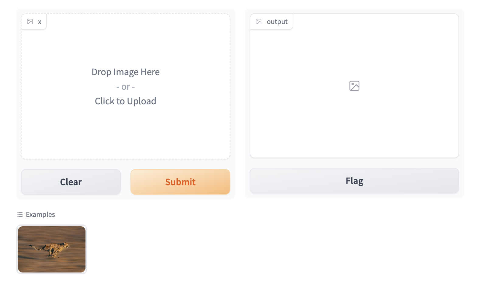
At the bottom of this screenshot, we show a miniature example image of a cheetah that, when clicked, will populate the same image in the input Image component:
To enable the example view, you must have the following two files in the top of the `frontend` directory:
* `Example.svelte`: this corresponds to the "example version" of your component
* `Index.svelte`: this corresponds to the "regular version"
In the backend, you typically don't need to do anything. The user-provided example `value` is processed using the same `.postprocess()` method described earlier. If you'd like to do process the data differently (for example, if the `.postprocess()` method is computationally expensive), then you can write your own `.process_example()` method for your custom component, which will be used instead.
The `Example.svelte` file and `process_example()` method will be covered in greater depth in the dedicated [frontend](./frontend) and [backend](./backend) guides respectively.
### What you need to remember
* If you expect your component to be used as input, it is important to define an "Example" view.
* If you don't, Gradio will use a default one but it won't be as informative as it can be!
## Conclusion
Now that you know the most important pieces to remember about Gradio components, you can start to design and build your own!
# Configuring Your Custom Component
The custom components workflow focuses on [convention over configuration](https://en.wikipedia.org/wiki/Convention_over_configuration) to reduce the number of decisions you as a developer need to make when developing your custom component.
That being said, you can still configure some aspects of the custom component package and directory.
This guide will cover how.
## The Package Name
By default, all custom component packages are called `gradio_<component-name>` where `component-name` is the name of the component's python class in lowercase.
As an example, let's walkthrough changing the name of a component from `gradio_mytextbox` to `supertextbox`.
1. Modify the `name` in the `pyproject.toml` file.
```bash
[project]
name = "supertextbox"
```
2. Change all occurrences of `gradio_<component-name>` in `pyproject.toml` to `<component-name>`
```bash
[tool.hatch.build]
artifacts = ["/backend/supertextbox/templates", "*.pyi"]
[tool.hatch.build.targets.wheel]
packages = ["/backend/supertextbox"]
```
3. Rename the `gradio_<component-name>` directory in `backend/` to `<component-name>`
```bash
mv backend/gradio_mytextbox backend/supertextbox
```
<div class='tip'>
<svg xmlns="http://www.w3.org/2000/svg" viewBox="0 0 24 24" fill="none" stroke="currentColor" stroke-width="2" stroke-linecap="round" stroke-linejoin="round">
<path d="M15 14c.2-1 .7-1.7 1.5-2.5 1-.9 1.5-2.2 1.5-3.5A6 6 0 0 0 6 8c0 1 .2 2.2 1.5 3.5.7.7 1.3 1.5 1.5 2.5"/>
<path d="M9 18h6"/>
<path d="M10 22h4"/>
</svg>
<div><p>Remember to change the import statement in <code>demo/app.py</code>!</p></div>
</div>
## Top Level Python Exports
By default, only the custom component python class is a top level export.
This means that when users type `from gradio_<component-name> import ...`, the only class that will be available is the custom component class.
To add more classes as top level exports, modify the `__all__` property in `__init__.py`
```python
from .mytextbox import MyTextbox
from .mytextbox import AdditionalClass, additional_function
__all__ = ['MyTextbox', 'AdditionalClass', 'additional_function']
```
## Python Dependencies
You can add python dependencies by modifying the `dependencies` key in `pyproject.toml`
```bash
dependencies = ["gradio", "numpy", "PIL"]
```
<div class='tip'>
<svg xmlns="http://www.w3.org/2000/svg" viewBox="0 0 24 24" fill="none" stroke="currentColor" stroke-width="2" stroke-linecap="round" stroke-linejoin="round">
<path d="M15 14c.2-1 .7-1.7 1.5-2.5 1-.9 1.5-2.2 1.5-3.5A6 6 0 0 0 6 8c0 1 .2 2.2 1.5 3.5.7.7 1.3 1.5 1.5 2.5"/>
<path d="M9 18h6"/>
<path d="M10 22h4"/>
</svg>
<div><p>Remember to run <code>gradio cc install</code> when you add dependencies!</p></div>
</div>
## Javascript Dependencies
You can add JavaScript dependencies by modifying the `"dependencies"` key in `frontend/package.json`
```json
"dependencies": {
"@gradio/atoms": "0.2.0-beta.4",
"@gradio/statustracker": "0.3.0-beta.6",
"@gradio/utils": "0.2.0-beta.4",
"your-npm-package": "<version>"
}
```
## Directory Structure
By default, the CLI will place the Python code in `backend` and the JavaScript code in `frontend`.
It is not recommended to change this structure since it makes it easy for a potential contributor to look at your source code and know where everything is.
However, if you did want to this is what you would have to do:
1. Place the Python code in the subdirectory of your choosing. Remember to modify the `[tool.hatch.build]` `[tool.hatch.build.targets.wheel]` in the `pyproject.toml` to match!
2. Place the JavaScript code in the subdirectory of your choosing.
2. Add the `FRONTEND_DIR` property on the component python class. It must be the relative path from the file where the class is defined to the location of the JavaScript directory.
```python
class SuperTextbox(Component):
FRONTEND_DIR = "../../frontend/"
```
The JavaScript and Python directories must be under the same common directory!
## Conclusion
Sticking to the defaults will make it easy for others to understand and contribute to your custom component.
After all, the beauty of open source is that anyone can help improve your code!
But if you ever need to deviate from the defaults, you know how!# The Backend 🐍
This guide will cover everything you need to know to implement your custom component's backend processing.
## Which Class to Inherit From
All components inherit from one of three classes `Component`, `FormComponent`, or `BlockContext`.
You need to inherit from one so that your component behaves like all other gradio components.
When you start from a template with `gradio cc create --template`, you don't need to worry about which one to choose since the template uses the correct one.
For completeness, and in the event that you need to make your own component from scratch, we explain what each class is for.
* `FormComponent`: Use this when you want your component to be grouped together in the same `Form` layout with other `FormComponents`. The `Slider`, `Textbox`, and `Number` components are all `FormComponents`.
* `BlockContext`: Use this when you want to place other components "inside" your component. This enabled `with MyComponent() as component:` syntax.
* `Component`: Use this for all other cases.
<div class='tip'>
<svg xmlns="http://www.w3.org/2000/svg" viewBox="0 0 24 24" fill="none" stroke="currentColor" stroke-width="2" stroke-linecap="round" stroke-linejoin="round">
<path d="M15 14c.2-1 .7-1.7 1.5-2.5 1-.9 1.5-2.2 1.5-3.5A6 6 0 0 0 6 8c0 1 .2 2.2 1.5 3.5.7.7 1.3 1.5 1.5 2.5"/>
<path d="M9 18h6"/>
<path d="M10 22h4"/>
</svg>
<div><p>If your component supports streaming output, inherit from the <code>StreamingOutput</code> class.</p></div>
</div>
<div class='tip'>
<svg xmlns="http://www.w3.org/2000/svg" viewBox="0 0 24 24" fill="none" stroke="currentColor" stroke-width="2" stroke-linecap="round" stroke-linejoin="round">
<path d="M15 14c.2-1 .7-1.7 1.5-2.5 1-.9 1.5-2.2 1.5-3.5A6 6 0 0 0 6 8c0 1 .2 2.2 1.5 3.5.7.7 1.3 1.5 1.5 2.5"/>
<path d="M9 18h6"/>
<path d="M10 22h4"/>
</svg>
<div><p>If you inherit from <code>BlockContext</code>, you also need to set the metaclass to be <code>ComponentMeta</code>. See example below.</p></div>
</div>
```python
from gradio.blocks import BlockContext
from gradio.component_meta import ComponentMeta
@document()
class Row(BlockContext, metaclass=ComponentMeta):
pass
```
## The methods you need to implement
When you inherit from any of these classes, the following methods must be implemented.
Otherwise the Python interpreter will raise an error when you instantiate your component!
### `preprocess` and `postprocess`
Explained in the [Key Concepts](./key-component-concepts#the-value-and-how-it-is-preprocessed-postprocessed) guide.
They handle the conversion from the data sent by the frontend to the format expected by the python function.
```python
def preprocess(self, x: Any) -> Any:
"""
Convert from the web-friendly (typically JSON) value in the frontend to the format expected by the python function.
"""
return x
def postprocess(self, y):
"""
Convert from the data returned by the python function to the web-friendly (typically JSON) value expected by the frontend.
"""
return y
```
### `process_example`
Takes in the original Python value and returns the modified value that should be displayed in the examples preview in the app.
If not provided, the `.postprocess()` method is used instead. Let's look at the following example from the `SimpleDropdown` component.
```python
def process_example(self, input_data):
return next((c[0] for c in self.choices if c[1] == input_data), None)
```
Since `self.choices` is a list of tuples corresponding to (`display_name`, `value`), this converts the value that a user provides to the display value (or if the value is not present in `self.choices`, it is converted to `None`).
### `api_info`
A JSON-schema representation of the value that the `preprocess` expects.
This powers api usage via the gradio clients.
You do **not** need to implement this yourself if you components specifies a `data_model`.
The `data_model` in the following section.
```python
def api_info(self) -> dict[str, list[str]]:
"""
A JSON-schema representation of the value that the `preprocess` expects and the `postprocess` returns.
"""
pass
```
### `example_payload`
An example payload for your component, e.g. something that can be passed into the `.preprocess()` method
of your component. The example input is displayed in the `View API` page of a Gradio app that uses your custom component.
Must be JSON-serializable. If your component expects a file, it is best to use a publicly accessible URL.
```python
def example_payload(self) -> Any:
"""
The example inputs for this component for API usage. Must be JSON-serializable.
"""
pass
```
### `example_value`
An example value for your component, e.g. something that can be passed into the `.postprocess()` method
of your component. This is used as the example value in the default app that is created in custom component development.
```python
def example_payload(self) -> Any:
"""
The example inputs for this component for API usage. Must be JSON-serializable.
"""
pass
```
### `flag`
Write the component's value to a format that can be stored in the `csv` or `json` file used for flagging.
You do **not** need to implement this yourself if you components specifies a `data_model`.
The `data_model` in the following section.
```python
def flag(self, x: Any | GradioDataModel, flag_dir: str | Path = "") -> str:
pass
```
### `read_from_flag`
Convert from the format stored in the `csv` or `json` file used for flagging to the component's python `value`.
You do **not** need to implement this yourself if you components specifies a `data_model`.
The `data_model` in the following section.
```python
def read_from_flag(
self,
x: Any,
) -> GradioDataModel | Any:
"""
Convert the data from the csv or jsonl file into the component state.
"""
return x
```
## The `data_model`
The `data_model` is how you define the expected data format your component's value will be stored in the frontend.
It specifies the data format your `preprocess` method expects and the format the `postprocess` method returns.
It is not necessary to define a `data_model` for your component but it greatly simplifies the process of creating a custom component.
If you define a custom component you only need to implement four methods - `preprocess`, `postprocess`, `example_payload`, and `example_value`!
You define a `data_model` by defining a [pydantic model](https://docs.pydantic.dev/latest/concepts/models/#basic-model-usage) that inherits from either `GradioModel` or `GradioRootModel`.
This is best explained with an example. Let's look at the core `Video` component, which stores the video data as a JSON object with two keys `video` and `subtitles` which point to separate files.
```python
from gradio.data_classes import FileData, GradioModel
class VideoData(GradioModel):
video: FileData
subtitles: Optional[FileData] = None
class Video(Component):
data_model = VideoData
```
By adding these four lines of code, your component automatically implements the methods needed for API usage, the flagging methods, and example caching methods!
It also has the added benefit of self-documenting your code.
Anyone who reads your component code will know exactly the data it expects.
<div class='tip'>
<svg xmlns="http://www.w3.org/2000/svg" viewBox="0 0 24 24" fill="none" stroke="currentColor" stroke-width="2" stroke-linecap="round" stroke-linejoin="round">
<path d="M15 14c.2-1 .7-1.7 1.5-2.5 1-.9 1.5-2.2 1.5-3.5A6 6 0 0 0 6 8c0 1 .2 2.2 1.5 3.5.7.7 1.3 1.5 1.5 2.5"/>
<path d="M9 18h6"/>
<path d="M10 22h4"/>
</svg>
<div><p>If your component expects files to be uploaded from the frontend, your must use the <code>FileData</code> model! It will be explained in the following section. </p></div>
</div>
<div class='tip'>
<svg xmlns="http://www.w3.org/2000/svg" viewBox="0 0 24 24" fill="none" stroke="currentColor" stroke-width="2" stroke-linecap="round" stroke-linejoin="round">
<path d="M15 14c.2-1 .7-1.7 1.5-2.5 1-.9 1.5-2.2 1.5-3.5A6 6 0 0 0 6 8c0 1 .2 2.2 1.5 3.5.7.7 1.3 1.5 1.5 2.5"/>
<path d="M9 18h6"/>
<path d="M10 22h4"/>
</svg>
<div><p>Read the pydantic docs <a href="https://docs.pydantic.dev/latest/concepts/models/#basic-model-usage">here</a>.</p></div>
</div>
The difference between a `GradioModel` and a `GradioRootModel` is that the `RootModel` will not serialize the data to a dictionary.
For example, the `Names` model will serialize the data to `{'names': ['freddy', 'pete']}` whereas the `NamesRoot` model will serialize it to `['freddy', 'pete']`.
```python
from typing import List
class Names(GradioModel):
names: List[str]
class NamesRoot(GradioRootModel):
root: List[str]
```
Even if your component does not expect a "complex" JSON data structure it can be beneficial to define a `GradioRootModel` so that you don't have to worry about implementing the API and flagging methods.
<div class='tip'>
<svg xmlns="http://www.w3.org/2000/svg" viewBox="0 0 24 24" fill="none" stroke="currentColor" stroke-width="2" stroke-linecap="round" stroke-linejoin="round">
<path d="M15 14c.2-1 .7-1.7 1.5-2.5 1-.9 1.5-2.2 1.5-3.5A6 6 0 0 0 6 8c0 1 .2 2.2 1.5 3.5.7.7 1.3 1.5 1.5 2.5"/>
<path d="M9 18h6"/>
<path d="M10 22h4"/>
</svg>
<div><p>Use classes from the Python typing library to type your models. e.g. <code>List</code> instead of <code>list</code>.</p></div>
</div>
## Handling Files
If your component expects uploaded files as input, or returns saved files to the frontend, you **MUST** use the `FileData` to type the files in your `data_model`.
When you use the `FileData`:
* Gradio knows that it should allow serving this file to the frontend. Gradio automatically blocks requests to serve arbitrary files in the computer running the server.
* Gradio will automatically place the file in a cache so that duplicate copies of the file don't get saved.
* The client libraries will automatically know that they should upload input files prior to sending the request. They will also automatically download files.
If you do not use the `FileData`, your component will not work as expected!
## Adding Event Triggers To Your Component
The events triggers for your component are defined in the `EVENTS` class attribute.
This is a list that contains the string names of the events.
Adding an event to this list will automatically add a method with that same name to your component!
You can import the `Events` enum from `gradio.events` to access commonly used events in the core gradio components.
For example, the following code will define `text_submit`, `file_upload` and `change` methods in the `MyComponent` class.
```python
from gradio.events import Events
from gradio.components import FormComponent
class MyComponent(FormComponent):
EVENTS = [
"text_submit",
"file_upload",
Events.change
]
```
<div class='tip'>
<svg xmlns="http://www.w3.org/2000/svg" viewBox="0 0 24 24" fill="none" stroke="currentColor" stroke-width="2" stroke-linecap="round" stroke-linejoin="round">
<path d="M15 14c.2-1 .7-1.7 1.5-2.5 1-.9 1.5-2.2 1.5-3.5A6 6 0 0 0 6 8c0 1 .2 2.2 1.5 3.5.7.7 1.3 1.5 1.5 2.5"/>
<path d="M9 18h6"/>
<path d="M10 22h4"/>
</svg>
<div><p>Don't forget to also handle these events in the JavaScript code!</p></div>
</div>
## Conclusion
# The Frontend 🌐⭐️
This guide will cover everything you need to know to implement your custom component's frontend.
<div class='tip'>
<svg xmlns="http://www.w3.org/2000/svg" viewBox="0 0 24 24" fill="none" stroke="currentColor" stroke-width="2" stroke-linecap="round" stroke-linejoin="round">
<path d="M15 14c.2-1 .7-1.7 1.5-2.5 1-.9 1.5-2.2 1.5-3.5A6 6 0 0 0 6 8c0 1 .2 2.2 1.5 3.5.7.7 1.3 1.5 1.5 2.5"/>
<path d="M9 18h6"/>
<path d="M10 22h4"/>
</svg>
<div><p>Gradio components use Svelte. Writing Svelte is fun! If you're not familiar with it, we recommend checking out their interactive <a href="https://learn.svelte.dev/tutorial/welcome-to-svelte">guide</a>.</p></div>
</div>
## The directory structure
The frontend code should have, at minimum, three files:
* `Index.svelte`: This is the main export and where your component's layout and logic should live.
* `Example.svelte`: This is where the example view of the component is defined.
Feel free to add additional files and subdirectories.
If you want to export any additional modules, remember to modify the `package.json` file
```json
"exports": {
".": "./Index.svelte",
"./example": "./Example.svelte",
"./package.json": "./package.json"
},
```
## The Index.svelte file
Your component should expose the following props that will be passed down from the parent Gradio application.
```typescript
import type { LoadingStatus } from "@gradio/statustracker";
import type { Gradio } from "@gradio/utils";
export let gradio: Gradio<{
event_1: never;
event_2: never;
}>;
export let elem_id = "";
export let elem_classes: string[] = [];
export let scale: number | null = null;
export let min_width: number | undefined = undefined;
export let loading_status: LoadingStatus | undefined = undefined;
export let mode: "static" | "interactive";
```
* `elem_id` and `elem_classes` allow Gradio app developers to target your component with custom CSS and JavaScript from the Python `Blocks` class.
* `scale` and `min_width` allow Gradio app developers to control how much space your component takes up in the UI.
* `loading_status` is used to display a loading status over the component when it is the output of an event.
* `mode` is how the parent Gradio app tells your component whether the `interactive` or `static` version should be displayed.
* `gradio`: The `gradio` object is created by the parent Gradio app. It stores some application-level configuration that will be useful in your component, like internationalization. You must use it to dispatch events from your component.
A minimal `Index.svelte` file would look like:
```svelte
<script lang="ts">
import type { LoadingStatus } from "@gradio/statustracker";
import { Block } from "@gradio/atoms";
import { StatusTracker } from "@gradio/statustracker";
import type { Gradio } from "@gradio/utils";
export let gradio: Gradio<{
event_1: never;
event_2: never;
}>;
export let value = "";
export let elem_id = "";
export let elem_classes: string[] = [];
export let scale: number | null = null;
export let min_width: number | undefined = undefined;
export let loading_status: LoadingStatus | undefined = undefined;
export let mode: "static" | "interactive";
</script>
<Block
visible={true}
{elem_id}
{elem_classes}
{scale}
{min_width}
allow_overflow={false}
padding={true}
>
{#if loading_status}
<StatusTracker
autoscroll={gradio.autoscroll}
i18n={gradio.i18n}
{...loading_status}
/>
{/if}
<p>{value}</p>
</Block>
```
## The Example.svelte file
The `Example.svelte` file should expose the following props:
```typescript
export let value: string;
export let type: "gallery" | "table";
export let selected = false;
export let index: number;
```
* `value`: The example value that should be displayed.
* `type`: This is a variable that can be either `"gallery"` or `"table"` depending on how the examples are displayed. The `"gallery"` form is used when the examples correspond to a single input component, while the `"table"` form is used when a user has multiple input components, and the examples need to populate all of them.
* `selected`: You can also adjust how the examples are displayed if a user "selects" a particular example by using the selected variable.
* `index`: The current index of the selected value.
* Any additional props your "non-example" component takes!
This is the `Example.svelte` file for the code `Radio` component:
```svelte
<script lang="ts">
export let value: string;
export let type: "gallery" | "table";
export let selected = false;
</script>
<div
class:table={type === "table"}
class:gallery={type === "gallery"}
class:selected
>
{value}
</div>
<style>
.gallery {
padding: var(--size-1) var(--size-2);
}
</style>
```
## Handling Files
If your component deals with files, these files **should** be uploaded to the backend server.
The `@gradio/client` npm package provides the `upload` and `prepare_files` utility functions to help you do this.
The `prepare_files` function will convert the browser's `File` datatype to gradio's internal `FileData` type.
You should use the `FileData` data in your component to keep track of uploaded files.
The `upload` function will upload an array of `FileData` values to the server.
Here's an example of loading files from an `<input>` element when its value changes.
```svelte
<script lang="ts">
import { upload, prepare_files, type FileData } from "@gradio/client";
export let root;
export let value;
let uploaded_files;
async function handle_upload(file_data: FileData[]): Promise<void> {
await tick();
uploaded_files = await upload(file_data, root);
}
async function loadFiles(files: FileList): Promise<void> {
let _files: File[] = Array.from(files);
if (!files.length) {
return;
}
if (file_count === "single") {
_files = [files[0]];
}
let file_data = await prepare_files(_files);
await handle_upload(file_data);
}
async function loadFilesFromUpload(e: Event): Promise<void> {
const target = e.target;
if (!target.files) return;
await loadFiles(target.files);
}
</script>
<input
type="file"
on:change={loadFilesFromUpload}
multiple={true}
/>
```
The component exposes a prop named `root`.
This is passed down by the parent gradio app and it represents the base url that the files will be uploaded to and fetched from.
For WASM support, you should get the upload function from the `Context` and pass that as the third parameter of the `upload` function.
```typescript
<script lang="ts">
import { getContext } from "svelte";
const upload_fn = getContext<typeof upload_files>("upload_files");
async function handle_upload(file_data: FileData[]): Promise<void> {
await tick();
await upload(file_data, root, upload_fn);
}
</script>
```
## Leveraging Existing Gradio Components
Most of Gradio's frontend components are published on [npm](https://www.npmjs.com/), the javascript package repository.
This means that you can use them to save yourself time while incorporating common patterns in your component, like uploading files.
For example, the `@gradio/upload` package has `Upload` and `ModifyUpload` components for properly uploading files to the Gradio server.
Here is how you can use them to create a user interface to upload and display PDF files.
```svelte
<script>
import { type FileData, Upload, ModifyUpload } from "@gradio/upload";
import { Empty, UploadText, BlockLabel } from "@gradio/atoms";
</script>
<BlockLabel Icon={File} label={label || "PDF"} />
{#if value === null && interactive}
<Upload
filetype="application/pdf"
on:load={handle_load}
{root}
>
<UploadText type="file" i18n={gradio.i18n} />
</Upload>
{:else if value !== null}
{#if interactive}
<ModifyUpload i18n={gradio.i18n} on:clear={handle_clear}/>
{/if}
<iframe title={value.orig_name || "PDF"} src={value.data} height="{height}px" width="100%"></iframe>
{:else}
<Empty size="large"> <File/> </Empty>
{/if}
```
You can also combine existing Gradio components to create entirely unique experiences.
Like rendering a gallery of chatbot conversations.
The possibilities are endless, please read the documentation on our javascript packages [here](https://gradio.app/main/docs/js).
We'll be adding more packages and documentation over the coming weeks!
## Matching Gradio Core's Design System
You can explore our component library via Storybook. You'll be able to interact with our components and see them in their various states.
For those interested in design customization, we provide the CSS variables consisting of our color palette, radii, spacing, and the icons we use - so you can easily match up your custom component with the style of our core components. This Storybook will be regularly updated with any new additions or changes.
[Storybook Link](https://gradio.app/main/docs/js/storybook)
## Custom configuration
If you want to make use of the vast vite ecosystem, you can use the `gradio.config.js` file to configure your component's build process. This allows you to make use of tools like tailwindcss, mdsvex, and more.
Currently, it is possible to configure the following:
Vite options:
- `plugins`: A list of vite plugins to use.
Svelte options:
- `preprocess`: A list of svelte preprocessors to use.
- `extensions`: A list of file extensions to compile to `.svelte` files.
- `build.target`: The target to build for, this may be necessary to support newer javascript features. See the [esbuild docs](https://esbuild.github.io/api/#target) for more information.
The `gradio.config.js` file should be placed in the root of your component's `frontend` directory. A default config file is created for you when you create a new component. But you can also create your own config file, if one doesn't exist, and use it to customize your component's build process.
### Example for a Vite plugin
Custom components can use Vite plugins to customize the build process. Check out the [Vite Docs](https://vitejs.dev/guide/using-plugins.html) for more information.
Here we configure [TailwindCSS](https://tailwindcss.com), a utility-first CSS framework. Setup is easiest using the version 4 prerelease.
```
npm install tailwindcss@next @tailwindcss/vite@next
```
In `gradio.config.js`:
```typescript
import tailwindcss from "@tailwindcss/vite";
export default {
plugins: [tailwindcss()]
};
```
Then create a `style.css` file with the following content:
```css
@import "tailwindcss";
```
Import this file into `Index.svelte`. Note, that you need to import the css file containing `@import` and cannot just use a `<style>` tag and use `@import` there.
```svelte
<script lang="ts">
[...]
import "./style.css";
[...]
</script>
```
### Example for Svelte options
In `gradio.config.js` you can also specify a some Svelte options to apply to the Svelte compilation. In this example we will add support for [`mdsvex`](https://mdsvex.pngwn.io), a Markdown preprocessor for Svelte.
In order to do this we will need to add a [Svelte Preprocessor](https://svelte.dev/docs/svelte-compiler#preprocess) to the `svelte` object in `gradio.config.js` and configure the [`extensions`](https://github.com/sveltejs/vite-plugin-svelte/blob/HEAD/docs/config.md#config-file) field. Other options are not currently supported.
First, install the `mdsvex` plugin:
```bash
npm install mdsvex
```
Then add the following to `gradio.config.js`:
```typescript
import { mdsvex } from "mdsvex";
export default {
svelte: {
preprocess: [
mdsvex()
],
extensions: [".svelte", ".svx"]
}
};
```
Now we can create `mdsvex` documents in our component's `frontend` directory and they will be compiled to `.svelte` files.
```md
<!-- HelloWorld.svx -->
<script lang="ts">
import { Block } from "@gradio/atoms";
export let title = "Hello World";
</script>
<Block label="Hello World">
# {title}
This is a markdown file.
</Block>
```
We can then use the `HelloWorld.svx` file in our components:
```svelte
<script lang="ts">
import HelloWorld from "./HelloWorld.svx";
</script>
<HelloWorld />
```
## Conclusion
You now know how to create delightful frontends for your components!
# Case Study: A Component to Display PDFs
Let's work through an example of building a custom gradio component for displaying PDF files.
This component will come in handy for showcasing [document question answering](https://huggingface.co/models?pipeline_tag=document-question-answering&sort=trending) models, which typically work on PDF input.
This is a sneak preview of what our finished component will look like:
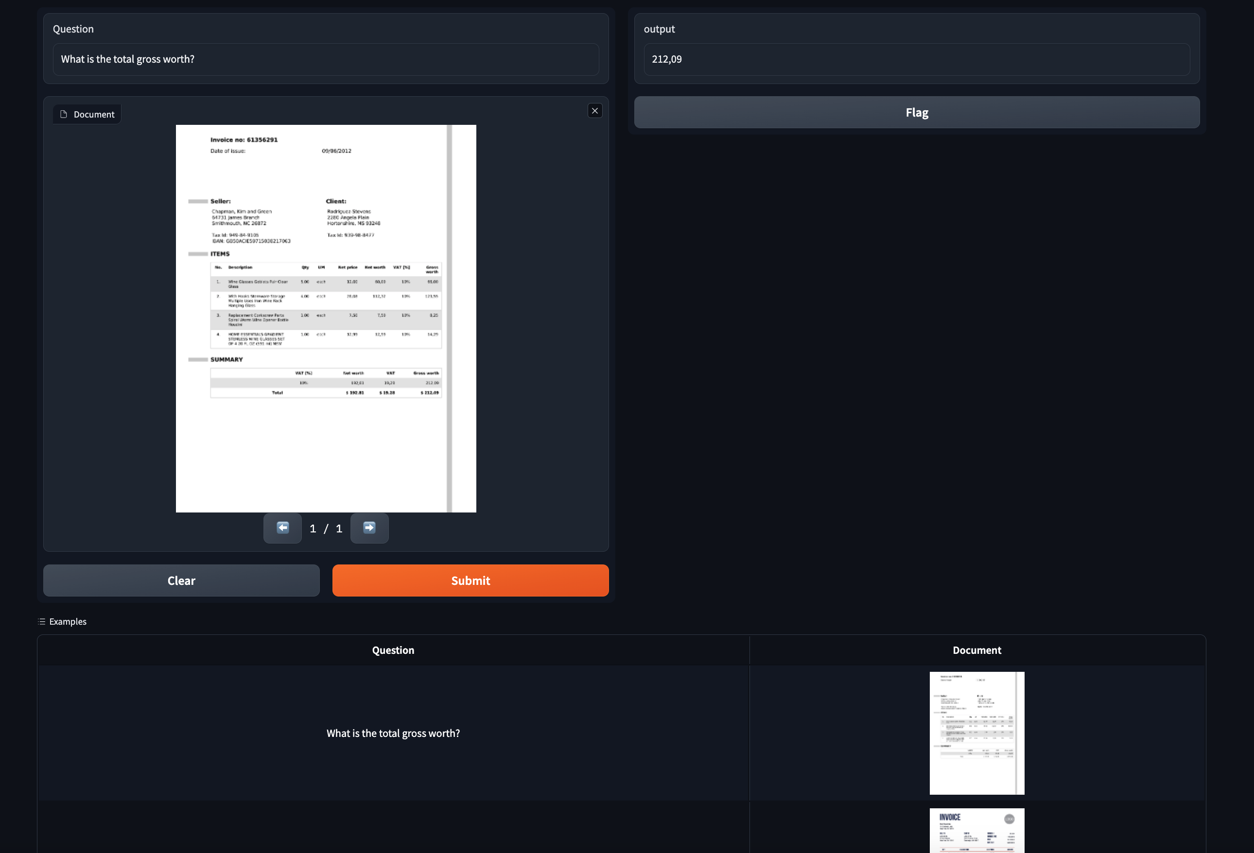
## Step 0: Prerequisites
Make sure you have gradio 5.0 or higher installed as well as node 20+.
As of the time of publication, the latest release is 4.1.1.
Also, please read the [Five Minute Tour](./custom-components-in-five-minutes) of custom components and the [Key Concepts](./key-component-concepts) guide before starting.
## Step 1: Creating the custom component
Navigate to a directory of your choosing and run the following command:
```bash
gradio cc create PDF
```
Tip: You should change the name of the component.
Some of the screenshots assume the component is called `PDF` but the concepts are the same!
This will create a subdirectory called `pdf` in your current working directory.
There are three main subdirectories in `pdf`: `frontend`, `backend`, and `demo`.
If you open `pdf` in your code editor, it will look like this:
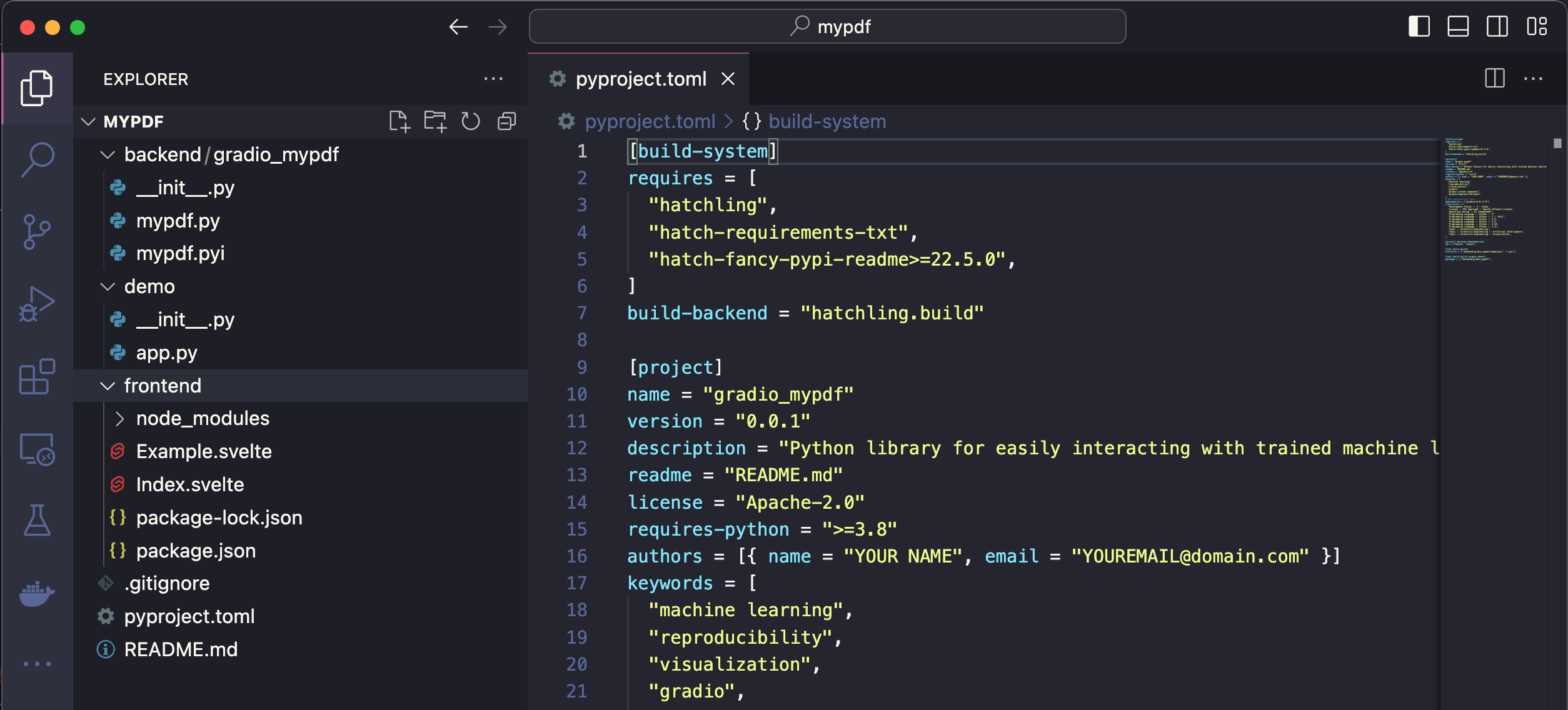
<div class='tip'>
<svg xmlns="http://www.w3.org/2000/svg" viewBox="0 0 24 24" fill="none" stroke="currentColor" stroke-width="2" stroke-linecap="round" stroke-linejoin="round">
<path d="M15 14c.2-1 .7-1.7 1.5-2.5 1-.9 1.5-2.2 1.5-3.5A6 6 0 0 0 6 8c0 1 .2 2.2 1.5 3.5.7.7 1.3 1.5 1.5 2.5"/>
<path d="M9 18h6"/>
<path d="M10 22h4"/>
</svg>
<div><p>For this demo we are not templating off a current gradio component. But you can see the list of available templates with <code>gradio cc show</code> and then pass the template name to the <code>--template</code> option, e.g. <code>gradio cc create <Name> --template <foo></code></p></div>
</div>
## Step 2: Frontend - modify javascript dependencies
We're going to use the [pdfjs](https://mozilla.github.io/pdf.js/) javascript library to display the pdfs in the frontend.
Let's start off by adding it to our frontend project's dependencies, as well as adding a couple of other projects we'll need.
From within the `frontend` directory, run `npm install @gradio/client @gradio/upload @gradio/icons @gradio/button` and `npm install --save-dev pdfjs-dist@3.11.174`.
Also, let's uninstall the `@zerodevx/svelte-json-view` dependency by running `npm uninstall @zerodevx/svelte-json-view`.
The complete `package.json` should look like this:
```json
{
"name": "gradio_pdf",
"version": "0.2.0",
"description": "Gradio component for displaying PDFs",
"type": "module",
"author": "",
"license": "ISC",
"private": false,
"main_changeset": true,
"exports": {
".": "./Index.svelte",
"./example": "./Example.svelte",
"./package.json": "./package.json"
},
"devDependencies": {
"pdfjs-dist": "3.11.174"
},
"dependencies": {
"@gradio/atoms": "0.2.0",
"@gradio/statustracker": "0.3.0",
"@gradio/utils": "0.2.0",
"@gradio/client": "0.7.1",
"@gradio/upload": "0.3.2",
"@gradio/icons": "0.2.0",
"@gradio/button": "0.2.3",
"pdfjs-dist": "3.11.174"
}
}
```
<div class='tip'>
<svg xmlns="http://www.w3.org/2000/svg" viewBox="0 0 24 24" fill="none" stroke="currentColor" stroke-width="2" stroke-linecap="round" stroke-linejoin="round">
<path d="M15 14c.2-1 .7-1.7 1.5-2.5 1-.9 1.5-2.2 1.5-3.5A6 6 0 0 0 6 8c0 1 .2 2.2 1.5 3.5.7.7 1.3 1.5 1.5 2.5"/>
<path d="M9 18h6"/>
<path d="M10 22h4"/>
</svg>
<div><p>Running <code>npm install</code> will install the latest version of the package available. You can install a specific version with <code>npm install package@<version></code>. You can find all of the gradio javascript package documentation <a href="https://www.gradio.app/main/docs/js">here</a>. It is recommended you use the same versions as me as the API can change.</p></div>
</div>
Navigate to `Index.svelte` and delete mentions of `JSONView`
```ts
import { JsonView } from "@zerodevx/svelte-json-view";
```
```svelte
<JsonView json={value} />
```
## Step 3: Frontend - Launching the Dev Server
Run the `dev` command to launch the development server.
This will open the demo in `demo/app.py` in an environment where changes to the `frontend` and `backend` directories will reflect instantaneously in the launched app.
After launching the dev server, you should see a link printed to your console that says `Frontend Server (Go here): ... `.
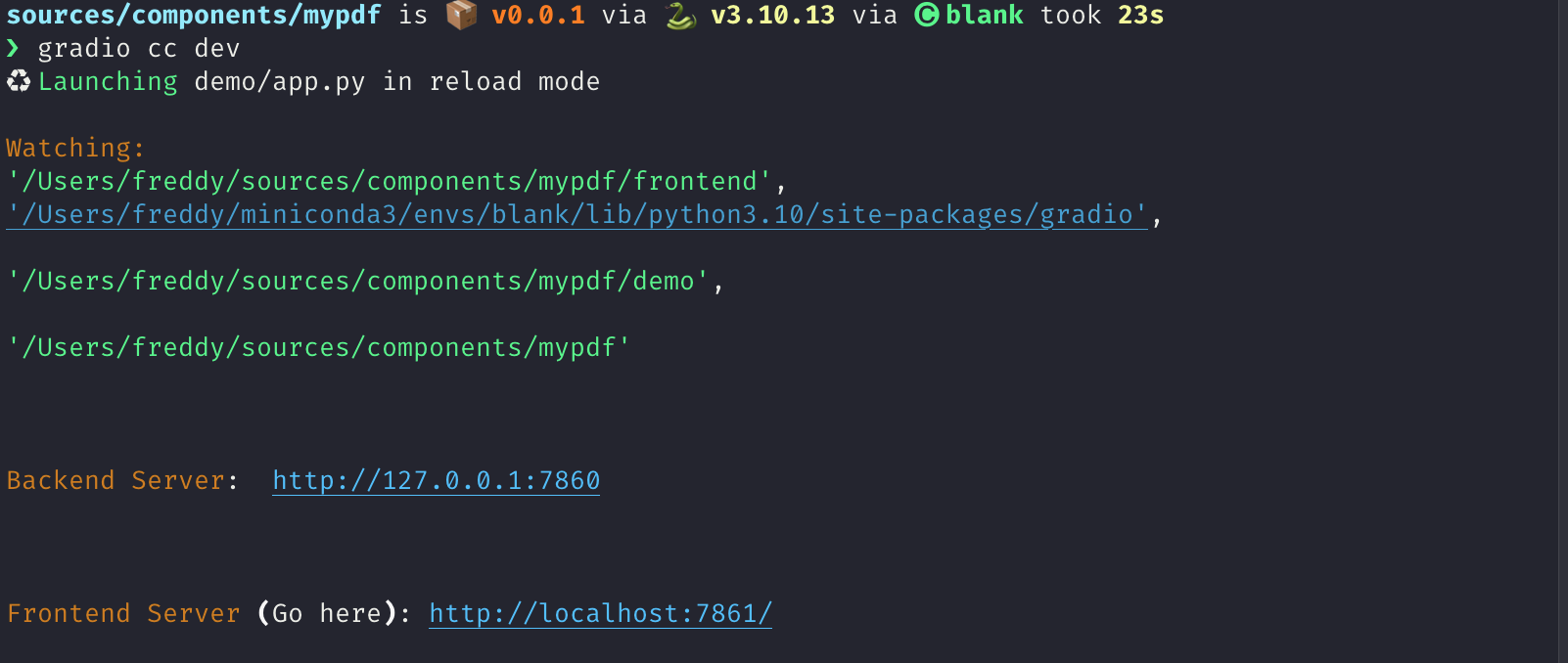
You should see the following:
Its not impressive yet but we're ready to start coding!
## Step 4: Frontend - The basic skeleton
We're going to start off by first writing the skeleton of our frontend and then adding the pdf rendering logic.
Add the following imports and expose the following properties to the top of your file in the `<script>` tag.
You may get some warnings from your code editor that some props are not used.
That's ok.
```ts
import { tick } from "svelte";
import type { Gradio } from "@gradio/utils";
import { Block, BlockLabel } from "@gradio/atoms";
import { File } from "@gradio/icons";
import { StatusTracker } from "@gradio/statustracker";
import type { LoadingStatus } from "@gradio/statustracker";
import type { FileData } from "@gradio/client";
import { Upload, ModifyUpload } from "@gradio/upload";
export let elem_id = "";
export let elem_classes: string[] = [];
export let visible = true;
export let value: FileData | null = null;
export let container = true;
export let scale: number | null = null;
export let root: string;
export let height: number | null = 500;
export let label: string;
export let proxy_url: string;
export let min_width: number | undefined = undefined;
export let loading_status: LoadingStatus;
export let gradio: Gradio<{
change: never;
upload: never;
}>;
let _value = value;
let old_value = _value;
```
<div class='tip'>
<svg xmlns="http://www.w3.org/2000/svg" viewBox="0 0 24 24" fill="none" stroke="currentColor" stroke-width="2" stroke-linecap="round" stroke-linejoin="round">
<path d="M15 14c.2-1 .7-1.7 1.5-2.5 1-.9 1.5-2.2 1.5-3.5A6 6 0 0 0 6 8c0 1 .2 2.2 1.5 3.5.7.7 1.3 1.5 1.5 2.5"/>
<path d="M9 18h6"/>
<path d="M10 22h4"/>
</svg>
<div><p>The `gradio`` object passed in here contains some metadata about the application as well as some utility methods. One of these utilities is a dispatch method. We want to dispatch change and upload events whenever our PDF is changed or updated. This line provides type hints that these are the only events we will be dispatching.</p></div>
</div>
We want our frontend component to let users upload a PDF document if there isn't one already loaded.
If it is loaded, we want to display it underneath a "clear" button that lets our users upload a new document.
We're going to use the `Upload` and `ModifyUpload` components that come with the `@gradio/upload` package to do this.
Underneath the `</script>` tag, delete all the current code and add the following:
```svelte
<Block {visible} {elem_id} {elem_classes} {container} {scale} {min_width}>
{#if loading_status}
<StatusTracker
autoscroll={gradio.autoscroll}
i18n={gradio.i18n}
{...loading_status}
/>
{/if}
<BlockLabel
show_label={label !== null}
Icon={File}
float={value === null}
label={label || "File"}
/>
{#if _value}
<ModifyUpload i18n={gradio.i18n} absolute />
{:else}
<Upload
filetype={"application/pdf"}
file_count="single"
{root}
>
Upload your PDF
</Upload>
{/if}
</Block>
```
You should see the following when you navigate to your app after saving your current changes:
## Step 5: Frontend - Nicer Upload Text
The `Upload your PDF` text looks a bit small and barebones.
Lets customize it!
Create a new file called `PdfUploadText.svelte` and copy the following code.
Its creating a new div to display our "upload text" with some custom styling.
<div class='tip'>
<svg xmlns="http://www.w3.org/2000/svg" viewBox="0 0 24 24" fill="none" stroke="currentColor" stroke-width="2" stroke-linecap="round" stroke-linejoin="round">
<path d="M15 14c.2-1 .7-1.7 1.5-2.5 1-.9 1.5-2.2 1.5-3.5A6 6 0 0 0 6 8c0 1 .2 2.2 1.5 3.5.7.7 1.3 1.5 1.5 2.5"/>
<path d="M9 18h6"/>
<path d="M10 22h4"/>
</svg>
<div><p>Notice that we're leveraging Gradio core's existing css variables here: <code>var(--size-60)</code> and <code>var(--body-text-color-subdued)</code>. This allows our component to work nicely in light mode and dark mode, as well as with Gradio's built-in themes.</p></div>
</div>
```svelte
<script lang="ts">
import { Upload as UploadIcon } from "@gradio/icons";
export let hovered = false;
</script>
<div class="wrap">
<span class="icon-wrap" class:hovered><UploadIcon /> </span>
Drop PDF
<span class="or">- or -</span>
Click to Upload
</div>
<style>
.wrap {
display: flex;
flex-direction: column;
justify-content: center;
align-items: center;
min-height: var(--size-60);
color: var(--block-label-text-color);
line-height: var(--line-md);
height: 100%;
padding-top: var(--size-3);
}
.or {
color: var(--body-text-color-subdued);
display: flex;
}
.icon-wrap {
width: 30px;
margin-bottom: var(--spacing-lg);
}
@media (--screen-md) {
.wrap {
font-size: var(--text-lg);
}
}
.hovered {
color: var(--color-accent);
}
</style>
```
Now import `PdfUploadText.svelte` in your `<script>` and pass it to the `Upload` component!
```svelte
import PdfUploadText from "./PdfUploadText.svelte";
...
<Upload
filetype={"application/pdf"}
file_count="single"
{root}
>
<PdfUploadText />
</Upload>
```
After saving your code, the frontend should now look like this:
## Step 6: PDF Rendering logic
This is the most advanced javascript part.
It took me a while to figure it out!
Do not worry if you have trouble, the important thing is to not be discouraged 💪
Ask for help in the gradio [discord](https://discord.gg/hugging-face-879548962464493619) if you need and ask for help.
With that out of the way, let's start off by importing `pdfjs` and loading the code of the pdf worker from the mozilla cdn.
```ts
import pdfjsLib from "pdfjs-dist";
...
pdfjsLib.GlobalWorkerOptions.workerSrc = "https://cdn.bootcss.com/pdf.js/3.11.174/pdf.worker.js";
```
Also create the following variables:
```ts
let pdfDoc;
let numPages = 1;
let currentPage = 1;
let canvasRef;
```
Now, we will use `pdfjs` to render a given page of the PDF onto an `html` document.
Add the following code to `Index.svelte`:
```ts
async function get_doc(value: FileData) {
const loadingTask = pdfjsLib.getDocument(value.url);
pdfDoc = await loadingTask.promise;
numPages = pdfDoc.numPages;
render_page();
}
function render_page() {
// Render a specific page of the PDF onto the canvas
pdfDoc.getPage(currentPage).then(page => {
const ctx = canvasRef.getContext('2d')
ctx.clearRect(0, 0, canvasRef.width, canvasRef.height);
let viewport = page.getViewport({ scale: 1 });
let scale = height / viewport.height;
viewport = page.getViewport({ scale: scale });
const renderContext = {
canvasContext: ctx,
viewport,
};
canvasRef.width = viewport.width;
canvasRef.height = viewport.height;
page.render(renderContext);
});
}
// If the value changes, render the PDF of the currentPage
$: if(JSON.stringify(old_value) != JSON.stringify(_value)) {
if (_value){
get_doc(_value);
}
old_value = _value;
gradio.dispatch("change");
}
```
<div class='tip'>
<svg xmlns="http://www.w3.org/2000/svg" viewBox="0 0 24 24" fill="none" stroke="currentColor" stroke-width="2" stroke-linecap="round" stroke-linejoin="round">
<path d="M15 14c.2-1 .7-1.7 1.5-2.5 1-.9 1.5-2.2 1.5-3.5A6 6 0 0 0 6 8c0 1 .2 2.2 1.5 3.5.7.7 1.3 1.5 1.5 2.5"/>
<path d="M9 18h6"/>
<path d="M10 22h4"/>
</svg>
<div><p>The <code>$:</code> syntax in svelte is how you declare statements to be reactive. Whenever any of the inputs of the statement change, svelte will automatically re-run that statement.</p></div>
</div>
Now place the `canvas` underneath the `ModifyUpload` component:
```svelte
<div class="pdf-canvas" style="height: {height}px">
<canvas bind:this={canvasRef}></canvas>
</div>
```
And add the following styles to the `<style>` tag:
```svelte
<style>
.pdf-canvas {
display: flex;
justify-content: center;
align-items: center;
}
</style>
```
## Step 7: Handling The File Upload And Clear
Now for the fun part - actually rendering the PDF when the file is uploaded!
Add the following functions to the `<script>` tag:
```ts
async function handle_clear() {
_value = null;
await tick();
gradio.dispatch("change");
}
async function handle_upload({detail}: CustomEvent<FileData>): Promise<void> {
value = detail;
await tick();
gradio.dispatch("change");
gradio.dispatch("upload");
}
```
<div class='tip'>
<svg xmlns="http://www.w3.org/2000/svg" viewBox="0 0 24 24" fill="none" stroke="currentColor" stroke-width="2" stroke-linecap="round" stroke-linejoin="round">
<path d="M15 14c.2-1 .7-1.7 1.5-2.5 1-.9 1.5-2.2 1.5-3.5A6 6 0 0 0 6 8c0 1 .2 2.2 1.5 3.5.7.7 1.3 1.5 1.5 2.5"/>
<path d="M9 18h6"/>
<path d="M10 22h4"/>
</svg>
<div><p>The <code>gradio.dispatch</code> method is actually what is triggering the <code>change</code> or <code>upload</code> events in the backend. For every event defined in the component's backend, we will explain how to do this in Step 9, there must be at least one <code>gradio.dispatch("<event-name>")</code> call. These are called <code>gradio</code> events and they can be listended from the entire Gradio application. You can dispatch a built-in <code>svelte</code> event with the <code>dispatch</code> function. These events can only be listened to from the component's direct parent. Learn about svelte events from the <a href="https://learn.svelte.dev/tutorial/component-events">official documentation</a>.</p></div>
</div>
Now we will run these functions whenever the `Upload` component uploads a file and whenever the `ModifyUpload` component clears the current file. The `<Upload>` component dispatches a `load` event with a payload of type `FileData` corresponding to the uploaded file. The `on:load` syntax tells `Svelte` to automatically run this function in response to the event.
```svelte
<ModifyUpload i18n={gradio.i18n} on:clear={handle_clear} absolute />
...
<Upload
on:load={handle_upload}
filetype={"application/pdf"}
file_count="single"
{root}
>
<PdfUploadText/>
</Upload>
```
Congratulations! You have a working pdf uploader!
## Step 8: Adding buttons to navigate pages
If a user uploads a PDF document with multiple pages, they will only be able to see the first one.
Let's add some buttons to help them navigate the page.
We will use the `BaseButton` from `@gradio/button` so that they look like regular Gradio buttons.
Import the `BaseButton` and add the following functions that will render the next and previous page of the PDF.
```ts
import { BaseButton } from "@gradio/button";
...
function next_page() {
if (currentPage >= numPages) {
return;
}
currentPage++;
render_page();
}
function prev_page() {
if (currentPage == 1) {
return;
}
currentPage--;
render_page();
}
```
Now we will add them underneath the canvas in a separate `<div>`
```svelte
...
<ModifyUpload i18n={gradio.i18n} on:clear={handle_clear} absolute />
<div class="pdf-canvas" style="height: {height}px">
<canvas bind:this={canvasRef}></canvas>
</div>
<div class="button-row">
<BaseButton on:click={prev_page}>
⬅️
</BaseButton>
<span class="page-count"> {currentPage} / {numPages} </span>
<BaseButton on:click={next_page}>
➡️
</BaseButton>
</div>
...
<style>
.button-row {
display: flex;
flex-direction: row;
width: 100%;
justify-content: center;
align-items: center;
}
.page-count {
margin: 0 10px;
font-family: var(--font-mono);
}
```
Congratulations! The frontend is almost complete 🎉
## Step 8.5: The Example view
We're going to want users of our component to get a preview of the PDF if its used as an `example` in a `gr.Interface` or `gr.Examples`.
To do so, we're going to add some of the pdf rendering logic in `Index.svelte` to `Example.svelte`.
```svelte
<script lang="ts">
export let value: string;
export let type: "gallery" | "table";
export let selected = false;
import pdfjsLib from "pdfjs-dist";
pdfjsLib.GlobalWorkerOptions.workerSrc = "https://cdn.bootcss.com/pdf.js/3.11.174/pdf.worker.js";
let pdfDoc;
let canvasRef;
async function get_doc(url: string) {
const loadingTask = pdfjsLib.getDocument(url);
pdfDoc = await loadingTask.promise;
renderPage();
}
function renderPage() {
// Render a specific page of the PDF onto the canvas
pdfDoc.getPage(1).then(page => {
const ctx = canvasRef.getContext('2d')
ctx.clearRect(0, 0, canvasRef.width, canvasRef.height);
const viewport = page.getViewport({ scale: 0.2 });
const renderContext = {
canvasContext: ctx,
viewport
};
canvasRef.width = viewport.width;
canvasRef.height = viewport.height;
page.render(renderContext);
});
}
$: get_doc(value);
</script>
<div
class:table={type === "table"}
class:gallery={type === "gallery"}
class:selected
style="justify-content: center; align-items: center; display: flex; flex-direction: column;"
>
<canvas bind:this={canvasRef}></canvas>
</div>
<style>
.gallery {
padding: var(--size-1) var(--size-2);
}
</style>
```
<div class='tip'>
<svg xmlns="http://www.w3.org/2000/svg" viewBox="0 0 24 24" fill="none" stroke="currentColor" stroke-width="2" stroke-linecap="round" stroke-linejoin="round">
<path d="M15 14c.2-1 .7-1.7 1.5-2.5 1-.9 1.5-2.2 1.5-3.5A6 6 0 0 0 6 8c0 1 .2 2.2 1.5 3.5.7.7 1.3 1.5 1.5 2.5"/>
<path d="M9 18h6"/>
<path d="M10 22h4"/>
</svg>
<div><p>Exercise for the reader - reduce the code duplication between <code>Index.svelte</code> and <code>Example.svelte</code> 😊</p></div>
</div>
You will not be able to render examples until we make some changes to the backend code in the next step!
## Step 9: The backend
The backend changes needed are smaller.
We're almost done!
What we're going to do is:
* Add `change` and `upload` events to our component.
* Add a `height` property to let users control the height of the PDF.
* Set the `data_model` of our component to be `FileData`. This is so that Gradio can automatically cache and safely serve any files that are processed by our component.
* Modify the `preprocess` method to return a string corresponding to the path of our uploaded PDF.
* Modify the `postprocess` to turn a path to a PDF created in an event handler to a `FileData`.
When all is said an done, your component's backend code should look like this:
```python
from __future__ import annotations
from typing import Any, Callable, TYPE_CHECKING
from gradio.components.base import Component
from gradio.data_classes import FileData
from gradio import processing_utils
if TYPE_CHECKING:
from gradio.components import Timer
class PDF(Component):
EVENTS = ["change", "upload"]
data_model = FileData
def __init__(self, value: Any = None, *,
height: int | None = None,
label: str | I18nData | None = None,
info: str | I18nData | None = None,
show_label: bool | None = None,
container: bool = True,
scale: int | None = None,
min_width: int | None = None,
interactive: bool | None = None,
visible: bool = True,
elem_id: str | None = None,
elem_classes: list[str] | str | None = None,
render: bool = True,
load_fn: Callable[..., Any] | None = None,
every: Timer | float | None = None):
super().__init__(value, label=label, info=info,
show_label=show_label, container=container,
scale=scale, min_width=min_width,
interactive=interactive, visible=visible,
elem_id=elem_id, elem_classes=elem_classes,
render=render, load_fn=load_fn, every=every)
self.height = height
def preprocess(self, payload: FileData) -> str:
return payload.path
def postprocess(self, value: str | None) -> FileData:
if not value:
return None
return FileData(path=value)
def example_payload(self):
return "https://gradio-builds.s3.amazonaws.com/assets/pdf-guide/fw9.pdf"
def example_value(self):
return "https://gradio-builds.s3.amazonaws.com/assets/pdf-guide/fw9.pdf"
```
## Step 10: Add a demo and publish!
To test our backend code, let's add a more complex demo that performs Document Question and Answering with huggingface transformers.
In our `demo` directory, create a `requirements.txt` file with the following packages
```
torch
transformers
pdf2image
pytesseract
```
<div class='tip'>
<svg xmlns="http://www.w3.org/2000/svg" viewBox="0 0 24 24" fill="none" stroke="currentColor" stroke-width="2" stroke-linecap="round" stroke-linejoin="round">
<path d="M15 14c.2-1 .7-1.7 1.5-2.5 1-.9 1.5-2.2 1.5-3.5A6 6 0 0 0 6 8c0 1 .2 2.2 1.5 3.5.7.7 1.3 1.5 1.5 2.5"/>
<path d="M9 18h6"/>
<path d="M10 22h4"/>
</svg>
<div><p>Remember to install these yourself and restart the dev server! You may need to install extra non-python dependencies for <code>pdf2image</code>. See <a href="https://pypi.org/project/pdf2image/">here</a>. Feel free to write your own demo if you have trouble.</p></div>
</div>
```python
import gradio as gr
from gradio_pdf import PDF
from pdf2image import convert_from_path
from transformers import pipeline
from pathlib import Path
dir_ = Path(__file__).parent
p = pipeline(
"document-question-answering",
model="impira/layoutlm-document-qa",
)
def qa(question: str, doc: str) -> str:
img = convert_from_path(doc)[0]
output = p(img, question)
return sorted(output, key=lambda x: x["score"], reverse=True)[0]['answer']
demo = gr.Interface(
qa,
[gr.Textbox(label="Question"), PDF(label="Document")],
gr.Textbox(),
)
demo.launch()
```
See our demo in action below!
<video autoplay muted loop>
<source src="https://gradio-builds.s3.amazonaws.com/assets/pdf-guide/PDFDemo.mov" type="video/mp4" />
</video>
Finally lets build our component with `gradio cc build` and publish it with the `gradio cc publish` command!
This will guide you through the process of uploading your component to [PyPi](https://pypi.org/) and [HuggingFace Spaces](https://huggingface.co/spaces).
<div class='tip'>
<svg xmlns="http://www.w3.org/2000/svg" viewBox="0 0 24 24" fill="none" stroke="currentColor" stroke-width="2" stroke-linecap="round" stroke-linejoin="round">
<path d="M15 14c.2-1 .7-1.7 1.5-2.5 1-.9 1.5-2.2 1.5-3.5A6 6 0 0 0 6 8c0 1 .2 2.2 1.5 3.5.7.7 1.3 1.5 1.5 2.5"/>
<path d="M9 18h6"/>
<path d="M10 22h4"/>
</svg>
<div><p>You may need to add the following lines to the <code>Dockerfile</code> of your HuggingFace Space.</p></div>
</div>
```Dockerfile
RUN mkdir -p /tmp/cache/
RUN chmod a+rwx -R /tmp/cache/
RUN apt-get update && apt-get install -y poppler-utils tesseract-ocr
ENV TRANSFORMERS_CACHE=/tmp/cache/
```
## Conclusion
In order to use our new component in **any** gradio 4.0 app, simply install it with pip, e.g. `pip install gradio-pdf`. Then you can use it like the built-in `gr.File()` component (except that it will only accept and display PDF files).
Here is a simple demo with the Blocks api:
```python
import gradio as gr
from gradio_pdf import PDF
with gr.Blocks() as demo:
pdf = PDF(label="Upload a PDF", interactive=True)
name = gr.Textbox()
pdf.upload(lambda f: f, pdf, name)
demo.launch()
```
I hope you enjoyed this tutorial!
The complete source code for our component is [here](https://huggingface.co/spaces/freddyaboulton/gradio_pdf/tree/main/src).
Please don't hesitate to reach out to the gradio community on the [HuggingFace Discord](https://discord.gg/hugging-face-879548962464493619) if you get stuck.
|