This page contains the documentation for the Gradio library. It is organized into the following sections:
- Gradio 6 Migration Guide
- Quickstart
- The Interface Class
- Blocks And Event Listeners
- Controlling Layout
- More Blocks Features
- Custom Css And Js
- Streaming Outputs
- Streaming Inputs
- API Reference: This section contains all the class and function signatures in the Gradio library.
- End to End Demos: This section contains examples of full end-to-end Gradio apps.
# Gradio 6 Migration Guide
We are excited to release Gradio 6, the latest major version of the Gradio library. Gradio 6 is significantly more performant, lighter, and easier to customize than previous versions of Gradio. The Gradio team is only planning on maintaining future versions of Gradio 6 so we encourage all developers to migrate to Gradio 6.x.
Gradio 6 includes several breaking changes that were made in order to standardize the Python API. This migration guide lists the breaking changes and the specific code changes needed in order to migrate. The easiest way to know whether you need to make changes is to upgrade your Gradio app to 5.50 (`pip install --upgrade gradio==5.50`). Gradio 5.50 emits deprecation warnings for any parameters removed in Gradio 6, allowing you to know whether your Gradio app will be compatible with Gradio 6.
Here, we walk through the breaking changes that were introduced in Gradio 6. Code snippets are provided, allowing you to migrate your code easily to Gradio 6. You can also copy-paste this document as Markdown if you are using an LLM to help migrate your code.
## App-level Changes
### App-level parameters have been moved from `Blocks` to `launch()`
The `gr.Blocks` class constructor previously contained several parameters that applied to your entire Gradio app, specifically:
* `theme`: The theme for your Gradio app
* `css`: Custom CSS code as a string
* `css_paths`: Paths to custom CSS files
* `js`: Custom JavaScript code
* `head`: Custom HTML code to insert in the head of the page
* `head_paths`: Paths to custom HTML files to insert in the head
Since `gr.Blocks` can be nested and are not necessarily unique to a Gradio app, these parameters have now been moved to `Blocks.launch()`, which can only be called once for your entire Gradio app.
**Before (Gradio 5.x):**
```python
import gradio as gr
with gr.Blocks(
theme=gr.themes.Soft(),
css=".my-class { color: red; }",
) as demo:
gr.Textbox(label="Input")
demo.launch()
```
**After (Gradio 6.x):**
```python
import gradio as gr
with gr.Blocks() as demo:
gr.Textbox(label="Input")
demo.launch(
theme=gr.themes.Soft(),
css=".my-class { color: red; }",
)
```
This change makes it clearer that these parameters apply to the entire app and not to individual `Blocks` instances.
### `show_api` parameter replaced with `footer_links`
The `show_api` parameter in `launch()` has been replaced with a more flexible `footer_links` parameter that allows you to control which links appear in the footer of your Gradio app.
**In Gradio 5.x:**
- `show_api=True` (default) showed the API documentation link in the footer
- `show_api=False` hid the API documentation link
**In Gradio 6.x:**
- `footer_links` accepts a list of strings: `["api", "gradio", "settings"]`
- You can now control precisely which footer links are shown:
- `"api"`: Shows the API documentation link
- `"gradio"`: Shows the "Built with Gradio" link
- `"settings"`: Shows the settings link
**Before (Gradio 5.x):**
```python
import gradio as gr
with gr.Blocks() as demo:
gr.Textbox(label="Input")
demo.launch(show_api=False)
```
**After (Gradio 6.x):**
```python
import gradio as gr
with gr.Blocks() as demo:
gr.Textbox(label="Input")
demo.launch(footer_links=["gradio", "settings"])
```
To replicate the old behavior:
- `show_api=True` → `footer_links=["api", "gradio", "settings"]` (or just omit the parameter, as this is the default)
- `show_api=False` → `footer_links=["gradio", "settings"]`
### Event listener parameters: `show_api` removed and `api_name=False` no longer supported
In event listeners (such as `.click()`, `.change()`, etc.), the `show_api` parameter has been removed, and `api_name` no longer accepts `False` as a valid value. These have been replaced with a new `api_visibility` parameter that provides more fine-grained control.
**In Gradio 5.x:**
- `show_api=True` (default) showed the endpoint in the API documentation
- `show_api=False` hid the endpoint from API docs but still allowed downstream apps to use it
- `api_name=False` completely disabled the API endpoint (no downstream apps could use it)
**In Gradio 6.x:**
- `api_visibility` accepts one of three string values:
- `"public"`: The endpoint is shown in API docs and accessible to all (equivalent to old `show_api=True`)
- `"undocumented"`: The endpoint is hidden from API docs but still accessible to downstream apps (equivalent to old `show_api=False`)
- `"private"`: The endpoint is completely disabled and inaccessible (equivalent to old `api_name=False`)
**Before (Gradio 5.x):**
```python
import gradio as gr
with gr.Blocks() as demo:
btn = gr.Button("Click me")
output = gr.Textbox()
btn.click(fn=lambda: "Hello", outputs=output, show_api=False)
demo.launch()
```
Or to completely disable the API:
```python
btn.click(fn=lambda: "Hello", outputs=output, api_name=False)
```
**After (Gradio 6.x):**
```python
import gradio as gr
with gr.Blocks() as demo:
btn = gr.Button("Click me")
output = gr.Textbox()
btn.click(fn=lambda: "Hello", outputs=output, api_visibility="undocumented")
demo.launch()
```
Or to completely disable the API:
```python
btn.click(fn=lambda: "Hello", outputs=output, api_visibility="private")
```
To replicate the old behavior:
- `show_api=True` → `api_visibility="public"` (or just omit the parameter, as this is the default)
- `show_api=False` → `api_visibility="undocumented"`
- `api_name=False` → `api_visibility="private"`
### `like_user_message` moved from `.like()` event to constructor
The `like_user_message` parameter has been moved from the `.like()` event listener to the Chatbot constructor.
**Before (Gradio 5.x):**
```python
chatbot = gr.Chatbot()
chatbot.like(print_like_dislike, None, None, like_user_message=True)
```
**After (Gradio 6.x):**
```python
chatbot = gr.Chatbot(like_user_message=True)
chatbot.like(print_like_dislike, None, None)
```
### Default API names for `Interface` and `ChatInterface` now use function names
The default API endpoint names for `gr.Interface` and `gr.ChatInterface` have changed to be consistent with how `gr.Blocks` events work and to better support MCP (Model Context Protocol) tools.
**In Gradio 5.x:**
- `gr.Interface` had a default API name of `/predict`
- `gr.ChatInterface` had a default API name of `/chat`
**In Gradio 6.x:**
- Both `gr.Interface` and `gr.ChatInterface` now use the name of the function you pass in as the default API endpoint name
- This makes the API more descriptive and consistent with `gr.Blocks` behavior
E.g. if your Gradio app is:
```python
import gradio as gr
def generate_text(prompt):
return f"Generated: {prompt}"
demo = gr.Interface(fn=generate_text, inputs="text", outputs="text")
demo.launch()
```
Previously, the API endpoint that Gradio generated would be: `/predict`. Now, the API endpoint will be: `/generate_text`
**To maintain the old endpoint names:**
If you need to keep the old endpoint names for backward compatibility (e.g., if you have external services calling these endpoints), you can explicitly set the `api_name` parameter:
```python
demo = gr.Interface(fn=generate_text, inputs="text", outputs="text", api_name="predict")
```
Similarly for `ChatInterface`:
```python
demo = gr.ChatInterface(fn=chat_function, api_name="chat")
```
### `gr.Chatbot` and `gr.ChatInterface` tuple format removed
The tuple format for chatbot messages has been removed in Gradio 6.0. You must now use the messages format with dictionaries containing "role" and "content" keys.
**In Gradio 5.x:**
- You could use `type="tuples"` or the default tuple format: `[["user message", "assistant message"], ...]`
- The tuple format was a list of lists where each inner list had two elements: `[user_message, assistant_message]`
**In Gradio 6.x:**
- Only the messages format is supported: `type="messages"`
- Messages must be dictionaries with "role" and "content" keys: `[{"role": "user", "content": "Hello"}, {"role": "assistant", "content": "Hi there!"}]`
**Before (Gradio 5.x):**
```python
import gradio as gr
# Using tuple format
chatbot = gr.Chatbot(value=[["Hello", "Hi there!"]])
```
Or with `type="tuples"`:
```python
chatbot = gr.Chatbot(value=[["Hello", "Hi there!"]], type="tuples")
```
**After (Gradio 6.x):**
```python
import gradio as gr
# Must use messages format
chatbot = gr.Chatbot(
value=[
{"role": "user", "content": "Hello"},
{"role": "assistant", "content": "Hi there!"}
],
type="messages"
)
```
Similarly for `gr.ChatInterface`, if you were manually setting the chat history:
```python
# Before (Gradio 5.x)
demo = gr.ChatInterface(
fn=chat_function,
examples=[["Hello", "Hi there!"]]
)
# After (Gradio 6.x)
demo = gr.ChatInterface(
fn=chat_function,
examples=[{"role": "user", "content": "Hello"}, {"role": "assistant", "content": "Hi there!"}]
)
```
**Note:** If you're using `gr.ChatInterface` with a function that returns messages, the function should return messages in the new format. The tuple format is no longer supported.
### `gr.ChatInterface` `history` format now uses structured content
The `history` format in `gr.ChatInterface` has been updated to consistently use OpenAI-style structured content format. Content is now always a list of content blocks, even for simple text messages.
**In Gradio 5.x:**
- Content could be a simple string: `{"role": "user", "content": "Hello"}`
- Simple text messages used a string directly
**In Gradio 6.x:**
- Content is always a list of content blocks: `{"role": "user", "content": [{"type": "text", "text": "Hello"}]}`
- This format is consistent with OpenAI's message format and supports multimodal content (text, images, etc.)
**Before (Gradio 5.x):**
```python
history = [
{"role": "user", "content": "What is the capital of France?"},
{"role": "assistant", "content": "Paris"}
]
```
**After (Gradio 6.x):**
```python
history = [
{"role": "user", "content": [{"type": "text", "text": "What is the capital of France?"}]},
{"role": "assistant", "content": [{"type": "text", "text": "Paris"}]}
]
```
**With files:**
When files are uploaded in the chat, they are represented as content blocks with `"type": "file"`. All content blocks (files and text) are grouped together in the same message's content array:
```python
history = [
{
"role": "user",
"content": [
{"type": "file", "file": {"path": "cat1.png"}},
{"type": "file", "file": {"path": "cat2.png"}},
{"type": "text", "text": "What's the difference between these two images?"}
]
}
]
```
This structured format allows for multimodal content (text, images, files, etc.) in chat messages, making it consistent with OpenAI's API format. All files uploaded in a single message are grouped together in the `content` array along with any text content.
### `cache_examples` parameter updated and `cache_mode` introduced
The `cache_examples` parameter (used in `Interface`, `ChatInterface`, and `Examples`) no longer accepts the string value `"lazy"`. It now strictly accepts boolean values (`True` or `False`). To control the caching strategy, a new `cache_mode` parameter has been introduced.
**In Gradio 5.x:**
- `cache_examples` accepted `True`, `False`, or `"lazy"`.
**In Gradio 6.x:**
- `cache_examples` only accepts `True` or `False`.
- `cache_mode` accepts `"eager"` (default) or `"lazy"`.
**Before (Gradio 5.x):**
```python
import gradio as gr
demo = gr.Interface(
fn=predict,
inputs="text",
outputs="text",
examples=["Hello", "World"],
cache_examples="lazy"
)
```
**After (Gradio 6.x):**
You must now set `cache_examples=True` and specify the mode separately:
```python
import gradio as gr
demo = gr.Interface(
fn=predict,
inputs="text",
outputs="text",
examples=["Hello", "World"],
cache_examples=True,
cache_mode="lazy"
)
```
If you previously used `cache_examples=True` (which implied eager caching), no changes are required, as `cache_mode` defaults to `"eager"`.
## Component-level Changes
### `gr.Video` no longer accepts tuple values for video and subtitles
The tuple format for returning video with subtitles has been deprecated. Instead of returning a tuple `(video_path, subtitle_path)`, you should now use the `gr.Video` component directly with the `subtitles` parameter.
**In Gradio 5.x:**
- You could return a tuple of `(video_path, subtitle_path)` from a function
- The tuple format was `(str | Path, str | Path | None)`
**In Gradio 6.x:**
- Return a `gr.Video` component instance with the `subtitles` parameter
- This provides more flexibility and consistency with other components
**Before (Gradio 5.x):**
```python
import gradio as gr
def generate_video_with_subtitles(input):
video_path = "output.mp4"
subtitle_path = "subtitles.srt"
return (video_path, subtitle_path)
demo = gr.Interface(
fn=generate_video_with_subtitles,
inputs="text",
outputs=gr.Video()
)
demo.launch()
```
**After (Gradio 6.x):**
```python
import gradio as gr
def generate_video_with_subtitles(input):
video_path = "output.mp4"
subtitle_path = "subtitles.srt"
return gr.Video(value=video_path, subtitles=subtitle_path)
demo = gr.Interface(
fn=generate_video_with_subtitles,
inputs="text",
outputs=gr.Video()
)
demo.launch()
```
### `gr.HTML` `padding` parameter default changed to `False`
The default value of the `padding` parameter in `gr.HTML` has been changed from `True` to `False` for consistency with `gr.Markdown`.
**In Gradio 5.x:**
- `padding=True` was the default for `gr.HTML`
- HTML components had padding by default
**In Gradio 6.x:**
- `padding=False` is the default for `gr.HTML`
- This matches the default behavior of `gr.Markdown` for consistency
**To maintain the old behavior:**
If you want to keep the padding that was present in Gradio 5.x, explicitly set `padding=True`:
```python
html = gr.HTML("
Content
", padding=True)
```
### `gr.Dataframe` `row_count` and `col_count` parameters restructured
The `row_count` and `col_count` parameters in `gr.Dataframe` have been restructured to provide more flexibility and clarity. The tuple format for specifying fixed/dynamic behavior has been replaced with separate parameters for initial counts and limits.
**In Gradio 5.x:**
- `row_count: int | tuple[int, str]` - Could be an int or tuple like `(5, "fixed")` or `(5, "dynamic")`
- `col_count: int | tuple[int, str] | None` - Could be an int or tuple like `(3, "fixed")` or `(3, "dynamic")`
**In Gradio 6.x:**
- `row_count: int | None` - Just the initial number of rows to display
- `row_limits: tuple[int | None, int | None] | None` - Tuple specifying (min_rows, max_rows) constraints
- `column_count: int | None` - The initial number of columns to display
- `column_limits: tuple[int | None, int | None] | None` - Tuple specifying (min_columns, max_columns) constraints
**Before (Gradio 5.x):**
```python
import gradio as gr
# Fixed number of rows (users can't add/remove rows)
df = gr.Dataframe(row_count=(5, "fixed"), col_count=(3, "dynamic"))
```
Or with dynamic rows:
```python
# Dynamic rows (users can add/remove rows)
df = gr.Dataframe(row_count=(5, "dynamic"), col_count=(3, "fixed"))
```
Or with just integers (defaults to dynamic):
```python
df = gr.Dataframe(row_count=5, col_count=3)
```
**After (Gradio 6.x):**
```python
import gradio as gr
# Fixed number of rows (users can't add/remove rows)
df = gr.Dataframe(row_count=5, row_limits=(5, 5), column_count=3, column_limits=None)
```
Or with dynamic rows (users can add/remove rows):
```python
# Dynamic rows with no limits
df = gr.Dataframe(row_count=5, row_limits=None, column_count=3, column_limits=None)
```
Or with min/max constraints:
```python
# Rows between 3 and 10, columns between 2 and 5
df = gr.Dataframe(row_count=5, row_limits=(3, 10), column_count=3, column_limits=(2, 5))
```
**Migration examples:**
- `row_count=(5, "fixed")` → `row_count=5, row_limits=(5, 5)`
- `row_count=(5, "dynamic")` → `row_count=5, row_limits=None`
- `row_count=5` → `row_count=5, row_limits=None` (same behavior)
- `col_count=(3, "fixed")` → `column_count=3, column_limits=(3, 3)`
- `col_count=(3, "dynamic")` → `column_count=3, column_limits=None`
- `col_count=3` → `column_count=3, column_limits=None` (same behavior)
### `allow_tags=True` is now the default for `gr.Chatbot`
Due to the rise in LLMs returning HTML, markdown tags, and custom tags (such as `` tags), the default value of `allow_tags` in `gr.Chatbot` has changed from `False` to `True` in Gradio 6.
**In Gradio 5.x:**
- `allow_tags=False` was the default
- All HTML and custom tags were sanitized/removed from chatbot messages (unless explicitly allowed)
**In Gradio 6.x:**
- `allow_tags=True` is the default
- All custom tags (non-standard HTML tags) are preserved in chatbot messages
- Standard HTML tags are still sanitized for security unless `sanitize_html=False`
**Before (Gradio 5.x):**
```python
import gradio as gr
chatbot = gr.Chatbot()
```
This would remove all tags from messages, including custom tags like ``.
**After (Gradio 6.x):**
```python
import gradio as gr
chatbot = gr.Chatbot()
```
This will now preserve custom tags like `` in the messages.
**To maintain the old behavior:**
If you want to continue removing all tags from chatbot messages (the old default behavior), explicitly set `allow_tags=False`:
```python
import gradio as gr
chatbot = gr.Chatbot(allow_tags=False)
```
**Note:** You can also specify a list of specific tags to allow:
```python
chatbot = gr.Chatbot(allow_tags=["thinking", "tool_call"])
```
This will only preserve `` and `` tags while removing all other custom tags.
### Other removed component parameters
Several component parameters have been removed in Gradio 6.0. These parameters were previously deprecated and have now been fully removed.
#### `gr.Chatbot` removed parameters
**`bubble_full_width`** - This parameter has been removed as it no longer has any effect.
**`resizeable`** - This parameter (with the typo) has been removed. Use `resizable` instead.
**Before (Gradio 5.x):**
```python
chatbot = gr.Chatbot(resizeable=True)
```
**After (Gradio 6.x):**
```python
chatbot = gr.Chatbot(resizable=True)
```
**`show_copy_button`, `show_copy_all_button`, `show_share_button`** - These parameters have been removed. Use the `buttons` parameter instead.
**Before (Gradio 5.x):**
```python
chatbot = gr.Chatbot(show_copy_button=True, show_copy_all_button=True, show_share_button=True)
```
**After (Gradio 6.x):**
```python
chatbot = gr.Chatbot(buttons=["copy", "copy_all", "share"])
```
#### `gr.Audio` / `WaveformOptions` removed parameters
**`show_controls`** - This parameter in `WaveformOptions` has been removed. Use `show_recording_waveform` instead.
**Before (Gradio 5.x):**
```python
audio = gr.Audio(
waveform_options=gr.WaveformOptions(show_controls=False)
)
```
**After (Gradio 6.x):**
```python
audio = gr.Audio(
waveform_options=gr.WaveformOptions(show_recording_waveform=False)
)
```
**`min_length` and `max_length`** - These parameters have been removed. Use validators instead.
**Before (Gradio 5.x):**
```python
audio = gr.Audio(min_length=1, max_length=10)
```
**After (Gradio 6.x):**
```python
audio = gr.Audio(
validator=lambda audio: gr.validators.is_audio_correct_length(audio, min_length=1, max_length=10)
)
```
**`show_download_button`, `show_share_button`** - These parameters have been removed. Use the `buttons` parameter instead.
**Before (Gradio 5.x):**
```python
audio = gr.Audio(show_download_button=True, show_share_button=True)
```
**After (Gradio 6.x):**
```python
audio = gr.Audio(buttons=["download", "share"])
```
**Note:** For components where `show_share_button` had a default of `None` (which would show the button on Spaces), you can use `buttons=["share"]` to always show it, or omit it from the list to hide it.
#### `gr.Image` removed parameters
**`mirror_webcam`** - This parameter has been removed. Use `webcam_options` with `gr.WebcamOptions` instead.
**Before (Gradio 5.x):**
```python
image = gr.Image(mirror_webcam=True)
```
**After (Gradio 6.x):**
```python
image = gr.Image(webcam_options=gr.WebcamOptions(mirror=True))
```
**`webcam_constraints`** - This parameter has been removed. Use `webcam_options` with `gr.WebcamOptions` instead.
**Before (Gradio 5.x):**
```python
image = gr.Image(webcam_constraints={"facingMode": "user"})
```
**After (Gradio 6.x):**
```python
image = gr.Image(webcam_options=gr.WebcamOptions(constraints={"facingMode": "user"}))
```
**`show_download_button`, `show_share_button`, `show_fullscreen_button`** - These parameters have been removed. Use the `buttons` parameter instead.
**Before (Gradio 5.x):**
```python
image = gr.Image(show_download_button=True, show_share_button=True, show_fullscreen_button=True)
```
**After (Gradio 6.x):**
```python
image = gr.Image(buttons=["download", "share", "fullscreen"])
```
#### `gr.Video` removed parameters
**`mirror_webcam`** - This parameter has been removed. Use `webcam_options` with `gr.WebcamOptions` instead.
**Before (Gradio 5.x):**
```python
video = gr.Video(mirror_webcam=True)
```
**After (Gradio 6.x):**
```python
video = gr.Video(webcam_options=gr.WebcamOptions(mirror=True))
```
**`webcam_constraints`** - This parameter has been removed. Use `webcam_options` with `gr.WebcamOptions` instead.
**Before (Gradio 5.x):**
```python
video = gr.Video(webcam_constraints={"facingMode": "user"})
```
**After (Gradio 6.x):**
```python
video = gr.Video(webcam_options=gr.WebcamOptions(constraints={"facingMode": "user"}))
```
**`min_length` and `max_length`** - These parameters have been removed. Use validators instead.
**Before (Gradio 5.x):**
```python
video = gr.Video(min_length=1, max_length=10)
```
**After (Gradio 6.x):**
```python
video = gr.Video(
validator=lambda video: gr.validators.is_video_correct_length(video, min_length=1, max_length=10)
)
```
**`show_download_button`, `show_share_button`** - These parameters have been removed. Use the `buttons` parameter instead.
**Before (Gradio 5.x):**
```python
video = gr.Video(show_download_button=True, show_share_button=True)
```
**After (Gradio 6.x):**
```python
video = gr.Video(buttons=["download", "share"])
```
#### `gr.ImageEditor` removed parameters
**`crop_size`** - This parameter has been removed. Use `canvas_size` instead.
**Before (Gradio 5.x):**
```python
editor = gr.ImageEditor(crop_size=(512, 512))
```
**After (Gradio 6.x):**
```python
editor = gr.ImageEditor(canvas_size=(512, 512))
```
#### Removed components
**`gr.LogoutButton`** - This component has been removed. Use `gr.LoginButton` instead, which handles both login and logout processes.
**Before (Gradio 5.x):**
```python
logout_btn = gr.LogoutButton()
```
**After (Gradio 6.x):**
```python
login_btn = gr.LoginButton()
```
#### Native plot components removed parameters
The following parameters have been removed from `gr.LinePlot`, `gr.BarPlot`, and `gr.ScatterPlot`:
- `overlay_point` - This parameter has been removed.
- `width` - This parameter has been removed. Use CSS styling or container width instead.
- `stroke_dash` - This parameter has been removed.
- `interactive` - This parameter has been removed.
- `show_actions_button` - This parameter has been removed.
- `color_legend_title` - This parameter has been removed. Use `color_title` instead.
- `show_fullscreen_button`, `show_export_button` - These parameters have been removed. Use the `buttons` parameter instead.
**Before (Gradio 5.x):**
```python
plot = gr.LinePlot(
value=data,
x="date",
y="downloads",
overlay_point=True,
width=900,
show_fullscreen_button=True,
show_export_button=True
)
```
**After (Gradio 6.x):**
```python
plot = gr.LinePlot(
value=data,
x="date",
y="downloads",
buttons=["fullscreen", "export"]
)
```
**Note:** For `color_legend_title`, use `color_title` instead:
**Before (Gradio 5.x):**
```python
plot = gr.ScatterPlot(color_legend_title="Category")
```
**After (Gradio 6.x):**
```python
plot = gr.ScatterPlot(color_title="Category")
```
#### `gr.Textbox` removed parameters
**`show_copy_button`** - This parameter has been removed. Use the `buttons` parameter instead.
**Before (Gradio 5.x):**
```python
text = gr.Textbox(show_copy_button=True)
```
**After (Gradio 6.x):**
```python
text = gr.Textbox(buttons=["copy"])
```
#### `gr.Markdown` removed parameters
**`show_copy_button`** - This parameter has been removed. Use the `buttons` parameter instead.
**Before (Gradio 5.x):**
```python
markdown = gr.Markdown(show_copy_button=True)
```
**After (Gradio 6.x):**
```python
markdown = gr.Markdown(buttons=["copy"])
```
#### `gr.Dataframe` removed parameters
**`show_copy_button`, `show_fullscreen_button`** - These parameters have been removed. Use the `buttons` parameter instead.
**Before (Gradio 5.x):**
```python
df = gr.Dataframe(show_copy_button=True, show_fullscreen_button=True)
```
**After (Gradio 6.x):**
```python
df = gr.Dataframe(buttons=["copy", "fullscreen"])
```
#### `gr.Slider` removed parameters
**`show_reset_button`** - This parameter has been removed. Use the `buttons` parameter instead.
**Before (Gradio 5.x):**
```python
slider = gr.Slider(show_reset_button=True)
```
**After (Gradio 6.x):**
```python
slider = gr.Slider(buttons=["reset"])
```
## CLI Changes
### `gradio sketch` command removed
The `gradio sketch` command-line tool has been deprecated and completely removed in Gradio 6. This tool was used to create Gradio apps through a visual interface.
**In Gradio 5.x:**
- You could run `gradio sketch` to launch an interactive GUI for building Gradio apps
- The tool would generate Python code visually
**In Gradio 6.x:**
- The `gradio sketch` command has been removed
- Running `gradio sketch` will raise a `DeprecationWarning`
## Python Client Changes
### `hf_token` parameter renamed to `token` in `Client`
The `hf_token` parameter in the `Client` class has been renamed to `token` for consistency and simplicity.
**Before (Gradio 5.x):**
```python
from gradio_client import Client
client = Client("abidlabs/my-private-space", hf_token="hf_...")
```
**After (Gradio 6.x):**
```python
from gradio_client import Client
client = Client("abidlabs/my-private-space", token="hf_...")
```
### `deploy_discord` method deprecated
The `deploy_discord` method in the `Client` class has been deprecated and will be removed in Gradio 6.0. This method was used to deploy Gradio apps as Discord bots.
**Before (Gradio 5.x):**
```python
from gradio_client import Client
client = Client("username/space-name")
client.deploy_discord(discord_bot_token="...")
```
**After (Gradio 6.x):**
The `deploy_discord` method is no longer available. Please see the [documentation on creating a Discord bot with Gradio](https://www.gradio.app/guides/creating-a-discord-bot-from-a-gradio-app) for alternative approaches.
### `AppError` now subclasses `Exception` instead of `ValueError`
The `AppError` exception class in the Python client now subclasses `Exception` directly instead of `ValueError`. This is a breaking change if you have code that specifically catches `ValueError` to handle `AppError` instances.
**Before (Gradio 5.x):**
```python
from gradio_client import Client
from gradio_client.exceptions import AppError
try:
client = Client("username/space-name")
result = client.predict("/predict", inputs)
except ValueError as e:
# This would catch AppError in Gradio 5.x
print(f"Error: {e}")
```
**After (Gradio 6.x):**
```python
from gradio_client import Client
from gradio_client.exceptions import AppError
try:
client = Client("username/space-name")
result = client.predict("/predict", inputs)
except AppError as e:
# Explicitly catch AppError
print(f"App error: {e}")
except ValueError as e:
# This will no longer catch AppError
print(f"Value error: {e}")
```
# Quickstart
Gradio is an open-source Python package that allows you to quickly **build** a demo or web application for your machine learning model, API, or any arbitrary Python function. You can then **share** a link to your demo or web application in just a few seconds using Gradio's built-in sharing features. *No JavaScript, CSS, or web hosting experience needed!*
It just takes a few lines of Python to create your own demo, so let's get started 💫
## Installation
**Prerequisite**: Gradio requires [Python 3.10 or higher](https://www.python.org/downloads/).
We recommend installing Gradio using `pip`, which is included by default in Python. Run this in your terminal or command prompt:
```bash
pip install --upgrade gradio
```
It is best to install Gradio in a virtual environment. Detailed installation instructions for all common operating systems are provided here.
## Building Your First Demo
You can run Gradio in your favorite code editor, Jupyter notebook, Google Colab, or anywhere else you write Python. Let's write your first Gradio app:
```python
import gradio as gr
def greet(name, intensity):
return "Hello, " + name + "!" * int(intensity)
demo = gr.Interface(
fn=greet,
inputs=["text", "slider"],
outputs=["text"],
api_name="predict"
)
demo.launch()
```
We shorten the imported name from gradio to gr. This is a widely adopted convention for better readability of code.
Now, run your code. If you've written the Python code in a file named `app.py`, then you would run `python app.py` from the terminal.
The demo below will open in a browser on [http://localhost:7860](http://localhost:7860) if running from a file. If you are running within a notebook, the demo will appear embedded within the notebook.
Type your name in the textbox on the left, drag the slider, and then press the Submit button. You should see a friendly greeting on the right.
When developing locally, you can run your Gradio app in hot reload mode, which automatically reloads the Gradio app whenever you make changes to the file. To do this, simply type in gradio before the name of the file instead of python. In the example above, you would type: gradio app.py in your terminal. You can also enable vibe mode by using the --vibe flag, e.g. gradio --vibe app.py, which provides an in-browser chat that can be used to write or edit your Gradio app using natural language. Learn more in the Hot Reloading Guide.
**Understanding the `Interface` Class**
You'll notice that in order to make your first demo, you created an instance of the `gr.Interface` class. The `Interface` class is designed to create demos for machine learning models which accept one or more inputs, and return one or more outputs.
The `Interface` class has three core arguments:
- `fn`: the function to wrap a user interface (UI) around
- `inputs`: the Gradio component(s) to use for the input. The number of components should match the number of arguments in your function.
- `outputs`: the Gradio component(s) to use for the output. The number of components should match the number of return values from your function.
The `fn` argument is very flexible -- you can pass *any* Python function that you want to wrap with a UI. In the example above, we saw a relatively simple function, but the function could be anything from a music generator to a tax calculator to the prediction function of a pretrained machine learning model.
The `inputs` and `outputs` arguments take one or more Gradio components. As we'll see, Gradio includes more than [30 built-in components](https://www.gradio.app/docs/gradio/introduction) (such as the `gr.Textbox()`, `gr.Image()`, and `gr.HTML()` components) that are designed for machine learning applications.
For the inputs and outputs arguments, you can pass in the name of these components as a string ("textbox") or an instance of the class (gr.Textbox()).
If your function accepts more than one argument, as is the case above, pass a list of input components to `inputs`, with each input component corresponding to one of the arguments of the function, in order. The same holds true if your function returns more than one value: simply pass in a list of components to `outputs`. This flexibility makes the `Interface` class a very powerful way to create demos.
We'll dive deeper into the `gr.Interface` on our series on [building Interfaces](https://www.gradio.app/main/guides/the-interface-class).
## Sharing Your Demo
What good is a beautiful demo if you can't share it? Gradio lets you easily share a machine learning demo without having to worry about the hassle of hosting on a web server. Simply set `share=True` in `launch()`, and a publicly accessible URL will be created for your demo. Let's revisit our example demo, but change the last line as follows:
```python
import gradio as gr
def greet(name):
return "Hello " + name + "!"
demo = gr.Interface(fn=greet, inputs="textbox", outputs="textbox")
demo.launch(share=True) # Share your demo with just 1 extra parameter 🚀
```
When you run this code, a public URL will be generated for your demo in a matter of seconds, something like:
👉 `https://a23dsf231adb.gradio.live`
Now, anyone around the world can try your Gradio demo from their browser, while the machine learning model and all computation continues to run locally on your computer.
To learn more about sharing your demo, read our dedicated guide on [sharing your Gradio application](https://www.gradio.app/guides/sharing-your-app).
## An Overview of Gradio
So far, we've been discussing the `Interface` class, which is a high-level class that lets you build demos quickly with Gradio. But what else does Gradio include?
### Custom Demos with `gr.Blocks`
Gradio offers a low-level approach for designing web apps with more customizable layouts and data flows with the `gr.Blocks` class. Blocks supports things like controlling where components appear on the page, handling multiple data flows and more complex interactions (e.g. outputs can serve as inputs to other functions), and updating properties/visibility of components based on user interaction — still all in Python.
You can build very custom and complex applications using `gr.Blocks()`. For example, the popular image generation [Automatic1111 Web UI](https://github.com/AUTOMATIC1111/stable-diffusion-webui) is built using Gradio Blocks. We dive deeper into the `gr.Blocks` on our series on [building with Blocks](https://www.gradio.app/guides/blocks-and-event-listeners).
### Chatbots with `gr.ChatInterface`
Gradio includes another high-level class, `gr.ChatInterface`, which is specifically designed to create Chatbot UIs. Similar to `Interface`, you supply a function and Gradio creates a fully working Chatbot UI. If you're interested in creating a chatbot, you can jump straight to [our dedicated guide on `gr.ChatInterface`](https://www.gradio.app/guides/creating-a-chatbot-fast).
### The Gradio Python & JavaScript Ecosystem
That's the gist of the core `gradio` Python library, but Gradio is actually so much more! It's an entire ecosystem of Python and JavaScript libraries that let you build machine learning applications, or query them programmatically, in Python or JavaScript. Here are other related parts of the Gradio ecosystem:
* [Gradio Python Client](https://www.gradio.app/guides/getting-started-with-the-python-client) (`gradio_client`): query any Gradio app programmatically in Python.
* [Gradio JavaScript Client](https://www.gradio.app/guides/getting-started-with-the-js-client) (`@gradio/client`): query any Gradio app programmatically in JavaScript.
* [Hugging Face Spaces](https://huggingface.co/spaces): the most popular place to host Gradio applications — for free!
## What's Next?
Keep learning about Gradio sequentially using the Gradio Guides, which include explanations as well as example code and embedded interactive demos. Next up: [let's dive deeper into the Interface class](https://www.gradio.app/guides/the-interface-class).
Or, if you already know the basics and are looking for something specific, you can search the more [technical API documentation](https://www.gradio.app/docs/).
## Gradio Sketch
You can also build Gradio applications without writing any code. Simply type `gradio sketch` into your terminal to open up an editor that lets you define and modify Gradio components, adjust their layouts, add events, all through a web editor. Or [use this hosted version of Gradio Sketch, running on Hugging Face Spaces](https://huggingface.co/spaces/aliabid94/Sketch).
# The `Interface` class
As mentioned in the [Quickstart](/main/guides/quickstart), the `gr.Interface` class is a high-level abstraction in Gradio that allows you to quickly create a demo for any Python function simply by specifying the input types and the output types. Revisiting our first demo:
```python
import gradio as gr
def greet(name, intensity):
return "Hello, " + name + "!" * int(intensity)
demo = gr.Interface(
fn=greet,
inputs=["text", "slider"],
outputs=["text"],
api_name="predict"
)
demo.launch()
```
We see that the `Interface` class is initialized with three required parameters:
- `fn`: the function to wrap a user interface (UI) around
- `inputs`: which Gradio component(s) to use for the input. The number of components should match the number of arguments in your function.
- `outputs`: which Gradio component(s) to use for the output. The number of components should match the number of return values from your function.
In this Guide, we'll dive into `gr.Interface` and the various ways it can be customized, but before we do that, let's get a better understanding of Gradio components.
## Gradio Components
Gradio includes more than 30 pre-built components (as well as many [community-built _custom components_](https://www.gradio.app/custom-components/gallery)) that can be used as inputs or outputs in your demo. These components correspond to common data types in machine learning and data science, e.g. the `gr.Image` component is designed to handle input or output images, the `gr.Label` component displays classification labels and probabilities, the `gr.LinePlot` component displays line plots, and so on.
## Components Attributes
We used the default versions of the `gr.Textbox` and `gr.Slider`, but what if you want to change how the UI components look or behave?
Let's say you want to customize the slider to have values from 1 to 10, with a default of 2. And you wanted to customize the output text field — you want it to be larger and have a label.
If you use the actual classes for `gr.Textbox` and `gr.Slider` instead of the string shortcuts, you have access to much more customizability through component attributes.
```python
import gradio as gr
def greet(name, intensity):
return "Hello, " + name + "!" * intensity
demo = gr.Interface(
fn=greet,
inputs=["text", gr.Slider(value=2, minimum=1, maximum=10, step=1)],
outputs=[gr.Textbox(label="greeting", lines=3)],
api_name="predict"
)
demo.launch()
```
## Multiple Input and Output Components
Suppose you had a more complex function, with multiple outputs as well. In the example below, we define a function that takes a string, boolean, and number, and returns a string and number.
```python
import gradio as gr
def greet(name, is_morning, temperature):
salutation = "Good morning" if is_morning else "Good evening"
greeting = f"{salutation} {name}. It is {temperature} degrees today"
celsius = (temperature - 32) * 5 / 9
return greeting, round(celsius, 2)
demo = gr.Interface(
fn=greet,
inputs=["text", "checkbox", gr.Slider(0, 100)],
outputs=["text", "number"],
api_name="predict"
)
demo.launch()
```
Just as each component in the `inputs` list corresponds to one of the parameters of the function, in order, each component in the `outputs` list corresponds to one of the values returned by the function, in order.
## An Image Example
Gradio supports many types of components, such as `Image`, `DataFrame`, `Video`, or `Label`. Let's try an image-to-image function to get a feel for these!
```python
import numpy as np
import gradio as gr
def sepia(input_img):
sepia_filter = np.array([
[0.393, 0.769, 0.189],
[0.349, 0.686, 0.168],
[0.272, 0.534, 0.131]
])
sepia_img = input_img.dot(sepia_filter.T)
sepia_img /= sepia_img.max()
return sepia_img
demo = gr.Interface(sepia, gr.Image(), "image", api_name="predict")
demo.launch()
```
When using the `Image` component as input, your function will receive a NumPy array with the shape `(height, width, 3)`, where the last dimension represents the RGB values. We'll return an image as well in the form of a NumPy array.
Gradio handles the preprocessing and postprocessing to convert images to NumPy arrays and vice versa. You can also control the preprocessing performed with the `type=` keyword argument. For example, if you wanted your function to take a file path to an image instead of a NumPy array, the input `Image` component could be written as:
```python
gr.Image(type="filepath")
```
You can read more about the built-in Gradio components and how to customize them in the [Gradio docs](https://gradio.app/docs).
## Example Inputs
You can provide example data that a user can easily load into `Interface`. This can be helpful to demonstrate the types of inputs the model expects, as well as to provide a way to explore your dataset in conjunction with your model. To load example data, you can provide a **nested list** to the `examples=` keyword argument of the Interface constructor. Each sublist within the outer list represents a data sample, and each element within the sublist represents an input for each input component. The format of example data for each component is specified in the [Docs](https://gradio.app/docs#components).
```python
import gradio as gr
def calculator(num1, operation, num2):
if operation == "add":
return num1 + num2
elif operation == "subtract":
return num1 - num2
elif operation == "multiply":
return num1 * num2
elif operation == "divide":
if num2 == 0:
raise gr.Error("Cannot divide by zero!")
return num1 / num2
demo = gr.Interface(
calculator,
[
"number",
gr.Radio(["add", "subtract", "multiply", "divide"]),
"number"
],
"number",
examples=[
[45, "add", 3],
[3.14, "divide", 2],
[144, "multiply", 2.5],
[0, "subtract", 1.2],
],
title="Toy Calculator",
description="Here's a sample toy calculator.",
api_name="predict"
)
demo.launch()
```
You can load a large dataset into the examples to browse and interact with the dataset through Gradio. The examples will be automatically paginated (you can configure this through the `examples_per_page` argument of `Interface`).
Continue learning about examples in the [More On Examples](https://gradio.app/guides/more-on-examples) guide.
## Descriptive Content
In the previous example, you may have noticed the `title=` and `description=` keyword arguments in the `Interface` constructor that helps users understand your app.
There are three arguments in the `Interface` constructor to specify where this content should go:
- `title`: which accepts text and can display it at the very top of interface, and also becomes the page title.
- `description`: which accepts text, markdown or HTML and places it right under the title.
- `article`: which also accepts text, markdown or HTML and places it below the interface.

Another useful keyword argument is `label=`, which is present in every `Component`. This modifies the label text at the top of each `Component`. You can also add the `info=` keyword argument to form elements like `Textbox` or `Radio` to provide further information on their usage.
```python
gr.Number(label='Age', info='In years, must be greater than 0')
```
## Additional Inputs within an Accordion
If your prediction function takes many inputs, you may want to hide some of them within a collapsed accordion to avoid cluttering the UI. The `Interface` class takes an `additional_inputs` argument which is similar to `inputs` but any input components included here are not visible by default. The user must click on the accordion to show these components. The additional inputs are passed into the prediction function, in order, after the standard inputs.
You can customize the appearance of the accordion by using the optional `additional_inputs_accordion` argument, which accepts a string (in which case, it becomes the label of the accordion), or an instance of the `gr.Accordion()` class (e.g. this lets you control whether the accordion is open or closed by default).
Here's an example:
```python
import gradio as gr
def generate_fake_image(prompt, seed, initial_image=None):
return f"Used seed: {seed}", "https://dummyimage.com/300/09f.png"
demo = gr.Interface(
generate_fake_image,
inputs=["textbox"],
outputs=["textbox", "image"],
additional_inputs=[
gr.Slider(0, 1000),
"image"
],
api_name="predict",
)
demo.launch()
```
# Blocks and Event Listeners
We briefly described the Blocks class in the [Quickstart](/main/guides/quickstart#custom-demos-with-gr-blocks) as a way to build custom demos. Let's dive deeper.
## Blocks Structure
Take a look at the demo below.
```python
import gradio as gr
def greet(name):
return "Hello " + name + "!"
with gr.Blocks() as demo:
name = gr.Textbox(label="Name")
output = gr.Textbox(label="Output Box")
greet_btn = gr.Button("Greet")
greet_btn.click(fn=greet, inputs=name, outputs=output, api_name="greet")
demo.launch()
```
- First, note the `with gr.Blocks() as demo:` clause. The Blocks app code will be contained within this clause.
- Next come the Components. These are the same Components used in `Interface`. However, instead of being passed to some constructor, Components are automatically added to the Blocks as they are created within the `with` clause.
- Finally, the `click()` event listener. Event listeners define the data flow within the app. In the example above, the listener ties the two Textboxes together. The Textbox `name` acts as the input and Textbox `output` acts as the output to the `greet` method. This dataflow is triggered when the Button `greet_btn` is clicked. Like an Interface, an event listener can take multiple inputs or outputs.
You can also attach event listeners using decorators - skip the `fn` argument and assign `inputs` and `outputs` directly:
```python
import gradio as gr
with gr.Blocks() as demo:
name = gr.Textbox(label="Name")
output = gr.Textbox(label="Output Box")
greet_btn = gr.Button("Greet")
@greet_btn.click(inputs=name, outputs=output)
def greet(name):
return "Hello " + name + "!"
demo.launch()
```
## Event Listeners and Interactivity
In the example above, you'll notice that you are able to edit Textbox `name`, but not Textbox `output`. This is because any Component that acts as an input to an event listener is made interactive. However, since Textbox `output` acts only as an output, Gradio determines that it should not be made interactive. You can override the default behavior and directly configure the interactivity of a Component with the boolean `interactive` keyword argument, e.g. `gr.Textbox(interactive=True)`.
```python
output = gr.Textbox(label="Output", interactive=True)
```
_Note_: What happens if a Gradio component is neither an input nor an output? If a component is constructed with a default value, then it is presumed to be displaying content and is rendered non-interactive. Otherwise, it is rendered interactive. Again, this behavior can be overridden by specifying a value for the `interactive` argument.
## Types of Event Listeners
Take a look at the demo below:
```python
import gradio as gr
def welcome(name):
return f"Welcome to Gradio, {name}!"
with gr.Blocks() as demo:
gr.Markdown(
"""
# Hello World!
Start typing below to see the output.
""")
inp = gr.Textbox(placeholder="What is your name?")
out = gr.Textbox()
inp.change(welcome, inp, out)
demo.launch()
```
Instead of being triggered by a click, the `welcome` function is triggered by typing in the Textbox `inp`. This is due to the `change()` event listener. Different Components support different event listeners. For example, the `Video` Component supports a `play()` event listener, triggered when a user presses play. See the [Docs](http://gradio.app/docs#components) for the event listeners for each Component.
## Multiple Data Flows
A Blocks app is not limited to a single data flow the way Interfaces are. Take a look at the demo below:
```python
import gradio as gr
def increase(num):
return num + 1
with gr.Blocks() as demo:
a = gr.Number(label="a")
b = gr.Number(label="b")
atob = gr.Button("a > b")
btoa = gr.Button("b > a")
atob.click(increase, a, b)
btoa.click(increase, b, a)
demo.launch()
```
Note that `num1` can act as input to `num2`, and also vice-versa! As your apps get more complex, you will have many data flows connecting various Components.
Here's an example of a "multi-step" demo, where the output of one model (a speech-to-text model) gets fed into the next model (a sentiment classifier).
```python
from transformers import pipeline
import gradio as gr
asr = pipeline("automatic-speech-recognition", "facebook/wav2vec2-base-960h")
classifier = pipeline("text-classification")
def speech_to_text(speech):
text = asr(speech)["text"]
return text
def text_to_sentiment(text):
return classifier(text)[0]["label"]
demo = gr.Blocks()
with demo:
audio_file = gr.Audio(type="filepath")
text = gr.Textbox()
label = gr.Label()
b1 = gr.Button("Recognize Speech")
b2 = gr.Button("Classify Sentiment")
b1.click(speech_to_text, inputs=audio_file, outputs=text)
b2.click(text_to_sentiment, inputs=text, outputs=label)
demo.launch()
```
## Function Input List vs Dict
The event listeners you've seen so far have a single input component. If you'd like to have multiple input components pass data to the function, you have two options on how the function can accept input component values:
1. as a list of arguments, or
2. as a single dictionary of values, keyed by the component
Let's see an example of each:
```python
import gradio as gr
with gr.Blocks() as demo:
a = gr.Number(label="a")
b = gr.Number(label="b")
with gr.Row():
add_btn = gr.Button("Add")
sub_btn = gr.Button("Subtract")
c = gr.Number(label="sum")
def add(num1, num2):
return num1 + num2
add_btn.click(add, inputs=[a, b], outputs=c)
def sub(data):
return data[a] - data[b]
sub_btn.click(sub, inputs={a, b}, outputs=c)
demo.launch()
```
Both `add()` and `sub()` take `a` and `b` as inputs. However, the syntax is different between these listeners.
1. To the `add_btn` listener, we pass the inputs as a list. The function `add()` takes each of these inputs as arguments. The value of `a` maps to the argument `num1`, and the value of `b` maps to the argument `num2`.
2. To the `sub_btn` listener, we pass the inputs as a set (note the curly brackets!). The function `sub()` takes a single dictionary argument `data`, where the keys are the input components, and the values are the values of those components.
It is a matter of preference which syntax you prefer! For functions with many input components, option 2 may be easier to manage.
## Function Return List vs Dict
Similarly, you may return values for multiple output components either as:
1. a list of values, or
2. a dictionary keyed by the component
Let's first see an example of (1), where we set the values of two output components by returning two values:
```python
with gr.Blocks() as demo:
food_box = gr.Number(value=10, label="Food Count")
status_box = gr.Textbox()
def eat(food):
if food > 0:
return food - 1, "full"
else:
return 0, "hungry"
gr.Button("Eat").click(
fn=eat,
inputs=food_box,
outputs=[food_box, status_box]
)
```
Above, each return statement returns two values corresponding to `food_box` and `status_box`, respectively.
**Note:** if your event listener has a single output component, you should **not** return it as a single-item list. This will not work, since Gradio does not know whether to interpret that outer list as part of your return value. You should instead just return that value directly.
Now, let's see option (2). Instead of returning a list of values corresponding to each output component in order, you can also return a dictionary, with the key corresponding to the output component and the value as the new value. This also allows you to skip updating some output components.
```python
with gr.Blocks() as demo:
food_box = gr.Number(value=10, label="Food Count")
status_box = gr.Textbox()
def eat(food):
if food > 0:
return {food_box: food - 1, status_box: "full"}
else:
return {status_box: "hungry"}
gr.Button("Eat").click(
fn=eat,
inputs=food_box,
outputs=[food_box, status_box]
)
```
Notice how when there is no food, we only update the `status_box` element. We skipped updating the `food_box` component.
Dictionary returns are helpful when an event listener affects many components on return, or conditionally affects outputs and not others.
Keep in mind that with dictionary returns, we still need to specify the possible outputs in the event listener.
## Updating Component Configurations
The return value of an event listener function is usually the updated value of the corresponding output Component. Sometimes we want to update the configuration of the Component as well, such as the visibility. In this case, we return a new Component, setting the properties we want to change.
```python
import gradio as gr
def change_textbox(choice):
if choice == "short":
return gr.Textbox(lines=2, visible=True)
elif choice == "long":
return gr.Textbox(lines=8, visible=True, value="Lorem ipsum dolor sit amet")
else:
return gr.Textbox(visible=False)
with gr.Blocks() as demo:
radio = gr.Radio(
["short", "long", "none"], label="What kind of essay would you like to write?"
)
text = gr.Textbox(lines=2, interactive=True, buttons=["copy"])
radio.change(fn=change_textbox, inputs=radio, outputs=text)
demo.launch()
```
See how we can configure the Textbox itself through a new `gr.Textbox()` method. The `value=` argument can still be used to update the value along with Component configuration. Any arguments we do not set will preserve their previous values.
## Not Changing a Component's Value
In some cases, you may want to leave a component's value unchanged. Gradio includes a special function, `gr.skip()`, which can be returned from your function. Returning this function will keep the output component (or components') values as is. Let us illustrate with an example:
```python
import random
import gradio as gr
with gr.Blocks() as demo:
with gr.Row():
clear_button = gr.Button("Clear")
skip_button = gr.Button("Skip")
random_button = gr.Button("Random")
numbers = [gr.Number(), gr.Number()]
clear_button.click(lambda : (None, None), outputs=numbers)
skip_button.click(lambda : [gr.skip(), gr.skip()], outputs=numbers)
random_button.click(lambda : (random.randint(0, 100), random.randint(0, 100)), outputs=numbers)
demo.launch()
```
Note the difference between returning `None` (which generally resets a component's value to an empty state) versus returning `gr.skip()`, which leaves the component value unchanged.
if you have multiple output components, and you want to leave all of their values unchanged, you can just return a single gr.skip() instead of returning a tuple of skips, one for each element.
## Running Events Consecutively
You can also run events consecutively by using the `then` method of an event listener. This will run an event after the previous event has finished running. This is useful for running events that update components in multiple steps.
For example, in the chatbot example below, we first update the chatbot with the user message immediately, and then update the chatbot with the computer response after a simulated delay.
```python
import gradio as gr
import random
import time
with gr.Blocks() as demo:
chatbot = gr.Chatbot()
msg = gr.Textbox()
clear = gr.Button("Clear")
def user(user_message, history):
return "", history + [{"role": "user", "content": user_message}]
def bot(history):
bot_message = random.choice(["How are you?", "I love you", "I'm very hungry"])
time.sleep(2)
history.append({"role": "assistant", "content": bot_message})
return history
msg.submit(user, [msg, chatbot], [msg, chatbot], queue=False).then(
bot, chatbot, chatbot
)
clear.click(lambda: None, None, chatbot, queue=False)
demo.launch()
```
The `.then()` method of an event listener executes the subsequent event regardless of whether the previous event raised any errors. If you'd like to only run subsequent events if the previous event executed successfully, use the `.success()` method, which takes the same arguments as `.then()`. Conversely, if you'd like to only run subsequent events if the previous event failed (i.e., raised an error), use the `.failure()` method. This is particularly useful for error handling workflows, such as displaying error messages or restoring previous states when an operation fails.
## Binding Multiple Triggers to a Function
Often times, you may want to bind multiple triggers to the same function. For example, you may want to allow a user to click a submit button, or press enter to submit a form. You can do this using the `gr.on` method and passing a list of triggers to the `trigger`.
```python
import gradio as gr
with gr.Blocks() as demo:
name = gr.Textbox(label="Name")
output = gr.Textbox(label="Output Box")
greet_btn = gr.Button("Greet")
trigger = gr.Textbox(label="Trigger Box")
def greet(name, evt_data: gr.EventData):
return "Hello " + name + "!", evt_data.target.__class__.__name__
def clear_name(evt_data: gr.EventData):
return ""
gr.on(
triggers=[name.submit, greet_btn.click],
fn=greet,
inputs=name,
outputs=[output, trigger],
).then(clear_name, outputs=[name])
demo.launch()
```
You can use decorator syntax as well:
```python
import gradio as gr
with gr.Blocks() as demo:
name = gr.Textbox(label="Name")
output = gr.Textbox(label="Output Box")
greet_btn = gr.Button("Greet")
@gr.on(triggers=[name.submit, greet_btn.click], inputs=name, outputs=output)
def greet(name):
return "Hello " + name + "!"
demo.launch()
```
You can use `gr.on` to create "live" events by binding to the `change` event of components that implement it. If you do not specify any triggers, the function will automatically bind to all `change` event of all input components that include a `change` event (for example `gr.Textbox` has a `change` event whereas `gr.Button` does not).
```python
import gradio as gr
with gr.Blocks() as demo:
with gr.Row():
num1 = gr.Slider(1, 10)
num2 = gr.Slider(1, 10)
num3 = gr.Slider(1, 10)
output = gr.Number(label="Sum")
@gr.on(inputs=[num1, num2, num3], outputs=output)
def sum(a, b, c):
return a + b + c
demo.launch()
```
You can follow `gr.on` with `.then`, just like any regular event listener. This handy method should save you from having to write a lot of repetitive code!
## Binding a Component Value Directly to a Function of Other Components
If you want to set a Component's value to always be a function of the value of other Components, you can use the following shorthand:
```python
with gr.Blocks() as demo:
num1 = gr.Number()
num2 = gr.Number()
product = gr.Number(lambda a, b: a * b, inputs=[num1, num2])
```
This functionally the same as:
```python
with gr.Blocks() as demo:
num1 = gr.Number()
num2 = gr.Number()
product = gr.Number()
gr.on(
[num1.change, num2.change, demo.load],
lambda a, b: a * b,
inputs=[num1, num2],
outputs=product
)
```
# Controlling Layout
By default, Components in Blocks are arranged vertically. Let's take a look at how we can rearrange Components. Under the hood, this layout structure uses the [flexbox model of web development](https://developer.mozilla.org/en-US/docs/Web/CSS/CSS_Flexible_Box_Layout/Basic_Concepts_of_Flexbox).
## Rows
Elements within a `with gr.Row` clause will all be displayed horizontally. For example, to display two Buttons side by side:
```python
with gr.Blocks() as demo:
with gr.Row():
btn1 = gr.Button("Button 1")
btn2 = gr.Button("Button 2")
```
You can set every element in a Row to have the same height. Configure this with the `equal_height` argument.
```python
with gr.Blocks() as demo:
with gr.Row(equal_height=True):
textbox = gr.Textbox()
btn2 = gr.Button("Button 2")
```
The widths of elements in a Row can be controlled via a combination of `scale` and `min_width` arguments that are present in every Component.
- `scale` is an integer that defines how an element will take up space in a Row. If scale is set to `0`, the element will not expand to take up space. If scale is set to `1` or greater, the element will expand. Multiple elements in a row will expand proportional to their scale. Below, `btn2` will expand twice as much as `btn1`, while `btn0` will not expand at all:
```python
with gr.Blocks() as demo:
with gr.Row():
btn0 = gr.Button("Button 0", scale=0)
btn1 = gr.Button("Button 1", scale=1)
btn2 = gr.Button("Button 2", scale=2)
```
- `min_width` will set the minimum width the element will take. The Row will wrap if there isn't sufficient space to satisfy all `min_width` values.
Learn more about Rows in the [docs](https://gradio.app/docs/row).
## Columns and Nesting
Components within a Column will be placed vertically atop each other. Since the vertical layout is the default layout for Blocks apps anyway, to be useful, Columns are usually nested within Rows. For example:
```python
import gradio as gr
with gr.Blocks() as demo:
with gr.Row():
text1 = gr.Textbox(label="t1")
slider2 = gr.Textbox(label="s2")
drop3 = gr.Dropdown(["a", "b", "c"], label="d3")
with gr.Row():
with gr.Column(scale=1, min_width=300):
text1 = gr.Textbox(label="prompt 1")
text2 = gr.Textbox(label="prompt 2")
inbtw = gr.Button("Between")
text4 = gr.Textbox(label="prompt 1")
text5 = gr.Textbox(label="prompt 2")
with gr.Column(scale=2, min_width=300):
img1 = gr.Image("images/cheetah.jpg")
btn = gr.Button("Go")
demo.launch()
```
See how the first column has two Textboxes arranged vertically. The second column has an Image and Button arranged vertically. Notice how the relative widths of the two columns is set by the `scale` parameter. The column with twice the `scale` value takes up twice the width.
Learn more about Columns in the [docs](https://gradio.app/docs/column).
# Fill Browser Height / Width
To make an app take the full width of the browser by removing the side padding, use `gr.Blocks(fill_width=True)`.
To make top level Components expand to take the full height of the browser, use `fill_height` and apply scale to the expanding Components.
```python
import gradio as gr
with gr.Blocks(fill_height=True) as demo:
gr.Chatbot(scale=1)
gr.Textbox(scale=0)
```
## Dimensions
Some components support setting height and width. These parameters accept either a number (interpreted as pixels) or a string. Using a string allows the direct application of any CSS unit to the encapsulating Block element.
Below is an example illustrating the use of viewport width (vw):
```python
import gradio as gr
with gr.Blocks() as demo:
im = gr.ImageEditor(width="50vw")
demo.launch()
```
## Tabs and Accordions
You can also create Tabs using the `with gr.Tab('tab_name'):` clause. Any component created inside of a `with gr.Tab('tab_name'):` context appears in that tab. Consecutive Tab clauses are grouped together so that a single tab can be selected at one time, and only the components within that Tab's context are shown.
For example:
```python
import numpy as np
import gradio as gr
def flip_text(x):
return x[::-1]
def flip_image(x):
return np.fliplr(x)
with gr.Blocks() as demo:
gr.Markdown("Flip text or image files using this demo.")
with gr.Tab("Flip Text"):
text_input = gr.Textbox()
text_output = gr.Textbox()
text_button = gr.Button("Flip")
with gr.Tab("Flip Image"):
with gr.Row():
image_input = gr.Image()
image_output = gr.Image()
image_button = gr.Button("Flip")
with gr.Accordion("Open for More!", open=False):
gr.Markdown("Look at me...")
temp_slider = gr.Slider(
0, 1,
value=0.1,
step=0.1,
interactive=True,
label="Slide me",
)
text_button.click(flip_text, inputs=text_input, outputs=text_output)
image_button.click(flip_image, inputs=image_input, outputs=image_output)
demo.launch()
```
Also note the `gr.Accordion('label')` in this example. The Accordion is a layout that can be toggled open or closed. Like `Tabs`, it is a layout element that can selectively hide or show content. Any components that are defined inside of a `with gr.Accordion('label'):` will be hidden or shown when the accordion's toggle icon is clicked.
Learn more about [Tabs](https://gradio.app/docs/tab) and [Accordions](https://gradio.app/docs/accordion) in the docs.
## Sidebar
The sidebar is a collapsible panel that renders child components on the left side of the screen and can be expanded or collapsed.
For example:
```python
import gradio as gr
import random
def generate_pet_name(animal_type, personality):
cute_prefixes = ["Fluffy", "Ziggy", "Bubbles", "Pickle", "Waffle", "Mochi", "Cookie", "Pepper"]
animal_suffixes = {
"Cat": ["Whiskers", "Paws", "Mittens", "Purrington"],
"Dog": ["Woofles", "Barkington", "Waggins", "Pawsome"],
"Bird": ["Feathers", "Wings", "Chirpy", "Tweets"],
"Rabbit": ["Hops", "Cottontail", "Bouncy", "Fluff"]
}
prefix = random.choice(cute_prefixes)
suffix = random.choice(animal_suffixes[animal_type])
if personality == "Silly":
prefix = random.choice(["Sir", "Lady", "Captain", "Professor"]) + " " + prefix
elif personality == "Royal":
suffix += " the " + random.choice(["Great", "Magnificent", "Wise", "Brave"])
return f"{prefix} {suffix}"
with gr.Blocks() as demo:
with gr.Sidebar(position="left"):
gr.Markdown("# 🐾 Pet Name Generator")
gr.Markdown("Use the options below to generate a unique pet name!")
animal_type = gr.Dropdown(
choices=["Cat", "Dog", "Bird", "Rabbit"],
label="Choose your pet type",
value="Cat"
)
personality = gr.Radio(
choices=["Normal", "Silly", "Royal"],
label="Personality type",
value="Normal"
)
name_output = gr.Textbox(label="Your pet's fancy name:", lines=2)
generate_btn = gr.Button("Generate Name! 🎲", variant="primary")
generate_btn.click(
fn=generate_pet_name,
inputs=[animal_type, personality],
outputs=name_output
)
if __name__ == "__main__":
demo.launch(theme=gr.themes.Soft())
```
Learn more about [Sidebar](https://gradio.app/docs/gradio/sidebar) in the docs.
## Multi-step walkthroughs
In order to provide a guided set of ordered steps, a controlled workflow, you can use the `Walkthrough` component with accompanying `Step` components.
The `Walkthrough` component has a visual style and user experience tailored for this usecase.
Authoring this component is very similar to `Tab`, except it is the app developers responsibility to progress through each step, by setting the appropriate ID for the parent `Walkthrough` which should correspond to an ID provided to an indvidual `Step`.
Learn more about [Walkthrough](https://gradio.app/docs/gradio/walkthrough) in the docs.
## Visibility
Both Components and Layout elements have a `visible` argument that can set initially and also updated. Setting `gr.Column(visible=...)` on a Column can be used to show or hide a set of Components.
```python
import gradio as gr
with gr.Blocks() as demo:
name_box = gr.Textbox(label="Name")
age_box = gr.Number(label="Age", minimum=0, maximum=100)
symptoms_box = gr.CheckboxGroup(["Cough", "Fever", "Runny Nose"])
submit_btn = gr.Button("Submit")
with gr.Column(visible=False) as output_col:
diagnosis_box = gr.Textbox(label="Diagnosis")
patient_summary_box = gr.Textbox(label="Patient Summary")
def submit(name, age, symptoms):
return {
submit_btn: gr.Button(visible=False),
output_col: gr.Column(visible=True),
diagnosis_box: "covid" if "Cough" in symptoms else "flu",
patient_summary_box: f"{name}, {age} y/o",
}
submit_btn.click(
submit,
[name_box, age_box, symptoms_box],
[submit_btn, diagnosis_box, patient_summary_box, output_col],
)
demo.launch()
```
## Defining and Rendering Components Separately
In some cases, you might want to define components before you actually render them in your UI. For instance, you might want to show an examples section using `gr.Examples` above the corresponding `gr.Textbox` input. Since `gr.Examples` requires as a parameter the input component object, you will need to first define the input component, but then render it later, after you have defined the `gr.Examples` object.
The solution to this is to define the `gr.Textbox` outside of the `gr.Blocks()` scope and use the component's `.render()` method wherever you'd like it placed in the UI.
Here's a full code example:
```python
input_textbox = gr.Textbox()
with gr.Blocks() as demo:
gr.Examples(["hello", "bonjour", "merhaba"], input_textbox)
input_textbox.render()
```
Similarly, if you have already defined a component in a Gradio app, but wish to unrender it so that you can define in a different part of your application, then you can call the `.unrender()` method. In the following example, the `Textbox` will appear in the third column:
```py
import gradio as gr
with gr.Blocks() as demo:
with gr.Row():
with gr.Column():
gr.Markdown("Row 1")
textbox = gr.Textbox()
with gr.Column():
gr.Markdown("Row 2")
textbox.unrender()
with gr.Column():
gr.Markdown("Row 3")
textbox.render()
demo.launch()
```
# More Blocks Features
## Examples
Just like with `gr.Interface`, you can also add examples for your functions when you are working with `gr.Blocks`. In this case, instantiate a `gr.Examples` similar to how you would instantiate any other component. The constructor of `gr.Examples` takes two required arguments:
- `examples`: a nested list of examples, in which the outer list consists of examples and each inner list consists of an input corresponding to each input component
- `inputs`: the component or list of components that should be populated when the examples are clicked
You can also set `cache_examples=True` or `cache_examples='lazy'`, similar to [the caching API in `gr.Interface`](https://www.gradio.app/guides/more-on-examples), in which case two additional arguments must be provided:
- `outputs`: the component or list of components corresponding to the output of the examples
- `fn`: the function to run to generate the outputs corresponding to the examples
Here's an example showing how to use `gr.Examples` in a `gr.Blocks` app:
```python
import gradio as gr
def calculator(num1, operation, num2):
if operation == "add":
return num1 + num2
elif operation == "subtract":
return num1 - num2
elif operation == "multiply":
return num1 * num2
elif operation == "divide":
return num1 / num2
with gr.Blocks() as demo:
with gr.Row():
with gr.Column():
num_1 = gr.Number(value=4)
operation = gr.Radio(["add", "subtract", "multiply", "divide"])
num_2 = gr.Number(value=0)
submit_btn = gr.Button(value="Calculate")
with gr.Column():
result = gr.Number()
submit_btn.click(
calculator, inputs=[num_1, operation, num_2], outputs=[result], api_visibility="private"
)
examples = gr.Examples(
examples=[
[5, "add", 3],
[4, "divide", 2],
[-4, "multiply", 2.5],
[0, "subtract", 1.2],
],
inputs=[num_1, operation, num_2],
)
if __name__ == "__main__":
demo.launch(footer_links=["gradio"])
```
**Note**: When you click on examples, not only does the value of the input component update to the example value, but the component's configuration also reverts to the properties with which you constructed the component. This ensures that the examples are compatible with the component even if its configuration has been changed.
## Running Events Continuously
You can run events on a fixed schedule using `gr.Timer()` object. This will run the event when the timer's `tick` event fires. See the code below:
```python
with gr.Blocks as demo:
timer = gr.Timer(5)
textbox = gr.Textbox()
textbox2 = gr.Textbox()
timer.tick(set_textbox_fn, textbox, textbox2)
```
This can also be used directly with a Component's `every=` parameter, if the value of the Component is a function:
```python
with gr.Blocks as demo:
timer = gr.Timer(5)
textbox = gr.Textbox()
textbox2 = gr.Textbox(set_textbox_fn, inputs=[textbox], every=timer)
```
Here is an example of a demo that print the current timestamp, and also prints random numbers regularly!
```python
import gradio as gr
import random
import time
with gr.Blocks() as demo:
timer = gr.Timer(1)
timestamp = gr.Number(label="Time")
timer.tick(lambda: round(time.time()), outputs=timestamp, api_name="timestamp")
number = gr.Number(lambda: random.randint(1, 10), every=timer, label="Random Number")
with gr.Row():
gr.Button("Start").click(lambda: gr.Timer(active=True), None, timer)
gr.Button("Stop").click(lambda: gr.Timer(active=False), None, timer)
gr.Button("Go Fast").click(lambda: 0.2, None, timer)
if __name__ == "__main__":
demo.launch()
```
## Gathering Event Data
You can gather specific data about an event by adding the associated event data class as a type hint to an argument in the event listener function.
For example, event data for `.select()` can be type hinted by a `gradio.SelectData` argument. This event is triggered when a user selects some part of the triggering component, and the event data includes information about what the user specifically selected. For example, if a user selected a specific word in a `Textbox`, a specific pixel in an `Image`, a specific image in a `Gallery`, or a specific cell in a `DataFrame`, the event data argument would contain information about the specific selection.
The `SelectData` includes the value that was selected, and the index where the selection occurred. A simple example that shows what text was selected in a `Textbox`.
```python
import gradio as gr
with gr.Blocks() as demo:
textbox = gr.Textbox("The quick brown fox jumped.")
selection = gr.Textbox()
def get_selection(select_evt: gr.SelectData):
return select_evt.value
textbox.select(get_selection, None, selection)
```
In the 2 player tic-tac-toe demo below, a user can select a cell in the `DataFrame` to make a move. The event data argument contains information about the specific cell that was selected. We can first check to see if the cell is empty, and then update the cell with the user's move.
```python
import gradio as gr
with gr.Blocks() as demo:
turn = gr.Textbox("X", interactive=False, label="Turn")
board = gr.Dataframe(value=[["", "", ""]] * 3, interactive=False, type="array")
def place(board: list[list[int]], turn, evt: gr.SelectData):
if evt.value:
return board, turn
board[evt.index[0]][evt.index[1]] = turn
turn = "O" if turn == "X" else "X"
return board, turn
board.select(place, [board, turn], [board, turn], show_progress="hidden")
demo.launch()
```
## Validation
For certain apps, it is important to validate inputs prior to using them. While this can be done in the main event function, events also support a `validator` function dedicated to this task.
This feature allows for a far better user experience than placing this logic in your main function for the following reasons:
- Input validation is performed immediately, bypassing the queue, giving the end user almost instant feedback.
- Validation errors returned from the `validator` function are displayed differently in the UI.
- The validator function allows for greater granularity. Rather than raising a generic exception, you can return a validation message and status for each input individually.
The `validator` kwarg should be a function that returns a `gr.validate` object for each input. `gr.validate` takes two arguments:
- `is_valid` - whether or not the input is valid
- `message` - the message to display if validation fails.
In the demo below you can see that by returning a validation status for each input, we have more granular information that we can display to the user.
```python
import gradio as gr
def validate_input(age, location):
return [
gr.validate(not age or age > 3, "Age must be at least 3"),
gr.validate("london" not in location.lower(), "Location must not be in London"),
]
def process_text(age, location):
return f"Processed: {age} -- {location.upper()}"
with gr.Blocks() as demo:
gr.Markdown("# Validator Parameter Test Demo")
with gr.Row():
with gr.Column():
age = gr.Number(
label="Enter age",
placeholder="Enter age",
)
location = gr.Textbox(
max_lines=3,
label="Enter location",
placeholder="Enter location",
)
validate_btn = gr.Button("Process with Validation", variant="primary")
output_with_validation = gr.Textbox(
label="Output (with validation)", interactive=False
)
validate_btn.click(
fn=process_text,
validator=validate_input,
inputs=[age, location],
outputs=output_with_validation,
)
demo.launch()
```
# Customizing your demo with CSS and Javascript
Gradio allows you to customize your demo in several ways. You can customize the layout of your demo, add custom HTML, and add custom theming as well. This tutorial will go beyond that and walk you through how to add custom CSS and JavaScript code to your demo in order to add custom styling, animations, custom UI functionality, analytics, and more.
## Adding custom CSS to your demo
Gradio themes are the easiest way to customize the look and feel of your app. You can choose from a variety of themes, or create your own. To do so, pass the `theme=` kwarg to the `launch()` method of the `Blocks` constructor. For example:
```python
with gr.Blocks() as demo:
... # your code here
demo.launch(theme=gr.themes.Glass())
...
```
Gradio comes with a set of prebuilt themes which you can load from `gr.themes.*`. You can extend these themes or create your own themes from scratch - see the [Theming guide](/guides/theming-guide) for more details.
For additional styling ability, you can pass any CSS to your app as a string using the `css=` kwarg in the `launch()` method. You can also pass a pathlib.Path to a css file or a list of such paths to the `css_paths=` kwarg in the `launch()` method.
**Warning**: The use of query selectors in custom JS and CSS is _not_ guaranteed to work across Gradio versions that bind to Gradio's own HTML elements as the Gradio HTML DOM may change. We recommend using query selectors sparingly.
The base class for the Gradio app is `gradio-container`, so here's an example that changes the background color of the Gradio app:
```python
with gr.Blocks() as demo:
... # your code here
demo.launch(css=".gradio-container {background-color: red}")
...
```
If you'd like to reference external files in your css, preface the file path (which can be a relative or absolute path) with `"/gradio_api/file="`, for example:
```python
with gr.Blocks() as demo:
... # your code here
demo.launch(css=".gradio-container {background: url('/gradio_api/file=clouds.jpg')}")
...
```
Note: By default, most files in the host machine are not accessible to users running the Gradio app. As a result, you should make sure that any referenced files (such as `clouds.jpg` here) are either URLs or [allowed paths, as described here](/main/guides/file-access).
## The `elem_id` and `elem_classes` Arguments
You can `elem_id` to add an HTML element `id` to any component, and `elem_classes` to add a class or list of classes. This will allow you to select elements more easily with CSS. This approach is also more likely to be stable across Gradio versions as built-in class names or ids may change (however, as mentioned in the warning above, we cannot guarantee complete compatibility between Gradio versions if you use custom CSS as the DOM elements may themselves change).
```python
css = """
#warning {background-color: #FFCCCB}
.feedback textarea {font-size: 24px !important}
"""
with gr.Blocks() as demo:
box1 = gr.Textbox(value="Good Job", elem_classes="feedback")
box2 = gr.Textbox(value="Failure", elem_id="warning", elem_classes="feedback")
demo.launch(css=css)
```
The CSS `#warning` ruleset will only target the second Textbox, while the `.feedback` ruleset will target both. Note that when targeting classes, you might need to put the `!important` selector to override the default Gradio styles.
## Adding custom JavaScript to your demo
There are 3 ways to add javascript code to your Gradio demo:
1. You can add JavaScript code as a string to the `js` parameter of the `Blocks` or `Interface` initializer. This will run the JavaScript code when the demo is first loaded.
Below is an example of adding custom js to show an animated welcome message when the demo first loads.
```python
import gradio as gr
def welcome(name):
return f"Welcome to Gradio, {name}!"
js = """
function createGradioAnimation() {
var container = document.createElement('div');
container.id = 'gradio-animation';
container.style.fontSize = '2em';
container.style.fontWeight = 'bold';
container.style.textAlign = 'center';
container.style.marginBottom = '20px';
var text = 'Welcome to Gradio!';
for (var i = 0; i < text.length; i++) {
(function(i){
setTimeout(function(){
var letter = document.createElement('span');
letter.style.opacity = '0';
letter.style.transition = 'opacity 0.5s';
letter.innerText = text[i];
container.appendChild(letter);
setTimeout(function() {
letter.style.opacity = '1';
}, 50);
}, i * 250);
})(i);
}
var gradioContainer = document.querySelector('.gradio-container');
gradioContainer.insertBefore(container, gradioContainer.firstChild);
return 'Animation created';
}
"""
with gr.Blocks() as demo:
inp = gr.Textbox(placeholder="What is your name?")
out = gr.Textbox()
inp.change(welcome, inp, out)
if __name__ == "__main__":
demo.launch(js=js)
```
2. When using `Blocks` and event listeners, events have a `js` argument that can take a JavaScript function as a string and treat it just like a Python event listener function. You can pass both a JavaScript function and a Python function (in which case the JavaScript function is run first) or only Javascript (and set the Python `fn` to `None`). Take a look at the code below:
```python
import gradio as gr
blocks = gr.Blocks()
with blocks as demo:
subject = gr.Textbox(placeholder="subject")
verb = gr.Radio(["ate", "loved", "hated"])
object = gr.Textbox(placeholder="object")
with gr.Row():
btn = gr.Button("Create sentence.")
reverse_btn = gr.Button("Reverse sentence.")
foo_bar_btn = gr.Button("Append foo")
reverse_then_to_the_server_btn = gr.Button(
"Reverse sentence and send to server."
)
def sentence_maker(w1, w2, w3):
return f"{w1} {w2} {w3}"
output1 = gr.Textbox(label="output 1")
output2 = gr.Textbox(label="verb")
output3 = gr.Textbox(label="verb reversed")
output4 = gr.Textbox(label="front end process and then send to backend")
btn.click(sentence_maker, [subject, verb, object], output1)
reverse_btn.click(
None, [subject, verb, object], output2, js="(s, v, o) => o + ' ' + v + ' ' + s"
)
verb.change(None, verb, output3, js="(x) => [...x].reverse().join('')")
foo_bar_btn.click(None, [], subject, js="(x) => x + ' foo'")
reverse_then_to_the_server_btn.click(
None,
[subject, verb, object],
output4,
js="(s, v, o) => [s, v, o].map(x => [...x].reverse().join('')).join(' ')",
)
demo.launch()
```
3. Lastly, you can add JavaScript code to the `head` param of the `Blocks` initializer. This will add the code to the head of the HTML document. For example, you can add Google Analytics to your demo like so:
```python
head = f"""
"""
with gr.Blocks() as demo:
gr.HTML("
My App
")
demo.launch(head=head)
```
The `head` parameter accepts any HTML tags you would normally insert into the `` of a page. For example, you can also include `` tags to `head` in order to update the social sharing preview for your Gradio app like this:
```py
import gradio as gr
custom_head = """
Sample App
"""
with gr.Blocks(title="My App") as demo:
gr.HTML("
My App
")
demo.launch(head=custom_head)
```
Note that injecting custom JS can affect browser behavior and accessibility (e.g. keyboard shortcuts may be lead to unexpected behavior if your Gradio app is embedded in another webpage). You should test your interface across different browsers and be mindful of how scripts may interact with browser defaults. Here's an example where pressing `Shift + s` triggers the `click` event of a specific `Button` component if the browser focus is _not_ on an input component (e.g. `Textbox` component):
```python
import gradio as gr
shortcut_js = """
"""
with gr.Blocks() as demo:
action_button = gr.Button(value="Name", elem_id="my_btn")
textbox = gr.Textbox()
action_button.click(lambda : "button pressed", None, textbox)
demo.launch(head=shortcut_js)
```
# Streaming outputs
In some cases, you may want to stream a sequence of outputs rather than show a single output at once. For example, you might have an image generation model and you want to show the image that is generated at each step, leading up to the final image. Or you might have a chatbot which streams its response one token at a time instead of returning it all at once.
In such cases, you can supply a **generator** function into Gradio instead of a regular function. Creating generators in Python is very simple: instead of a single `return` value, a function should `yield` a series of values instead. Usually the `yield` statement is put in some kind of loop. Here's an example of an generator that simply counts up to a given number:
```python
def my_generator(x):
for i in range(x):
yield i
```
You supply a generator into Gradio the same way as you would a regular function. For example, here's a a (fake) image generation model that generates noise for several steps before outputting an image using the `gr.Interface` class:
```python
import gradio as gr
import numpy as np
import time
def fake_diffusion(steps):
rng = np.random.default_rng()
for i in range(steps):
time.sleep(1)
image = rng.random(size=(600, 600, 3))
yield image
image = np.ones((1000,1000,3), np.uint8)
image[:] = [255, 124, 0]
yield image
demo = gr.Interface(fake_diffusion,
inputs=gr.Slider(1, 10, 3, step=1),
outputs="image",
api_name="predict")
demo.launch()
```
Note that we've added a `time.sleep(1)` in the iterator to create an artificial pause between steps so that you are able to observe the steps of the iterator (in a real image generation model, this probably wouldn't be necessary).
Similarly, Gradio can handle streaming inputs, e.g. an image generation model that reruns every time a user types a letter in a textbox. This is covered in more details in our guide on building [reactive Interfaces](/guides/reactive-interfaces).
## Streaming Media
Gradio can stream audio and video directly from your generator function.
This lets your user hear your audio or see your video nearly as soon as it's `yielded` by your function.
All you have to do is
1. Set `streaming=True` in your `gr.Audio` or `gr.Video` output component.
2. Write a python generator that yields the next "chunk" of audio or video.
3. Set `autoplay=True` so that the media starts playing automatically.
For audio, the next "chunk" can be either an `.mp3` or `.wav` file or a `bytes` sequence of audio.
For video, the next "chunk" has to be either `.mp4` file or a file with `h.264` codec with a `.ts` extension.
For smooth playback, make sure chunks are consistent lengths and larger than 1 second.
We'll finish with some simple examples illustrating these points.
### Streaming Audio
```python
import gradio as gr
from time import sleep
def keep_repeating(audio_file):
for _ in range(10):
sleep(0.5)
yield audio_file
gr.Interface(keep_repeating,
gr.Audio(sources=["microphone"], type="filepath"),
gr.Audio(streaming=True, autoplay=True)
).launch()
```
### Streaming Video
```python
import gradio as gr
from time import sleep
def keep_repeating(video_file):
for _ in range(10):
sleep(0.5)
yield video_file
gr.Interface(keep_repeating,
gr.Video(sources=["webcam"], format="mp4"),
gr.Video(streaming=True, autoplay=True)
).launch()
```
## End-to-End Examples
For an end-to-end example of streaming media, see the object detection from video [guide](/main/guides/object-detection-from-video) or the streaming AI-generated audio with [transformers](https://huggingface.co/docs/transformers/index) [guide](/main/guides/streaming-ai-generated-audio).
# Streaming inputs
Check out FastRTC, our companion library for building low latency streaming web apps with a familiar Gradio syntax.
In the previous guide, we covered how to stream a sequence of outputs from an event handler. Gradio also allows you to stream images from a user's camera or audio chunks from their microphone **into** your event handler. This can be used to create real-time object detection apps or conversational chat applications with Gradio.
Currently, the `gr.Image` and the `gr.Audio` components support input streaming via the `stream` event.
Let's create the simplest streaming app possible, which simply returns the webcam stream unmodified.
```python
import gradio as gr
with gr.Blocks() as demo:
with gr.Row():
with gr.Column():
input_img = gr.Image(label="Input", sources="webcam")
with gr.Column():
output_img = gr.Image(label="Output")
input_img.stream(lambda s: s, input_img, output_img, time_limit=15, stream_every=0.1, concurrency_limit=30)
if __name__ == "__main__":
demo.launch()
```
Try it out! The streaming event is triggered when the user starts recording. Under the hood, the webcam will take a photo every 0.1 seconds and send it to the server. The server will then return that image.
There are two unique keyword arguments for the `stream` event:
* `time_limit` - This is the amount of time the gradio server will spend processing the event. Media streams are naturally unbounded so it's important to set a time limit so that one user does not hog the Gradio queue. The time limit only counts the time spent processing the stream, not the time spent waiting in the queue. The orange bar displayed at the bottom of the input image represents the remaining time. When the time limit expires, the user will automatically rejoin the queue.
* `stream_every` - This is the frequency (in seconds) with which the stream will capture input and send it to the server. For demos like image detection or manipulation, setting a smaller value is desired to get a "real-time" effect. For demos like speech transcription, a higher value is useful so that the transcription algorithm has more context of what's being said.
## A Realistic Image Demo
Let's create a demo where a user can choose a filter to apply to their webcam stream. Users can choose from an edge-detection filter, a cartoon filter, or simply flipping the stream vertically.
```python
import gradio as gr
import numpy as np
import cv2
def transform_cv2(frame, transform):
if transform == "cartoon":
# prepare color
img_color = cv2.pyrDown(cv2.pyrDown(frame))
for _ in range(6):
img_color = cv2.bilateralFilter(img_color, 9, 9, 7)
img_color = cv2.pyrUp(cv2.pyrUp(img_color))
# prepare edges
img_edges = cv2.cvtColor(frame, cv2.COLOR_RGB2GRAY)
img_edges = cv2.adaptiveThreshold(
cv2.medianBlur(img_edges, 7),
255,
cv2.ADAPTIVE_THRESH_MEAN_C,
cv2.THRESH_BINARY,
9,
2,
)
img_edges = cv2.cvtColor(img_edges, cv2.COLOR_GRAY2RGB)
# combine color and edges
img = cv2.bitwise_and(img_color, img_edges)
return img
elif transform == "edges":
# perform edge detection
img = cv2.cvtColor(cv2.Canny(frame, 100, 200), cv2.COLOR_GRAY2BGR)
return img
else:
return np.flipud(frame)
with gr.Blocks() as demo:
with gr.Row():
with gr.Column():
transform = gr.Dropdown(
choices=["cartoon", "edges", "flip"],
value="flip",
label="Transformation",
)
input_img = gr.Image(sources=["webcam"], type="numpy")
with gr.Column():
output_img = gr.Image(streaming=True)
dep = input_img.stream(
transform_cv2,
[input_img, transform],
[output_img],
time_limit=30,
stream_every=0.1,
concurrency_limit=30,
)
demo.launch()
```
You will notice that if you change the filter value it will immediately take effect in the output stream. That is an important difference of stream events in comparison to other Gradio events. The input values of the stream can be changed while the stream is being processed.
We set the "streaming" parameter of the image output component to be "True". Doing so lets the server automatically convert our output images into base64 format, a format that is efficient for streaming.
## Unified Image Demos
For some image streaming demos, like the one above, we don't need to display separate input and output components. Our app would look cleaner if we could just display the modified output stream.
We can do so by just specifying the input image component as the output of the stream event.
```python
import gradio as gr
import numpy as np
import cv2
def transform_cv2(frame, transform):
if transform == "cartoon":
# prepare color
img_color = cv2.pyrDown(cv2.pyrDown(frame))
for _ in range(6):
img_color = cv2.bilateralFilter(img_color, 9, 9, 7)
img_color = cv2.pyrUp(cv2.pyrUp(img_color))
# prepare edges
img_edges = cv2.cvtColor(frame, cv2.COLOR_RGB2GRAY)
img_edges = cv2.adaptiveThreshold(
cv2.medianBlur(img_edges, 7),
255,
cv2.ADAPTIVE_THRESH_MEAN_C,
cv2.THRESH_BINARY,
9,
2,
)
img_edges = cv2.cvtColor(img_edges, cv2.COLOR_GRAY2RGB)
# combine color and edges
img = cv2.bitwise_and(img_color, img_edges)
return img
elif transform == "edges":
# perform edge detection
img = cv2.cvtColor(cv2.Canny(frame, 100, 200), cv2.COLOR_GRAY2BGR)
return img
else:
return np.flipud(frame)
css=""".my-group {max-width: 500px !important; max-height: 500px !important;}
.my-column {display: flex !important; justify-content: center !important; align-items: center !important};"""
with gr.Blocks() as demo:
with gr.Column(elem_classes=["my-column"]):
with gr.Group(elem_classes=["my-group"]):
transform = gr.Dropdown(choices=["cartoon", "edges", "flip"],
value="flip", label="Transformation")
input_img = gr.Image(sources=["webcam"], type="numpy", streaming=True)
input_img.stream(transform_cv2, [input_img, transform], [input_img], time_limit=30, stream_every=0.1)
if __name__ == "__main__":
demo.launch(css=css)
```
## Keeping track of past inputs or outputs
Your streaming function should be stateless. It should take the current input and return its corresponding output. However, there are cases where you may want to keep track of past inputs or outputs. For example, you may want to keep a buffer of the previous `k` inputs to improve the accuracy of your transcription demo. You can do this with Gradio's `gr.State()` component.
Let's showcase this with a sample demo:
```python
def transcribe_handler(current_audio, state, transcript):
next_text = transcribe(current_audio, history=state)
state.append(current_audio)
state = state[-3:]
return state, transcript + next_text
with gr.Blocks() as demo:
with gr.Row():
with gr.Column():
mic = gr.Audio(sources="microphone")
state = gr.State(value=[])
with gr.Column():
transcript = gr.Textbox(label="Transcript")
mic.stream(transcribe_handler, [mic, state, transcript], [state, transcript],
time_limit=10, stream_every=1)
demo.launch()
```
## End-to-End Examples
For an end-to-end example of streaming from the webcam, see the object detection from webcam [guide](/main/guides/object-detection-from-webcam-with-webrtc).
# Sharing Your App
In this Guide, we dive more deeply into the various aspects of sharing a Gradio app with others. We will cover:
1. [Sharing demos with the share parameter](#sharing-demos)
2. [Hosting on HF Spaces](#hosting-on-hf-spaces)
3. [Sharing Deep Links](#sharing-deep-links)
4. [Embedding hosted spaces](#embedding-hosted-spaces)
5. [Using the API page](#api-page)
6. [Accessing network requests](#accessing-the-network-request-directly)
7. [Mounting within FastAPI](#mounting-within-another-fast-api-app)
8. [Authentication](#authentication)
9. [MCP Servers](#mcp-servers)
10. [Rate Limits](#rate-limits)
11. [Analytics](#analytics)
12. [Progressive Web Apps (PWAs)](#progressive-web-app-pwa)
## Sharing Demos
Gradio demos can be easily shared publicly by setting `share=True` in the `launch()` method. Like this:
```python
import gradio as gr
def greet(name):
return "Hello " + name + "!"
demo = gr.Interface(fn=greet, inputs="textbox", outputs="textbox")
demo.launch(share=True) # Share your demo with just 1 extra parameter 🚀
```
This generates a public, shareable link that you can send to anybody! When you send this link, the user on the other side can try out the model in their browser. Because the processing happens on your device (as long as your device stays on), you don't have to worry about any packaging any dependencies.

A share link usually looks something like this: **https://07ff8706ab.gradio.live**. Although the link is served through the Gradio Share Servers, these servers are only a proxy for your local server, and do not store any data sent through your app. Share links expire after 1 week. (it is [also possible to set up your own Share Server](https://github.com/huggingface/frp/) on your own cloud server to overcome this restriction.)
Keep in mind that share links are publicly accessible, meaning that anyone can use your model for prediction! Therefore, make sure not to expose any sensitive information through the functions you write, or allow any critical changes to occur on your device. Or you can add authentication to your Gradio app as discussed below.
Note that by default, `share=False`, which means that your server is only running locally. (This is the default, except in Google Colab notebooks, where share links are automatically created). As an alternative to using share links, you can use use [SSH port-forwarding](https://www.ssh.com/ssh/tunneling/example) to share your local server with specific users.
## Hosting on HF Spaces
If you'd like to have a permanent link to your Gradio demo on the internet, use Hugging Face Spaces. [Hugging Face Spaces](http://huggingface.co/spaces/) provides the infrastructure to permanently host your machine learning model for free!
After you have [created a free Hugging Face account](https://huggingface.co/join), you have two methods to deploy your Gradio app to Hugging Face Spaces:
1. From terminal: run `gradio deploy` in your app directory. The CLI will gather some basic metadata, upload all the files in the current directory (respecting any `.gitignore` file that may be present in the root of the directory), and then launch your app on Spaces. To update your Space, you can re-run this command or enable the Github Actions option in the CLI to automatically update the Spaces on `git push`.
2. From your browser: Drag and drop a folder containing your Gradio model and all related files [here](https://huggingface.co/new-space). See [this guide how to host on Hugging Face Spaces](https://huggingface.co/blog/gradio-spaces) for more information, or watch the embedded video:
## Sharing Deep Links
You can add a button to your Gradio app that creates a unique URL you can use to share your app and all components **as they currently are** with others. This is useful for sharing unique and interesting generations from your application , or for saving a snapshot of your app at a particular point in time.
To add a deep link button to your app, place the `gr.DeepLinkButton` component anywhere in your app.
For the URL to be accessible to others, your app must be available at a public URL. So be sure to host your app like Hugging Face Spaces or use the `share=True` parameter when launching your app.
Let's see an example of how this works. Here's a simple Gradio chat ap that uses the `gr.DeepLinkButton` component. After a couple of messages, click the deep link button and paste it into a new browser tab to see the app as it is at that point in time.
```python
import gradio as gr
import random
def random_response(message, history):
return random.choice(["Hi!", "Hello!", "Greetings!"])
with gr.Blocks() as demo:
gr.ChatInterface(
random_response,
title="Greeting Bot",
description="Ask anything and receive a nice greeting!",
api_name="chat",
)
gr.DeepLinkButton()
if __name__ == "__main__":
demo.launch(share=True)
```
## Embedding Hosted Spaces
Once you have hosted your app on Hugging Face Spaces (or on your own server), you may want to embed the demo on a different website, such as your blog or your portfolio. Embedding an interactive demo allows people to try out the machine learning model that you have built, without needing to download or install anything — right in their browser! The best part is that you can embed interactive demos even in static websites, such as GitHub pages.
There are two ways to embed your Gradio demos. You can find quick links to both options directly on the Hugging Face Space page, in the "Embed this Space" dropdown option:

### Embedding with Web Components
Web components typically offer a better experience to users than IFrames. Web components load lazily, meaning that they won't slow down the loading time of your website, and they automatically adjust their height based on the size of the Gradio app.
To embed with Web Components:
1. Import the gradio JS library into into your site by adding the script below in your site (replace {GRADIO_VERSION} in the URL with the library version of Gradio you are using).
```html
```
2. Add
```html
```
element where you want to place the app. Set the `src=` attribute to your Space's embed URL, which you can find in the "Embed this Space" button. For example:
```html
```
You can see examples of how web components look on the Gradio landing page.
You can also customize the appearance and behavior of your web component with attributes that you pass into the `` tag:
- `src`: as we've seen, the `src` attributes links to the URL of the hosted Gradio demo that you would like to embed
- `space`: an optional shorthand if your Gradio demo is hosted on Hugging Face Space. Accepts a `username/space_name` instead of a full URL. Example: `gradio/Echocardiogram-Segmentation`. If this attribute attribute is provided, then `src` does not need to be provided.
- `control_page_title`: a boolean designating whether the html title of the page should be set to the title of the Gradio app (by default `"false"`)
- `initial_height`: the initial height of the web component while it is loading the Gradio app, (by default `"300px"`). Note that the final height is set based on the size of the Gradio app.
- `container`: whether to show the border frame and information about where the Space is hosted (by default `"true"`)
- `info`: whether to show just the information about where the Space is hosted underneath the embedded app (by default `"true"`)
- `autoscroll`: whether to autoscroll to the output when prediction has finished (by default `"false"`)
- `eager`: whether to load the Gradio app as soon as the page loads (by default `"false"`)
- `theme_mode`: whether to use the `dark`, `light`, or default `system` theme mode (by default `"system"`)
- `render`: an event that is triggered once the embedded space has finished rendering.
Here's an example of how to use these attributes to create a Gradio app that does not lazy load and has an initial height of 0px.
```html
```
Here's another example of how to use the `render` event. An event listener is used to capture the `render` event and will call the `handleLoadComplete()` function once rendering is complete.
```html
```
_Note: While Gradio's CSS will never impact the embedding page, the embedding page can affect the style of the embedded Gradio app. Make sure that any CSS in the parent page isn't so general that it could also apply to the embedded Gradio app and cause the styling to break. Element selectors such as `header { ... }` and `footer { ... }` will be the most likely to cause issues._
### Embedding with IFrames
To embed with IFrames instead (if you cannot add javascript to your website, for example), add this element:
```html
```
Again, you can find the `src=` attribute to your Space's embed URL, which you can find in the "Embed this Space" button.
Note: if you use IFrames, you'll probably want to add a fixed `height` attribute and set `style="border:0;"` to remove the border. In addition, if your app requires permissions such as access to the webcam or the microphone, you'll need to provide that as well using the `allow` attribute.
## API Page
You can use almost any Gradio app as an API! In the footer of a Gradio app [like this one](https://huggingface.co/spaces/gradio/hello_world), you'll see a "Use via API" link.

This is a page that lists the endpoints that can be used to query the Gradio app, via our supported clients: either [the Python client](https://gradio.app/guides/getting-started-with-the-python-client/), or [the JavaScript client](https://gradio.app/guides/getting-started-with-the-js-client/). For each endpoint, Gradio automatically generates the parameters and their types, as well as example inputs, like this.

The endpoints are automatically created when you launch a Gradio application. If you are using Gradio `Blocks`, you can also name each event listener, such as
```python
btn.click(add, [num1, num2], output, api_name="addition")
```
This will add and document the endpoint `/addition/` to the automatically generated API page. Read more about the [API page here](./view-api-page).
## Accessing the Network Request Directly
When a user makes a prediction to your app, you may need the underlying network request, in order to get the request headers (e.g. for advanced authentication), log the client's IP address, getting the query parameters, or for other reasons. Gradio supports this in a similar manner to FastAPI: simply add a function parameter whose type hint is `gr.Request` and Gradio will pass in the network request as that parameter. Here is an example:
```python
import gradio as gr
def echo(text, request: gr.Request):
if request:
print("Request headers dictionary:", request.headers)
print("IP address:", request.client.host)
print("Query parameters:", dict(request.query_params))
return text
io = gr.Interface(echo, "textbox", "textbox").launch()
```
Note: if your function is called directly instead of through the UI (this happens, for
example, when examples are cached, or when the Gradio app is called via API), then `request` will be `None`.
You should handle this case explicitly to ensure that your app does not throw any errors. That is why
we have the explicit check `if request`.
## Mounting Within Another FastAPI App
In some cases, you might have an existing FastAPI app, and you'd like to add a path for a Gradio demo.
You can easily do this with `gradio.mount_gradio_app()`.
Here's a complete example:
```python
from fastapi import FastAPI
import gradio as gr
CUSTOM_PATH = "/gradio"
app = FastAPI()
@app.get("/")
def read_main():
return {"message": "This is your main app"}
io = gr.Interface(lambda x: "Hello, " + x + "!", "textbox", "textbox")
app = gr.mount_gradio_app(app, io, path=CUSTOM_PATH)
# Run this from the terminal as you would normally start a FastAPI app: `uvicorn run:app`
# and navigate to http://localhost:8000/gradio in your browser.
```
Note that this approach also allows you run your Gradio apps on custom paths (`http://localhost:8000/gradio` in the example above).
## Authentication
### Password-protected app
You may wish to put an authentication page in front of your app to limit who can open your app. With the `auth=` keyword argument in the `launch()` method, you can provide a tuple with a username and password, or a list of acceptable username/password tuples; Here's an example that provides password-based authentication for a single user named "admin":
```python
demo.launch(auth=("admin", "pass1234"))
```
For more complex authentication handling, you can even pass a function that takes a username and password as arguments, and returns `True` to allow access, `False` otherwise.
Here's an example of a function that accepts any login where the username and password are the same:
```python
def same_auth(username, password):
return username == password
demo.launch(auth=same_auth)
```
If you have multiple users, you may wish to customize the content that is shown depending on the user that is logged in. You can retrieve the logged in user by [accessing the network request directly](#accessing-the-network-request-directly) as discussed above, and then reading the `.username` attribute of the request. Here's an example:
```python
import gradio as gr
def update_message(request: gr.Request):
return f"Welcome, {request.username}"
with gr.Blocks() as demo:
m = gr.Markdown()
demo.load(update_message, None, m)
demo.launch(auth=[("Abubakar", "Abubakar"), ("Ali", "Ali")])
```
Note: For authentication to work properly, third party cookies must be enabled in your browser. This is not the case by default for Safari or for Chrome Incognito Mode.
If users visit the `/logout` page of your Gradio app, they will automatically be logged out and session cookies deleted. This allows you to add logout functionality to your Gradio app as well. Let's update the previous example to include a log out button:
```python
import gradio as gr
def update_message(request: gr.Request):
return f"Welcome, {request.username}"
with gr.Blocks() as demo:
m = gr.Markdown()
logout_button = gr.Button("Logout", link="/logout")
demo.load(update_message, None, m)
demo.launch(auth=[("Pete", "Pete"), ("Dawood", "Dawood")])
```
By default, visiting `/logout` logs the user out from **all sessions** (e.g. if they are logged in from multiple browsers or devices, all will be signed out). If you want to log out only from the **current session**, add the query parameter `all_session=false` (i.e. `/logout?all_session=false`).
Note: Gradio's built-in authentication provides a straightforward and basic layer of access control but does not offer robust security features for applications that require stringent access controls (e.g. multi-factor authentication, rate limiting, or automatic lockout policies).
### OAuth (Login via Hugging Face)
Gradio natively supports OAuth login via Hugging Face. In other words, you can easily add a _"Sign in with Hugging Face"_ button to your demo, which allows you to get a user's HF username as well as other information from their HF profile. Check out [this Space](https://huggingface.co/spaces/Wauplin/gradio-oauth-demo) for a live demo.
To enable OAuth, you must set `hf_oauth: true` as a Space metadata in your README.md file. This will register your Space
as an OAuth application on Hugging Face. Next, you can use `gr.LoginButton` to add a login button to
your Gradio app. Once a user is logged in with their HF account, you can retrieve their profile by adding a parameter of type
`gr.OAuthProfile` to any Gradio function. The user profile will be automatically injected as a parameter value. If you want
to perform actions on behalf of the user (e.g. list user's private repos, create repo, etc.), you can retrieve the user
token by adding a parameter of type `gr.OAuthToken`. You must define which scopes you will use in your Space metadata
(see [documentation](https://huggingface.co/docs/hub/spaces-oauth#scopes) for more details).
Here is a short example:
```python
from __future__ import annotations
import gradio as gr
from huggingface_hub import whoami
def hello(profile: gr.OAuthProfile | None) -> str:
if profile is None:
return "I don't know you."
return f"Hello {profile.name}"
def list_organizations(oauth_token: gr.OAuthToken | None) -> str:
if oauth_token is None:
return "Please deploy this on Spaces and log in to list organizations."
org_names = [org["name"] for org in whoami(oauth_token.token)["orgs"]]
return f"You belong to {', '.join(org_names)}."
with gr.Blocks() as demo:
gr.LoginButton()
m1 = gr.Markdown()
m2 = gr.Markdown()
demo.load(hello, inputs=None, outputs=m1)
demo.load(list_organizations, inputs=None, outputs=m2)
demo.launch()
```
When the user clicks on the login button, they get redirected in a new page to authorize your Space.
Users can revoke access to their profile at any time in their [settings](https://huggingface.co/settings/connected-applications).
As seen above, OAuth features are available only when your app runs in a Space. However, you often need to test your app
locally before deploying it. To test OAuth features locally, your machine must be logged in to Hugging Face. Please run `huggingface-cli login` or set `HF_TOKEN` as environment variable with one of your access token. You can generate a new token in your settings page (https://huggingface.co/settings/tokens). Then, clicking on the `gr.LoginButton` will log in to your local Hugging Face profile, allowing you to debug your app with your Hugging Face account before deploying it to a Space.
**Security Note**: It is important to note that adding a `gr.LoginButton` does not restrict users from using your app, in the same way that adding [username-password authentication](/guides/sharing-your-app#password-protected-app) does. This means that users of your app who have not logged in with Hugging Face can still access and run events in your Gradio app -- the difference is that the `gr.OAuthProfile` or `gr.OAuthToken` will be `None` in the corresponding functions.
### OAuth (with external providers)
It is also possible to authenticate with external OAuth providers (e.g. Google OAuth) in your Gradio apps. To do this, first mount your Gradio app within a FastAPI app ([as discussed above](#mounting-within-another-fast-api-app)). Then, you must write an *authentication function*, which gets the user's username from the OAuth provider and returns it. This function should be passed to the `auth_dependency` parameter in `gr.mount_gradio_app`.
Similar to [FastAPI dependency functions](https://fastapi.tiangolo.com/tutorial/dependencies/), the function specified by `auth_dependency` will run before any Gradio-related route in your FastAPI app. The function should accept a single parameter: the FastAPI `Request` and return either a string (representing a user's username) or `None`. If a string is returned, the user will be able to access the Gradio-related routes in your FastAPI app.
First, let's show a simplistic example to illustrate the `auth_dependency` parameter:
```python
from fastapi import FastAPI, Request
import gradio as gr
app = FastAPI()
def get_user(request: Request):
return request.headers.get("user")
demo = gr.Interface(lambda s: f"Hello {s}!", "textbox", "textbox")
app = gr.mount_gradio_app(app, demo, path="/demo", auth_dependency=get_user)
if __name__ == '__main__':
uvicorn.run(app)
```
In this example, only requests that include a "user" header will be allowed to access the Gradio app. Of course, this does not add much security, since any user can add this header in their request.
Here's a more complete example showing how to add Google OAuth to a Gradio app (assuming you've already created OAuth Credentials on the [Google Developer Console](https://console.cloud.google.com/project)):
```python
import os
from authlib.integrations.starlette_client import OAuth, OAuthError
from fastapi import FastAPI, Depends, Request
from starlette.config import Config
from starlette.responses import RedirectResponse
from starlette.middleware.sessions import SessionMiddleware
import uvicorn
import gradio as gr
app = FastAPI()
# Replace these with your own OAuth settings
GOOGLE_CLIENT_ID = "..."
GOOGLE_CLIENT_SECRET = "..."
SECRET_KEY = "..."
config_data = {'GOOGLE_CLIENT_ID': GOOGLE_CLIENT_ID, 'GOOGLE_CLIENT_SECRET': GOOGLE_CLIENT_SECRET}
starlette_config = Config(environ=config_data)
oauth = OAuth(starlette_config)
oauth.register(
name='google',
server_metadata_url='https://accounts.google.com/.well-known/openid-configuration',
client_kwargs={'scope': 'openid email profile'},
)
SECRET_KEY = os.environ.get('SECRET_KEY') or "a_very_secret_key"
app.add_middleware(SessionMiddleware, secret_key=SECRET_KEY)
# Dependency to get the current user
def get_user(request: Request):
user = request.session.get('user')
if user:
return user['name']
return None
@app.get('/')
def public(user: dict = Depends(get_user)):
if user:
return RedirectResponse(url='/gradio')
else:
return RedirectResponse(url='/login-demo')
@app.route('/logout')
async def logout(request: Request):
request.session.pop('user', None)
return RedirectResponse(url='/')
@app.route('/login')
async def login(request: Request):
redirect_uri = request.url_for('auth')
# If your app is running on https, you should ensure that the
# `redirect_uri` is https, e.g. uncomment the following lines:
#
# from urllib.parse import urlparse, urlunparse
# redirect_uri = urlunparse(urlparse(str(redirect_uri))._replace(scheme='https'))
return await oauth.google.authorize_redirect(request, redirect_uri)
@app.route('/auth')
async def auth(request: Request):
try:
access_token = await oauth.google.authorize_access_token(request)
except OAuthError:
return RedirectResponse(url='/')
request.session['user'] = dict(access_token)["userinfo"]
return RedirectResponse(url='/')
with gr.Blocks() as login_demo:
gr.Button("Login", link="/login")
app = gr.mount_gradio_app(app, login_demo, path="/login-demo")
def greet(request: gr.Request):
return f"Welcome to Gradio, {request.username}"
with gr.Blocks() as main_demo:
m = gr.Markdown("Welcome to Gradio!")
gr.Button("Logout", link="/logout")
main_demo.load(greet, None, m)
app = gr.mount_gradio_app(app, main_demo, path="/gradio", auth_dependency=get_user)
if __name__ == '__main__':
uvicorn.run(app)
```
There are actually two separate Gradio apps in this example! One that simply displays a log in button (this demo is accessible to any user), while the other main demo is only accessible to users that are logged in. You can try this example out on [this Space](https://huggingface.co/spaces/gradio/oauth-example).
## MCP Servers
Gradio apps can function as MCP (Model Context Protocol) servers, allowing LLMs to use your app's functions as tools. By simply setting `mcp_server=True` in the `.launch()` method, Gradio automatically converts your app's functions into MCP tools that can be called by MCP clients like Claude Desktop, Cursor, or Cline. The server exposes tools based on your function names, docstrings, and type hints, and can handle file uploads, authentication headers, and progress updates. You can also create MCP-only functions using `gr.api` and expose resources and prompts using decorators. For a comprehensive guide on building MCP servers with Gradio, see [Building an MCP Server with Gradio](https://www.gradio.app/guides/building-mcp-server-with-gradio).
## Rate Limits
When publishing your app publicly, and making it available via API or via MCP server, you might want to set rate limits to prevent users from abusing your app. You can identify users using their IP address (using the `gr.Request` object [as discussed above](#accessing-the-network-request-directly)) or, if they are logged in via Hugging Face OAuth, using their username. To see a complete example of how to set rate limits, please see [this Gradio app](https://github.com/gradio-app/gradio/blob/main/demo/rate_limit/run.py).
## Analytics
By default, Gradio collects certain analytics to help us better understand the usage of the `gradio` library. This includes the following information:
* What environment the Gradio app is running on (e.g. Colab Notebook, Hugging Face Spaces)
* What input/output components are being used in the Gradio app
* Whether the Gradio app is utilizing certain advanced features, such as `auth` or `show_error`
* The IP address which is used solely to measure the number of unique developers using Gradio
* The version of Gradio that is running
No information is collected from _users_ of your Gradio app. If you'd like to disable analytics altogether, you can do so by setting the `analytics_enabled` parameter to `False` in `gr.Blocks`, `gr.Interface`, or `gr.ChatInterface`. Or, you can set the GRADIO_ANALYTICS_ENABLED environment variable to `"False"` to apply this to all Gradio apps created across your system.
*Note*: this reflects the analytics policy as of `gradio>=4.32.0`.
## Progressive Web App (PWA)
[Progressive Web Apps (PWAs)](https://developer.mozilla.org/en-US/docs/Web/Progressive_web_apps) are web applications that are regular web pages or websites, but can appear to the user like installable platform-specific applications.
Gradio apps can be easily served as PWAs by setting the `pwa=True` parameter in the `launch()` method. Here's an example:
```python
import gradio as gr
def greet(name):
return "Hello " + name + "!"
demo = gr.Interface(fn=greet, inputs="textbox", outputs="textbox")
demo.launch(pwa=True) # Launch your app as a PWA
```
This will generate a PWA that can be installed on your device. Here's how it looks:

When you specify `favicon_path` in the `launch()` method, the icon will be used as the app's icon. Here's an example:
```python
demo.launch(pwa=True, favicon_path="./hf-logo.svg") # Use a custom icon for your PWA
```

# API Reference:
Below are all the class and function signatures in the Gradio library.
Base(primary_hue: colors.Color | str = Color(), secondary_hue: colors.Color | str = Color(), neutral_hue: colors.Color | str = Color(), text_size: sizes.Size | str = Size(), spacing_size: sizes.Size | str = Size(), radius_size: sizes.Size | str = Size(), font: fonts.Font | str | Iterable[fonts.Font | str] = (, 'ui-sans-serif', 'system-ui', 'sans-serif'), font_mono: fonts.Font | str | Iterable[fonts.Font | str] = (, 'ui-monospace', 'Consolas', 'monospace'))
Base.push_to_hub(repo_name: str, org_name: str | None = None, version: str | None = None, token: str | None = None, theme_name: str | None = None, description: str | None = None, private: bool = False)
Upload a theme to the HuggingFace hub. <br> This requires a HuggingFace account. <br>
Base.from_hub(repo_name: str, token: str | None = None)
Load a theme from the hub. <br> This DOES NOT require a HuggingFace account for downloading publicly available themes. <br>
Base.load(path: str)
Load a theme from a json file. <br>
Base.dump(filename: str)
Write the theme to a json file. <br>
Base.from_dict(theme: dict[str, dict[str, str]])
Create a theme instance from a dictionary representation. <br>
Base.to_dict()
Convert the theme into a python dictionary.
SimpleCSVLogger()
A simplified implementation of the FlaggingCallback abstract class provided for illustrative purposes. Each flagged sample (both the input and output data) is logged to a CSV file on the machine running the gradio app.
ClassicCSVLogger(simplify_file_data: bool = True)
The classic implementation of the FlaggingCallback abstract class in gradio<5.0. Each flagged sample (both the input and output data) is logged to a CSV file with headers on the machine running the gradio app.
CSVLogger(simplify_file_data: bool = True, verbose: bool = True, dataset_file_name: str | None = None)
The default implementation of the FlaggingCallback abstract class in gradio>=5.0. Each flagged sample (both the input and output data) is logged to a CSV file with headers on the machine running the gradio app. Unlike ClassicCSVLogger, this implementation is concurrent-safe and it creates a new dataset file every time the headers of the CSV (derived from the labels of the components) change. It also only creates columns for "username" and "flag" if the flag_option and username are provided, respectively.
queue(status_update_rate: float | Literal['auto'] = "auto", api_open: bool | None = None, max_size: int | None = None, default_concurrency_limit: int | None | Literal['not_set'] = "not_set")
By enabling the queue you can control when users know their position in the queue, and set a limit on maximum number of events allowed.
route(name: str, path: str | None = None, show_in_navbar: bool = True)
Adds a new page to the Blocks app.
Blocks(analytics_enabled: bool | None = None, mode: str = "blocks", title: str | I18nData = "Gradio", fill_height: bool = False, fill_width: bool = False, delete_cache: tuple[int, int] | None = None)
Blocks is Gradio's low-level API that allows you to create more custom web applications and demos than Interfaces (yet still entirely in Python).
Compared to the Interface class, Blocks offers more flexibility and control over: (1) the layout of components (2) the events that trigger the execution of functions (3) data flows (e.g. inputs can trigger outputs, which can trigger the next level of outputs). Blocks also offers ways to group together related demos such as with tabs.
The basic usage of Blocks is as follows: create a Blocks object, then use it as a context (with the "with" statement), and then define layouts, components, or events within the Blocks context. Finally, call the launch() method to launch the demo.
Blocks.launch(inline: bool | None = None, inbrowser: bool = False, share: bool | None = None, debug: bool = False, max_threads: int = 40, auth: Callable[[str, str], bool] | tuple[str, str] | list[tuple[str, str]] | None = None, auth_message: str | None = None, prevent_thread_lock: bool = False, show_error: bool = False, server_name: str | None = None, server_port: int | None = None, height: int = 500, width: int | str = "100%", favicon_path: str | Path | None = None, ssl_keyfile: str | None = None, ssl_certfile: str | None = None, ssl_keyfile_password: str | None = None, ssl_verify: bool = True, quiet: bool = False, footer_links: list[Literal['api', 'gradio', 'settings'] | dict[str, str]] | None = None, allowed_paths: list[str] | None = None, blocked_paths: list[str] | None = None, root_path: str | None = None, app_kwargs: dict[str, Any] | None = None, state_session_capacity: int = 10000, share_server_address: str | None = None, share_server_protocol: Literal['http', 'https'] | None = None, share_server_tls_certificate: str | None = None, auth_dependency: Callable[[fastapi.Request], str | None] | None = None, max_file_size: str | int | None = None, enable_monitoring: bool | None = None, strict_cors: bool = True, node_server_name: str | None = None, node_port: int | None = None, ssr_mode: bool | None = None, pwa: bool | None = None, mcp_server: bool | None = None, i18n: I18n | None = None, theme: Theme | str | None = None, css: str | None = None, css_paths: str | Path | Sequence[str | Path] | None = None, js: str | Literal[True] | None = None, head: str | None = None, head_paths: str | Path | Sequence[str | Path] | None = None)
Launches a simple web server that serves the demo. Can also be used to create a public link used by anyone to access the demo from their browser by setting share=True.
Blocks.queue(status_update_rate: float | Literal['auto'] = "auto", api_open: bool | None = None, max_size: int | None = None, default_concurrency_limit: int | None | Literal['not_set'] = "not_set")
By enabling the queue you can control when users know their position in the queue, and set a limit on maximum number of events allowed.
Blocks.integrate(comet_ml: = None, wandb: ModuleType | None = None, mlflow: ModuleType | None = None)
A catch-all method for integrating with other libraries. This method should be run after launch()
Blocks.load(block: Block | None, fn: Callable | None | Literal['decorator'] = "decorator", inputs: Component | BlockContext | Sequence[Component | BlockContext] | Set[Component | BlockContext] | None = None, outputs: Component | BlockContext | Sequence[Component | BlockContext] | Set[Component | BlockContext] | None = None, api_name: str | None = None, api_description: str | None | Literal[False] = None, scroll_to_output: bool = False, show_progress: Literal['full', 'minimal', 'hidden'] = "full", show_progress_on: Component | Sequence[Component] | None = None, queue: bool = True, batch: bool = False, max_batch_size: int = 4, preprocess: bool = True, postprocess: bool = True, cancels: dict[str, Any] | list[dict[str, Any]] | None = None, trigger_mode: Literal['once', 'multiple', 'always_last'] | None = None, js: str | Literal[True] | None = None, concurrency_limit: int | None | Literal['default'] = "default", concurrency_id: str | None = None, api_visibility: Literal['public', 'private', 'undocumented'] = "public", time_limit: int | None = None, stream_every: float = 0.5, key: int | str | tuple[int | str, ...] | None = None, validator: Callable | None = None)
This listener is triggered when the Blocks initially loads in the browser.
Blocks.unload(fn: Callable[..., Any])
This listener is triggered when the user closes or refreshes the tab, ending the user session. It is useful for cleaning up resources when the app is closed.
Accordion(label: str | I18nData | None = None, open: bool = True, visible: bool | Literal['hidden'] = True, elem_id: str | None = None, elem_classes: list[str] | str | None = None, render: bool = True, key: int | str | tuple[int | str, ...] | None = None, preserved_by_key: list[str] | str | None = None)
Accordion is a layout element which can be toggled to show/hide the contained content.
Accordion.expand(fn: Callable | None | Literal['decorator'] = "decorator", inputs: Component | BlockContext | Sequence[Component | BlockContext] | Set[Component | BlockContext] | None = None, outputs: Component | BlockContext | Sequence[Component | BlockContext] | Set[Component | BlockContext] | None = None, api_name: str | None = None, api_description: str | None | Literal[False] = None, scroll_to_output: bool = False, show_progress: Literal['full', 'minimal', 'hidden'] = "full", show_progress_on: Component | Sequence[Component] | None = None, queue: bool = True, batch: bool = False, max_batch_size: int = 4, preprocess: bool = True, postprocess: bool = True, cancels: dict[str, Any] | list[dict[str, Any]] | None = None, trigger_mode: Literal['once', 'multiple', 'always_last'] | None = None, js: str | Literal[True] | None = None, concurrency_limit: int | None | Literal['default'] = "default", concurrency_id: str | None = None, api_visibility: Literal['public', 'private', 'undocumented'] = "public", time_limit: int | None = None, stream_every: float = 0.5, key: int | str | tuple[int | str, ...] | None = None, validator: Callable | None = None)
This listener is triggered when the Accordion is expanded.
Accordion.collapse(fn: Callable | None | Literal['decorator'] = "decorator", inputs: Component | BlockContext | Sequence[Component | BlockContext] | Set[Component | BlockContext] | None = None, outputs: Component | BlockContext | Sequence[Component | BlockContext] | Set[Component | BlockContext] | None = None, api_name: str | None = None, api_description: str | None | Literal[False] = None, scroll_to_output: bool = False, show_progress: Literal['full', 'minimal', 'hidden'] = "full", show_progress_on: Component | Sequence[Component] | None = None, queue: bool = True, batch: bool = False, max_batch_size: int = 4, preprocess: bool = True, postprocess: bool = True, cancels: dict[str, Any] | list[dict[str, Any]] | None = None, trigger_mode: Literal['once', 'multiple', 'always_last'] | None = None, js: str | Literal[True] | None = None, concurrency_limit: int | None | Literal['default'] = "default", concurrency_id: str | None = None, api_visibility: Literal['public', 'private', 'undocumented'] = "public", time_limit: int | None = None, stream_every: float = 0.5, key: int | str | tuple[int | str, ...] | None = None, validator: Callable | None = None)
This listener is triggered when the Accordion is collapsed.
Column(scale: int = 1, min_width: int = 320, variant: Literal['default', 'panel', 'compact'] = "default", visible: bool | Literal['hidden'] = True, elem_id: str | None = None, elem_classes: list[str] | str | None = None, render: bool = True, show_progress: bool = False, key: int | str | tuple[int | str, ...] | None = None, preserved_by_key: list[str] | str | None = None)
Column is a layout element within Blocks that renders all children vertically. The widths of columns can be set through the `scale` and `min_width` parameters. If a certain scale results in a column narrower than min_width, the min_width parameter will win.
Draggable(orientation: Literal['row', 'column'] = "column", visible: bool | Literal['hidden'] = True, elem_id: str | None = None, elem_classes: list[str] | str | None = None, render: bool = True, key: int | str | tuple[int | str, ...] | None = None, preserved_by_key: list[str] | str | None = None)
Draggable is a layout element within Blocks that renders children with drag and drop functionality. A user can reorder children by dragging them around and snapping them into place. If a child is a layout (e.g. gr.Row, gr.Group), all the components in the child layout will drag together.
Row(variant: Literal['default', 'panel', 'compact'] = "default", visible: bool | Literal['hidden'] = True, elem_id: str | None = None, elem_classes: list[str] | str | None = None, scale: int | None = None, render: bool = True, height: int | str | None = None, max_height: int | str | None = None, min_height: int | str | None = None, equal_height: bool = False, show_progress: bool = False, key: int | str | tuple[int | str, ...] | None = None, preserved_by_key: list[str] | str | None = None)
Row is a layout element within Blocks that renders all children horizontally.
Group(visible: bool | Literal['hidden'] = True, elem_id: str | None = None, elem_classes: list[str] | str | None = None, render: bool = True, key: int | str | tuple[int | str, ...] | None = None, preserved_by_key: list[str] | str | None = None)
Group is a layout element within Blocks which groups together children so that they do not have any padding or margin between them.
Sidebar(label: str | I18nData | None = None, open: bool = True, visible: bool | Literal['hidden'] = True, elem_id: str | None = None, elem_classes: list[str] | str | None = None, render: bool = True, width: int | str = 320, position: Literal['left', 'right'] = "left", key: int | str | tuple[int | str, ...] | None = None, preserved_by_key: list[str] | str | None = None)
Sidebar is a collapsible panel that renders child components on the left side of the screen within a Blocks layout.
Sidebar.expand(fn: Callable | None | Literal['decorator'] = "decorator", inputs: Component | BlockContext | Sequence[Component | BlockContext] | Set[Component | BlockContext] | None = None, outputs: Component | BlockContext | Sequence[Component | BlockContext] | Set[Component | BlockContext] | None = None, api_name: str | None = None, api_description: str | None | Literal[False] = None, scroll_to_output: bool = False, show_progress: Literal['full', 'minimal', 'hidden'] = "full", show_progress_on: Component | Sequence[Component] | None = None, queue: bool = True, batch: bool = False, max_batch_size: int = 4, preprocess: bool = True, postprocess: bool = True, cancels: dict[str, Any] | list[dict[str, Any]] | None = None, trigger_mode: Literal['once', 'multiple', 'always_last'] | None = None, js: str | Literal[True] | None = None, concurrency_limit: int | None | Literal['default'] = "default", concurrency_id: str | None = None, api_visibility: Literal['public', 'private', 'undocumented'] = "public", time_limit: int | None = None, stream_every: float = 0.5, key: int | str | tuple[int | str, ...] | None = None, validator: Callable | None = None)
This listener is triggered when the Sidebar is expanded.
Sidebar.collapse(fn: Callable | None | Literal['decorator'] = "decorator", inputs: Component | BlockContext | Sequence[Component | BlockContext] | Set[Component | BlockContext] | None = None, outputs: Component | BlockContext | Sequence[Component | BlockContext] | Set[Component | BlockContext] | None = None, api_name: str | None = None, api_description: str | None | Literal[False] = None, scroll_to_output: bool = False, show_progress: Literal['full', 'minimal', 'hidden'] = "full", show_progress_on: Component | Sequence[Component] | None = None, queue: bool = True, batch: bool = False, max_batch_size: int = 4, preprocess: bool = True, postprocess: bool = True, cancels: dict[str, Any] | list[dict[str, Any]] | None = None, trigger_mode: Literal['once', 'multiple', 'always_last'] | None = None, js: str | Literal[True] | None = None, concurrency_limit: int | None | Literal['default'] = "default", concurrency_id: str | None = None, api_visibility: Literal['public', 'private', 'undocumented'] = "public", time_limit: int | None = None, stream_every: float = 0.5, key: int | str | tuple[int | str, ...] | None = None, validator: Callable | None = None)
This listener is triggered when the Sidebar is collapsed.
Tab(label: str | I18nData | None = None, visible: bool | Literal['hidden'] = True, interactive: bool = True, id: int | str | None = None, elem_id: str | None = None, elem_classes: list[str] | str | None = None, scale: int | None = None, render: bool = True, key: int | str | tuple[int | str, ...] | None = None, preserved_by_key: list[str] | str | None = None, render_children: bool = False)
Tab (or its alias TabItem) is a layout element. Components defined within the Tab will be visible when this tab is selected tab.
Tab.select(fn: Callable | None | Literal['decorator'] = "decorator", inputs: Component | BlockContext | Sequence[Component | BlockContext] | Set[Component | BlockContext] | None = None, outputs: Component | BlockContext | Sequence[Component | BlockContext] | Set[Component | BlockContext] | None = None, api_name: str | None = None, api_description: str | None | Literal[False] = None, scroll_to_output: bool = False, show_progress: Literal['full', 'minimal', 'hidden'] = "full", show_progress_on: Component | Sequence[Component] | None = None, queue: bool = True, batch: bool = False, max_batch_size: int = 4, preprocess: bool = True, postprocess: bool = True, cancels: dict[str, Any] | list[dict[str, Any]] | None = None, trigger_mode: Literal['once', 'multiple', 'always_last'] | None = None, js: str | Literal[True] | None = None, concurrency_limit: int | None | Literal['default'] = "default", concurrency_id: str | None = None, api_visibility: Literal['public', 'private', 'undocumented'] = "public", time_limit: int | None = None, stream_every: float = 0.5, key: int | str | tuple[int | str, ...] | None = None, validator: Callable | None = None)
Event listener for when the user selects or deselects the Tab. Uses event data gradio.SelectData to carry `value` referring to the label of the Tab, and `selected` to refer to state of the Tab. See EventData documentation on how to use this event data
Walkthrough(selected: int | None = None, visible: bool = True, elem_id: str | None = None, elem_classes: list[str] | str | None = None, render: bool = True, key: int | str | tuple[int | str, ...] | None = None, preserved_by_key: list[str] | str | None = None)
Walkthrough is a layout element within Blocks that can contain multiple "Step" Components, which can be used to create a step-by-step workflow.
Walkthrough.change(fn: Callable | None | Literal['decorator'] = "decorator", inputs: Component | BlockContext | Sequence[Component | BlockContext] | Set[Component | BlockContext] | None = None, outputs: Component | BlockContext | Sequence[Component | BlockContext] | Set[Component | BlockContext] | None = None, api_name: str | None = None, api_description: str | None | Literal[False] = None, scroll_to_output: bool = False, show_progress: Literal['full', 'minimal', 'hidden'] = "full", show_progress_on: Component | Sequence[Component] | None = None, queue: bool = True, batch: bool = False, max_batch_size: int = 4, preprocess: bool = True, postprocess: bool = True, cancels: dict[str, Any] | list[dict[str, Any]] | None = None, trigger_mode: Literal['once', 'multiple', 'always_last'] | None = None, js: str | Literal[True] | None = None, concurrency_limit: int | None | Literal['default'] = "default", concurrency_id: str | None = None, api_visibility: Literal['public', 'private', 'undocumented'] = "public", time_limit: int | None = None, stream_every: float = 0.5, key: int | str | tuple[int | str, ...] | None = None, validator: Callable | None = None)
Triggered when the value of the Walkthrough changes either because of user input (e.g. a user types in a textbox) OR because of a function update (e.g. an image receives a value from the output of an event trigger). See `.input()` for a listener that is only triggered by user input.
Walkthrough.select(fn: Callable | None | Literal['decorator'] = "decorator", inputs: Component | BlockContext | Sequence[Component | BlockContext] | Set[Component | BlockContext] | None = None, outputs: Component | BlockContext | Sequence[Component | BlockContext] | Set[Component | BlockContext] | None = None, api_name: str | None = None, api_description: str | None | Literal[False] = None, scroll_to_output: bool = False, show_progress: Literal['full', 'minimal', 'hidden'] = "full", show_progress_on: Component | Sequence[Component] | None = None, queue: bool = True, batch: bool = False, max_batch_size: int = 4, preprocess: bool = True, postprocess: bool = True, cancels: dict[str, Any] | list[dict[str, Any]] | None = None, trigger_mode: Literal['once', 'multiple', 'always_last'] | None = None, js: str | Literal[True] | None = None, concurrency_limit: int | None | Literal['default'] = "default", concurrency_id: str | None = None, api_visibility: Literal['public', 'private', 'undocumented'] = "public", time_limit: int | None = None, stream_every: float = 0.5, key: int | str | tuple[int | str, ...] | None = None, validator: Callable | None = None)
Event listener for when the user selects or deselects the Walkthrough. Uses event data gradio.SelectData to carry `value` referring to the label of the Walkthrough, and `selected` to refer to state of the Walkthrough. See EventData documentation on how to use this event data
Step(label: str | I18nData | None = None, visible: bool = True, interactive: bool = True, id: int | None = None, elem_id: str | None = None, elem_classes: list[str] | str | None = None, scale: int | None = None, render: bool = True, key: int | str | tuple[int | str, ...] | None = None, preserved_by_key: list[str] | str | None = None)
Step is a layout element. A step is a single step in a step-by-step workflow.
Step.select(fn: Callable | None | Literal['decorator'] = "decorator", inputs: Component | BlockContext | Sequence[Component | BlockContext] | Set[Component | BlockContext] | None = None, outputs: Component | BlockContext | Sequence[Component | BlockContext] | Set[Component | BlockContext] | None = None, api_name: str | None = None, api_description: str | None | Literal[False] = None, scroll_to_output: bool = False, show_progress: Literal['full', 'minimal', 'hidden'] = "full", show_progress_on: Component | Sequence[Component] | None = None, queue: bool = True, batch: bool = False, max_batch_size: int = 4, preprocess: bool = True, postprocess: bool = True, cancels: dict[str, Any] | list[dict[str, Any]] | None = None, trigger_mode: Literal['once', 'multiple', 'always_last'] | None = None, js: str | Literal[True] | None = None, concurrency_limit: int | None | Literal['default'] = "default", concurrency_id: str | None = None, api_visibility: Literal['public', 'private', 'undocumented'] = "public", time_limit: int | None = None, stream_every: float = 0.5, key: int | str | tuple[int | str, ...] | None = None, validator: Callable | None = None)
Event listener for when the user selects or deselects the Step. Uses event data gradio.SelectData to carry `value` referring to the label of the Step, and `selected` to refer to state of the Step. See EventData documentation on how to use this event data
is_audio_correct_length(audio: tuple[int, 'np.ndarray'], min_length: float | None, max_length: float | None)
Validates that the audio length is within the specified min and max length (in seconds).
is_video_correct_length(video: , min_length: float | None, max_length: float | None)
Validates that the video file length is within the specified min and max length (in seconds).
Interface(fn: Callable, inputs: str | Component | Sequence[str | Component] | None, outputs: str | Component | Sequence[str | Component] | None, examples: list[Any] | list[list[Any]] | str | None = None, cache_examples: bool | None = None, cache_mode: Literal['eager', 'lazy'] | None = None, examples_per_page: int = 10, example_labels: list[str] | None = None, preload_example: int | Literal[False] = 0, live: bool = False, title: str | I18nData | None = None, description: str | None = None, article: str | None = None, flagging_mode: Literal['never'] | Literal['auto'] | Literal['manual'] | None = None, flagging_options: list[str] | list[tuple[str, str]] | None = None, flagging_dir: str = ".gradio/flagged", flagging_callback: FlaggingCallback | None = None, analytics_enabled: bool | None = None, batch: bool = False, max_batch_size: int = 4, api_visibility: Literal['public', 'private', 'undocumented'] = "public", api_name: str | None = None, api_description: str | None | Literal[False] = None, allow_duplication: bool = False, concurrency_limit: int | None | Literal['default'] = "default", additional_inputs: str | Component | Sequence[str | Component] | None = None, additional_inputs_accordion: str | Accordion | None = None, submit_btn: str | Button = "Submit", stop_btn: str | Button = "Stop", clear_btn: str | Button | None = "Clear", delete_cache: tuple[int, int] | None = None, show_progress: Literal['full', 'minimal', 'hidden'] = "full", fill_width: bool = False, time_limit: int | None = 30, stream_every: float = 0.5, deep_link: str | DeepLinkButton | bool | None = None, validator: Callable | None = None)
Interface is Gradio's main high-level class, and allows you to create a web-based GUI / demo around a machine learning model (or any Python function) in a few lines of code. You must specify three parameters: (1) the function to create a GUI for (2) the desired input components and (3) the desired output components. Additional parameters can be used to control the appearance and behavior of the demo.
Interface.launch(inline: bool | None = None, inbrowser: bool = False, share: bool | None = None, debug: bool = False, max_threads: int = 40, auth: Callable[[str, str], bool] | tuple[str, str] | list[tuple[str, str]] | None = None, auth_message: str | None = None, prevent_thread_lock: bool = False, show_error: bool = False, server_name: str | None = None, server_port: int | None = None, height: int = 500, width: int | str = "100%", favicon_path: str | Path | None = None, ssl_keyfile: str | None = None, ssl_certfile: str | None = None, ssl_keyfile_password: str | None = None, ssl_verify: bool = True, quiet: bool = False, footer_links: list[Literal['api', 'gradio', 'settings'] | dict[str, str]] | None = None, allowed_paths: list[str] | None = None, blocked_paths: list[str] | None = None, root_path: str | None = None, app_kwargs: dict[str, Any] | None = None, state_session_capacity: int = 10000, share_server_address: str | None = None, share_server_protocol: Literal['http', 'https'] | None = None, share_server_tls_certificate: str | None = None, auth_dependency: Callable[[fastapi.Request], str | None] | None = None, max_file_size: str | int | None = None, enable_monitoring: bool | None = None, strict_cors: bool = True, node_server_name: str | None = None, node_port: int | None = None, ssr_mode: bool | None = None, pwa: bool | None = None, mcp_server: bool | None = None, i18n: I18n | None = None, theme: Theme | str | None = None, css: str | None = None, css_paths: str | Path | Sequence[str | Path] | None = None, js: str | Literal[True] | None = None, head: str | None = None, head_paths: str | Path | Sequence[str | Path] | None = None)
Launches a simple web server that serves the demo. Can also be used to create a public link used by anyone to access the demo from their browser by setting share=True.
Interface.load(block: Block | None, fn: Callable | None | Literal['decorator'] = "decorator", inputs: Component | BlockContext | Sequence[Component | BlockContext] | Set[Component | BlockContext] | None = None, outputs: Component | BlockContext | Sequence[Component | BlockContext] | Set[Component | BlockContext] | None = None, api_name: str | None = None, api_description: str | None | Literal[False] = None, scroll_to_output: bool = False, show_progress: Literal['full', 'minimal', 'hidden'] = "full", show_progress_on: Component | Sequence[Component] | None = None, queue: bool = True, batch: bool = False, max_batch_size: int = 4, preprocess: bool = True, postprocess: bool = True, cancels: dict[str, Any] | list[dict[str, Any]] | None = None, trigger_mode: Literal['once', 'multiple', 'always_last'] | None = None, js: str | Literal[True] | None = None, concurrency_limit: int | None | Literal['default'] = "default", concurrency_id: str | None = None, api_visibility: Literal['public', 'private', 'undocumented'] = "public", time_limit: int | None = None, stream_every: float = 0.5, key: int | str | tuple[int | str, ...] | None = None, validator: Callable | None = None)
This listener is triggered when the Interface initially loads in the browser.
Interface.from_pipeline(pipeline: Pipeline | DiffusionPipeline)
Class method that constructs an Interface from a Hugging Face transformers.Pipeline or diffusers.DiffusionPipeline object. The input and output components are automatically determined from the pipeline.
Interface.integrate(comet_ml: = None, wandb: ModuleType | None = None, mlflow: ModuleType | None = None)
A catch-all method for integrating with other libraries. This method should be run after launch()
Interface.queue(status_update_rate: float | Literal['auto'] = "auto", api_open: bool | None = None, max_size: int | None = None, default_concurrency_limit: int | None | Literal['not_set'] = "not_set")
By enabling the queue you can control when users know their position in the queue, and set a limit on maximum number of events allowed.
TabbedInterface(interface_list: Sequence[Blocks], tab_names: list[str] | None = None, title: str | None = None, analytics_enabled: bool | None = None)
A TabbedInterface is created by providing a list of Interfaces or Blocks, each of which gets rendered in a separate tab. Only the components from the Interface/Blocks will be rendered in the tab.
render(inputs: Sequence[Component] | Component | None = None, triggers: Sequence[EventListenerCallable] | EventListenerCallable | None = None, queue: bool = True, trigger_mode: Literal['once', 'multiple', 'always_last'] | None = "always_last", concurrency_limit: int | None | Literal['default'] = None, concurrency_id: str | None = None, show_progress: Literal['full', 'minimal', 'hidden'] = "full")
The render decorator allows Gradio Blocks apps to have dynamic layouts, so that the components and event listeners in your app can change depending on custom logic. Attaching a @gr.render decorator to a function will cause the function to be re-run whenever the inputs are changed (or specified triggers are activated). The function contains the components and event listeners that will update based on the inputs. The basic usage of @gr.render is as follows: 1. Create a function and attach the @gr.render decorator to it. 2. Add the input components to the `inputs=` argument of @gr.render, and create a corresponding argument in your function for each component. 3. Add all components inside the function that you want to update based on the inputs. Any event listeners that use these components should also be inside this function.
AnnotatedImage(value: tuple[np.ndarray | PIL.Image.Image | str, list[tuple[np.ndarray | tuple[int, int, int, int], str]]] | None = None, format: str = "webp", show_legend: bool = True, height: int | str | None = None, width: int | str | None = None, color_map: dict[str, str] | None = None, label: str | I18nData | None = None, every: Timer | float | None = None, inputs: Component | Sequence[Component] | set[Component] | None = None, show_label: bool | None = None, container: bool = True, scale: int | None = None, min_width: int = 160, visible: bool | Literal['hidden'] = True, elem_id: str | None = None, elem_classes: list[str] | str | None = None, render: bool = True, key: int | str | tuple[int | str, ...] | None = None, preserved_by_key: list[str] | str | None = "value", buttons: list[Literal['fullscreen']] | None = None)
Creates a component to displays a base image and colored annotations on top of that image. Annotations can take the from of rectangles (e.g. object detection) or masks (e.g. image segmentation). As this component does not accept user input, it is rarely used as an input component.
WaveformOptions(waveform_color: str | None = None, waveform_progress_color: str | None = None, trim_region_color: str | None = None, show_recording_waveform: bool = True, skip_length: int | float = 5, sample_rate: int = 44100)
A dataclass for specifying options for the waveform display in the Audio component. An instance of this class can be passed into the `waveform_options` parameter of `gr.Audio`.
Audio(value: str | Path | tuple[int, np.ndarray] | Callable | None = None, sources: list[Literal['upload', 'microphone']] | Literal['upload', 'microphone'] | None = None, type: Literal['numpy', 'filepath'] = "numpy", label: str | I18nData | None = None, every: Timer | float | None = None, inputs: Component | Sequence[Component] | set[Component] | None = None, show_label: bool | None = None, container: bool = True, scale: int | None = None, min_width: int = 160, interactive: bool | None = None, visible: bool | Literal['hidden'] = True, streaming: bool = False, elem_id: str | None = None, elem_classes: list[str] | str | None = None, render: bool = True, key: int | str | tuple[int | str, ...] | None = None, preserved_by_key: list[str] | str | None = "value", format: Literal['wav', 'mp3'] | None = None, autoplay: bool = False, editable: bool = True, buttons: list[Literal['download', 'share']] | None = None, waveform_options: WaveformOptions | dict | None = None, loop: bool = False, recording: bool = False, subtitles: str | Path | list[dict[str, Any]] | None = None)
Creates an audio component that can be used to upload/record audio (as an input) or display audio (as an output).
BrowserState(default_value: Any = None, storage_key: str | None = None, secret: str | None = None, render: bool = True)
A base class for defining methods that all input/output components should have.
Button(value: str | I18nData | Callable = "Run", every: Timer | float | None = None, inputs: Component | Sequence[Component] | set[Component] | None = None, variant: Literal['primary', 'secondary', 'stop', 'huggingface'] = "secondary", size: Literal['sm', 'md', 'lg'] = "lg", icon: str | Path | None = None, link: str | None = None, visible: bool | Literal['hidden'] = True, interactive: bool = True, elem_id: str | None = None, elem_classes: list[str] | str | None = None, render: bool = True, key: int | str | tuple[int | str, ...] | None = None, preserved_by_key: list[str] | str | None = "value", scale: int | None = None, min_width: int | None = None)
Creates a button that can be assigned arbitrary .click() events. The value (label) of the button can be used as an input to the function (rarely used) or set via the output of a function.
MetadataDict()
A typed dictionary to represent metadata for a message in the Chatbot component. An instance of this dictionary is used for the `metadata` field in a ChatMessage when the chat message should be displayed as a thought.
OptionDict()
A typed dictionary to represent an option in a ChatMessage. A list of these dictionaries is used for the `options` field in a ChatMessage.
ChatMessage(content: MessageContent | list[MessageContent], role: Literal['user', 'assistant', 'system'] = "assistant", metadata: MetadataDict = _HAS_DEFAULT_FACTORY_CLASS(), options: list[OptionDict] = _HAS_DEFAULT_FACTORY_CLASS())
A dataclass that represents a message in the Chatbot component (with type="messages"). The only required field is `content`. The value of `gr.Chatbot` is a list of these dataclasses.
Chatbot(value: list[MessageDict | Message] | Callable | None = None, label: str | I18nData | None = None, every: Timer | float | None = None, inputs: Component | Sequence[Component] | set[Component] | None = None, show_label: bool | None = None, container: bool = True, scale: int | None = None, min_width: int = 160, visible: bool | Literal['hidden'] = True, elem_id: str | None = None, elem_classes: list[str] | str | None = None, autoscroll: bool = True, render: bool = True, key: int | str | tuple[int | str, ...] | None = None, preserved_by_key: list[str] | str | None = "value", height: int | str | None = 400, resizable: bool = False, max_height: int | str | None = None, min_height: int | str | None = None, editable: Literal['user', 'all'] | None = None, latex_delimiters: list[dict[str, str | bool]] | None = None, rtl: bool = False, buttons: list[Literal['share', 'copy', 'copy_all']] | None = None, watermark: str | None = None, avatar_images: tuple[str | Path | None, str | Path | None] | None = None, sanitize_html: bool = True, render_markdown: bool = True, feedback_options: list[str] | tuple[str, ...] | None = ('Like', 'Dislike'), feedback_value: Sequence[str | None] | None = None, line_breaks: bool = True, layout: Literal['panel', 'bubble'] | None = None, placeholder: str | None = None, examples: list[ExampleMessage] | None = None, allow_file_downloads: = True, group_consecutive_messages: bool = True, allow_tags: list[str] | bool = True, reasoning_tags: list[tuple[str, str]] | None = None, like_user_message: bool = False)
Creates a chatbot that displays user-submitted messages and responses. Supports a subset of Markdown including bold, italics, code, tables. Also supports audio/video/image files, which are displayed in the Chatbot, and other kinds of files which are displayed as links. This component is usually used as an output component.
Checkbox(value: bool | Callable = False, label: str | I18nData | None = None, info: str | I18nData | None = None, every: Timer | float | None = None, inputs: Component | Sequence[Component] | set[Component] | None = None, show_label: bool | None = None, container: bool = True, scale: int | None = None, min_width: int = 160, interactive: bool | None = None, visible: bool | Literal['hidden'] = True, elem_id: str | None = None, elem_classes: list[str] | str | None = None, render: bool = True, key: int | str | tuple[int | str, ...] | None = None, preserved_by_key: list[str] | str | None = "value")
Creates a checkbox that can be set to `True` or `False`. Can be used as an input to pass a boolean value to a function or as an output to display a boolean value.
CheckboxGroup(choices: Sequence[str | int | float | tuple[str, str | int | float]] | None = None, value: Sequence[str | float | int] | str | float | int | Callable | None = None, type: Literal['value', 'index'] = "value", label: str | I18nData | None = None, info: str | I18nData | None = None, every: Timer | float | None = None, inputs: Component | Sequence[Component] | set[Component] | None = None, show_label: bool | None = None, show_select_all: bool = False, container: bool = True, scale: int | None = None, min_width: int = 160, interactive: bool | None = None, visible: bool | Literal['hidden'] = True, elem_id: str | None = None, elem_classes: list[str] | str | None = None, render: bool = True, key: int | str | tuple[int | str, ...] | None = None, preserved_by_key: list[str] | str | None = "value")
Creates a set of checkboxes. Can be used as an input to pass a set of values to a function or as an output to display values, a subset of which are selected.
ClearButton(components: None | Sequence[Component] | Component = None, value: str = "Clear", every: Timer | float | None = None, inputs: Component | Sequence[Component] | set[Component] | None = None, variant: Literal['primary', 'secondary', 'stop'] = "secondary", size: Literal['sm', 'md', 'lg'] = "lg", icon: str | Path | None = None, link: str | None = None, visible: bool | Literal['hidden'] = True, interactive: bool = True, elem_id: str | None = None, elem_classes: list[str] | str | None = None, render: bool = True, key: int | str | tuple[int | str, ...] | None = None, preserved_by_key: list[str] | str | None = "value", scale: int | None = None, min_width: int | None = None, api_name: str | None = None, api_visibility: Literal['public', 'private', 'undocumented'] = "undocumented")
Button that clears the value of a component or a list of components when clicked. It is instantiated with the list of components to clear.
Code(value: str | Callable | None = None, language: Literal['python', 'c', 'cpp', 'markdown', 'latex', 'json', 'html', 'css', 'javascript', 'jinja2', 'typescript', 'yaml', 'dockerfile', 'shell', 'r', 'sql', 'sql-msSQL', 'sql-mySQL', 'sql-mariaDB', 'sql-sqlite', 'sql-cassandra', 'sql-plSQL', 'sql-hive', 'sql-pgSQL', 'sql-gql', 'sql-gpSQL', 'sql-sparkSQL', 'sql-esper'] | None = None, every: Timer | float | None = None, inputs: Component | Sequence[Component] | set[Component] | None = None, lines: int = 5, max_lines: int | None = None, label: str | I18nData | None = None, interactive: bool | None = None, show_label: bool | None = None, container: bool = True, scale: int | None = None, min_width: int = 160, visible: bool | Literal['hidden'] = True, elem_id: str | None = None, elem_classes: list[str] | str | None = None, render: bool = True, key: int | str | tuple[int | str, ...] | None = None, preserved_by_key: list[str] | str | None = "value", wrap_lines: bool = False, show_line_numbers: bool = True, autocomplete: bool = False)
Creates a code editor for viewing code (as an output component), or for entering and editing code (as an input component).
ColorPicker(value: str | Callable | None = None, label: str | I18nData | None = None, info: str | I18nData | None = None, every: Timer | float | None = None, inputs: Component | Sequence[Component] | set[Component] | None = None, show_label: bool | None = None, container: bool = True, scale: int | None = None, min_width: int = 160, interactive: bool | None = None, visible: bool | Literal['hidden'] = True, elem_id: str | None = None, elem_classes: list[str] | str | None = None, render: bool = True, key: int | str | tuple[int | str, ...] | None = None, preserved_by_key: list[str] | str | None = "value")
Creates a color picker for user to select a color as string input. Can be used as an input to pass a color value to a function or as an output to display a color value.
Dataframe(value: pd.DataFrame | Styler | np.ndarray | pl.DataFrame | list | list[list] | dict | str | Callable | None = None, headers: list[str] | None = None, row_count: int | None = None, row_limits: tuple[int | None, int | None] | None = None, col_count: None = None, column_count: int | None = None, column_limits: tuple[int | None, int | None] | None = None, datatype: Literal['str', 'number', 'bool', 'date', 'markdown', 'html', 'image', 'auto'] | Sequence[Literal['str', 'number', 'bool', 'date', 'markdown', 'html']] = "str", type: Literal['pandas', 'numpy', 'array', 'polars'] = "pandas", latex_delimiters: list[dict[str, str | bool]] | None = None, label: str | I18nData | None = None, show_label: bool | None = None, every: Timer | float | None = None, inputs: Component | Sequence[Component] | set[Component] | None = None, max_height: int | str = 500, scale: int | None = None, min_width: int = 160, interactive: bool | None = None, visible: bool | Literal['hidden'] = True, elem_id: str | None = None, elem_classes: list[str] | str | None = None, render: bool = True, key: int | str | tuple[int | str, ...] | None = None, preserved_by_key: list[str] | str | None = "value", wrap: bool = False, line_breaks: bool = True, column_widths: list[str | int] | None = None, buttons: list[Literal['fullscreen', 'copy']] | None = None, show_row_numbers: bool = False, max_chars: int | None = None, show_search: Literal['none', 'search', 'filter'] = "none", pinned_columns: int | None = None, static_columns: list[int] | None = None)
This component displays a table of value spreadsheet-like component. Can be used to display data as an output component, or as an input to collect data from the user.
Dataset(label: str | I18nData | None = None, show_label: bool = True, components: Sequence[Component] | list[str] | None = None, component_props: list[dict[str, Any]] | None = None, samples: list[list[Any]] | None = None, headers: list[str] | None = None, type: Literal['values', 'index', 'tuple'] = "values", layout: Literal['gallery', 'table'] | None = None, samples_per_page: int = 10, visible: bool | Literal['hidden'] = True, elem_id: str | None = None, elem_classes: list[str] | str | None = None, render: bool = True, key: int | str | tuple[int | str, ...] | None = None, preserved_by_key: list[str] | str | None = "value", container: bool = True, scale: int | None = None, min_width: int = 160, proxy_url: str | None = None, sample_labels: list[str] | None = None)
Creates a gallery or table to display data samples. This component is primarily designed for internal use to display examples. However, it can also be used directly to display a dataset and let users select examples.
DateTime(value: float | str | datetime | None = None, include_time: bool = True, type: Literal['timestamp', 'datetime', 'string'] = "timestamp", timezone: str | None = None, label: str | I18nData | None = None, show_label: bool | None = None, info: str | I18nData | None = None, every: float | None = None, scale: int | None = None, min_width: int = 160, visible: bool | Literal['hidden'] = True, interactive: bool | None = None, elem_id: str | None = None, elem_classes: list[str] | str | None = None, render: bool = True, key: int | str | tuple[int | str, ...] | None = None, preserved_by_key: list[str] | str | None = "value")
Component to select a date and (optionally) a time.
DeepLinkButton(value: str = "Share via Link", copied_value: str = "Link Copied!", inputs: Component | Sequence[Component] | set[Component] | None = None, variant: Literal['primary', 'secondary'] = "secondary", size: Literal['sm', 'md', 'lg'] = "lg", icon: str | Path | None = "/home/runner/work/gradio/gradio/gradio/icons/link.svg", link: str | None = None, visible: bool | Literal['hidden'] = True, interactive: bool = True, elem_id: str | None = None, elem_classes: list[str] | str | None = None, render: bool = True, key: int | str | tuple[int | str, ...] | None = None, preserved_by_key: list[str] | str | None = "value", scale: int | None = None, min_width: int | None = None, every: Timer | float | None = None)
Creates a button that copies a shareable link to the current Gradio Space. The link includes the current session hash as a query parameter.
Dialogue(value: list[dict[str, str]] | Callable | None = None, type: Literal['list', 'text'] = "text", speakers: list[str] | None = None, formatter: Callable | None = None, unformatter: Callable | None = None, tags: list[str] | None = None, separator: str = "
", color_map: dict[str, str] | None = None, label: str | None = "Dialogue", info: str | None = "Type colon (:) in the dialogue line to see the available tags", placeholder: str | None = None, show_label: bool | None = None, container: bool = True, scale: int | None = None, min_width: int = 160, interactive: bool | None = None, visible: bool | Literal['hidden'] = True, elem_id: str | None = None, autofocus: bool = False, autoscroll: bool = True, elem_classes: list[str] | str | None = None, render: bool = True, key: int | str | None = None, max_lines: int | None = None, buttons: list[Literal['copy']] | None = None, submit_btn: str | bool | None = False, ui_mode: Literal['dialogue', 'text', 'both'] = "both")
Creates a Dialogue component for displaying or collecting multi-speaker conversations. This component can be used as input to allow users to enter dialogue involving multiple speakers, or as output to display diarized speech, such as the result of a transcription or speaker identification model. Each message can be associated with a specific speaker, making it suitable for use cases like conversations, interviews, or meetings.
DownloadButton(label: str = "Download", value: str | Path | Callable | None = None, every: Timer | float | None = None, inputs: Component | Sequence[Component] | set[Component] | None = None, variant: Literal['primary', 'secondary', 'stop'] = "secondary", visible: bool | Literal['hidden'] = True, size: Literal['sm', 'md', 'lg'] = "lg", icon: str | None = None, scale: int | None = None, min_width: int | None = None, interactive: bool = True, elem_id: str | None = None, elem_classes: list[str] | str | None = None, render: bool = True, key: int | str | tuple[int | str, ...] | None = None, preserved_by_key: list[str] | str | None = "value")
Creates a button, that when clicked, allows a user to download a single file of arbitrary type.
Dropdown(choices: Sequence[str | int | float | tuple[str, str | int | float]] | None = None, value: str | int | float | Sequence[str | int | float] | Callable | DefaultValue | None = DefaultValue(), type: Literal['value', 'index'] = "value", multiselect: bool | None = None, allow_custom_value: bool = False, max_choices: int | None = None, filterable: bool = True, label: str | I18nData | None = None, info: str | I18nData | None = None, every: Timer | float | None = None, inputs: Component | Sequence[Component] | set[Component] | None = None, show_label: bool | None = None, container: bool = True, scale: int | None = None, min_width: int = 160, interactive: bool | None = None, visible: bool | Literal['hidden'] = True, elem_id: str | None = None, elem_classes: list[str] | str | None = None, render: bool = True, key: int | str | tuple[int | str, ...] | None = None, preserved_by_key: list[str] | str | None = "value")
Creates a dropdown of choices from which a single entry or multiple entries can be selected (as an input component) or displayed (as an output component).
DuplicateButton(value: str = "Duplicate Space", every: Timer | float | None = None, inputs: Component | Sequence[Component] | set[Component] | None = None, variant: Literal['primary', 'secondary', 'stop', 'huggingface'] = "huggingface", size: Literal['sm', 'md', 'lg'] = "sm", icon: str | Path | None = None, link: str | None = None, visible: bool | Literal['hidden'] = True, interactive: bool = True, elem_id: str | None = None, elem_classes: list[str] | str | None = None, render: bool = True, key: int | str | tuple[int | str, ...] | None = None, preserved_by_key: list[str] | str | None = "value", scale: int | None = 0, min_width: int | None = None)
Button that triggers a Spaces Duplication, when the demo is on Hugging Face Spaces. Does nothing locally.
File(value: str | list[str] | Callable | None = None, file_count: Literal['single', 'multiple', 'directory'] = "single", file_types: list[str] | None = None, type: Literal['filepath', 'binary'] = "filepath", label: str | I18nData | None = None, every: Timer | float | None = None, inputs: Component | Sequence[Component] | set[Component] | None = None, show_label: bool | None = None, container: bool = True, scale: int | None = None, min_width: int = 160, height: int | str | float | None = None, interactive: bool | None = None, visible: bool | Literal['hidden'] = True, elem_id: str | None = None, elem_classes: list[str] | str | None = None, render: bool = True, key: int | str | tuple[int | str, ...] | None = None, preserved_by_key: list[str] | str | None = "value", allow_reordering: bool = False)
Creates a file component that allows uploading one or more generic files (when used as an input) or displaying generic files or URLs for download (as output). Demo: zip_files, zip_to_json
FileExplorer(glob: str = "**/*", value: str | list[str] | Callable | None = None, file_count: Literal['single', 'multiple'] = "multiple", root_dir: str | Path = ".", ignore_glob: str | None = None, label: str | I18nData | None = None, every: Timer | float | None = None, inputs: Component | Sequence[Component] | set[Component] | None = None, show_label: bool | None = None, container: bool = True, scale: int | None = None, min_width: int = 160, height: int | str | None = None, max_height: int | str | None = 500, min_height: int | str | None = None, interactive: bool | None = None, visible: bool | Literal['hidden'] = True, elem_id: str | None = None, elem_classes: list[str] | str | None = None, render: bool = True, key: int | str | tuple[int | str, ...] | None = None, preserved_by_key: list[str] | str | None = "value")
Creates a file explorer component that allows users to browse files on the machine hosting the Gradio app. As an input component, it also allows users to select files to be used as input to a function, while as an output component, it displays selected files.
Eraser(default_size: int | Literal['auto'] = "auto")
A dataclass for specifying options for the eraser tool in the ImageEditor component. An instance of this class can be passed to the `eraser` parameter of `gr.ImageEditor`.
Brush(default_size: int | Literal['auto'] = "auto", colors: list[str | tuple[str, float]] | str | tuple[str, float] | None = None, default_color: str | tuple[str, float] | None = None, color_mode: Literal['fixed', 'defaults'] = "defaults")
A dataclass for specifying options for the brush tool in the ImageEditor component. An instance of this class can be passed to the `brush` parameter of `gr.ImageEditor`.
LayerOptions(allow_additional_layers: bool = True, layers: list[str] | None = None, disabled: bool = False)
A dataclass for specifying options for the layer tool in the ImageEditor component. An instance of this class can be passed to the `layers` parameter of `gr.ImageEditor`.
WebcamOptions(mirror: bool = True, constraints: dict[str, Any] | None = None)
A dataclass for specifying options for the webcam tool in the ImageEditor component. An instance of this class can be passed to the `webcam_options` parameter of `gr.ImageEditor`.
WatermarkOptions(watermark: Union[str, Path, PIL.Image.Image, np.ndarray, None] = None, position: Union[tuple[int, int], Literal['top-left', 'top-right', 'bottom-left', 'bottom-right']] = "bottom-right")
A dataclass for specifying options for the watermark tool in the ImageEditor component.
ImageEditor(value: EditorValue | ImageType | None = None, height: int | str | None = None, width: int | str | None = None, image_mode: Literal['1', 'L', 'P', 'RGB', 'RGBA', 'CMYK', 'YCbCr', 'LAB', 'HSV', 'I', 'F'] = "RGBA", sources: Iterable[Literal['upload', 'webcam', 'clipboard']] | Literal['upload', 'webcam', 'clipboard'] | None = ('upload', 'webcam', 'clipboard'), type: Literal['numpy', 'pil', 'filepath'] = "numpy", label: str | I18nData | None = None, every: Timer | float | None = None, inputs: Component | Sequence[Component] | set[Component] | None = None, show_label: bool | None = None, buttons: list[Literal['download', 'share', 'fullscreen']] | None = None, container: bool = True, scale: int | None = None, min_width: int = 160, interactive: bool | None = None, visible: bool | Literal['hidden'] = True, elem_id: str | None = None, elem_classes: list[str] | str | None = None, render: bool = True, key: int | str | tuple[int | str, ...] | None = None, preserved_by_key: list[str] | str | None = "value", placeholder: str | None = None, transforms: Iterable[Literal['crop', 'resize']] | None = ('crop', 'resize'), eraser: Eraser | None | Literal[False] = None, brush: Brush | None | Literal[False] = None, format: str = "webp", layers: bool | LayerOptions = True, canvas_size: tuple[int, int] = (800, 800), fixed_canvas: bool = False, webcam_options: WebcamOptions | None = None)
Creates an image component that, as an input, can be used to upload and edit images using simple editing tools such as brushes, strokes, cropping, and layers. Or, as an output, this component can be used to display images.
Gallery(value: Sequence[np.ndarray | PIL.Image.Image | str | Path | tuple] | Callable | None = None, format: str = "webp", file_types: list[str] | None = None, label: str | I18nData | None = None, every: Timer | float | None = None, inputs: Component | Sequence[Component] | set[Component] | None = None, show_label: bool | None = None, container: bool = True, scale: int | None = None, min_width: int = 160, visible: bool | Literal['hidden'] = True, elem_id: str | None = None, elem_classes: list[str] | str | None = None, render: bool = True, key: int | str | tuple[int | str, ...] | None = None, preserved_by_key: list[str] | str | None = "value", columns: int | None = 2, rows: int | None = None, height: int | float | str | None = None, allow_preview: bool = True, preview: bool | None = None, selected_index: int | None = None, object_fit: Literal['contain', 'cover', 'fill', 'none', 'scale-down'] | None = None, buttons: list[Literal['share', 'download', 'fullscreen']] | None = None, interactive: bool | None = None, type: Literal['numpy', 'pil', 'filepath'] = "filepath", fit_columns: bool = True)
Creates a gallery component that allows displaying a grid of images or videos, and optionally captions. If used as an input, the user can upload images or videos to the gallery. If used as an output, the user can click on individual images or videos to view them at a higher resolution.
HighlightedText(value: list[tuple[str, str | float | None]] | dict | Callable | None = None, color_map: dict[str, str] | None = None, show_legend: bool = False, show_inline_category: bool = True, combine_adjacent: bool = False, adjacent_separator: str = "", label: str | I18nData | None = None, every: Timer | float | None = None, inputs: Component | Sequence[Component] | set[Component] | None = None, show_label: bool | None = None, container: bool = True, scale: int | None = None, min_width: int = 160, visible: bool | Literal['hidden'] = True, elem_id: str | None = None, elem_classes: list[str] | str | None = None, render: bool = True, key: int | str | tuple[int | str, ...] | None = None, preserved_by_key: list[str] | str | None = "value", interactive: bool | None = None, rtl: bool = False)
Displays text that contains spans that are highlighted by category or numerical value.
HTML(value: Any | Callable | None = None, label: str | I18nData | None = None, html_template: str = "${value}", css_template: str = "", js_on_load: str | None = "element.addEventListener('click', function() { trigger('click') });", apply_default_css: bool = True, every: Timer | float | None = None, inputs: Component | Sequence[Component] | set[Component] | None = None, show_label: bool = False, visible: bool | Literal['hidden'] = True, elem_id: str | None = None, elem_classes: list[str] | str | None = None, render: bool = True, key: int | str | tuple[int | str, ...] | None = None, preserved_by_key: list[str] | str | None = "value", min_height: int | None = None, max_height: int | None = None, container: bool = False, padding: bool = False, autoscroll: bool = False, props: Any)
Creates a component with arbitrary HTML. Can include CSS and JavaScript to create highly customized and interactive components.
Image(value: str | PIL.Image.Image | np.ndarray | Callable | None = None, format: str = "webp", height: int | str | None = None, width: int | str | None = None, image_mode: Literal['1', 'L', 'P', 'RGB', 'RGBA', 'CMYK', 'YCbCr', 'LAB', 'HSV', 'I', 'F'] | None = "RGB", sources: list[Literal['upload', 'webcam', 'clipboard']] | Literal['upload', 'webcam', 'clipboard'] | None = None, type: Literal['numpy', 'pil', 'filepath'] = "numpy", label: str | I18nData | None = None, every: Timer | float | None = None, inputs: Component | Sequence[Component] | set[Component] | None = None, show_label: bool | None = None, buttons: list[Literal['download', 'share', 'fullscreen']] | None = None, container: bool = True, scale: int | None = None, min_width: int = 160, interactive: bool | None = None, visible: bool | Literal['hidden'] = True, streaming: bool = False, elem_id: str | None = None, elem_classes: list[str] | str | None = None, render: bool = True, key: int | str | tuple[int | str, ...] | None = None, preserved_by_key: list[str] | str | None = "value", webcam_options: WebcamOptions | None = None, placeholder: str | None = None, watermark: WatermarkOptions | None = None)
Creates an image component that can be used to upload images (as an input) or display images (as an output).
ImageSlider(value: image_tuple | Callable | None = None, format: str = "webp", height: int | str | None = None, width: int | str | None = None, image_mode: Literal['1', 'L', 'P', 'RGB', 'RGBA', 'CMYK', 'YCbCr', 'LAB', 'HSV', 'I', 'F'] | None = "RGB", type: Literal['numpy', 'pil', 'filepath'] = "numpy", label: str | None = None, every: Timer | float | None = None, inputs: Component | Sequence[Component] | set[Component] | None = None, show_label: bool | None = None, buttons: list[Literal['download', 'fullscreen']] | None = None, container: bool = True, scale: int | None = None, min_width: int = 160, interactive: bool | None = None, visible: bool | Literal['hidden'] = True, elem_id: str | None = None, elem_classes: list[str] | str | None = None, render: bool = True, key: int | str | tuple[int | str, ...] | None = None, preserved_by_key: list[str] | str | None = "value", slider_position: float = 50, max_height: int = 500)
Creates an image component that can be used to upload images (as an input) or display images (as an output).
JSON(value: str | dict | list | Callable | None = None, label: str | I18nData | None = None, every: Timer | float | None = None, inputs: Component | Sequence[Component] | set[Component] | None = None, show_label: bool | None = None, container: bool = True, scale: int | None = None, min_width: int = 160, visible: bool | Literal['hidden'] = True, elem_id: str | None = None, elem_classes: list[str] | str | None = None, render: bool = True, key: int | str | tuple[int | str, ...] | None = None, preserved_by_key: list[str] | str | None = "value", open: bool = False, show_indices: bool = False, height: int | str | None = None, max_height: int | str | None = 500, min_height: int | str | None = None, buttons: list[Literal['copy']] | None = None)
Used to display arbitrary JSON output prettily. As this component does not accept user input, it is rarely used as an input component.
Label(value: dict[str, float] | str | float | Callable | None = None, num_top_classes: int | None = None, label: str | I18nData | None = None, every: Timer | float | None = None, inputs: Component | Sequence[Component] | set[Component] | None = None, show_label: bool | None = None, container: bool = True, scale: int | None = None, min_width: int = 160, visible: bool | Literal['hidden'] = True, elem_id: str | None = None, elem_classes: list[str] | str | None = None, render: bool = True, key: int | str | tuple[int | str, ...] | None = None, preserved_by_key: list[str] | str | None = "value", color: str | None = None, show_heading: bool = True)
Displays a classification label, along with confidence scores of top categories, if provided. As this component does not accept user input, it is rarely used as an input component.
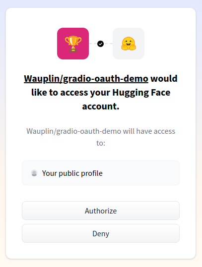
LoginButton(value: str = "Sign in with Hugging Face", logout_value: str = "Logout ({})", every: Timer | float | None = None, inputs: Component | Sequence[Component] | set[Component] | None = None, variant: Literal['primary', 'secondary', 'stop', 'huggingface'] = "huggingface", size: Literal['sm', 'md', 'lg'] = "lg", icon: str | Path | None = "/home/runner/work/gradio/gradio/gradio/icons/huggingface-logo.svg", link: str | None = None, visible: bool | Literal['hidden'] = True, interactive: bool = True, elem_id: str | None = None, elem_classes: list[str] | str | None = None, render: bool = True, key: int | str | tuple[int | str, ...] | None = None, preserved_by_key: list[str] | str | None = "value", scale: int | None = None, min_width: int | None = None)
Creates a "Sign In" button that redirects the user to sign in with Hugging Face OAuth. Once the user is signed in, the button will act as a logout button, and you can retrieve a signed-in user's profile by adding a parameter of type `gr.OAuthProfile` to any Gradio function. This will only work if this Gradio app is running in a Hugging Face Space. Permissions for the OAuth app can be configured in the Spaces README file, as described here: https://huggingface.co/docs/hub/en/spaces-oauth. For local development, instead of OAuth, the local Hugging Face account that is logged in (via `hf auth login`) will be available through the `gr.OAuthProfile` object.
Markdown(value: str | I18nData | Callable | None = None, label: str | I18nData | None = None, every: Timer | float | None = None, inputs: Component | Sequence[Component] | set[Component] | None = None, show_label: bool | None = None, rtl: bool = False, latex_delimiters: list[dict[str, str | bool]] | None = None, visible: bool | Literal['hidden'] = True, elem_id: str | None = None, elem_classes: list[str] | str | None = None, render: bool = True, key: int | str | tuple[int | str, ...] | None = None, preserved_by_key: list[str] | str | None = "value", sanitize_html: bool = True, line_breaks: bool = False, header_links: bool = False, height: int | str | None = None, max_height: int | str | None = None, min_height: int | str | None = None, buttons: list[Literal['copy']] | None = None, container: bool = False, padding: bool = False)
Used to render arbitrary Markdown output. Can also render latex enclosed by dollar signs as well as code blocks with syntax highlighting. Supported languages are bash, c, cpp, go, java, javascript, json, php, python, rust, sql, and yaml. As this component does not accept user input, it is rarely used as an input component.
Model3D(value: str | Callable | None = None, display_mode: Literal['solid', 'point_cloud', 'wireframe'] | None = None, clear_color: tuple[float, float, float, float] | None = None, camera_position: tuple[int | float | None, int | float | None, int | float | None] = (None, None, None), zoom_speed: float = 1, pan_speed: float = 1, height: int | str | None = None, label: str | I18nData | None = None, show_label: bool | None = None, every: Timer | float | None = None, inputs: Component | Sequence[Component] | set[Component] | None = None, container: bool = True, scale: int | None = None, min_width: int = 160, interactive: bool | None = None, visible: bool | Literal['hidden'] = True, elem_id: str | None = None, elem_classes: list[str] | str | None = None, render: bool = True, key: int | str | tuple[int | str, ...] | None = None, preserved_by_key: list[str] | str | None = "value")
Creates a component allows users to upload or view 3D Model files (.obj, .glb, .stl, .gltf, .splat, or .ply).
InputHTMLAttributes(autocapitalize: Literal['off', 'none', 'on', 'sentences', 'words', 'characters'] | None = None, autocorrect: Literal['on', 'off'] | None = None, spellcheck: bool | None = None, autocomplete: str | None = None, tabindex: int | None = None, enterkeyhint: Literal['enter', 'done', 'go', 'next', 'previous', 'search', 'send'] | None = None, lang: str | None = None)
A dataclass for specifying HTML attributes for the input/textarea element. If any of these attributes are not provided, the browser will use the default value.
Textbox(value: str | I18nData | Callable | None = None, type: Literal['text', 'password', 'email'] = "text", lines: int = 1, max_lines: int | None = None, placeholder: str | I18nData | None = None, label: str | I18nData | None = None, info: str | I18nData | None = None, every: Timer | float | None = None, inputs: Component | Sequence[Component] | set[Component] | None = None, show_label: bool | None = None, container: bool = True, scale: int | None = None, min_width: int = 160, interactive: bool | None = None, visible: bool | Literal['hidden'] = True, elem_id: str | None = None, autofocus: bool = False, autoscroll: bool = True, elem_classes: list[str] | str | None = None, render: bool = True, key: int | str | tuple[int | str, ...] | None = None, preserved_by_key: list[str] | str | None = "value", text_align: Literal['left', 'right'] | None = None, rtl: bool = False, buttons: list[Literal['copy']] | None = None, max_length: int | None = None, submit_btn: str | bool | None = False, stop_btn: str | bool | None = False, html_attributes: InputHTMLAttributes | None = None)
Creates a textarea for user to enter string input or display string output.
MultimodalTextbox(value: str | dict[str, str | list] | Callable | None = None, sources: list[Literal['upload', 'microphone']] | Literal['upload', 'microphone'] | None = None, file_types: list[str] | None = None, file_count: Literal['single', 'multiple', 'directory'] = "single", lines: int = 1, max_lines: int = 20, placeholder: str | None = None, label: str | I18nData | None = None, info: str | I18nData | None = None, every: Timer | float | None = None, inputs: Component | Sequence[Component] | set[Component] | None = None, show_label: bool | None = None, container: bool = True, scale: int | None = None, min_width: int = 160, interactive: bool | None = None, visible: bool | Literal['hidden'] = True, elem_id: str | None = None, autofocus: bool = False, autoscroll: bool = True, elem_classes: list[str] | str | None = None, render: bool = True, key: int | str | tuple[int | str, ...] | None = None, preserved_by_key: list[str] | str | None = "value", text_align: Literal['left', 'right'] | None = None, rtl: bool = False, submit_btn: str | bool | None = True, stop_btn: str | bool | None = False, max_plain_text_length: int = 1000, html_attributes: InputHTMLAttributes | None = None)
Creates a textarea for users to enter string input or display string output and also allows for the uploading of multimedia files.
BarPlot(value: pd.DataFrame | Callable | None = None, x: str | None = None, y: str | None = None, color: str | None = None, title: str | None = None, x_title: str | None = None, y_title: str | None = None, color_title: str | None = None, x_bin: str | float | None = None, y_aggregate: Literal['sum', 'mean', 'median', 'min', 'max', 'count'] | None = None, color_map: dict[str, str] | None = None, colors_in_legend: list[str] | None = None, x_lim: list[float | None] | None = None, y_lim: list[float | None] = None, x_label_angle: float = 0, y_label_angle: float = 0, x_axis_labels_visible: bool | Literal['hidden'] = True, caption: str | I18nData | None = None, sort: Literal['x', 'y', '-x', '-y'] | list[str] | None = None, tooltip: Literal['axis', 'none', 'all'] | list[str] = "axis", height: int | None = None, label: str | I18nData | None = None, show_label: bool | None = None, container: bool = True, scale: int | None = None, min_width: int = 160, every: Timer | float | None = None, inputs: Component | Sequence[Component] | Set[Component] | None = None, visible: bool | Literal['hidden'] = True, elem_id: str | None = None, elem_classes: list[str] | str | None = None, render: bool = True, buttons: list[Literal['fullscreen', 'export']] | None = None, key: int | str | tuple[int | str, ...] | None = None, preserved_by_key: list[str] | str | None = "value")
Creates a bar plot component to display data from a pandas DataFrame.
LinePlot(value: pd.DataFrame | Callable | None = None, x: str | None = None, y: str | None = None, color: str | None = None, title: str | None = None, x_title: str | None = None, y_title: str | None = None, color_title: str | None = None, x_bin: str | float | None = None, y_aggregate: Literal['sum', 'mean', 'median', 'min', 'max', 'count'] | None = None, color_map: dict[str, str] | None = None, colors_in_legend: list[str] | None = None, x_lim: list[float | None] | None = None, y_lim: list[float | None] = None, x_label_angle: float = 0, y_label_angle: float = 0, x_axis_labels_visible: bool | Literal['hidden'] = True, caption: str | I18nData | None = None, sort: Literal['x', 'y', '-x', '-y'] | list[str] | None = None, tooltip: Literal['axis', 'none', 'all'] | list[str] = "axis", height: int | None = None, label: str | I18nData | None = None, show_label: bool | None = None, container: bool = True, scale: int | None = None, min_width: int = 160, every: Timer | float | None = None, inputs: Component | Sequence[Component] | Set[Component] | None = None, visible: bool | Literal['hidden'] = True, elem_id: str | None = None, elem_classes: list[str] | str | None = None, render: bool = True, buttons: list[Literal['fullscreen', 'export']] | None = None, key: int | str | tuple[int | str, ...] | None = None, preserved_by_key: list[str] | str | None = "value")
Creates a line plot component to display data from a pandas DataFrame.
ScatterPlot(value: pd.DataFrame | Callable | None = None, x: str | None = None, y: str | None = None, color: str | None = None, title: str | None = None, x_title: str | None = None, y_title: str | None = None, color_title: str | None = None, x_bin: str | float | None = None, y_aggregate: Literal['sum', 'mean', 'median', 'min', 'max', 'count'] | None = None, color_map: dict[str, str] | None = None, colors_in_legend: list[str] | None = None, x_lim: list[float | None] | None = None, y_lim: list[float | None] = None, x_label_angle: float = 0, y_label_angle: float = 0, x_axis_labels_visible: bool | Literal['hidden'] = True, caption: str | I18nData | None = None, sort: Literal['x', 'y', '-x', '-y'] | list[str] | None = None, tooltip: Literal['axis', 'none', 'all'] | list[str] = "axis", height: int | None = None, label: str | I18nData | None = None, show_label: bool | None = None, container: bool = True, scale: int | None = None, min_width: int = 160, every: Timer | float | None = None, inputs: Component | Sequence[Component] | Set[Component] | None = None, visible: bool | Literal['hidden'] = True, elem_id: str | None = None, elem_classes: list[str] | str | None = None, render: bool = True, buttons: list[Literal['fullscreen', 'export']] | None = None, key: int | str | tuple[int | str, ...] | None = None, preserved_by_key: list[str] | str | None = "value")
Creates a scatter plot component to display data from a pandas DataFrame.
Navbar(value: list[tuple[str, str]] | None = None, visible: bool = True, main_page_name: str | Literal[False] = "Home", elem_id: str | None = None, elem_classes: list[str] | str | None = None, render: bool = True, key: int | str | tuple[int | str, ...] | None = None)
Creates a navigation bar component for multipage Gradio apps. The navbar component allows customizing the appearance of the navbar for that page. Only one Navbar component can exist per page in a Blocks app, and it can be placed anywhere within the page. The Navbar component is designed to control the appearance of the navigation bar in multipage applications. When present in a Blocks app, its properties override the default navbar behavior.
Number(value: float | Callable | None = None, label: str | I18nData | None = None, placeholder: str | I18nData | None = None, info: str | I18nData | None = None, every: Timer | float | None = None, inputs: Component | Sequence[Component] | set[Component] | None = None, show_label: bool | None = None, container: bool = True, scale: int | None = None, min_width: int = 160, interactive: bool | None = None, visible: bool | Literal['hidden'] = True, elem_id: str | None = None, elem_classes: list[str] | str | None = None, render: bool = True, key: int | str | tuple[int | str, ...] | None = None, preserved_by_key: list[str] | str | None = "value", precision: int | None = None, minimum: float | None = None, maximum: float | None = None, step: float = 1)
Creates a numeric field for user to enter numbers as input or display numeric output.
ParamViewer(value: Mapping[str, Parameter] | None = None, language: Literal['python', 'typescript'] = "python", linkify: list[str] | None = None, every: Timer | float | None = None, inputs: Component | Sequence[Component] | set[Component] | None = None, render: bool = True, key: int | str | tuple[int | str, ...] | None = None, preserved_by_key: list[str] | str | None = "value", header: str | None = "Parameters", anchor_links: bool | str = False, max_height: int | str | None = None)
Displays an interactive table of parameters and their descriptions and default values with syntax highlighting. For each parameter, the user should provide a type (e.g. a `str`), a human-readable description, and a default value. As this component does not accept user input, it is rarely used as an input component. Internally, this component is used to display the parameters of components in the Custom Component Gallery (https://www.gradio.app/custom-components/gallery).
Plot(value: Any | None = None, format: str = "webp", label: str | I18nData | None = None, every: Timer | float | None = None, inputs: Component | Sequence[Component] | set[Component] | None = None, show_label: bool | None = None, container: bool = True, scale: int | None = None, min_width: int = 160, visible: bool | Literal['hidden'] = True, elem_id: str | None = None, elem_classes: list[str] | str | None = None, render: bool = True, key: int | str | tuple[int | str, ...] | None = None, preserved_by_key: list[str] | str | None = "value")
Creates a plot component to display various kinds of plots (matplotlib, plotly, altair, or bokeh plots are supported). As this component does not accept user input, it is rarely used as an input component.
Radio(choices: Sequence[str | int | float | tuple[str, str | int | float]] | None = None, value: str | int | float | Callable | None = None, type: Literal['value', 'index'] = "value", label: str | I18nData | None = None, info: str | I18nData | None = None, every: Timer | float | None = None, inputs: Component | Sequence[Component] | set[Component] | None = None, show_label: bool | None = None, container: bool = True, scale: int | None = None, min_width: int = 160, interactive: bool | None = None, visible: bool | Literal['hidden'] = True, elem_id: str | None = None, elem_classes: list[str] | str | None = None, render: bool = True, key: int | str | tuple[int | str, ...] | None = None, preserved_by_key: list[str] | str | None = "value", rtl: bool = False)
Creates a set of (string or numeric type) radio buttons of which only one can be selected.
Slider(minimum: float = 0, maximum: float = 100, value: float | Callable | None = None, step: float | None = None, precision: int | None = None, label: str | I18nData | None = None, info: str | I18nData | None = None, every: Timer | float | None = None, inputs: Component | Sequence[Component] | set[Component] | None = None, show_label: bool | None = None, container: bool = True, scale: int | None = None, min_width: int = 160, interactive: bool | None = None, visible: bool | Literal['hidden'] = True, elem_id: str | None = None, elem_classes: list[str] | str | None = None, render: bool = True, key: int | str | tuple[int | str, ...] | None = None, preserved_by_key: list[str] | str | None = "value", randomize: bool = False, buttons: list[Literal['reset']] | None = None)
Creates a slider that ranges from {minimum} to {maximum} with a step size of {step}.
State(value: Any = None, render: bool = True, time_to_live: int | float | None = None, delete_callback: Callable[[Any], None] | None = None)
A base class for defining methods that all input/output components should have.
Timer(value: float = 1, active: bool = True, render: bool = True)
Special component that ticks at regular intervals when active. It is not visible, and only used to trigger events at a regular interval through the `tick` event listener.
UploadButton(label: str = "Upload a File", value: str | I18nData | list[str] | Callable | None = None, every: Timer | float | None = None, inputs: Component | Sequence[Component] | set[Component] | None = None, variant: Literal['primary', 'secondary', 'stop'] = "secondary", visible: bool | Literal['hidden'] = True, size: Literal['sm', 'md', 'lg'] = "lg", icon: str | None = None, scale: int | None = None, min_width: int | None = None, interactive: bool = True, elem_id: str | None = None, elem_classes: list[str] | str | None = None, render: bool = True, key: int | str | tuple[int | str, ...] | None = None, preserved_by_key: list[str] | str | None = "value", type: Literal['filepath', 'binary'] = "filepath", file_count: Literal['single', 'multiple', 'directory'] = "single", file_types: list[str] | None = None)
Used to create an upload button, when clicked allows a user to upload files that satisfy the specified file type or generic files (if file_type not set).
Video(value: str | Path | Callable | None = None, format: str | None = None, sources: list[Literal['upload', 'webcam']] | Literal['upload', 'webcam'] | None = None, height: int | str | None = None, width: int | str | None = None, label: str | I18nData | None = None, every: Timer | float | None = None, inputs: Component | Sequence[Component] | set[Component] | None = None, show_label: bool | None = None, container: bool = True, scale: int | None = None, min_width: int = 160, interactive: bool | None = None, visible: bool | Literal['hidden'] = True, elem_id: str | None = None, elem_classes: list[str] | str | None = None, render: bool = True, key: int | str | tuple[int | str, ...] | None = None, preserved_by_key: list[str] | str | None = "value", webcam_options: WebcamOptions | None = None, include_audio: bool | None = None, autoplay: bool = False, buttons: list[Literal['download', 'share']] | None = None, loop: bool = False, streaming: bool = False, watermark: WatermarkOptions | None = None, subtitles: str | Path | list[dict[str, Any]] | None = None)
Creates a video component that can be used to upload/record videos (as an input) or display videos (as an output). For the video to be playable in the browser it must have a compatible container and codec combination. Allowed combinations are .mp4 with h264 codec, .ogg with theora codec, and .webm with vp9 codec. If the component detects that the output video would not be playable in the browser it will attempt to convert it to a playable mp4 video. If the conversion fails, the original video is returned.
SimpleImage(value: str | None = None, label: str | I18nData | None = None, every: Timer | float | None = None, inputs: Component | Sequence[Component] | set[Component] | None = None, show_label: bool | None = None, show_download_button: bool = True, container: bool = True, scale: int | None = None, min_width: int = 160, interactive: bool | None = None, visible: bool | Literal['hidden'] = True, elem_id: str | None = None, elem_classes: list[str] | str | None = None, render: bool = True, key: int | str | tuple[int | str, ...] | None = None, preserved_by_key: list[str] | str | None = "value")
Creates an image component that can be used to upload images (as an input) or display images (as an output).
FileData(data: Any)
The FileData class is a subclass of the GradioModel class that represents a file object within a Gradio interface. It is used to store file data and metadata when a file is uploaded.
set_static_paths(paths: str | Path | list[str | Path])
Set the static paths to be served by the gradio app. Static files are are served directly from the file system instead of being copied. They are served to users with The Content-Disposition HTTP header set to "inline" when sending these files to users. This indicates that the file should be displayed directly in the browser window if possible. This function is useful when you want to serve files that you know will not be modified during the lifetime of the gradio app (like files used in gr.Examples). By setting static paths, your app will launch faster and it will consume less disk space. Calling this function will set the static paths for all gradio applications defined in the same interpreter session until it is called again or the session ends.
Dependency(trigger: , key_vals: , dep_index: , fn: , associated_timer: Timer | None = None)
dict() -> new empty dictionary dict(mapping) -> new dictionary initialized from a mapping object's (key, value) pairs dict(iterable) -> new dictionary initialized as if via: d = {} for k, v in iterable: d[k] = v dict(**kwargs) -> new dictionary initialized with the name=value pairs in the keyword argument list. For example: dict(one=1, two=2)
EventData(target: Block | None)
When gr.EventData or one of its subclasses is added as a type hint to an argument of a prediction function, a gr.EventData object will automatically be passed as the value of that argument. The attributes of this object contains information about the event that triggered the listener. The gr.EventData object itself contains a `.target` attribute that refers to the component that triggered the event, while subclasses of gr.EventData contains additional attributes that are different for each class.
SelectData(target: Block | None, data: Any)
The gr.SelectData class is a subclass of gr.EventData that specifically carries information about the `.select()` event. When gr.SelectData is added as a type hint to an argument of an event listener method, a gr.SelectData object will automatically be passed as the value of that argument. The attributes of this object contains information about the event that triggered the listener.
KeyUpData(target: Block | None, data: Any)
The gr.KeyUpData class is a subclass of gr.EventData that specifically carries information about the `.key_up()` event. When gr.KeyUpData is added as a type hint to an argument of an event listener method, a gr.KeyUpData object will automatically be passed as the value of that argument. The attributes of this object contains information about the event that triggered the listener.
DeletedFileData(target: Block | None, data: FileDataDict)
The gr.DeletedFileData class is a subclass of gr.EventData that specifically carries information about the `.delete()` event. When gr.DeletedFileData is added as a type hint to an argument of an event listener method, a gr.DeletedFileData object will automatically be passed as the value of that argument. The attributes of this object contains information about the event that triggered the listener.
LikeData(target: Block | None, data: Any)
The gr.LikeData class is a subclass of gr.EventData that specifically carries information about the `.like()` event. When gr.LikeData is added as a type hint to an argument of an event listener method, a gr.LikeData object will automatically be passed as the value of that argument. The attributes of this object contains information about the event that triggered the listener.
RetryData(target: Block | None, data: Any)
The gr.RetryData class is a subclass of gr.Event data that specifically carries information about the `.retry()` event. When gr.RetryData is added as a type hint to an argument of an event listener method, a gr.RetryData object will automatically be passed as the value of that argument. The attributes of this object contains information about the event that triggered the listener.
UndoData(target: Block | None, data: Any)
The gr.UndoData class is a subclass of gr.Event data that specifically carries information about the `.undo()` event. When gr.UndoData is added as a type hint to an argument of an event listener method, a gr.UndoData object will automatically be passed as the value of that argument. The attributes of this object contains information about the event that triggered the listener.
EditData(target: Block | None, data: Any)
The gr.EditData class is a subclass of gr.Event data that specifically carries information about the `.edit()` event. When gr.EditData is added as a type hint to an argument of an event listener method, a gr.EditData object will automatically be passed as the value of that argument. The attributes of this object contains information about the event that triggered the listener.
DownloadData(target: Block | None, data: FileDataDict)
The gr.DownloadData class is a subclass of gr.EventData that specifically carries information about the `.download()` event. When gr.DownloadData is added as a type hint to an argument of an event listener method, a gr.DownloadData object will automatically be passed as the value of that argument. The attributes of this object contains information about the event that triggered the listener.
CopyData(target: Block | None, data: Any)
The gr.CopyData class is a subclass of gr.EventData that specifically carries information about the `.copy()` event. When gr.CopyData is added as a type hint to an argument of an event listener method, a gr.CopyData object will automatically be passed as the value of that argument. The attributes of this object contains information about the event that triggered the listener.
on(triggers: Sequence[EventListenerCallable] | EventListenerCallable | None = None, fn: Callable[..., Any] | None | Literal['decorator'] = "decorator", inputs: Component | BlockContext | Sequence[Component | BlockContext] | Set[Component | BlockContext] | None = None, outputs: Component | BlockContext | Sequence[Component | BlockContext] | Set[Component | BlockContext] | None = None, api_visibility: Literal['public', 'private', 'undocumented'] = "public", api_name: str | None = None, api_description: str | None | Literal[False] = None, scroll_to_output: bool = False, show_progress: Literal['full', 'minimal', 'hidden'] = "full", show_progress_on: Component | Sequence[Component] | None = None, queue: bool = True, batch: bool = False, max_batch_size: int = 4, preprocess: bool = True, postprocess: bool = True, cancels: dict[str, Any] | list[dict[str, Any]] | None = None, trigger_mode: Literal['once', 'multiple', 'always_last'] | None = None, js: str | Literal[True] | None = None, concurrency_limit: int | None | Literal['default'] = "default", concurrency_id: str | None = None, time_limit: int | None = None, stream_every: float = 0.5, key: int | str | tuple[int | str, ...] | None = None, validator: Callable | None = None)
Sets up an event listener that triggers a function when the specified event(s) occur. This is especially useful when the same function should be triggered by multiple events. Only a single API endpoint is generated for all events in the triggers list.
api(fn: Callable | Literal['decorator'] = "decorator", api_name: str | None = None, api_description: str | None = None, queue: bool = True, batch: bool = False, max_batch_size: int = 4, concurrency_limit: int | None | Literal['default'] = "default", concurrency_id: str | None = None, api_visibility: Literal['public', 'private', 'undocumented'] = "public", time_limit: int | None = None, stream_every: float = 0.5)
Sets up an API or MCP endpoint for a generic function without needing define events listeners or components. Derives its typing from type hints in the provided function's signature rather than the components.
Examples(examples: list[Any] | list[list[Any]] | str, inputs: Component | Sequence[Component], outputs: Component | Sequence[Component] | None = None, fn: Callable | None = None, cache_examples: bool | None = None, cache_mode: Literal['eager', 'lazy'] | None = None, examples_per_page: int = 10, label: str | I18nData | None = "Examples", elem_id: str | None = None, run_on_click: bool = False, preprocess: bool = True, postprocess: bool = True, api_visibility: Literal['public', 'private', 'undocumented'] = "undocumented", api_name: str | None = "load_example", api_description: str | None | Literal[False] = None, batch: bool = False, example_labels: list[str] | None = None, visible: bool | Literal['hidden'] = True, preload: int | Literal[False] = 0)
This class is a wrapper over the Dataset component and can be used to create Examples for Blocks / Interfaces. Populates the Dataset component with examples and assigns event listener so that clicking on an example populates the input/output components. Optionally handles example caching for fast inference.
Progress(track_tqdm: bool = False)
The Progress class provides a custom progress tracker that is used in a function signature. To attach a Progress tracker to a function, simply add a parameter right after the input parameters that has a default value set to a `gradio.Progress()` instance. The Progress tracker can then be updated in the function by calling the Progress object or using the `tqdm` method on an Iterable.
Progress.__call__(progress: float | tuple[int, int | None] | None, desc: str | None = None, total: int | float | None = None, unit: str = "steps")
Updates progress tracker with progress and message text.
Progress.tqdm(iterable: Iterable | None, desc: str | None = None, total: int | float | None = None, unit: str = "steps")
Attaches progress tracker to iterable, like tqdm.
validate(is_valid: bool, message: str)
A special function that can be returned from a Gradio function to set the validation error of an output component.
skip()
A special function that can be returned from a Gradio function to skip updating the output component. This may be useful when you want to update the output component conditionally, and in some cases, you want to skip updating the output component. If you have multiple output components, you can return `gr.skip()` as part of a tuple to skip updating a specific output component, or you can return a single `gr.skip()` to skip updating all output components.
load(name: str, src: Callable[[str, str | None], Blocks] | Literal['models', 'spaces', 'huggingface'] | None = None, token: str | None = None, accept_token: bool | LoginButton = False, provider: PROVIDER_T | None = None, kwargs: )
Constructs a Gradio app automatically from a Hugging Face model/Space repo name or a 3rd-party API provider. Note that if a Space repo is loaded, certain high-level attributes of the Blocks (e.g. custom `css`, `js`, and `head` attributes) will not be loaded.
load_chat(base_url: str, model: str, token: str | None = None, file_types: Literal['text_encoded', 'image'] | list[Literal['text_encoded', 'image']] | None = "text_encoded", system_message: str | None = None, streaming: bool = True, kwargs: )
Load a chat interface from an OpenAI API chat compatible endpoint.
load_openapi(openapi_spec: str | dict, base_url: str, paths: list[str] | None = None, exclude_paths: list[str] | None = None, methods: list[Literal['get', 'post', 'put', 'patch', 'delete']] | None = None, auth_token: str | None = None, interface_kwargs: )
Load a Gradio app from an OpenAPI v3 specification.
Error(message: str = "Error raised.", duration: float | None = 10, visible: bool = True, title: str = "Error", print_exception: bool = True)
This class allows you to pass custom error messages to the user. You can do so by raising a gr.Error("custom message") anywhere in the code, and when that line is executed the custom message will appear in a modal on the demo.
Warning(message: str = "Warning issued.", duration: float | None = 10, visible: bool = True, title: str = "Warning")
This function allows you to pass custom warning messages to the user. You can do so simply by writing `gr.Warning('message here')` in your function, and when that line is executed the custom message will appear in a modal on the demo. The modal is yellow by default and has the heading: "Warning." Queue must be enabled for this behavior; otherwise, the warning will be printed to the console using the `warnings` library.
Info(message: str = "Info issued.", duration: float | None = 10, visible: bool = True, title: str = "Info")
This function allows you to pass custom info messages to the user. You can do so simply by writing `gr.Info('message here')` in your function, and when that line is executed the custom message will appear in a modal on the demo. The modal is gray by default and has the heading: "Info." Queue must be enabled for this behavior; otherwise, the message will be printed to the console.
Success(message: str = "Success.", duration: float | None = 10, visible: bool = True, title: str = "Success")
This function allows you to pass custom success messages to the user. You can do so simply by writing `gr.Success('message here')` in your function, and when that line is executed the custom message will appear in a modal on the demo. The modal is green by default and has the heading: "Success." Queue must be enabled for this behavior; otherwise, the message will be printed to the console.
Request(request: fastapi.Request | None = None, username: str | None = None, session_hash: str | None = None)
A Gradio request object that can be used to access the request headers, cookies, query parameters and other information about the request from within the prediction function. The class is a thin wrapper around the fastapi.Request class. Attributes of this class include: `headers`, `client`, `query_params`, `session_hash`, and `path_params`. If auth is enabled, the `username` attribute can be used to get the logged in user. In some environments, the dict-like attributes (e.g. `requests.headers`, `requests.query_params`) of this class are automatically converted to dictionaries, so we recommend converting them to dictionaries before accessing attributes for consistent behavior in different environments.
Header()
A string that represents a header value in an incoming HTTP request to the Gradio app. When you type a function argument of type `Header`, Gradio will automatically extract that header from the request and pass it to the function. Note that it's common for header values to use hyphens, e.g. `x-forwarded-host`, and these will automatically be converted to underscores. So make sure you use underscores in your function arguments.
mount_gradio_app(app: fastapi.FastAPI, blocks: gradio.Blocks, path: str, server_name: str = "0.0.0.0", server_port: int = 7860, footer_links: list[Literal['api', 'gradio', 'settings'] | dict[str, str]] | None = None, app_kwargs: dict[str, Any] | None = None, auth: Callable | tuple[str, str] | list[tuple[str, str]] | None = None, auth_message: str | None = None, auth_dependency: Callable[[fastapi.Request], str | None] | None = None, root_path: str | None = None, allowed_paths: list[str] | None = None, blocked_paths: list[str] | None = None, favicon_path: str | None = None, show_error: bool = True, max_file_size: str | int | None = None, ssr_mode: bool | None = None, node_server_name: str | None = None, node_port: int | None = None, enable_monitoring: bool | None = None, pwa: bool | None = None, i18n: I18n | None = None, mcp_server: bool | None = None, theme: Theme | str | None = None, css: str | None = None, css_paths: str | Path | Sequence[str | Path] | None = None, js: str | Literal[True] | None = None, head: str | None = None, head_paths: str | Path | Sequence[str | Path] | None = None)
Mount a gradio.Blocks to an existing FastAPI application.
ChatInterface(fn: Callable, multimodal: bool = False, chatbot: Chatbot | None = None, textbox: Textbox | MultimodalTextbox | None = None, additional_inputs: str | Component | list[str | Component] | None = None, additional_inputs_accordion: str | Accordion | None = None, additional_outputs: Component | list[Component] | None = None, editable: bool = False, examples: list[str] | list[MultimodalValue] | list[list] | None = None, example_labels: list[str] | None = None, example_icons: list[str] | None = None, run_examples_on_click: bool = True, cache_examples: bool | None = None, cache_mode: Literal['eager', 'lazy'] | None = None, title: str | I18nData | None = None, description: str | None = None, flagging_mode: Literal['never', 'manual'] | None = None, flagging_options: list[str] | tuple[str, ...] | None = ('Like', 'Dislike'), flagging_dir: str = ".gradio/flagged", analytics_enabled: bool | None = None, autofocus: bool = True, autoscroll: bool = True, submit_btn: str | bool | None = True, stop_btn: str | bool | None = True, concurrency_limit: int | None | Literal['default'] = "default", delete_cache: tuple[int, int] | None = None, show_progress: Literal['full', 'minimal', 'hidden'] = "minimal", fill_height: bool = True, fill_width: bool = False, api_name: str | None = None, api_description: str | None | Literal[False] = None, api_visibility: Literal['public', 'private', 'undocumented'] = "public", save_history: bool = False, validator: Callable | None = None)
ChatInterface is Gradio's high-level abstraction for creating chatbot UIs, and allows you to create a web-based demo around a chatbot model in a few lines of code. Only one parameter is required: fn, which takes a function that governs the response of the chatbot based on the user input and chat history. Additional parameters can be used to control the appearance and behavior of the demo.
Event listeners allow Gradio to respond to user interactions with the UI components defined in a Blocks app. When a user interacts with an element, such as changing a slider value or uploading an image, a function is called.
All event listeners have the same signature:
.(fn: Callable | None | Literal['decorator'] = "decorator", inputs: Component | BlockContext | Sequence[Component | BlockContext] | Set[Component | BlockContext] | None = None, outputs: Component | BlockContext | Sequence[Component | BlockContext] | Set[Component | BlockContext] | None = None, api_name: str | None = None, api_description: str | None | Literal[False] = None, scroll_to_output: bool = False, show_progress: Literal['full', 'minimal', 'hidden'] = "minimal", show_progress_on: Component | Sequence[Component] | None = None, queue: bool = True, batch: bool = False, max_batch_size: int = 4, preprocess: bool = True, postprocess: bool = True, cancels: dict[str, Any] | list[dict[str, Any]] | None = None, trigger_mode: Literal['once', 'multiple', 'always_last'] | None = None, js: str | Literal[True] | None = None, concurrency_limit: int | None | Literal['default'] = "default", concurrency_id: str | None = None, api_visibility: Literal['public', 'private', 'undocumented'] = "public", time_limit: int | None = None, stream_every: float = 0.5, key: int | str | tuple[int | str, ...] | None = None, validator: Callable | None = None)
Each component only supports some specific events. Below is a list of all gradio components and every event that each component supports. If an event is supported by a component, it is a valid method of the component.AnnotatedImage: select
Audio: stream, change, clear, play, pause, pause, stop, pause, pause, start_recording, pause_recording, stop_recording, upload, input
BrowserState: change
Button: click
Chatbot: change, select, like, retry, undo, example_select, option_select, clear, copy, edit
Checkbox: change, input, select
CheckboxGroup: change, input, select
ClearButton: click
Code: change, input, focus, blur
ColorPicker: change, input, submit, focus, blur
Dataframe: change, input, select, edit
Dataset: click, select
DateTime: change, submit
DeepLinkButton: click
Dialogue: change, input, submit
DownloadButton: click
Dropdown: change, input, select, focus, blur, key_up
DuplicateButton: click
File: change, select, clear, upload, delete, download
FileExplorer: change
ImageEditor: clear, change, input, select, upload, apply
Gallery: select, upload, change, delete, preview_close, preview_open
HighlightedText: change, select
HTML: change, input, click, double_click, submit, stop, edit, clear, play, pause, end, start_recording, pause_recording, stop_recording, focus, blur, upload, release, select, stream, like, example_select, option_select, load, key_up, apply, delete, tick, undo, retry, expand, collapse, download, copy
Image: clear, change, stream, select, upload, input
ImageSlider: clear, change, stream, select, upload, input
JSON: change
Label: change, select
LoginButton: click
Markdown: change, copy
Model3D: change, upload, edit, clear
Textbox: change, input, select, submit, focus, blur, stop, copy
MultimodalTextbox: change, input, select, submit, focus, blur, stop
BarPlot: select, double_click
LinePlot: select, double_click
ScatterPlot: select, double_click
Navbar: change
Number: change, input, submit, focus, blur
ParamViewer: change, upload
Plot: change
Radio: select, change, input
Slider: change, input, release
State: change
Timer: tick
UploadButton: click, upload
Video: change, clear, start_recording, stop_recording, stop, play, pause, end, upload
SimpleImage: clear, change, upload
End to End Demos:
Below are examples of full end-to-end Gradio apps:
Name: custom css
Code:
import gradio as gr
with gr.Blocks() as demo:
with gr.Column(elem_classes="cool-col"):
gr.Markdown("### Gradio Demo with Custom CSS", elem_classes="darktest")
gr.Markdown(
elem_classes="markdown",
value="Resize the browser window to see the CSS media query in action.",
)
demo.launch(css_paths=["demo/custom_css/custom_css.css"])
Name: annotatedimage component
Code:
import gradio as gr
import numpy as np
import requests
from io import BytesIO
from PIL import Image
base_image = "https://gradio-docs-json.s3.us-west-2.amazonaws.com/base.png"
building_image = requests.get("https://gradio-docs-json.s3.us-west-2.amazonaws.com/buildings.png")
building_image = np.asarray(Image.open(BytesIO(building_image.content)))[:, :, -1] > 0
with gr.Blocks() as demo:
gr.AnnotatedImage(
value=(base_image, [(building_image, "buildings")]),
height=500,
)
demo.launch()
Name: blocks essay simple
Code:
import gradio as gr
def change_textbox(choice):
if choice == "short":
return gr.Textbox(lines=2, visible=True)
elif choice == "long":
return gr.Textbox(lines=8, visible=True, value="Lorem ipsum dolor sit amet")
else:
return gr.Textbox(visible=False)
with gr.Blocks() as demo:
radio = gr.Radio(
["short", "long", "none"], label="What kind of essay would you like to write?"
)
text = gr.Textbox(lines=2, interactive=True, buttons=["copy"])
radio.change(fn=change_textbox, inputs=radio, outputs=text)
demo.launch()
Name: blocks flipper
Code:
import numpy as np
import gradio as gr
def flip_text(x):
return x[::-1]
def flip_image(x):
return np.fliplr(x)
with gr.Blocks() as demo:
gr.Markdown("Flip text or image files using this demo.")
with gr.Tab("Flip Text"):
text_input = gr.Textbox()
text_output = gr.Textbox()
text_button = gr.Button("Flip")
with gr.Tab("Flip Image"):
with gr.Row():
image_input = gr.Image()
image_output = gr.Image()
image_button = gr.Button("Flip")
with gr.Accordion("Open for More!", open=False):
gr.Markdown("Look at me...")
temp_slider = gr.Slider(
0, 1,
value=0.1,
step=0.1,
interactive=True,
label="Slide me",
)
text_button.click(flip_text, inputs=text_input, outputs=text_output)
image_button.click(flip_image, inputs=image_input, outputs=image_output)
demo.launch()
Name: blocks form
Code:
import gradio as gr
with gr.Blocks() as demo:
name_box = gr.Textbox(label="Name")
age_box = gr.Number(label="Age", minimum=0, maximum=100)
symptoms_box = gr.CheckboxGroup(["Cough", "Fever", "Runny Nose"])
submit_btn = gr.Button("Submit")
with gr.Column(visible=False) as output_col:
diagnosis_box = gr.Textbox(label="Diagnosis")
patient_summary_box = gr.Textbox(label="Patient Summary")
def submit(name, age, symptoms):
return {
submit_btn: gr.Button(visible=False),
output_col: gr.Column(visible=True),
diagnosis_box: "covid" if "Cough" in symptoms else "flu",
patient_summary_box: f"{name}, {age} y/o",
}
submit_btn.click(
submit,
[name_box, age_box, symptoms_box],
[submit_btn, diagnosis_box, patient_summary_box, output_col],
)
demo.launch()
Name: blocks hello
Code:
import gradio as gr
def welcome(name):
return f"Welcome to Gradio, {name}!"
with gr.Blocks() as demo:
gr.Markdown(
"""
# Hello World!
Start typing below to see the output.
""")
inp = gr.Textbox(placeholder="What is your name?")
out = gr.Textbox()
inp.change(welcome, inp, out)
demo.launch()
Name: blocks js load
Code:
import gradio as gr
def welcome(name):
return f"Welcome to Gradio, {name}!"
js = """
function createGradioAnimation() {
var container = document.createElement('div');
container.id = 'gradio-animation';
container.style.fontSize = '2em';
container.style.fontWeight = 'bold';
container.style.textAlign = 'center';
container.style.marginBottom = '20px';
var text = 'Welcome to Gradio!';
for (var i = 0; i < text.length; i++) {
(function(i){
setTimeout(function(){
var letter = document.createElement('span');
letter.style.opacity = '0';
letter.style.transition = 'opacity 0.5s';
letter.innerText = text[i];
container.appendChild(letter);
setTimeout(function() {
letter.style.opacity = '1';
}, 50);
}, i * 250);
})(i);
}
var gradioContainer = document.querySelector('.gradio-container');
gradioContainer.insertBefore(container, gradioContainer.firstChild);
return 'Animation created';
}
"""
with gr.Blocks() as demo:
inp = gr.Textbox(placeholder="What is your name?")
out = gr.Textbox()
inp.change(welcome, inp, out)
demo.launch(js=js)
Name: blocks js methods
Code:
import gradio as gr
blocks = gr.Blocks()
with blocks as demo:
subject = gr.Textbox(placeholder="subject")
verb = gr.Radio(["ate", "loved", "hated"])
object = gr.Textbox(placeholder="object")
with gr.Row():
btn = gr.Button("Create sentence.")
reverse_btn = gr.Button("Reverse sentence.")
foo_bar_btn = gr.Button("Append foo")
reverse_then_to_the_server_btn = gr.Button(
"Reverse sentence and send to server."
)
def sentence_maker(w1, w2, w3):
return f"{w1} {w2} {w3}"
output1 = gr.Textbox(label="output 1")
output2 = gr.Textbox(label="verb")
output3 = gr.Textbox(label="verb reversed")
output4 = gr.Textbox(label="front end process and then send to backend")
btn.click(sentence_maker, [subject, verb, object], output1)
reverse_btn.click(
None, [subject, verb, object], output2, js="(s, v, o) => o + ' ' + v + ' ' + s"
)
verb.change(None, verb, output3, js="(x) => [...x].reverse().join('')")
foo_bar_btn.click(None, [], subject, js="(x) => x + ' foo'")
reverse_then_to_the_server_btn.click(
None,
[subject, verb, object],
output4,
js="(s, v, o) => [s, v, o].map(x => [...x].reverse().join('')).join(' ')",
)
demo.launch()
Name: blocks kinematics
Code:
import pandas as pd
import numpy as np
import gradio as gr
def plot(v, a):
g = 9.81
theta = a / 180 * 3.14
tmax = ((2 * v) * np.sin(theta)) / g
timemat = tmax * np.linspace(0, 1, 40)
x = (v * timemat) * np.cos(theta)
y = ((v * timemat) * np.sin(theta)) - ((0.5 * g) * (timemat**2))
df = pd.DataFrame({"x": x, "y": y})
return df
demo = gr.Blocks()
with demo:
gr.Markdown(
r"Let's do some kinematics! Choose the speed and angle to see the trajectory. Remember that the range $R = v_0^2 \cdot \frac{\sin(2\theta)}{g}$"
)
with gr.Row():
speed = gr.Slider(1, 30, 25, label="Speed")
angle = gr.Slider(0, 90, 45, label="Angle")
output = gr.LinePlot(
x="x",
y="y",
tooltip=["x", "y"],
x_lim=[0, 100],
y_lim=[0, 60],
height=300,
)
btn = gr.Button(value="Run")
btn.click(plot, [speed, angle], output)
demo.launch()
Name: blocks layout
Code:
import gradio as gr
demo = gr.Blocks()
with demo:
with gr.Row():
gr.Image(interactive=True, scale=2)
gr.Image()
with gr.Row():
gr.Textbox(label="Text")
gr.Number(label="Count", scale=2)
gr.Radio(choices=["One", "Two"])
with gr.Row():
gr.Button("500", scale=0, min_width=500)
gr.Button("A", scale=0)
gr.Button("grow")
with gr.Row():
gr.Textbox()
gr.Textbox()
gr.Button()
with gr.Row():
with gr.Row():
with gr.Column():
gr.Textbox(label="Text")
gr.Number(label="Count")
gr.Radio(choices=["One", "Two"])
gr.Image()
with gr.Column():
gr.Image(interactive=True)
gr.Image()
gr.Image()
gr.Textbox(label="Text")
gr.Number(label="Count")
gr.Radio(choices=["One", "Two"])
demo.launch()
Name: blocks plug
Code:
import gradio as gr
def change_tab():
return gr.Tabs(selected=2)
identity_demo, input_demo, output_demo = gr.Blocks(), gr.Blocks(), gr.Blocks()
with identity_demo:
gr.Interface(lambda x: x, "text", "text")
with input_demo:
t = gr.Textbox(label="Enter your text here")
with gr.Row():
btn = gr.Button("Submit")
clr = gr.ClearButton(t)
with output_demo:
gr.Textbox("This is a static output")
with gr.Blocks() as demo:
gr.Markdown("Three demos in one!")
with gr.Tabs(selected=1) as tabs:
with gr.TabItem("Text Identity", id=0) as tab0:
tab0.select(lambda: gr.Tabs(selected=0), None, tabs)
identity_demo.render()
with gr.TabItem("Text Input", id=1) as tab1:
tab1.select(lambda: gr.Tabs(selected=1), None, tabs)
input_demo.render()
with gr.TabItem("Text Static", id=2) as tab2:
tab2.select(lambda: gr.Tabs(selected=2), None, tabs)
output_demo.render()
btn = gr.Button("Change tab")
btn.click(inputs=None, outputs=tabs, fn=change_tab)
demo.launch()
Name: blocks simple squares
Code:
import gradio as gr
demo = gr.Blocks()
with demo:
default_json = {"a": "a"}
num = gr.State(value=0)
squared = gr.Number(value=0)
btn = gr.Button("Next Square", elem_id="btn", elem_classes=["abc", "def"])
stats = gr.State(value=default_json)
table = gr.JSON()
def increase(var, stats_history):
var += 1
stats_history[str(var)] = var**2
return var, var**2, stats_history, stats_history
btn.click(increase, [num, stats], [num, squared, stats, table])
demo.launch(css="""#btn {color: red} .abc {font-family: "Comic Sans MS", "Comic Sans", cursive !important}""")
Name: calculator
Code:
import gradio as gr
def calculator(num1, operation, num2):
if operation == "add":
return num1 + num2
elif operation == "subtract":
return num1 - num2
elif operation == "multiply":
return num1 * num2
elif operation == "divide":
if num2 == 0:
raise gr.Error("Cannot divide by zero!")
return num1 / num2
demo = gr.Interface(
calculator,
[
"number",
gr.Radio(["add", "subtract", "multiply", "divide"]),
"number"
],
"number",
examples=[
[45, "add", 3],
[3.14, "divide", 2],
[144, "multiply", 2.5],
[0, "subtract", 1.2],
],
title="Toy Calculator",
description="Here's a sample toy calculator.",
api_name="predict"
)
demo.launch()
Name: chatbot consecutive
Code:
import gradio as gr
import random
import time
with gr.Blocks() as demo:
chatbot = gr.Chatbot()
msg = gr.Textbox()
clear = gr.Button("Clear")
def user(user_message, history):
return "", history + [{"role": "user", "content": user_message}]
def bot(history):
bot_message = random.choice(["How are you?", "I love you", "I'm very hungry"])
time.sleep(2)
history.append({"role": "assistant", "content": bot_message})
return history
msg.submit(user, [msg, chatbot], [msg, chatbot], queue=False).then(
bot, chatbot, chatbot
)
clear.click(lambda: None, None, chatbot, queue=False)
demo.launch()
Name: chatbot simple
Code:
import gradio as gr
import random
import time
with gr.Blocks() as demo:
chatbot = gr.Chatbot()
msg = gr.Textbox()
clear = gr.ClearButton([msg, chatbot])
def respond(message, chat_history):
bot_message = random.choice(["How are you?", "Today is a great day", "I'm very hungry"])
chat_history.append({"role": "user", "content": message})
chat_history.append({"role": "assistant", "content": bot_message})
time.sleep(2)
return "", chat_history
msg.submit(respond, [msg, chatbot], [msg, chatbot])
demo.launch()
Name: chatbot streaming
Code:
import gradio as gr
import random
import time
with gr.Blocks() as demo:
chatbot = gr.Chatbot()
msg = gr.Textbox()
clear = gr.Button("Clear")
def user(user_message, history: list):
return "", history + [{"role": "user", "content": user_message}]
def bot(history: list):
bot_message = random.choice(["How are you?", "I love you", "I'm very hungry"])
history.append({"role": "assistant", "content": ""})
for character in bot_message:
history[-1]['content'] += character
time.sleep(0.05)
yield history
msg.submit(user, [msg, chatbot], [msg, chatbot], queue=False).then(
bot, chatbot, chatbot
)
clear.click(lambda: None, None, chatbot, queue=False)
demo.launch()
Name: datetimes
Code:
import gradio as gr
with gr.Blocks() as demo:
date1 = gr.DateTime(include_time=True, label="Date and Time", type="datetime", elem_id="date1")
date2 = gr.DateTime(include_time=False, label="Date Only", type="string", elem_id="date2")
date3 = gr.DateTime(elem_id="date3", timezone="Europe/Paris")
with gr.Row():
btn1 = gr.Button("Load Date 1")
btn2 = gr.Button("Load Date 2")
btn3 = gr.Button("Load Date 3")
click_output = gr.Textbox(label="Last Load")
change_output = gr.Textbox(label="Last Change")
submit_output = gr.Textbox(label="Last Submit")
btn1.click(lambda x:x, date1, click_output)
btn2.click(lambda x:x, date2, click_output)
btn3.click(lambda x:x, date3, click_output)
for item in [date1, date2, date3]:
item.change(lambda x:x, item, change_output)
item.submit(lambda x:x, item, submit_output)
demo.launch()
Name: diff texts
Code:
from difflib import Differ
import gradio as gr
def diff_texts(text1, text2):
d = Differ()
return [
(token[2:], token[0] if token[0] != " " else None)
for token in d.compare(text1, text2)
]
demo = gr.Interface(
diff_texts,
[
gr.Textbox(
label="Text 1",
info="Initial text",
lines=3,
value="The quick brown fox jumped over the lazy dogs.",
),
gr.Textbox(
label="Text 2",
info="Text to compare",
lines=3,
value="The fast brown fox jumps over lazy dogs.",
),
],
gr.HighlightedText(
label="Diff",
combine_adjacent=True,
show_legend=True,
color_map={"+": "red", "-": "green"}),
api_name="predict",
)
demo.launch(theme=gr.themes.Base())
Name: dropdown key up
Code:
import gradio as gr
def test(value, key_up_data: gr.KeyUpData):
return {
"component value": value,
"input value": key_up_data.input_value,
"key": key_up_data.key
}
with gr.Blocks() as demo:
d = gr.Dropdown(["abc", "def"], allow_custom_value=True)
t = gr.JSON()
d.key_up(test, d, t)
demo.launch()
Name: fake diffusion
Code:
import gradio as gr
import numpy as np
import time
def fake_diffusion(steps):
rng = np.random.default_rng()
for i in range(steps):
time.sleep(1)
image = rng.random(size=(600, 600, 3))
yield image
image = np.ones((1000,1000,3), np.uint8)
image[:] = [255, 124, 0]
yield image
demo = gr.Interface(fake_diffusion,
inputs=gr.Slider(1, 10, 3, step=1),
outputs="image",
api_name="predict")
demo.launch()
Name: filter records
Code:
import gradio as gr
def filter_records(records, gender):
return records[records["gender"] == gender]
demo = gr.Interface(
filter_records,
[
gr.Dataframe(
headers=["name", "age", "gender"],
datatype=["str", "number", "str"],
row_count=5,
column_count=3,
column_limits=(3, 3),
),
gr.Dropdown(["M", "F", "O"]),
],
"dataframe",
api_name="predict",
description="Enter gender as 'M', 'F', or 'O' for other.",
)
demo.launch()
Name: function values
Code:
import gradio as gr
import random
countries = [
"Algeria",
"Argentina",
"Australia",
"Brazil",
"Canada",
"China",
"Democratic Republic of the Congo",
"Greenland (Denmark)",
"India",
"Kazakhstan",
"Mexico",
"Mongolia",
"Peru",
"Russia",
"Saudi Arabia",
"Sudan",
"United States",
]
with gr.Blocks() as demo:
with gr.Row():
count = gr.Slider(1, 10, step=1, label="Country Count")
alpha_order = gr.Checkbox(True, label="Alphabetical Order")
gr.JSON(
lambda count, alpha_order: countries[:count]
if alpha_order
else countries[-count:],
inputs=[count, alpha_order],
)
timer = gr.Timer(1)
with gr.Row():
gr.Textbox(
lambda: random.choice(countries), label="Random Country", every=timer
)
gr.Textbox(
lambda count: ", ".join(random.sample(countries, count)),
inputs=count,
label="Random Countries",
every=timer,
)
with gr.Row():
gr.Button("Start").click(lambda: gr.Timer(active=True), None, timer)
gr.Button("Stop").click(lambda: gr.Timer(active=False), None, timer)
demo.launch()
Name: gallery component events
Code:
import gradio as gr
with gr.Blocks() as demo:
files = [
"https://gradio-builds.s3.amazonaws.com/assets/cheetah-003.jpg",
"https://gradio-static-files.s3.amazonaws.com/world.mp4",
"https://gradio-builds.s3.amazonaws.com/assets/TheCheethcat.jpg",
]
with gr.Row():
with gr.Column():
gal = gr.Gallery(columns=4, interactive=True, label="Input Gallery")
btn = gr.Button()
with gr.Column():
output_gal = gr.Gallery(columns=4, interactive=True, label="Output Gallery")
with gr.Row():
textbox = gr.Json(label="uploaded files")
num_upload = gr.Number(value=0, label="Num Upload")
num_change = gr.Number(value=0, label="Num Change")
preview_open = gr.Number(value=0, label="Preview Open?")
select_output = gr.Textbox(label="Select Data")
gal.upload(lambda v,n: (v, v, n+1), [gal, num_upload], [textbox, output_gal, num_upload])
gal.change(lambda v,n: (v, v, n+1), [gal, num_change], [textbox, output_gal, num_change])
output_gal.preview_open(lambda: 1, inputs=None, outputs=preview_open)
output_gal.preview_close(lambda: 0, inputs=None, outputs=preview_open)
btn.click(lambda: files, None, [output_gal])
def select(select_data: gr.SelectData):
return select_data.value['image']['url'] if 'image' in select_data.value else select_data.value['video']['url']
output_gal.select(select, None, select_output)
demo.launch()
Name: generate tone
Code:
import numpy as np
import gradio as gr
notes = ["C", "C#", "D", "D#", "E", "F", "F#", "G", "G#", "A", "A#", "B"]
def generate_tone(note, octave, duration):
sr = 48000
a4_freq, tones_from_a4 = 440, 12 * (octave - 4) + (note - 9)
frequency = a4_freq * 2 ** (tones_from_a4 / 12)
duration = int(duration)
audio = np.linspace(0, duration, duration * sr)
audio = (20000 * np.sin(audio * (2 * np.pi * frequency))).astype(np.int16)
return sr, audio
demo = gr.Interface(
generate_tone,
[
gr.Dropdown(notes, type="index"),
gr.Slider(4, 6, step=1),
gr.Textbox(value="1", label="Duration in seconds"),
],
"audio",
api_name="predict"
)
demo.launch()
Name: hangman
Code:
import gradio as gr
secret_word = "gradio"
with gr.Blocks() as demo:
used_letters_var = gr.State([])
with gr.Row() as row:
with gr.Column():
input_letter = gr.Textbox(label="Enter letter")
btn = gr.Button("Guess Letter")
with gr.Column():
hangman = gr.Textbox(
label="Hangman",
value="_"*len(secret_word)
)
used_letters_box = gr.Textbox(label="Used Letters")
def guess_letter(letter, used_letters):
used_letters.append(letter)
answer = "".join([
(letter if letter in used_letters else "_")
for letter in secret_word
])
return {
used_letters_var: used_letters,
used_letters_box: ", ".join(used_letters),
hangman: answer
}
btn.click(
guess_letter,
[input_letter, used_letters_var],
[used_letters_var, used_letters_box, hangman]
)
demo.launch()
Name: hello blocks
Code:
import gradio as gr
def greet(name):
return "Hello " + name + "!"
with gr.Blocks() as demo:
name = gr.Textbox(label="Name")
output = gr.Textbox(label="Output Box")
greet_btn = gr.Button("Greet")
greet_btn.click(fn=greet, inputs=name, outputs=output, api_name="greet")
demo.launch()
Name: hello blocks decorator
Code:
import gradio as gr
with gr.Blocks() as demo:
name = gr.Textbox(label="Name")
output = gr.Textbox(label="Output Box")
greet_btn = gr.Button("Greet")
@greet_btn.click(inputs=name, outputs=output)
def greet(name):
return "Hello " + name + "!"
demo.launch()
Name: hello world
Code:
import gradio as gr
def greet(name):
return "Hello " + name + "!"
demo = gr.Interface(fn=greet, inputs="textbox", outputs="textbox", api_name="predict")
demo.launch()
Name: image editor
Code:
import gradio as gr
import time
def sleep(im):
time.sleep(5)
return [im["background"], im["layers"][0], im["layers"][1], im["composite"]]
def predict(im):
return im["composite"]
with gr.Blocks() as demo:
with gr.Row():
im = gr.ImageEditor(
type="numpy",
)
im_preview = gr.Image()
n_upload = gr.Number(0, label="Number of upload events", step=1)
n_change = gr.Number(0, label="Number of change events", step=1)
n_input = gr.Number(0, label="Number of input events", step=1)
im.upload(lambda x: x + 1, outputs=n_upload, inputs=n_upload)
im.change(lambda x: x + 1, outputs=n_change, inputs=n_change)
im.input(lambda x: x + 1, outputs=n_input, inputs=n_input)
im.change(predict, outputs=im_preview, inputs=im, show_progress="hidden")
demo.launch()
Name: matrix transpose
Code:
import numpy as np
import gradio as gr
def transpose(matrix):
return matrix.T
demo = gr.Interface(
transpose,
gr.Dataframe(type="numpy", datatype="number", row_count=5, column_count=3, buttons=["fullscreen"]),
"numpy",
examples=[
[np.zeros((30, 30)).tolist()],
[np.ones((2, 2)).tolist()],
[np.random.randint(0, 10, (3, 10)).tolist()],
[np.random.randint(0, 10, (10, 3)).tolist()],
[np.random.randint(0, 10, (10, 10)).tolist()],
],
cache_examples=False,
api_name="predict"
)
demo.launch()
Name: model3D
Code:
import gradio as gr
# get_model3d() returns the file path to sample 3D models included with Gradio
from gradio.media import get_model3d, MEDIA_ROOT
def load_mesh(mesh_file_name):
return mesh_file_name
demo = gr.Interface(
fn=load_mesh,
inputs=gr.Model3D(label="Other name", display_mode="wireframe"),
outputs=gr.Model3D(
clear_color=(0.0, 0.0, 0.0, 0.0), label="3D Model", display_mode="wireframe"
),
examples=[
[get_model3d("Bunny.obj")],
[get_model3d("Duck.glb")],
[get_model3d("Fox.gltf")],
[get_model3d("face.obj")],
[get_model3d("sofia.stl")],
[
"https://huggingface.co/datasets/dylanebert/3dgs/resolve/main/bonsai/bonsai-7k-mini.splat"
],
[
"https://huggingface.co/datasets/dylanebert/3dgs/resolve/main/luigi/luigi.ply"
],
],
cache_examples=True,
api_name="predict",
)
demo.launch(allowed_paths=[str(MEDIA_ROOT)])
Name: on listener decorator
Code:
import gradio as gr
with gr.Blocks() as demo:
name = gr.Textbox(label="Name")
output = gr.Textbox(label="Output Box")
greet_btn = gr.Button("Greet")
@gr.on(triggers=[name.submit, greet_btn.click], inputs=name, outputs=output)
def greet(name):
return "Hello " + name + "!"
demo.launch()
Name: plot component
Code:
import gradio as gr
import matplotlib.pyplot as plt
import numpy as np
Fs = 8000
f = 5
sample = 8000
x = np.arange(sample)
y = np.sin(2 * np.pi * f * x / Fs)
plt.plot(x, y)
with gr.Blocks() as demo:
gr.Plot(value=plt)
demo.launch()
Name: render merge
Code:
import gradio as gr
import time
with gr.Blocks() as demo:
text_count = gr.Slider(1, 5, value=1, step=1, label="Textbox Count")
@gr.render(inputs=text_count)
def render_count(count):
boxes = []
for i in range(count):
box = gr.Textbox(label=f"Box {i}")
boxes.append(box)
def merge(*args):
time.sleep(0.2) # simulate a delay
return " ".join(args)
merge_btn.click(merge, boxes, output)
def clear():
time.sleep(0.2) # simulate a delay
return [" "] * count
clear_btn.click(clear, None, boxes)
def countup():
time.sleep(0.2) # simulate a delay
return list(range(count))
count_btn.click(countup, None, boxes, queue=False)
with gr.Row():
merge_btn = gr.Button("Merge")
clear_btn = gr.Button("Clear")
count_btn = gr.Button("Count")
output = gr.Textbox()
demo.launch()
Name: render split
Code:
import gradio as gr
with gr.Blocks() as demo:
input_text = gr.Textbox(label="input")
mode = gr.Radio(["textbox", "button"], value="textbox")
@gr.render(inputs=[input_text, mode], triggers=[input_text.submit])
def show_split(text, mode):
if len(text) == 0:
gr.Markdown("## No Input Provided")
else:
for letter in text:
if mode == "textbox":
gr.Textbox(letter)
else:
gr.Button(letter)
demo.launch()
Name: reverse audio 2
Code:
import gradio as gr
import numpy as np
def reverse_audio(audio):
sr, data = audio
return (sr, np.flipud(data))
demo = gr.Interface(fn=reverse_audio,
inputs="microphone",
outputs="audio", api_name="predict")
demo.launch()
Name: sepia filter
Code:
import numpy as np
import gradio as gr
def sepia(input_img):
sepia_filter = np.array([
[0.393, 0.769, 0.189],
[0.349, 0.686, 0.168],
[0.272, 0.534, 0.131]
])
sepia_img = input_img.dot(sepia_filter.T)
sepia_img /= sepia_img.max()
return sepia_img
demo = gr.Interface(sepia, gr.Image(), "image", api_name="predict")
demo.launch()
Name: sort records
Code:
import gradio as gr
def sort_records(records):
return records.sort("Quantity")
demo = gr.Interface(
sort_records,
gr.Dataframe(
headers=["Item", "Quantity"],
datatype=["str", "number"],
row_count=3,
column_count=2,
column_limits=(2, 2),
type="polars"
),
"dataframe",
description="Sort by Quantity"
)
demo.launch()
Name: streaming simple
Code:
import gradio as gr
with gr.Blocks() as demo:
with gr.Row():
with gr.Column():
input_img = gr.Image(label="Input", sources="webcam")
with gr.Column():
output_img = gr.Image(label="Output")
input_img.stream(lambda s: s, input_img, output_img, time_limit=15, stream_every=0.1, concurrency_limit=30)
if __name__ == "__main__":
demo.launch()
Name: tabbed interface lite
Code:
import gradio as gr
hello_world = gr.Interface(lambda name: "Hello " + name, "text", "text", api_name="predict")
bye_world = gr.Interface(lambda name: "Bye " + name, "text", "text", api_name="predict")
chat = gr.ChatInterface(lambda *args: "Hello " + args[0], api_name="chat")
demo = gr.TabbedInterface([hello_world, bye_world, chat], ["Hello World", "Bye World", "Chat"])
demo.launch()
Name: tax calculator
Code:
import gradio as gr
def tax_calculator(income, marital_status, assets):
tax_brackets = [(10, 0), (25, 8), (60, 12), (120, 20), (250, 30)]
total_deductible = sum(cost for cost, deductible in zip(assets["Cost"], assets["Deductible"]) if deductible)
taxable_income = income - total_deductible
total_tax = 0
for bracket, rate in tax_brackets:
if taxable_income > bracket:
total_tax += (taxable_income - bracket) * rate / 100
if marital_status == "Married":
total_tax *= 0.75
elif marital_status == "Divorced":
total_tax *= 0.8
return round(total_tax)
demo = gr.Interface(
tax_calculator,
[
"number",
gr.Radio(["Single", "Married", "Divorced"]),
gr.Dataframe(
headers=["Item", "Cost", "Deductible"],
datatype=["str", "number", "bool"],
label="Assets Purchased this Year",
),
],
gr.Number(label="Tax due"),
examples=[
[10000, "Married", [["Suit", 5000, True], ["Laptop (for work)", 800, False], ["Car", 1800, True]]],
[80000, "Single", [["Suit", 800, True], ["Watch", 1800, True], ["Food", 800, True]]],
],
live=True,
api_name="predict"
)
demo.launch()
Name: theme soft
Code:
import gradio as gr
import time
with gr.Blocks() as demo:
textbox = gr.Textbox(label="Name")
slider = gr.Slider(label="Count", minimum=0, maximum=100, step=1)
with gr.Row():
button = gr.Button("Submit", variant="primary")
clear = gr.Button("Clear")
output = gr.Textbox(label="Output")
def repeat(name, count):
time.sleep(3)
return name * count
button.click(repeat, [textbox, slider], output)
demo.launch(theme=gr.themes.Soft())
Name: timer
Code:
import gradio as gr
import random
import time
with gr.Blocks() as demo:
timer = gr.Timer(1)
timestamp = gr.Number(label="Time")
timer.tick(lambda: round(time.time()), outputs=timestamp)
gr.Number(lambda: round(time.time()), label="Time 2", every=1)
with gr.Row():
timestamp_3 = gr.Number()
start_btn = gr.Button("Start")
stop_btn = gr.Button("Stop")
time_3 = start_btn.click(lambda: round(time.time()), None, timestamp_3, every=1)
stop_btn.click(fn=None, cancels=time_3)
with gr.Row():
min = gr.Number(1, label="Min")
max = gr.Number(10, label="Max")
timer2 = gr.Timer(1)
number = gr.Number(lambda a, b: random.randint(a, b), inputs=[min, max], every=timer2, label="Random Number")
with gr.Row():
gr.Button("Start").click(lambda: gr.Timer(active=True), None, timer2)
gr.Button("Stop").click(lambda: gr.Timer(active=False), None, timer2)
gr.Button("Go Fast").click(lambda: 0.2, None, timer2)
gr.Button("Go Slow").click(lambda: 2, None, timer2)
if __name__ == "__main__":
demo.launch()
Name: timer simple
Code:
import gradio as gr
import random
import time
with gr.Blocks() as demo:
timer = gr.Timer(1)
timestamp = gr.Number(label="Time")
timer.tick(lambda: round(time.time()), outputs=timestamp, api_name="timestamp")
number = gr.Number(lambda: random.randint(1, 10), every=timer, label="Random Number")
with gr.Row():
gr.Button("Start").click(lambda: gr.Timer(active=True), None, timer)
gr.Button("Stop").click(lambda: gr.Timer(active=False), None, timer)
gr.Button("Go Fast").click(lambda: 0.2, None, timer)
if __name__ == "__main__":
demo.launch()
Name: variable outputs
Code:
import gradio as gr
max_textboxes = 10
def variable_outputs(k):
k = int(k)
return [gr.Textbox(visible=True)]*k + [gr.Textbox(visible=False)]*(max_textboxes-k)
with gr.Blocks() as demo:
s = gr.Slider(1, max_textboxes, value=max_textboxes, step=1, label="How many textboxes to show:")
textboxes = []
for i in range(max_textboxes):
t = gr.Textbox(f"Textbox {i}")
textboxes.append(t)
s.change(variable_outputs, s, textboxes)
if __name__ == "__main__":
demo.launch()
Name: video identity
Code:
import gradio as gr
from gradio.media import get_video
def video_identity(video):
return video
# get_video() returns file paths to sample media included with Gradio
demo = gr.Interface(video_identity,
gr.Video(),
"playable_video",
examples=[
get_video("world.mp4")
],
cache_examples=True,
api_name="predict",)
demo.launch()