Spaces:
Running


More Blocks Features
Examples
Just like with gr.Interface, you can also add examples for your functions when you are working with gr.Blocks. In this case, instantiate a gr.Examples similar to how you would instantiate any other component. The constructor of gr.Examples takes two required arguments:
examples: a nested list of examples, in which the outer list consists of examples and each inner list consists of an input corresponding to each input componentinputs: the component or list of components that should be populated when the examples are clicked
You can also set cache_examples=True or cache_examples='lazy', similar to the caching API in gr.Interface, in which case two additional arguments must be provided:
outputs: the component or list of components corresponding to the output of the examplesfn: the function to run to generate the outputs corresponding to the examples
Here's an example showing how to use gr.Examples in a gr.Blocks app:
import gradio as gr

def calculator(num1, operation, num2):
    if operation == "add":
        return num1 + num2
    elif operation == "subtract":
        return num1 - num2
    elif operation == "multiply":
        return num1 * num2
    elif operation == "divide":
        return num1 / num2

with gr.Blocks() as demo:
    with gr.Row():
        with gr.Column():
            num_1 = gr.Number(value=4)
            operation = gr.Radio(["add", "subtract", "multiply", "divide"])
            num_2 = gr.Number(value=0)
            submit_btn = gr.Button(value="Calculate")
        with gr.Column():
            result = gr.Number()

    submit_btn.click(
        calculator, inputs=[num_1, operation, num_2], outputs=[result], api_visibility="private"
    )
    examples = gr.Examples(
        examples=[
            [5, "add", 3],
            [4, "divide", 2],
            [-4, "multiply", 2.5],
            [0, "subtract", 1.2],
        ],
        inputs=[num_1, operation, num_2],
    )

if __name__ == "__main__":
    demo.launch(footer_links=["gradio"])
Note: When you click on examples, not only does the value of the input component update to the example value, but the component's configuration also reverts to the properties with which you constructed the component. This ensures that the examples are compatible with the component even if its configuration has been changed.
Running Events Continuously
You can run events on a fixed schedule using gr.Timer() object. This will run the event when the timer's tick event fires. See the code below:
with gr.Blocks as demo:
    timer = gr.Timer(5)
    textbox = gr.Textbox()
    textbox2 = gr.Textbox()
    timer.tick(set_textbox_fn, textbox, textbox2)
This can also be used directly with a Component's every= parameter, if the value of the Component is a function:
with gr.Blocks as demo:
    timer = gr.Timer(5)
    textbox = gr.Textbox()
    textbox2 = gr.Textbox(set_textbox_fn, inputs=[textbox], every=timer)
Here is an example of a demo that print the current timestamp, and also prints random numbers regularly!
import gradio as gr
import random
import time

with gr.Blocks() as demo:
  timer = gr.Timer(1)
  timestamp = gr.Number(label="Time")
  timer.tick(lambda: round(time.time()), outputs=timestamp, api_name="timestamp")

  number = gr.Number(lambda: random.randint(1, 10), every=timer, label="Random Number")
  with gr.Row():
    gr.Button("Start").click(lambda: gr.Timer(active=True), None, timer)
    gr.Button("Stop").click(lambda: gr.Timer(active=False), None, timer)
    gr.Button("Go Fast").click(lambda: 0.2, None, timer)

if __name__ == "__main__":
  demo.launch()
Gathering Event Data
You can gather specific data about an event by adding the associated event data class as a type hint to an argument in the event listener function.
For example, event data for .select() can be type hinted by a gradio.SelectData argument. This event is triggered when a user selects some part of the triggering component, and the event data includes information about what the user specifically selected. For example, if a user selected a specific word in a Textbox, a specific pixel in an Image, a specific image in a Gallery, or a specific cell in a DataFrame, the event data argument would contain information about the specific selection.
The SelectData includes the value that was selected, and the index where the selection occurred. A simple example that shows what text was selected in a Textbox.
import gradio as gr

with gr.Blocks() as demo:
    textbox = gr.Textbox("The quick brown fox jumped.")
    selection = gr.Textbox()

    def get_selection(select_evt: gr.SelectData):
        return select_evt.value

    textbox.select(get_selection, None, selection)
In the 2 player tic-tac-toe demo below, a user can select a cell in the DataFrame to make a move. The event data argument contains information about the specific cell that was selected. We can first check to see if the cell is empty, and then update the cell with the user's move.
import gradio as gr

with gr.Blocks() as demo:
    turn = gr.Textbox("X", interactive=False, label="Turn")
    board = gr.Dataframe(value=[["", "", ""]] * 3, interactive=False, type="array")

    def place(board: list[list[int]], turn, evt: gr.SelectData):
        if evt.value:
            return board, turn
        board[evt.index[0]][evt.index[1]] = turn
        turn = "O" if turn == "X" else "X"
        return board, turn

    board.select(place, [board, turn], [board, turn], show_progress="hidden")

demo.launch()
Validation
For certain apps, it is important to validate inputs prior to using them. While this can be done in the main event function, events also support a validator function dedicated to this task.
This feature allows for a far better user experience than placing this logic in your main function for the following reasons:
- Input validation is performed immediately, bypassing the queue, giving the end user almost instant feedback.
- Validation errors returned from the
validatorfunction are displayed differently in the UI. - The validator function allows for greater granularity. Rather than raising a generic exception, you can return a validation message and status for each input individually.
The validator kwarg should be a function that returns a gr.validate object for each input. gr.validate takes two arguments:
is_valid- whether or not the input is validmessage- the message to display if validation fails.
In the demo below you can see that by returning a validation status for each input, we have more granular information that we can display to the user.
import gradio as gr


def validate_input(age, location):
    return [
        gr.validate(not age or age > 3, "Age must be at least 3"),
        gr.validate("london" not in location.lower(), "Location must not be in London"),
    ]


def process_text(age, location):
    return f"Processed: {age} -- {location.upper()}"


with gr.Blocks() as demo:
    gr.Markdown("# Validator Parameter Test Demo")

    with gr.Row():
        with gr.Column():
            age = gr.Number(
                label="Enter age",
                placeholder="Enter age",
            )
            location = gr.Textbox(
                max_lines=3,
                label="Enter location",
                placeholder="Enter location",
            )

    validate_btn = gr.Button("Process with Validation", variant="primary")

    output_with_validation = gr.Textbox(
        label="Output (with validation)", interactive=False
    )

    validate_btn.click(
        fn=process_text,
        validator=validate_input,
        inputs=[age, location],
        outputs=output_with_validation,
    )


demo.launch()
Custom Components with gr.HTML
If you wish to create custom HTML in your app, use the gr.HTML component. Here's a basic "HTML-only" example:
gr.HTML(value="<h1>Hello World!</h1>")
You can also use html-templates to organize your HTML. Take a look at the example below:
gr.HTML(value="John", html_template"<h1>Hello, {{value}}!</h1><p>${value.length} letters</p>")
"John" becomes value when injected into the template, resulting in:
<h1>Hello, John!</h1><p>4 letters</p>
Notice how we support two types of templating syntaxes: ${} for custom JavaScript expressions, and {{}} for Handlebars templating. You can use either or both in your templates - ${} allows for completely custom JS logic, while Handlebars provides structured templating for loops and conditionals.
Let's look at another example for displaying a list of items:
gr.HTML(value=["apple", "banana", "cherry"], html_templates="""
    <h1>${value.length} fruits:</h1>
    <ul>
      {{#each value}}
        <li>{{this}}</li>
      {{/each}}
    </ul>
""")
By default, the content of gr.HTML will have some CSS styles applied to match the Gradio theme. You can disable this with apply_default_css=False. You can also provide your own CSS styles via the css_template argument as shown in the next example.
Let's build a simple star rating component using gr.HTML, and then extend it with more features.
import gradio as gr

with gr.Blocks() as demo:
    three_star_rating = gr.HTML("""
        <h2>Star Rating:</h2>
        <img src='https://upload.wikimedia.org/wikipedia/commons/d/df/Award-star-gold-3d.svg'>
        <img src='https://upload.wikimedia.org/wikipedia/commons/d/df/Award-star-gold-3d.svg'>
        <img src='https://upload.wikimedia.org/wikipedia/commons/d/df/Award-star-gold-3d.svg'>
        <img class='faded' src='https://upload.wikimedia.org/wikipedia/commons/d/df/Award-star-gold-3d.svg'>
        <img class='faded' src='https://upload.wikimedia.org/wikipedia/commons/d/df/Award-star-gold-3d.svg'>
    """, css_template="""
        img { height: 50px; display: inline-block; }
        .faded { filter: grayscale(100%); opacity: 0.3; }
    """)

demo.launch()
Note how we used the css_template argument to add custom CSS that styles the HTML inside the gr.HTML component.
Let's see how the template automatically updates when we update the value.
import gradio as gr

with gr.Blocks() as demo:
    star_rating = gr.HTML(
        value=3,
        html_template="""
        <h2>Star Rating:</h2>
        ${Array.from({length: 5}, (_, i) => `<img class='${i < value ? '' : 'faded'}' src='https://upload.wikimedia.org/wikipedia/commons/d/df/Award-star-gold-3d.svg'>`).join('')}""",
        css_template="""
            img { height: 50px; display: inline-block; }
            .faded { filter: grayscale(100%); opacity: 0.3; }
        """)
    rating_slider = gr.Slider(0, 5, 3, step=1, label="Select Rating")
    rating_slider.change(fn=lambda x: x, inputs=rating_slider, outputs=star_rating)

demo.launch()
We may wish to pass additional props beyond just value to the html_template. Simply add these props to your templates and pass them as kwargs to the gr.HTML component. For example, lets add size and max_stars props to the star rating component.
import gradio as gr

with gr.Blocks() as demo:
    star_rating = gr.HTML(
        7,
        size=40,
        max_stars=10,
        html_template="""
        <h2>Star Rating:</h2>
        ${Array.from({length: max_stars}, (_, i) => `<img class='${i < value ? '' : 'faded'}' src='https://upload.wikimedia.org/wikipedia/commons/d/df/Award-star-gold-3d.svg'>`).join('')}""",
        css_template="""
            img { height: ${size}px; display: inline-block; }
            .faded { filter: grayscale(100%); opacity: 0.3; }
        """
    )
    rating_slider = gr.Slider(0, 10, step=1, label="Select Rating")
    rating_slider.change(fn=lambda x: x, inputs=rating_slider, outputs=star_rating)

    size_slider = gr.Slider(20, 100, 40, step=1, label="Select Size")
    size_slider.change(fn=lambda x: gr.HTML(size=x), inputs=size_slider, outputs=star_rating)

demo.launch()
Note how both html_template and css_template can format these extra props. Note also how any of these props can be updated via Gradio event listeners.
Triggering Events and Custom Input Components
The gr.HTML component can also be used to create custom input components by triggering events. You will provide js_on_load, javascript code that runs when the component loads. The code has access to the trigger function to trigger events that Gradio can listen to, and the object props which has access to all the props of the component, including value.
import gradio as gr

with gr.Blocks() as demo:
    star_rating = gr.HTML(
        value=3,
        html_template="""
        <h2>Star Rating:</h2>
        ${Array.from({length: 5}, (_, i) => `<img class='${i < value ? '' : 'faded'}' src='https://upload.wikimedia.org/wikipedia/commons/d/df/Award-star-gold-3d.svg'>`).join('')}
        <button id='submit-btn'>Submit Rating</button>
        """,
        css_template="""
            img { height: 50px; display: inline-block; cursor: pointer; }
            .faded { filter: grayscale(100%); opacity: 0.3; }
        """,
        js_on_load="""
            const imgs = element.querySelectorAll('img');
            imgs.forEach((img, index) => {
                img.addEventListener('click', () => {
                    props.value = index + 1;
                });
            });
            const submitBtn = element.querySelector('#submit-btn');
            submitBtn.addEventListener('click', () => {
                trigger('submit');
            });
        """)
    rating_output = gr.Textbox(label="Submitted Rating")
    star_rating.submit(lambda x: x, inputs=star_rating, outputs=rating_output)

demo.launch()
Take a look at the js_on_load code above. We add click event listeners to each star image to update the value via props.value when a star is clicked. This also re-renders the template to show the updated value. We also add a click event listener to the submit button that triggers the submit event. In our app, we listen to this trigger to run a function that outputs the value of the star rating.
You can update any other props of the component via props.<prop_name>, and trigger events via trigger('<event_name>'). The trigger event can also be send event data, e.g.
trigger('event_name', { key: value, count: 123 });
This event data will be accessible the Python event listener functions via gr.EventData.
def handle_event(evt: gr.EventData):
    print(evt.key)
    print(evt.count)

star_rating.event(fn=handle_event, inputs=[], outputs=[])
Keep in mind that event listeners attached in js_on_load are only attached once when the component is first rendered. If your component creates new elements dynamically that need event listeners, attach the event listener to a parent element that exists when the component loads, and check for the target. For example:
element.addEventListener('click', (e) =>
    if (e.target && e.target.matches('.child-element')) {
        props.value = e.target.dataset.value;
    }
);
Component Classes
If you are reusing the same HTML component in multiple places, you can create a custom component class by subclassing gr.HTML and setting default values for the templates and other arguments. Here's an example of creating a reusable StarRating component.
import gradio as gr

class StarRating(gr.HTML):
    def __init__(self, label, value=0, **kwargs):
        html_template = """
        <h2>${label} rating:</h2>
        ${Array.from({length: 5}, (_, i) => `<img class='${i < value ? '' : 'faded'}' src='https://upload.wikimedia.org/wikipedia/commons/d/df/Award-star-gold-3d.svg'>`).join('')}
        """
        css_template = """
            img { height: 50px; display: inline-block; cursor: pointer; }
            .faded { filter: grayscale(100%); opacity: 0.3; }
        """
        js_on_load = """
            const imgs = element.querySelectorAll('img');
            imgs.forEach((img, index) => {
                img.addEventListener('click', () => {
                    props.value = index + 1;
                });
            });
        """
        super().__init__(value=value, label=label, html_template=html_template, css_template=css_template, js_on_load=js_on_load, **kwargs)

    def api_info(self):
        return {"type": "integer", "minimum": 0, "maximum": 5}


with gr.Blocks() as demo:
    gr.Markdown("# Restaurant Review")
    food_rating = StarRating(label="Food", value=3)
    service_rating = StarRating(label="Service", value=3)
    ambience_rating = StarRating(label="Ambience", value=3)

    average_btn = gr.Button("Calculate Average Rating")

    rating_output = StarRating(label="Average", value=3)
    def calculate_average(food, service, ambience):
        return round((food + service + ambience) / 3)
    average_btn.click(
        fn=calculate_average,
        inputs=[food_rating, service_rating, ambience_rating],
        outputs=rating_output
    )

demo.launch()
Note: Gradio requires all components to accept certain arguments, such as render. You do not need
to handle these arguments, but you do need to accept them in your component constructor and pass
them to the parent gr.HTML class. Otherwise, your component may not behave correctly. The easiest
way is to add **kwargs to your __init__ method and pass it to super().__init__(), just like in the code example above.
We've created several custom HTML components as reusable components as examples you can reference in this directory.
API / MCP support
To make your custom HTML component work with Gradio's built-in support for API and MCP (Model Context Protocol) usage, you need to define how its data should be serialized. There are two ways to do this:
Option 1: Define an api_info() method
Add an api_info() method that returns a JSON schema dictionary describing your component's data format. This is what we do in the StarRating class above.
Option 2: Define a Pydantic data model
For more complex data structures, you can define a Pydantic model that inherits from GradioModel or GradioRootModel:
from gradio.data_classes import GradioModel, GradioRootModel

class MyComponentData(GradioModel):
    items: List[str]
    count: int

class MyComponent(gr.HTML):
    data_model = MyComponentData
Use GradioModel when your data is a dictionary with named fields, or GradioRootModel when your data is a simple type (string, list, etc.) that doesn't need to be wrapped in a dictionary. By defining a data_model, your component automatically implements API methods.
Security Considerations
Keep in mind that using gr.HTML to create custom components involves injecting raw HTML and JavaScript into your Gradio app. Be cautious about using untrusted user input into html_template and js_on_load, as this could lead to cross-site scripting (XSS) vulnerabilities.
You should also expect that any Python event listeners that take your gr.HTML component as input could have any arbitrary value passed to them, not just the values you expect the frontend to be able to set for value. Sanitize and validate user input appropriately in public applications.
Next Steps
Check out some examples of custom components that you can build in this directory.
Customizing your demo with CSS and Javascript
Gradio allows you to customize your demo in several ways. You can customize the layout of your demo, add custom HTML, and add custom theming as well. This tutorial will go beyond that and walk you through how to add custom CSS and JavaScript code to your demo in order to add custom styling, animations, custom UI functionality, analytics, and more.
Adding custom CSS to your demo
Gradio themes are the easiest way to customize the look and feel of your app. You can choose from a variety of themes, or create your own. To do so, pass the theme= kwarg to the launch() method of the Blocks constructor. For example:
with gr.Blocks() as demo:
    ... # your code here
demo.launch(theme=gr.themes.Glass())
    ...
Gradio comes with a set of prebuilt themes which you can load from gr.themes.*. You can extend these themes or create your own themes from scratch - see the Theming guide for more details.
For additional styling ability, you can pass any CSS to your app as a string using the css= kwarg in the launch() method. You can also pass a pathlib.Path to a css file or a list of such paths to the css_paths= kwarg in the launch() method.
Warning: The use of query selectors in custom JS and CSS is not guaranteed to work across Gradio versions that bind to Gradio's own HTML elements as the Gradio HTML DOM may change. We recommend using query selectors sparingly.
The base class for the Gradio app is gradio-container, so here's an example that changes the background color of the Gradio app:
with gr.Blocks() as demo:
    ... # your code here
demo.launch(css=".gradio-container {background-color: red}")
    ...
If you'd like to reference external files in your css, preface the file path (which can be a relative or absolute path) with "/gradio_api/file=", for example:
with gr.Blocks() as demo:
    ... # your code here
demo.launch(css=".gradio-container {background: url('/gradio_api/file=clouds.jpg')}")
    ...
Note: By default, most files in the host machine are not accessible to users running the Gradio app. As a result, you should make sure that any referenced files (such as clouds.jpg here) are either URLs or allowed paths, as described here.
The elem_id and elem_classes Arguments
You can elem_id to add an HTML element id to any component, and elem_classes to add a class or list of classes. This will allow you to select elements more easily with CSS. This approach is also more likely to be stable across Gradio versions as built-in class names or ids may change (however, as mentioned in the warning above, we cannot guarantee complete compatibility between Gradio versions if you use custom CSS as the DOM elements may themselves change).
css = """
#warning {background-color: #FFCCCB}
.feedback textarea {font-size: 24px !important}
"""

with gr.Blocks() as demo:
    box1 = gr.Textbox(value="Good Job", elem_classes="feedback")
    box2 = gr.Textbox(value="Failure", elem_id="warning", elem_classes="feedback")
demo.launch(css=css)
The CSS #warning ruleset will only target the second Textbox, while the .feedback ruleset will target both. Note that when targeting classes, you might need to put the !important selector to override the default Gradio styles.
Adding custom JavaScript to your demo
There are 3 ways to add javascript code to your Gradio demo:
- You can add JavaScript code as a string to the
jsparameter of theBlocksorInterfaceinitializer. This will run the JavaScript code when the demo is first loaded.
Below is an example of adding custom js to show an animated welcome message when the demo first loads.
import gradio as gr

def welcome(name):
    return f"Welcome to Gradio, {name}!"

js = """
function createGradioAnimation() {
    var container = document.createElement('div');
    container.id = 'gradio-animation';
    container.style.fontSize = '2em';
    container.style.fontWeight = 'bold';
    container.style.textAlign = 'center';
    container.style.marginBottom = '20px';

    var text = 'Welcome to Gradio!';
    for (var i = 0; i < text.length; i++) {
        (function(i){
            setTimeout(function(){
                var letter = document.createElement('span');
                letter.style.opacity = '0';
                letter.style.transition = 'opacity 0.5s';
                letter.innerText = text[i];

                container.appendChild(letter);

                setTimeout(function() {
                    letter.style.opacity = '1';
                }, 50);
            }, i * 250);
        })(i);
    }

    var gradioContainer = document.querySelector('.gradio-container');
    gradioContainer.insertBefore(container, gradioContainer.firstChild);

    return 'Animation created';
}
"""

with gr.Blocks() as demo:
    inp = gr.Textbox(placeholder="What is your name?")
    out = gr.Textbox()
    inp.change(welcome, inp, out)

if __name__ == "__main__":
    demo.launch(js=js)
- When using
Blocksand event listeners, events have ajsargument that can take a JavaScript function as a string and treat it just like a Python event listener function. You can pass both a JavaScript function and a Python function (in which case the JavaScript function is run first) or only Javascript (and set the PythonfntoNone). Take a look at the code below:
import gradio as gr

blocks = gr.Blocks()

with blocks as demo:
    subject = gr.Textbox(placeholder="subject")
    verb = gr.Radio(["ate", "loved", "hated"])
    object = gr.Textbox(placeholder="object")

    with gr.Row():
        btn = gr.Button("Create sentence.")
        reverse_btn = gr.Button("Reverse sentence.")
        foo_bar_btn = gr.Button("Append foo")
        reverse_then_to_the_server_btn = gr.Button(
            "Reverse sentence and send to server."
        )

    def sentence_maker(w1, w2, w3):
        return f"{w1} {w2} {w3}"

    output1 = gr.Textbox(label="output 1")
    output2 = gr.Textbox(label="verb")
    output3 = gr.Textbox(label="verb reversed")
    output4 = gr.Textbox(label="front end process and then send to backend")

    btn.click(sentence_maker, [subject, verb, object], output1)
    reverse_btn.click(
        None, [subject, verb, object], output2, js="(s, v, o) => o + ' ' + v + ' ' + s"
    )
    verb.change(None, verb, output3, js="(x) => [...x].reverse().join('')")
    foo_bar_btn.click(None, [], subject, js="(x) => x + ' foo'")

    reverse_then_to_the_server_btn.click(
        None,
        [subject, verb, object],
        output4,
        js="(s, v, o) => [s, v, o].map(x => [...x].reverse().join('')).join(' ')",
    )

demo.launch()
- Lastly, you can add JavaScript code to the
headparam of theBlocksinitializer. This will add the code to the head of the HTML document. For example, you can add Google Analytics to your demo like so:
head = f"""
<script async src="https://www.googletagmanager.com/gtag/js?id={google_analytics_tracking_id}"></script>
<script>
  window.dataLayer = window.dataLayer || [];
  function gtag(){{dataLayer.push(arguments);}}
  gtag('js', new Date());
  gtag('config', '{google_analytics_tracking_id}');
</script>
"""

with gr.Blocks() as demo:
    gr.HTML("<h1>My App</h1>")

demo.launch(head=head)
The head parameter accepts any HTML tags you would normally insert into the <head> of a page. For example, you can also include <meta> tags to head in order to update the social sharing preview for your Gradio app like this:
import gradio as gr

custom_head = """
<!-- HTML Meta Tags -->
<title>Sample App</title>
<meta name="description" content="An open-source web application showcasing various features and capabilities.">

<!-- Facebook Meta Tags -->
<meta property="og:url" content="https://example.com">
<meta property="og:type" content="website">
<meta property="og:title" content="Sample App">
<meta property="og:description" content="An open-source web application showcasing various features and capabilities.">
<meta property="og:image" content="https://cdn.britannica.com/98/152298-050-8E45510A/Cheetah.jpg">

<!-- Twitter Meta Tags -->
<meta name="twitter:card" content="summary_large_image">
<meta name="twitter:creator" content="@example_user">
<meta name="twitter:title" content="Sample App">
<meta name="twitter:description" content="An open-source web application showcasing various features and capabilities.">
<meta name="twitter:image" content="https://cdn.britannica.com/98/152298-050-8E45510A/Cheetah.jpg">
<meta property="twitter:domain" content="example.com">
<meta property="twitter:url" content="https://example.com">
"""

with gr.Blocks(title="My App") as demo:
    gr.HTML("<h1>My App</h1>")

demo.launch(head=custom_head)
Note that injecting custom JS can affect browser behavior and accessibility (e.g. keyboard shortcuts may be lead to unexpected behavior if your Gradio app is embedded in another webpage). You should test your interface across different browsers and be mindful of how scripts may interact with browser defaults. Here's an example where pressing Shift + s triggers the click event of a specific Button component if the browser focus is not on an input component (e.g. Textbox component):
import gradio as gr

shortcut_js = """
<script>
function shortcuts(e) {
    var event = document.all ? window.event : e;
    switch (e.target.tagName.toLowerCase()) {
        case "input":
        case "textarea":
        break;
        default:
        if (e.key.toLowerCase() == "s" && e.shiftKey) {
            document.getElementById("my_btn").click();
        }
    }
}
document.addEventListener('keypress', shortcuts, false);
</script>
"""

with gr.Blocks() as demo:
    action_button = gr.Button(value="Name", elem_id="my_btn")
    textbox = gr.Textbox()
    action_button.click(lambda : "button pressed", None, textbox)

demo.launch(head=shortcut_js)
Using Gradio Blocks Like Functions
Prerequisite: This Guide builds on the Blocks Introduction. Make sure to read that guide first.
Introduction
Did you know that apart from being a full-stack machine learning demo, a Gradio Blocks app is also a regular-old python function!?
This means that if you have a gradio Blocks (or Interface) app called demo, you can use demo like you would any python function.
So doing something like output = demo("Hello", "friend") will run the first event defined in demo on the inputs "Hello" and "friend" and store it
in the variable output.
If I put you to sleep 🥱, please bear with me! By using apps like functions, you can seamlessly compose Gradio apps. The following section will show how.
Treating Blocks like functions
Let's say we have the following demo that translates english text to german text.
import gradio as gr

from transformers import pipeline

pipe = pipeline("translation", model="t5-base")

def translate(text):
    return pipe(text)[0]["translation_text"]

with gr.Blocks() as demo:
    with gr.Row():
        with gr.Column():
            english = gr.Textbox(label="English text")
            translate_btn = gr.Button(value="Translate")
        with gr.Column():
            german = gr.Textbox(label="German Text")

    translate_btn.click(translate, inputs=english, outputs=german, api_name="translate-to-german")
    examples = gr.Examples(examples=["I went to the supermarket yesterday.", "Helen is a good swimmer."],
                           inputs=[english])

demo.launch()
I already went ahead and hosted it in Hugging Face spaces at gradio/english_translator.
You can see the demo below as well:
Now, let's say you have an app that generates english text, but you wanted to additionally generate german text.
You could either:
Copy the source code of my english-to-german translation and paste it in your app.
Load my english-to-german translation in your app and treat it like a normal python function.
Option 1 technically always works, but it often introduces unwanted complexity.
Option 2 lets you borrow the functionality you want without tightly coupling our apps.
All you have to do is call the Blocks.load class method in your source file.
After that, you can use my translation app like a regular python function!
The following code snippet and demo shows how to use Blocks.load.
Note that the variable english_translator is my english to german app, but its used in generate_text like a regular function.
import gradio as gr

from transformers import pipeline

english_translator = gr.load(name="spaces/gradio/english_translator")
english_generator = pipeline("text-generation", model="distilgpt2")

def generate_text(text):
    english_text = english_generator(text)[0]["generated_text"]
    german_text = english_translator(english_text)
    return english_text, german_text

with gr.Blocks() as demo:
    with gr.Row():
        with gr.Column():
            seed = gr.Text(label="Input Phrase")
        with gr.Column():
            english = gr.Text(label="Generated English Text")
            german = gr.Text(label="Generated German Text")
    btn = gr.Button("Generate")
    btn.click(generate_text, inputs=[seed], outputs=[english, german])
    gr.Examples(["My name is Clara and I am"], inputs=[seed])

demo.launch()
How to control which function in the app to use
If the app you are loading defines more than one function, you can specify which function to use
with the fn_index and api_name parameters.
In the code for our english to german demo, you'll see the following line:
translate_btn.click(translate, inputs=english, outputs=german, api_name="translate-to-german")
The api_name gives this function a unique name in our app. You can use this name to tell gradio which
function in the upstream space you want to use:
english_generator(text, api_name="translate-to-german")[0]["generated_text"]
You can also use the fn_index parameter.
Imagine my app also defined an english to spanish translation function.
In order to use it in our text generation app, we would use the following code:
english_generator(text, fn_index=1)[0]["generated_text"]
Functions in gradio spaces are zero-indexed, so since the spanish translator would be the second function in my space, you would use index 1.
Parting Remarks
We showed how treating a Blocks app like a regular python helps you compose functionality across different apps.
Any Blocks app can be treated like a function, but a powerful pattern is to load an app hosted on
Hugging Face Spaces prior to treating it like a function in your own app.
You can also load models hosted on the Hugging Face Model Hub - see the Using Hugging Face Integrations guide for an example.
Happy building! ⚒️
Custom Components in 5 minutes
Gradio includes the ability for developers to create their own custom components and use them in Gradio apps. You can publish your components as Python packages so that other users can use them as well.
Users will be able to use all of Gradio's existing functions, such as gr.Blocks, gr.Interface, API usage, themes, etc. with Custom Components. This guide will cover how to get started making custom components.
Installation
You will need to have:
- Python 3.10+ (install here)
- pip 21.3+ (
python -m pip install --upgrade pip) - Node.js 20+ (install here)
- npm 9+ (install here)
- Gradio 5+ (
pip install --upgrade gradio)
The Workflow
The Custom Components workflow consists of 4 steps: create, dev, build, and publish.
- create: creates a template for you to start developing a custom component.
- dev: launches a development server with a sample app & hot reloading allowing you to easily develop your custom component
- build: builds a python package containing to your custom component's Python and JavaScript code -- this makes things official!
- publish: uploads your package to PyPi and/or a sample app to HuggingFace Spaces.
Each of these steps is done via the Custom Component CLI. You can invoke it with gradio cc or gradio component
Run gradio cc --help to get a help menu of all available commands. There are some commands that are not covered in this guide. You can also append --help to any command name to bring up a help page for that command, e.g. gradio cc create --help.
1. create
Bootstrap a new template by running the following in any working directory:
gradio cc create MyComponent --template SimpleTextbox
Instead of MyComponent, give your component any name.
Instead of SimpleTextbox, you can use any Gradio component as a template. SimpleTextbox is actually a special component that a stripped-down version of the Textbox component that makes it particularly useful when creating your first custom component.
Some other components that are good if you are starting out: SimpleDropdown, SimpleImage, or File.
Run gradio cc show to get a list of available component templates.
The create command will:
- Create a directory with your component's name in lowercase with the following structure:
- backend/ <- The python code for your custom component
- frontend/ <- The javascript code for your custom component
- demo/ <- A sample app using your custom component. Modify this to develop your component!
- pyproject.toml <- Used to build the package and specify package metadata.
- Install the component in development mode
Each of the directories will have the code you need to get started developing!
2. dev
Once you have created your new component, you can start a development server by entering the directory and running
gradio cc dev
You'll see several lines that are printed to the console. The most important one is the one that says:
Frontend Server (Go here): http://localhost:7861/
The port number might be different for you. Click on that link to launch the demo app in hot reload mode. Now, you can start making changes to the backend and frontend you'll see the results reflected live in the sample app! We'll go through a real example in a later guide.
You don't have to run dev mode from your custom component directory. The first argument to dev mode is the path to the directory. By default it uses the current directory.
3. build
Once you are satisfied with your custom component's implementation, you can build it to use it outside of the development server.
From your component directory, run:
gradio cc build
This will create a tar.gz and .whl file in a dist/ subdirectory.
If you or anyone installs that .whl file (pip install <path-to-whl>) they will be able to use your custom component in any gradio app!
The build command will also generate documentation for your custom component. This takes the form of an interactive space and a static README.md. You can disable this by passing --no-generate-docs. You can read more about the documentation generator in the dedicated guide.
4. publish
Right now, your package is only available on a .whl file on your computer.
You can share that file with the world with the publish command!
Simply run the following command from your component directory:
gradio cc publish
This will guide you through the following process:
- Upload your distribution files to PyPi. This makes it easier to upload the demo to Hugging Face spaces. Otherwise your package must be at a publicly available url. If you decide to upload to PyPi, you will need a PyPI username and password. You can get one here.
- Upload a demo of your component to hugging face spaces. This is also optional.
Here is an example of what publishing looks like:
Conclusion
Now that you know the high-level workflow of creating custom components, you can go in depth in the next guides! After reading the guides, check out this collection of custom components on the HuggingFace Hub so you can learn from other's code.
If you want to start off from someone else's custom component see this guide.
Gradio Components: The Key Concepts
In this section, we discuss a few important concepts when it comes to components in Gradio. It's important to understand these concepts when developing your own component. Otherwise, your component may behave very different to other Gradio components!
You can skip this section if you are familiar with the internals of the Gradio library, such as each component's preprocess and postprocess methods.
Interactive vs Static
Every component in Gradio comes in a static variant, and most come in an interactive version as well.
The static version is used when a component is displaying a value, and the user can NOT change that value by interacting with it.
The interactive version is used when the user is able to change the value by interacting with the Gradio UI.
Let's see some examples:
import gradio as gr

with gr.Blocks() as demo:
   gr.Textbox(value="Hello", interactive=True)
   gr.Textbox(value="Hello", interactive=False)

demo.launch()
This will display two textboxes. The only difference: you'll be able to edit the value of the Gradio component on top, and you won't be able to edit the variant on the bottom (i.e. the textbox will be disabled).
Perhaps a more interesting example is with the Image component:
import gradio as gr

with gr.Blocks() as demo:
   gr.Image(interactive=True)
   gr.Image(interactive=False)

demo.launch()
The interactive version of the component is much more complex -- you can upload images or snap a picture from your webcam -- while the static version can only be used to display images.
Not every component has a distinct interactive version. For example, the gr.AnnotatedImage only appears as a static version since there's no way to interactively change the value of the annotations or the image.
What you need to remember
Gradio will use the interactive version (if available) of a component if that component is used as the input to any event; otherwise, the static version will be used.
When you design custom components, you must accept the boolean interactive keyword in the constructor of your Python class. In the frontend, you may accept the
interactiveproperty, aboolwhich represents whether the component should be static or interactive. If you do not use this property in the frontend, the component will appear the same in interactive or static mode.
The value and how it is preprocessed/postprocessed
The most important attribute of a component is its value.
Every component has a value.
The value that is typically set by the user in the frontend (if the component is interactive) or displayed to the user (if it is static).
It is also this value that is sent to the backend function when a user triggers an event, or returned by the user's function e.g. at the end of a prediction.
So this value is passed around quite a bit, but sometimes the format of the value needs to change between the frontend and backend. Take a look at this example:
import numpy as np
import gradio as gr

def sepia(input_img):
    sepia_filter = np.array([
        [0.393, 0.769, 0.189],
        [0.349, 0.686, 0.168],
        [0.272, 0.534, 0.131]
    ])
    sepia_img = input_img.dot(sepia_filter.T)
    sepia_img /= sepia_img.max()
    return sepia_img

demo = gr.Interface(sepia, gr.Image(width=200, height=200), "image")
demo.launch()
This will create a Gradio app which has an Image component as the input and the output.
In the frontend, the Image component will actually upload the file to the server and send the filepath but this is converted to a numpy array before it is sent to a user's function.
Conversely, when the user returns a numpy array from their function, the numpy array is converted to a file so that it can be sent to the frontend and displayed by the Image component.
By default, the Image component sends numpy arrays to the python function because it is a common choice for machine learning engineers, though the Image component also supports other formats using the type parameter. Read the Image docs here to learn more.
Each component does two conversions:
preprocess: Converts thevaluefrom the format sent by the frontend to the format expected by the python function. This usually involves going from a web-friendly JSON structure to a python-native data structure, like anumpyarray orPILimage. TheAudio,Imagecomponents are good examples ofpreprocessmethods.postprocess: Converts the value returned by the python function to the format expected by the frontend. This usually involves going from a python-native data-structure, like aPILimage to a JSON structure.
What you need to remember
Every component must implement
preprocessandpostprocessmethods. In the rare event that no conversion needs to happen, simply return the value as-is.TextboxandNumberare examples of this.As a component author, YOU control the format of the data displayed in the frontend as well as the format of the data someone using your component will receive. Think of an ergonomic data-structure a python developer will find intuitive, and control the conversion from a Web-friendly JSON data structure (and vice-versa) with
preprocessandpostprocess.
The "Example Version" of a Component
Gradio apps support providing example inputs -- and these are very useful in helping users get started using your Gradio app.
In gr.Interface, you can provide examples using the examples keyword, and in Blocks, you can provide examples using the special gr.Examples component.
At the bottom of this screenshot, we show a miniature example image of a cheetah that, when clicked, will populate the same image in the input Image component:
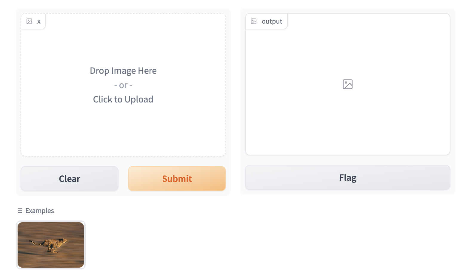
To enable the example view, you must have the following two files in the top of the frontend directory:
Example.svelte: this corresponds to the "example version" of your componentIndex.svelte: this corresponds to the "regular version"
In the backend, you typically don't need to do anything. The user-provided example value is processed using the same .postprocess() method described earlier. If you'd like to do process the data differently (for example, if the .postprocess() method is computationally expensive), then you can write your own .process_example() method for your custom component, which will be used instead.
The Example.svelte file and process_example() method will be covered in greater depth in the dedicated frontend and backend guides respectively.
What you need to remember
- If you expect your component to be used as input, it is important to define an "Example" view.
- If you don't, Gradio will use a default one but it won't be as informative as it can be!
Conclusion
Now that you know the most important pieces to remember about Gradio components, you can start to design and build your own!
Configuring Your Custom Component
The custom components workflow focuses on convention over configuration to reduce the number of decisions you as a developer need to make when developing your custom component. That being said, you can still configure some aspects of the custom component package and directory. This guide will cover how.
The Package Name
By default, all custom component packages are called gradio_<component-name> where component-name is the name of the component's python class in lowercase.
As an example, let's walkthrough changing the name of a component from gradio_mytextbox to supertextbox.
- Modify the
namein thepyproject.tomlfile.
[project]
name = "supertextbox"
- Change all occurrences of
gradio_<component-name>inpyproject.tomlto<component-name>
[tool.hatch.build]
artifacts = ["/backend/supertextbox/templates", "*.pyi"]

[tool.hatch.build.targets.wheel]
packages = ["/backend/supertextbox"]
- Rename the
gradio_<component-name>directory inbackend/to<component-name>
mv backend/gradio_mytextbox backend/supertextbox
        <div class='tip'>
            <svg xmlns="http://www.w3.org/2000/svg" viewBox="0 0 24 24" fill="none" stroke="currentColor" stroke-width="2" stroke-linecap="round" stroke-linejoin="round">
                <path d="M15 14c.2-1 .7-1.7 1.5-2.5 1-.9 1.5-2.2 1.5-3.5A6 6 0 0 0 6 8c0 1 .2 2.2 1.5 3.5.7.7 1.3 1.5 1.5 2.5"/>
                <path d="M9 18h6"/>
                <path d="M10 22h4"/>
            </svg>
            <div><p>Remember to change the import statement in <code>demo/app.py</code>!</p></div>
        </div>
Top Level Python Exports
By default, only the custom component python class is a top level export.
This means that when users type from gradio_<component-name> import ..., the only class that will be available is the custom component class.
To add more classes as top level exports, modify the __all__ property in __init__.py
from .mytextbox import MyTextbox
from .mytextbox import AdditionalClass, additional_function

__all__ = ['MyTextbox', 'AdditionalClass', 'additional_function']
Python Dependencies
You can add python dependencies by modifying the dependencies key in pyproject.toml
dependencies = ["gradio", "numpy", "PIL"]
        <div class='tip'>
            <svg xmlns="http://www.w3.org/2000/svg" viewBox="0 0 24 24" fill="none" stroke="currentColor" stroke-width="2" stroke-linecap="round" stroke-linejoin="round">
                <path d="M15 14c.2-1 .7-1.7 1.5-2.5 1-.9 1.5-2.2 1.5-3.5A6 6 0 0 0 6 8c0 1 .2 2.2 1.5 3.5.7.7 1.3 1.5 1.5 2.5"/>
                <path d="M9 18h6"/>
                <path d="M10 22h4"/>
            </svg>
            <div><p>Remember to run <code>gradio cc install</code> when you add dependencies!</p></div>
        </div>
Javascript Dependencies
You can add JavaScript dependencies by modifying the "dependencies" key in frontend/package.json
"dependencies": {
    "@gradio/atoms": "0.2.0-beta.4",
    "@gradio/statustracker": "0.3.0-beta.6",
    "@gradio/utils": "0.2.0-beta.4",
    "your-npm-package": "<version>"
}
Directory Structure
By default, the CLI will place the Python code in backend and the JavaScript code in frontend.
It is not recommended to change this structure since it makes it easy for a potential contributor to look at your source code and know where everything is.
However, if you did want to this is what you would have to do:
Place the Python code in the subdirectory of your choosing. Remember to modify the
[tool.hatch.build][tool.hatch.build.targets.wheel]in thepyproject.tomlto match!Place the JavaScript code in the subdirectory of your choosing.
Add the
FRONTEND_DIRproperty on the component python class. It must be the relative path from the file where the class is defined to the location of the JavaScript directory.
class SuperTextbox(Component):
    FRONTEND_DIR = "../../frontend/"
The JavaScript and Python directories must be under the same common directory!
Conclusion
Sticking to the defaults will make it easy for others to understand and contribute to your custom component. After all, the beauty of open source is that anyone can help improve your code! But if you ever need to deviate from the defaults, you know how!# The Backend 🐍
This guide will cover everything you need to know to implement your custom component's backend processing.
Which Class to Inherit From
All components inherit from one of three classes Component, FormComponent, or BlockContext.
You need to inherit from one so that your component behaves like all other gradio components.
When you start from a template with gradio cc create --template, you don't need to worry about which one to choose since the template uses the correct one.
For completeness, and in the event that you need to make your own component from scratch, we explain what each class is for.
FormComponent: Use this when you want your component to be grouped together in the sameFormlayout with otherFormComponents. TheSlider,Textbox, andNumbercomponents are allFormComponents.BlockContext: Use this when you want to place other components "inside" your component. This enabledwith MyComponent() as component:syntax.Component: Use this for all other cases.If your component supports streaming output, inherit from the
StreamingOutputclass.
If you inherit from
BlockContext, you also need to set the metaclass to beComponentMeta. See example below.
from gradio.blocks import BlockContext
from gradio.component_meta import ComponentMeta


@document()
class Row(BlockContext, metaclass=ComponentMeta):
    pass
The methods you need to implement
When you inherit from any of these classes, the following methods must be implemented. Otherwise the Python interpreter will raise an error when you instantiate your component!
preprocess and postprocess
Explained in the Key Concepts guide. They handle the conversion from the data sent by the frontend to the format expected by the python function.
    def preprocess(self, x: Any) -> Any:
        """
        Convert from the web-friendly (typically JSON) value in the frontend to the format expected by the python function.
        """
        return x

    def postprocess(self, y):
        """
        Convert from the data returned by the python function to the web-friendly (typically JSON) value expected by the frontend.
        """
        return y
process_example
Takes in the original Python value and returns the modified value that should be displayed in the examples preview in the app.
If not provided, the .postprocess() method is used instead. Let's look at the following example from the SimpleDropdown component.
def process_example(self, input_data):
    return next((c[0] for c in self.choices if c[1] == input_data), None)
Since self.choices is a list of tuples corresponding to (display_name, value), this converts the value that a user provides to the display value (or if the value is not present in self.choices, it is converted to None).
api_info
A JSON-schema representation of the value that the preprocess expects.
This powers api usage via the gradio clients.
You do not need to implement this yourself if you components specifies a data_model.
The data_model in the following section.
def api_info(self) -> dict[str, list[str]]:
    """
    A JSON-schema representation of the value that the `preprocess` expects and the `postprocess` returns.
    """
    pass
example_payload
An example payload for your component, e.g. something that can be passed into the .preprocess() method
of your component. The example input is displayed in the View API page of a Gradio app that uses your custom component.
Must be JSON-serializable. If your component expects a file, it is best to use a publicly accessible URL.
def example_payload(self) -> Any:
    """
    The example inputs for this component for API usage. Must be JSON-serializable.
    """
    pass
example_value
An example value for your component, e.g. something that can be passed into the .postprocess() method
of your component. This is used as the example value in the default app that is created in custom component development.
def example_payload(self) -> Any:
    """
    The example inputs for this component for API usage. Must be JSON-serializable.
    """
    pass
flag
Write the component's value to a format that can be stored in the csv or json file used for flagging.
You do not need to implement this yourself if you components specifies a data_model.
The data_model in the following section.
def flag(self, x: Any | GradioDataModel, flag_dir: str | Path = "") -> str:
    pass
read_from_flag
Convert from the format stored in the csv or json file used for flagging to the component's python value.
You do not need to implement this yourself if you components specifies a data_model.
The data_model in the following section.
def read_from_flag(
    self,
    x: Any,
) -> GradioDataModel | Any:
    """
    Convert the data from the csv or jsonl file into the component state.
    """
    return x
The data_model
The data_model is how you define the expected data format your component's value will be stored in the frontend.
It specifies the data format your preprocess method expects and the format the postprocess method returns.
It is not necessary to define a data_model for your component but it greatly simplifies the process of creating a custom component.
If you define a custom component you only need to implement four methods - preprocess, postprocess, example_payload, and example_value!
You define a data_model by defining a pydantic model that inherits from either GradioModel or GradioRootModel.
This is best explained with an example. Let's look at the core Video component, which stores the video data as a JSON object with two keys video and subtitles which point to separate files.
from gradio.data_classes import FileData, GradioModel

class VideoData(GradioModel):
    video: FileData
    subtitles: Optional[FileData] = None

class Video(Component):
    data_model = VideoData
By adding these four lines of code, your component automatically implements the methods needed for API usage, the flagging methods, and example caching methods! It also has the added benefit of self-documenting your code. Anyone who reads your component code will know exactly the data it expects.
If your component expects files to be uploaded from the frontend, your must use the FileData model! It will be explained in the following section.
        <div class='tip'>
            <svg xmlns="http://www.w3.org/2000/svg" viewBox="0 0 24 24" fill="none" stroke="currentColor" stroke-width="2" stroke-linecap="round" stroke-linejoin="round">
                <path d="M15 14c.2-1 .7-1.7 1.5-2.5 1-.9 1.5-2.2 1.5-3.5A6 6 0 0 0 6 8c0 1 .2 2.2 1.5 3.5.7.7 1.3 1.5 1.5 2.5"/>
                <path d="M9 18h6"/>
                <path d="M10 22h4"/>
            </svg>
            <div><p>Read the pydantic docs <a href="https://docs.pydantic.dev/latest/concepts/models/#basic-model-usage">here</a>.</p></div>
        </div>
The difference between a GradioModel and a GradioRootModel is that the RootModel will not serialize the data to a dictionary.
For example, the Names model will serialize the data to {'names': ['freddy', 'pete']} whereas the NamesRoot model will serialize it to ['freddy', 'pete'].
from typing import List

class Names(GradioModel):
    names: List[str]

class NamesRoot(GradioRootModel):
    root: List[str]
Even if your component does not expect a "complex" JSON data structure it can be beneficial to define a GradioRootModel so that you don't have to worry about implementing the API and flagging methods.
Use classes from the Python typing library to type your models. e.g. List instead of list.
Handling Files
If your component expects uploaded files as input, or returns saved files to the frontend, you MUST use the FileData to type the files in your data_model.
When you use the FileData:
Gradio knows that it should allow serving this file to the frontend. Gradio automatically blocks requests to serve arbitrary files in the computer running the server.
Gradio will automatically place the file in a cache so that duplicate copies of the file don't get saved.
The client libraries will automatically know that they should upload input files prior to sending the request. They will also automatically download files.
If you do not use the FileData, your component will not work as expected!
Adding Event Triggers To Your Component
The events triggers for your component are defined in the EVENTS class attribute.
This is a list that contains the string names of the events.
Adding an event to this list will automatically add a method with that same name to your component!
You can import the Events enum from gradio.events to access commonly used events in the core gradio components.
For example, the following code will define text_submit, file_upload and change methods in the MyComponent class.
from gradio.events import Events
from gradio.components import FormComponent

class MyComponent(FormComponent):

    EVENTS = [
        "text_submit",
        "file_upload",
        Events.change
    ]
        <div class='tip'>
            <svg xmlns="http://www.w3.org/2000/svg" viewBox="0 0 24 24" fill="none" stroke="currentColor" stroke-width="2" stroke-linecap="round" stroke-linejoin="round">
                <path d="M15 14c.2-1 .7-1.7 1.5-2.5 1-.9 1.5-2.2 1.5-3.5A6 6 0 0 0 6 8c0 1 .2 2.2 1.5 3.5.7.7 1.3 1.5 1.5 2.5"/>
                <path d="M9 18h6"/>
                <path d="M10 22h4"/>
            </svg>
            <div><p>Don't forget to also handle these events in the JavaScript code!</p></div>
        </div>
Conclusion
The Frontend 🌐⭐️
This guide will cover everything you need to know to implement your custom component's frontend.
Gradio components use Svelte. Writing Svelte is fun! If you're not familiar with it, we recommend checking out their interactive guide.
The directory structure
The frontend code should have, at minimum, three files:
Index.svelte: This is the main export and where your component's layout and logic should live.Example.svelte: This is where the example view of the component is defined.
Feel free to add additional files and subdirectories.
If you want to export any additional modules, remember to modify the package.json file
"exports": {
    ".": "./Index.svelte",
    "./example": "./Example.svelte",
    "./package.json": "./package.json"
},
The Index.svelte file
Your component should expose the following props that will be passed down from the parent Gradio application.
import type { LoadingStatus } from "@gradio/statustracker";
import type { Gradio } from "@gradio/utils";

export let gradio: Gradio<{
    event_1: never;
    event_2: never;
}>;

export let elem_id = "";
export let elem_classes: string[] = [];
export let scale: number | null = null;
export let min_width: number | undefined = undefined;
export let loading_status: LoadingStatus | undefined = undefined;
export let mode: "static" | "interactive";
elem_idandelem_classesallow Gradio app developers to target your component with custom CSS and JavaScript from the PythonBlocksclass.scaleandmin_widthallow Gradio app developers to control how much space your component takes up in the UI.loading_statusis used to display a loading status over the component when it is the output of an event.modeis how the parent Gradio app tells your component whether theinteractiveorstaticversion should be displayed.gradio: Thegradioobject is created by the parent Gradio app. It stores some application-level configuration that will be useful in your component, like internationalization. You must use it to dispatch events from your component.
A minimal Index.svelte file would look like:
<script lang="ts">
    import type { LoadingStatus } from "@gradio/statustracker";
    import { Block } from "@gradio/atoms";
    import { StatusTracker } from "@gradio/statustracker";
    import type { Gradio } from "@gradio/utils";

    export let gradio: Gradio<{
        event_1: never;
        event_2: never;
    }>;

    export let value = "";
    export let elem_id = "";
    export let elem_classes: string[] = [];
    export let scale: number | null = null;
    export let min_width: number | undefined = undefined;
    export let loading_status: LoadingStatus | undefined = undefined;
    export let mode: "static" | "interactive";
</script>

<Block
    visible={true}
    {elem_id}
    {elem_classes}
    {scale}
    {min_width}
    allow_overflow={false}
    padding={true}
>
    {#if loading_status}
        <StatusTracker
            autoscroll={gradio.autoscroll}
            i18n={gradio.i18n}
            {...loading_status}
        />
    {/if}
    <p>{value}</p>
</Block>
The Example.svelte file
The Example.svelte file should expose the following props:
    export let value: string;
    export let type: "gallery" | "table";
    export let selected = false;
    export let index: number;
value: The example value that should be displayed.type: This is a variable that can be either"gallery"or"table"depending on how the examples are displayed. The"gallery"form is used when the examples correspond to a single input component, while the"table"form is used when a user has multiple input components, and the examples need to populate all of them.selected: You can also adjust how the examples are displayed if a user "selects" a particular example by using the selected variable.index: The current index of the selected value.Any additional props your "non-example" component takes!
This is the Example.svelte file for the code Radio component:
<script lang="ts">
    export let value: string;
    export let type: "gallery" | "table";
    export let selected = false;
</script>

<div
    class:table={type === "table"}
    class:gallery={type === "gallery"}
    class:selected
>
    {value}
</div>

<style>
    .gallery {
        padding: var(--size-1) var(--size-2);
    }
</style>
Handling Files
If your component deals with files, these files should be uploaded to the backend server.
The @gradio/client npm package provides the upload and prepare_files utility functions to help you do this.
The prepare_files function will convert the browser's File datatype to gradio's internal FileData type.
You should use the FileData data in your component to keep track of uploaded files.
The upload function will upload an array of FileData values to the server.
Here's an example of loading files from an <input> element when its value changes.
<script lang="ts">
    import { upload, prepare_files, type FileData } from "@gradio/client";
    export let root;
    export let value;
    let uploaded_files;

    async function handle_upload(file_data: FileData[]): Promise<void> {
        await tick();
        uploaded_files = await upload(file_data, root);
    }

    async function loadFiles(files: FileList): Promise<void> {
        let _files: File[] = Array.from(files);
        if (!files.length) {
            return;
        }
        if (file_count === "single") {
            _files = [files[0]];
        }
        let file_data = await prepare_files(_files);
        await handle_upload(file_data);
    }

    async function loadFilesFromUpload(e: Event): Promise<void> {
        const target = e.target;

        if (!target.files) return;
        await loadFiles(target.files);
    }
</script>

<input
    type="file"
    on:change={loadFilesFromUpload}
    multiple={true}
/>
The component exposes a prop named root.
This is passed down by the parent gradio app and it represents the base url that the files will be uploaded to and fetched from.
For WASM support, you should get the upload function from the Context and pass that as the third parameter of the upload function.
<script lang="ts">
    import { getContext } from "svelte";
    const upload_fn = getContext<typeof upload_files>("upload_files");

    async function handle_upload(file_data: FileData[]): Promise<void> {
        await tick();
        await upload(file_data, root, upload_fn);
    }
</script>
Leveraging Existing Gradio Components
Most of Gradio's frontend components are published on npm, the javascript package repository.
This means that you can use them to save yourself time while incorporating common patterns in your component, like uploading files.
For example, the @gradio/upload package has Upload and ModifyUpload components for properly uploading files to the Gradio server.
Here is how you can use them to create a user interface to upload and display PDF files.
<script>
    import { type FileData, Upload, ModifyUpload } from "@gradio/upload";
    import { Empty, UploadText, BlockLabel } from "@gradio/atoms";
</script>

<BlockLabel Icon={File} label={label || "PDF"} />
{#if value === null && interactive}
    <Upload
        filetype="application/pdf"
        on:load={handle_load}
        {root}
        >
        <UploadText type="file" i18n={gradio.i18n} />
    </Upload>
{:else if value !== null}
    {#if interactive}
        <ModifyUpload i18n={gradio.i18n} on:clear={handle_clear}/>
    {/if}
    <iframe title={value.orig_name || "PDF"} src={value.data} height="{height}px" width="100%"></iframe>
{:else}
    <Empty size="large"> <File/> </Empty>
{/if}
You can also combine existing Gradio components to create entirely unique experiences. Like rendering a gallery of chatbot conversations. The possibilities are endless, please read the documentation on our javascript packages here. We'll be adding more packages and documentation over the coming weeks!
Matching Gradio Core's Design System
You can explore our component library via Storybook. You'll be able to interact with our components and see them in their various states.
For those interested in design customization, we provide the CSS variables consisting of our color palette, radii, spacing, and the icons we use - so you can easily match up your custom component with the style of our core components. This Storybook will be regularly updated with any new additions or changes.
Custom configuration
If you want to make use of the vast vite ecosystem, you can use the gradio.config.js file to configure your component's build process. This allows you to make use of tools like tailwindcss, mdsvex, and more.
Currently, it is possible to configure the following:
Vite options:
plugins: A list of vite plugins to use.
Svelte options:
preprocess: A list of svelte preprocessors to use.extensions: A list of file extensions to compile to.sveltefiles.build.target: The target to build for, this may be necessary to support newer javascript features. See the esbuild docs for more information.
The gradio.config.js file should be placed in the root of your component's frontend directory. A default config file is created for you when you create a new component. But you can also create your own config file, if one doesn't exist, and use it to customize your component's build process.
Example for a Vite plugin
Custom components can use Vite plugins to customize the build process. Check out the Vite Docs for more information.
Here we configure TailwindCSS, a utility-first CSS framework. Setup is easiest using the version 4 prerelease.
npm install tailwindcss@next @tailwindcss/vite@next
In gradio.config.js:
import tailwindcss from "@tailwindcss/vite";
export default {
    plugins: [tailwindcss()]
};
Then create a style.css file with the following content:
@import "tailwindcss";
Import this file into Index.svelte. Note, that you need to import the css file containing @import and cannot just use a <style> tag and use @import there.
<script lang="ts">
[...]
import "./style.css";
[...]
</script>
Example for Svelte options
In gradio.config.js you can also specify a some Svelte options to apply to the Svelte compilation. In this example we will add support for mdsvex, a Markdown preprocessor for Svelte.
In order to do this we will need to add a Svelte Preprocessor to the svelte object in gradio.config.js and configure the extensions field. Other options are not currently supported.
First, install the mdsvex plugin:
npm install mdsvex
Then add the following to gradio.config.js:
import { mdsvex } from "mdsvex";

export default {
    svelte: {
        preprocess: [
            mdsvex()
        ],
        extensions: [".svelte", ".svx"]
    }
};
Now we can create mdsvex documents in our component's frontend directory and they will be compiled to .svelte files.
<!-- HelloWorld.svx -->
<script lang="ts">
import { Block } from "@gradio/atoms";
export let title = "Hello World";
</script>
# {title}
This is a markdown file.
We can then use the HelloWorld.svx file in our components:
<script lang="ts">
    import HelloWorld from "./HelloWorld.svx";
</script>

<HelloWorld />
Conclusion
You now know how to create delightful frontends for your components!
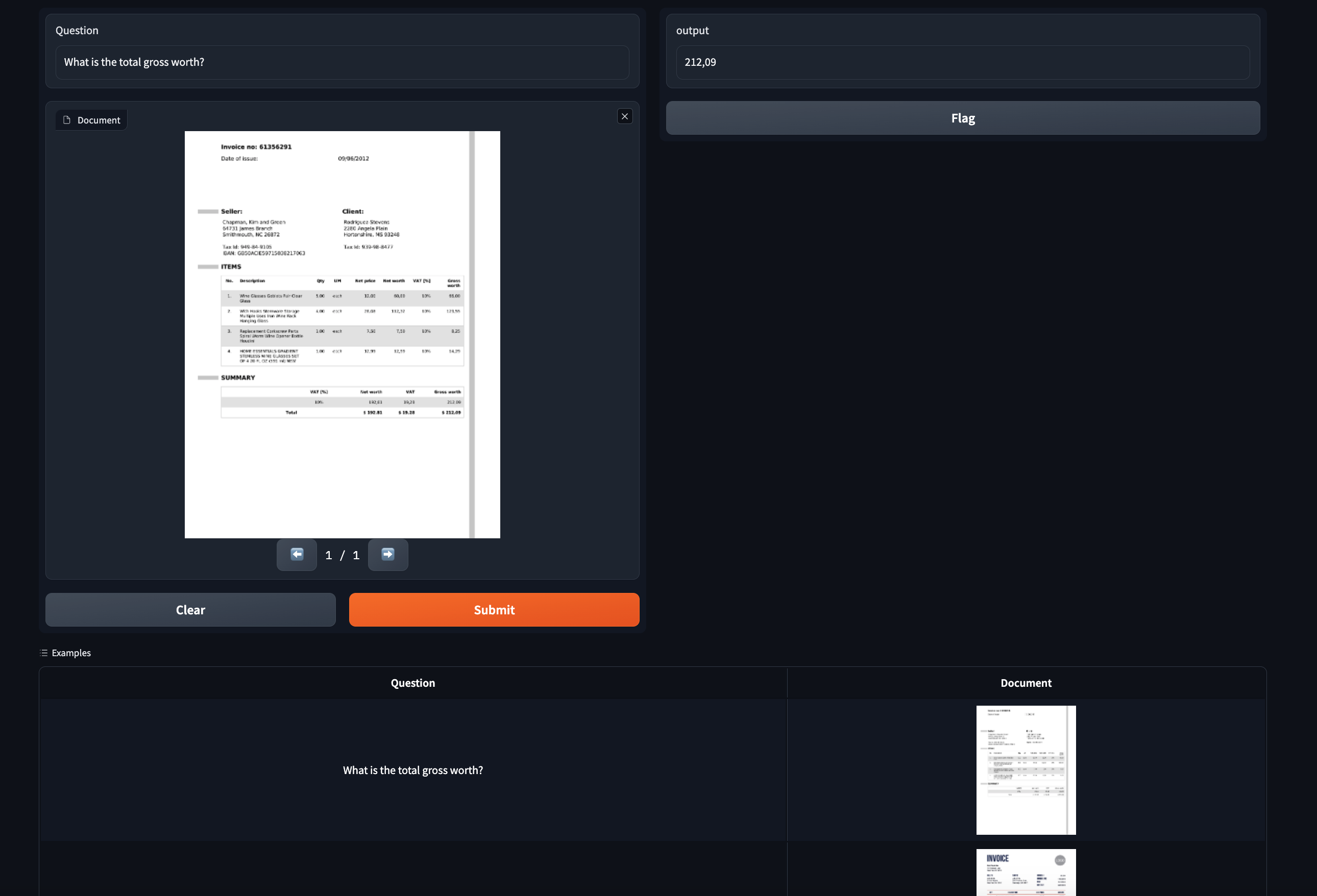
Case Study: A Component to Display PDFs
Let's work through an example of building a custom gradio component for displaying PDF files. This component will come in handy for showcasing document question answering models, which typically work on PDF input. This is a sneak preview of what our finished component will look like:
Step 0: Prerequisites
Make sure you have gradio 5.0 or higher installed as well as node 20+. As of the time of publication, the latest release is 4.1.1. Also, please read the Five Minute Tour of custom components and the Key Concepts guide before starting.
Step 1: Creating the custom component
Navigate to a directory of your choosing and run the following command:
gradio cc create PDF
Tip: You should change the name of the component.
Some of the screenshots assume the component is called PDF but the concepts are the same!
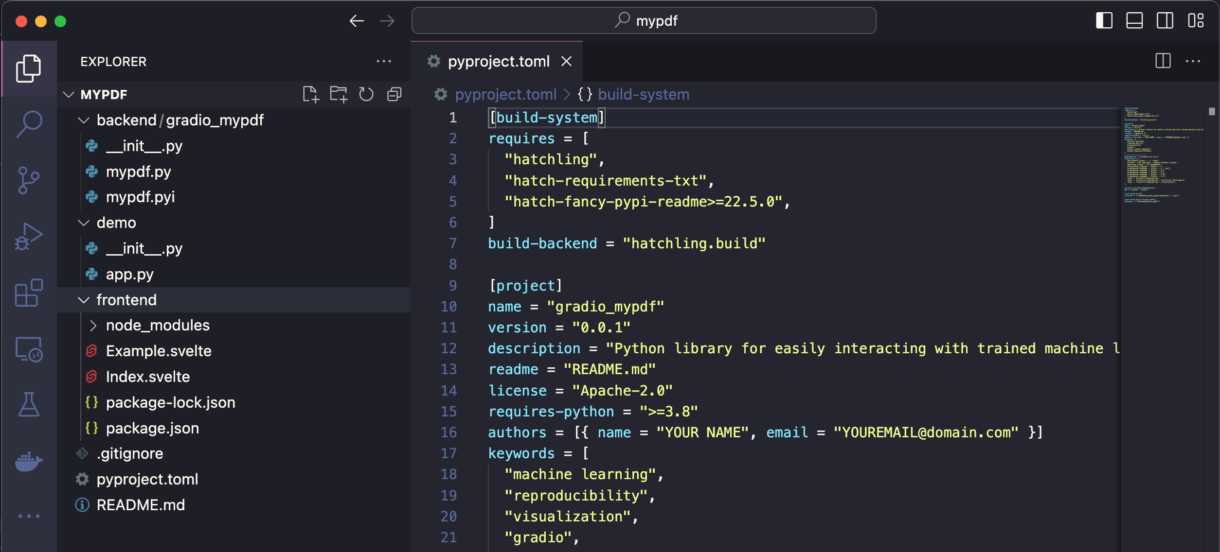
This will create a subdirectory called pdf in your current working directory.
There are three main subdirectories in pdf: frontend, backend, and demo.
If you open pdf in your code editor, it will look like this:
For this demo we are not templating off a current gradio component. But you can see the list of available templates with gradio cc show and then pass the template name to the --template option, e.g. gradio cc create <Name> --template <foo>
Step 2: Frontend - modify javascript dependencies
We're going to use the pdfjs javascript library to display the pdfs in the frontend. Let's start off by adding it to our frontend project's dependencies, as well as adding a couple of other projects we'll need.
From within the frontend directory, run npm install @gradio/client @gradio/upload @gradio/icons @gradio/button and npm install --save-dev pdfjs-dist@3.11.174.
Also, let's uninstall the @zerodevx/svelte-json-view dependency by running npm uninstall @zerodevx/svelte-json-view.
The complete package.json should look like this:
{
  "name": "gradio_pdf",
  "version": "0.2.0",
  "description": "Gradio component for displaying PDFs",
  "type": "module",
  "author": "",
  "license": "ISC",
  "private": false,
  "main_changeset": true,
  "exports": {
    ".": "./Index.svelte",
    "./example": "./Example.svelte",
    "./package.json": "./package.json"
  },
  "devDependencies": {
    "pdfjs-dist": "3.11.174"
  },
  "dependencies": {
    "@gradio/atoms": "0.2.0",
    "@gradio/statustracker": "0.3.0",
    "@gradio/utils": "0.2.0",
    "@gradio/client": "0.7.1",
    "@gradio/upload": "0.3.2",
    "@gradio/icons": "0.2.0",
    "@gradio/button": "0.2.3",
    "pdfjs-dist": "3.11.174"
  }
}
<div class='tip'>
<svg xmlns="http://www.w3.org/2000/svg" viewBox="0 0 24 24" fill="none" stroke="currentColor" stroke-width="2" stroke-linecap="round" stroke-linejoin="round">
<path d="M15 14c.2-1 .7-1.7 1.5-2.5 1-.9 1.5-2.2 1.5-3.5A6 6 0 0 0 6 8c0 1 .2 2.2 1.5 3.5.7.7 1.3 1.5 1.5 2.5"/>
<path d="M9 18h6"/>
<path d="M10 22h4"/>
</svg>
<div><p>Running <code>npm install</code> will install the latest version of the package available. You can install a specific version with <code>npm install package@<version></code>. You can find all of the gradio javascript package documentation <a href="https://www.gradio.app/main/docs/js">here</a>. It is recommended you use the same versions as me as the API can change.</p></div>
</div>
Navigate to Index.svelte and delete mentions of JSONView
import { JsonView } from "@zerodevx/svelte-json-view";
<JsonView json={value} />
Step 3: Frontend - Launching the Dev Server
Run the dev command to launch the development server.
This will open the demo in demo/app.py in an environment where changes to the frontend and backend directories will reflect instantaneously in the launched app.
After launching the dev server, you should see a link printed to your console that says Frontend Server (Go here): ... .
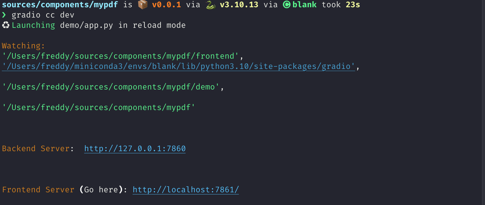
You should see the following:
Its not impressive yet but we're ready to start coding!
Step 4: Frontend - The basic skeleton
We're going to start off by first writing the skeleton of our frontend and then adding the pdf rendering logic.
Add the following imports and expose the following properties to the top of your file in the <script> tag.
You may get some warnings from your code editor that some props are not used.
That's ok.
    import { tick } from "svelte";
    import type { Gradio } from "@gradio/utils";
    import { Block, BlockLabel } from "@gradio/atoms";
    import { File } from "@gradio/icons";
    import { StatusTracker } from "@gradio/statustracker";
    import type { LoadingStatus } from "@gradio/statustracker";
    import type { FileData } from "@gradio/client";
    import { Upload, ModifyUpload } from "@gradio/upload";

    export let elem_id = "";
    export let elem_classes: string[] = [];
    export let visible = true;
    export let value: FileData | null = null;
    export let container = true;
    export let scale: number | null = null;
    export let root: string;
    export let height: number | null = 500;
    export let label: string;
    export let proxy_url: string;
    export let min_width: number | undefined = undefined;
    export let loading_status: LoadingStatus;
    export let gradio: Gradio<{
        change: never;
        upload: never;
    }>;

    let _value = value;
    let old_value = _value;
        <div class='tip'>
            <svg xmlns="http://www.w3.org/2000/svg" viewBox="0 0 24 24" fill="none" stroke="currentColor" stroke-width="2" stroke-linecap="round" stroke-linejoin="round">
                <path d="M15 14c.2-1 .7-1.7 1.5-2.5 1-.9 1.5-2.2 1.5-3.5A6 6 0 0 0 6 8c0 1 .2 2.2 1.5 3.5.7.7 1.3 1.5 1.5 2.5"/>
                <path d="M9 18h6"/>
                <path d="M10 22h4"/>
            </svg>
            <div><p>The `gradio`` object passed in here contains some metadata about the application as well as some utility methods. One of these utilities is a dispatch method. We want to dispatch change and upload events whenever our PDF is changed or updated. This line provides type hints that these are the only events we will be dispatching.</p></div>
        </div>
We want our frontend component to let users upload a PDF document if there isn't one already loaded.
If it is loaded, we want to display it underneath a "clear" button that lets our users upload a new document.
We're going to use the Upload and ModifyUpload components that come with the @gradio/upload package to do this.
Underneath the </script> tag, delete all the current code and add the following:
<Block {visible} {elem_id} {elem_classes} {container} {scale} {min_width}>
    {#if loading_status}
        <StatusTracker
            autoscroll={gradio.autoscroll}
            i18n={gradio.i18n}
            {...loading_status}
        />
    {/if}
    <BlockLabel
        show_label={label !== null}
        Icon={File}
        float={value === null}
        label={label || "File"}
    />
    {#if _value}
        <ModifyUpload i18n={gradio.i18n} absolute />
    {:else}
        <Upload
            filetype={"application/pdf"}
            file_count="single"
            {root}
        >
            Upload your PDF
        </Upload>
    {/if}
</Block>
You should see the following when you navigate to your app after saving your current changes:
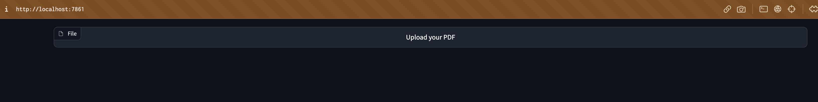
Step 5: Frontend - Nicer Upload Text
The Upload your PDF text looks a bit small and barebones.
Lets customize it!
Create a new file called PdfUploadText.svelte and copy the following code.
Its creating a new div to display our "upload text" with some custom styling.
Notice that we're leveraging Gradio core's existing css variables here: var(--size-60) and var(--body-text-color-subdued). This allows our component to work nicely in light mode and dark mode, as well as with Gradio's built-in themes.
<script lang="ts">
    import { Upload as UploadIcon } from "@gradio/icons";
    export let hovered = false;

</script>

<div class="wrap">
    <span class="icon-wrap" class:hovered><UploadIcon /> </span>
    Drop PDF
    <span class="or">- or -</span>
    Click to Upload
</div>

<style>
    .wrap {
        display: flex;
        flex-direction: column;
        justify-content: center;
        align-items: center;
        min-height: var(--size-60);
        color: var(--block-label-text-color);
        line-height: var(--line-md);
        height: 100%;
        padding-top: var(--size-3);
    }

    .or {
        color: var(--body-text-color-subdued);
        display: flex;
    }

    .icon-wrap {
        width: 30px;
        margin-bottom: var(--spacing-lg);
    }

    @media (--screen-md) {
        .wrap {
            font-size: var(--text-lg);
        }
    }

    .hovered {
        color: var(--color-accent);
    }
</style>
Now import PdfUploadText.svelte in your <script> and pass it to the Upload component!
    import PdfUploadText from "./PdfUploadText.svelte";

...

    <Upload
        filetype={"application/pdf"}
        file_count="single"
        {root}
    >
        <PdfUploadText />
    </Upload>
After saving your code, the frontend should now look like this:
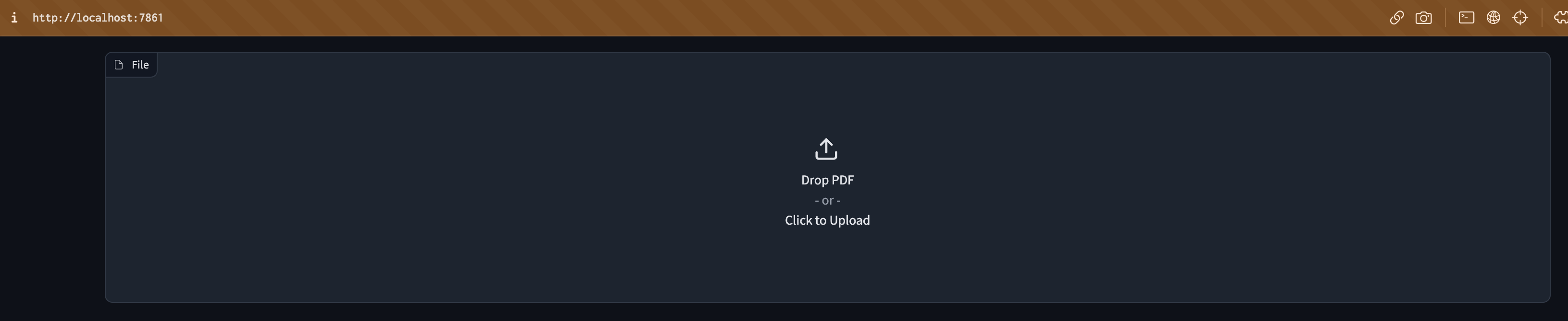
Step 6: PDF Rendering logic
This is the most advanced javascript part. It took me a while to figure it out! Do not worry if you have trouble, the important thing is to not be discouraged 💪 Ask for help in the gradio discord if you need and ask for help.
With that out of the way, let's start off by importing pdfjs and loading the code of the pdf worker from the mozilla cdn.
    import pdfjsLib from "pdfjs-dist";
    ...
    pdfjsLib.GlobalWorkerOptions.workerSrc =  "https://cdn.bootcss.com/pdf.js/3.11.174/pdf.worker.js";
Also create the following variables:
    let pdfDoc;
    let numPages = 1;
    let currentPage = 1;
    let canvasRef;
Now, we will use pdfjs to render a given page of the PDF onto an html document.
Add the following code to Index.svelte:
    async function get_doc(value: FileData) {
        const loadingTask = pdfjsLib.getDocument(value.url);
        pdfDoc = await loadingTask.promise;
        numPages = pdfDoc.numPages;
        render_page();
    }

    function render_page() {
    // Render a specific page of the PDF onto the canvas
        pdfDoc.getPage(currentPage).then(page => {
            const ctx  = canvasRef.getContext('2d')
            ctx.clearRect(0, 0, canvasRef.width, canvasRef.height);
            let viewport = page.getViewport({ scale: 1 });
            let scale = height / viewport.height;
            viewport = page.getViewport({ scale: scale });

            const renderContext = {
                canvasContext: ctx,
                viewport,
            };
            canvasRef.width = viewport.width;
            canvasRef.height = viewport.height;
            page.render(renderContext);
        });
    }

    // If the value changes, render the PDF of the currentPage
    $: if(JSON.stringify(old_value) != JSON.stringify(_value)) {
        if (_value){
            get_doc(_value);
        }
        old_value = _value;
        gradio.dispatch("change");
    }
        <div class='tip'>
            <svg xmlns="http://www.w3.org/2000/svg" viewBox="0 0 24 24" fill="none" stroke="currentColor" stroke-width="2" stroke-linecap="round" stroke-linejoin="round">
                <path d="M15 14c.2-1 .7-1.7 1.5-2.5 1-.9 1.5-2.2 1.5-3.5A6 6 0 0 0 6 8c0 1 .2 2.2 1.5 3.5.7.7 1.3 1.5 1.5 2.5"/>
                <path d="M9 18h6"/>
                <path d="M10 22h4"/>
            </svg>
            <div><p>The <code>$:</code> syntax in svelte is how you declare statements to be reactive. Whenever any of the inputs of the statement change, svelte will automatically re-run that statement.</p></div>
        </div>
Now place the canvas underneath the ModifyUpload component:
<div class="pdf-canvas" style="height: {height}px">
    <canvas bind:this={canvasRef}></canvas>
</div>
And add the following styles to the <style> tag:
<style>
    .pdf-canvas {
        display: flex;
        justify-content: center;
        align-items: center;
    }
</style>
Step 7: Handling The File Upload And Clear
Now for the fun part - actually rendering the PDF when the file is uploaded!
Add the following functions to the <script> tag:
    async function handle_clear() {
        _value = null;
        await tick();
        gradio.dispatch("change");
    }

    async function handle_upload({detail}: CustomEvent<FileData>): Promise<void> {
        value = detail;
        await tick();
        gradio.dispatch("change");
        gradio.dispatch("upload");
    }
<div class='tip'>
<svg xmlns="http://www.w3.org/2000/svg" viewBox="0 0 24 24" fill="none" stroke="currentColor" stroke-width="2" stroke-linecap="round" stroke-linejoin="round">
<path d="M15 14c.2-1 .7-1.7 1.5-2.5 1-.9 1.5-2.2 1.5-3.5A6 6 0 0 0 6 8c0 1 .2 2.2 1.5 3.5.7.7 1.3 1.5 1.5 2.5"/>
<path d="M9 18h6"/>
<path d="M10 22h4"/>
</svg>
<div><p>The <code>gradio.dispatch</code> method is actually what is triggering the <code>change</code> or <code>upload</code> events in the backend. For every event defined in the component's backend, we will explain how to do this in Step 9, there must be at least one <code>gradio.dispatch("<event-name>")</code> call. These are called <code>gradio</code> events and they can be listended from the entire Gradio application. You can dispatch a built-in <code>svelte</code> event with the <code>dispatch</code> function. These events can only be listened to from the component's direct parent. Learn about svelte events from the <a href="https://learn.svelte.dev/tutorial/component-events">official documentation</a>.</p></div>
</div>
Now we will run these functions whenever the Upload component uploads a file and whenever the ModifyUpload component clears the current file. The <Upload> component dispatches a load event with a payload of type FileData corresponding to the uploaded file. The on:load syntax tells Svelte to automatically run this function in response to the event.
    <ModifyUpload i18n={gradio.i18n} on:clear={handle_clear} absolute />

    ...

    <Upload
        on:load={handle_upload}
        filetype={"application/pdf"}
        file_count="single"
        {root}
    >
        <PdfUploadText/>
    </Upload>
Congratulations! You have a working pdf uploader!
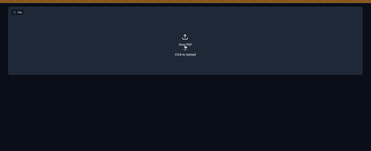
Step 8: Adding buttons to navigate pages
If a user uploads a PDF document with multiple pages, they will only be able to see the first one.
Let's add some buttons to help them navigate the page.
We will use the BaseButton from @gradio/button so that they look like regular Gradio buttons.
Import the BaseButton and add the following functions that will render the next and previous page of the PDF.
    import { BaseButton } from "@gradio/button";

    ...

    function next_page() {
        if (currentPage >= numPages) {
            return;
        }
        currentPage++;
        render_page();
    }

    function prev_page() {
        if (currentPage == 1) {
            return;
        }
        currentPage--;
        render_page();
    }
Now we will add them underneath the canvas in a separate <div>
    ...

    <ModifyUpload i18n={gradio.i18n} on:clear={handle_clear} absolute />
    <div class="pdf-canvas" style="height: {height}px">
        <canvas bind:this={canvasRef}></canvas>
    </div>
    <div class="button-row">
        <BaseButton on:click={prev_page}>
            ⬅️
        </BaseButton>
        <span class="page-count"> {currentPage} / {numPages} </span>
        <BaseButton on:click={next_page}>
            ➡️
        </BaseButton>
    </div>

    ...

<style>
    .button-row {
        display: flex;
        flex-direction: row;
        width: 100%;
        justify-content: center;
        align-items: center;
    }

    .page-count {
        margin: 0 10px;
        font-family: var(--font-mono);
    }
Congratulations! The frontend is almost complete 🎉
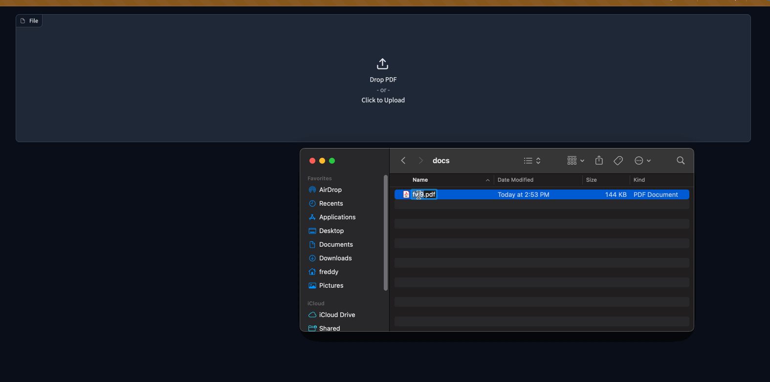
Step 8.5: The Example view
We're going to want users of our component to get a preview of the PDF if its used as an example in a gr.Interface or gr.Examples.
To do so, we're going to add some of the pdf rendering logic in Index.svelte to Example.svelte.
<script lang="ts">
    export let value: string;
    export let type: "gallery" | "table";
    export let selected = false;
    import pdfjsLib from "pdfjs-dist";
    pdfjsLib.GlobalWorkerOptions.workerSrc =  "https://cdn.bootcss.com/pdf.js/3.11.174/pdf.worker.js";

    let pdfDoc;
    let canvasRef;

    async function get_doc(url: string) {
        const loadingTask = pdfjsLib.getDocument(url);
        pdfDoc = await loadingTask.promise;
        renderPage();
        }

    function renderPage() {
        // Render a specific page of the PDF onto the canvas
            pdfDoc.getPage(1).then(page => {
                const ctx  = canvasRef.getContext('2d')
                ctx.clearRect(0, 0, canvasRef.width, canvasRef.height);

                const viewport = page.getViewport({ scale: 0.2 });

                const renderContext = {
                    canvasContext: ctx,
                    viewport
                };
                canvasRef.width = viewport.width;
                canvasRef.height = viewport.height;
                page.render(renderContext);
            });
        }

    $: get_doc(value);
</script>

<div
    class:table={type === "table"}
    class:gallery={type === "gallery"}
    class:selected
    style="justify-content: center; align-items: center; display: flex; flex-direction: column;"
>
    <canvas bind:this={canvasRef}></canvas>
</div>

<style>
    .gallery {
        padding: var(--size-1) var(--size-2);
    }
</style>
        <div class='tip'>
            <svg xmlns="http://www.w3.org/2000/svg" viewBox="0 0 24 24" fill="none" stroke="currentColor" stroke-width="2" stroke-linecap="round" stroke-linejoin="round">
                <path d="M15 14c.2-1 .7-1.7 1.5-2.5 1-.9 1.5-2.2 1.5-3.5A6 6 0 0 0 6 8c0 1 .2 2.2 1.5 3.5.7.7 1.3 1.5 1.5 2.5"/>
                <path d="M9 18h6"/>
                <path d="M10 22h4"/>
            </svg>
            <div><p>Exercise for the reader - reduce the code duplication between <code>Index.svelte</code> and <code>Example.svelte</code> 😊</p></div>
        </div>
You will not be able to render examples until we make some changes to the backend code in the next step!
Step 9: The backend
The backend changes needed are smaller. We're almost done!
What we're going to do is:
- Add
changeanduploadevents to our component. - Add a
heightproperty to let users control the height of the PDF. - Set the
data_modelof our component to beFileData. This is so that Gradio can automatically cache and safely serve any files that are processed by our component. - Modify the
preprocessmethod to return a string corresponding to the path of our uploaded PDF. - Modify the
postprocessto turn a path to a PDF created in an event handler to aFileData.
When all is said an done, your component's backend code should look like this:
from __future__ import annotations
from typing import Any, Callable, TYPE_CHECKING

from gradio.components.base import Component
from gradio.data_classes import FileData
from gradio import processing_utils
if TYPE_CHECKING:
    from gradio.components import Timer

class PDF(Component):

    EVENTS = ["change", "upload"]

    data_model = FileData

    def __init__(self, value: Any = None, *,
                 height: int | None = None,
                 label: str | I18nData | None = None,
                 info: str | I18nData | None = None,
                 show_label: bool | None = None,
                 container: bool = True,
                 scale: int | None = None,
                 min_width: int | None = None,
                 interactive: bool | None = None,
                 visible: bool = True,
                 elem_id: str | None = None,
                 elem_classes: list[str] | str | None = None,
                 render: bool = True,
                 load_fn: Callable[..., Any] | None = None,
                 every: Timer | float | None = None):
        super().__init__(value, label=label, info=info,
                         show_label=show_label, container=container,
                         scale=scale, min_width=min_width,
                         interactive=interactive, visible=visible,
                         elem_id=elem_id, elem_classes=elem_classes,
                         render=render, load_fn=load_fn, every=every)
        self.height = height

    def preprocess(self, payload: FileData) -> str:
        return payload.path

    def postprocess(self, value: str | None) -> FileData:
        if not value:
            return None
        return FileData(path=value)

    def example_payload(self):
        return "https://gradio-builds.s3.amazonaws.com/assets/pdf-guide/fw9.pdf"

    def example_value(self):
        return "https://gradio-builds.s3.amazonaws.com/assets/pdf-guide/fw9.pdf"
Step 10: Add a demo and publish!
To test our backend code, let's add a more complex demo that performs Document Question and Answering with huggingface transformers.
In our demo directory, create a requirements.txt file with the following packages
torch
transformers
pdf2image
pytesseract
        <div class='tip'>
            <svg xmlns="http://www.w3.org/2000/svg" viewBox="0 0 24 24" fill="none" stroke="currentColor" stroke-width="2" stroke-linecap="round" stroke-linejoin="round">
                <path d="M15 14c.2-1 .7-1.7 1.5-2.5 1-.9 1.5-2.2 1.5-3.5A6 6 0 0 0 6 8c0 1 .2 2.2 1.5 3.5.7.7 1.3 1.5 1.5 2.5"/>
                <path d="M9 18h6"/>
                <path d="M10 22h4"/>
            </svg>
            <div><p>Remember to install these yourself and restart the dev server! You may need to install extra non-python dependencies for <code>pdf2image</code>. See <a href="https://pypi.org/project/pdf2image/">here</a>. Feel free to write your own demo if you have trouble.</p></div>
        </div>
import gradio as gr
from gradio_pdf import PDF
from pdf2image import convert_from_path
from transformers import pipeline
from pathlib import Path

dir_ = Path(__file__).parent

p = pipeline(
    "document-question-answering",
    model="impira/layoutlm-document-qa",
)

def qa(question: str, doc: str) -> str:
    img = convert_from_path(doc)[0]
    output = p(img, question)
    return sorted(output, key=lambda x: x["score"], reverse=True)[0]['answer']


demo = gr.Interface(
    qa,
    [gr.Textbox(label="Question"), PDF(label="Document")],
    gr.Textbox(),
)

demo.launch()
See our demo in action below!
Finally lets build our component with gradio cc build and publish it with the gradio cc publish command!
This will guide you through the process of uploading your component to PyPi and HuggingFace Spaces.
        <div class='tip'>
            <svg xmlns="http://www.w3.org/2000/svg" viewBox="0 0 24 24" fill="none" stroke="currentColor" stroke-width="2" stroke-linecap="round" stroke-linejoin="round">
                <path d="M15 14c.2-1 .7-1.7 1.5-2.5 1-.9 1.5-2.2 1.5-3.5A6 6 0 0 0 6 8c0 1 .2 2.2 1.5 3.5.7.7 1.3 1.5 1.5 2.5"/>
                <path d="M9 18h6"/>
                <path d="M10 22h4"/>
            </svg>
            <div><p>You may need to add the following lines to the <code>Dockerfile</code> of your HuggingFace Space.</p></div>
        </div>
RUN mkdir -p /tmp/cache/
RUN chmod a+rwx -R /tmp/cache/
RUN apt-get update && apt-get install -y poppler-utils tesseract-ocr

ENV TRANSFORMERS_CACHE=/tmp/cache/
Conclusion
In order to use our new component in any gradio 4.0 app, simply install it with pip, e.g. pip install gradio-pdf. Then you can use it like the built-in gr.File() component (except that it will only accept and display PDF files).
Here is a simple demo with the Blocks api:
import gradio as gr
from gradio_pdf import PDF

with gr.Blocks() as demo:
    pdf = PDF(label="Upload a PDF", interactive=True)
    name = gr.Textbox()
    pdf.upload(lambda f: f, pdf, name)

demo.launch()
I hope you enjoyed this tutorial! The complete source code for our component is here. Please don't hesitate to reach out to the gradio community on the HuggingFace Discord if you get stuck.